Hardouken
-
Posts
9 -
Joined
-
Last visited
Recent Profile Visitors
397 profile views

-
 Hardouken reacted to a post in a topic:
Monogram - Logo - Putting two letters on each other
Hardouken reacted to a post in a topic:
Monogram - Logo - Putting two letters on each other
-
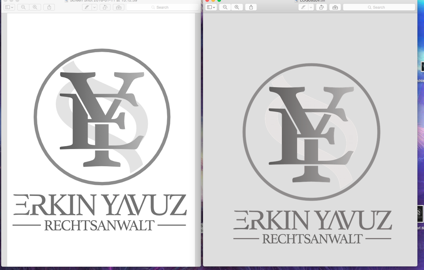
Hi, and sorry for creating another topic, but I thought it would be better to open a new topic so that opther people, who have the same problem, could find any help here. My problem is I've created this logo for a friend, who's a lawyer. I exported the file to a TIFF-File, thought that would be the best for him and sent it to him. But he says the logo doesn't look like it's supposed to look. Blueish background, wrong colors etc. He wants to use this one on his website. So what would be the correct File to send him? And what about the wrong colors? Attachment: The Logo on the left side is the correct one, the one on the right is what the TIFF-File looks like. Very strange. What's up with that? What did I do wrong? Can't find the problem... I have to say I'm a total loser when it comes to correct Files and settings. :/ Would be very cool if somebody could help me with this one. Oh and the text is german, just for the record. Thanks.

-
Thanks guys, but I have to admit I don't know much about AD and struggle a lot finding those features. It all seems so complicated and it's really frustrating. Well, however I kinda managed to get what I wanted and I really don't know what I did exactly, clicked here and there and voila hehe. I know that's not supposed how it should be done but I was getting angry and just wanted to finish that logo somehow... Well, that's the result in the end. The logo was made for a lawyer here in Germany, in case you wonder what the text above the logo is saying. But I've got one more question left: Could yomebody tell me how I could allign every elemt of logo and text perfectly? So that everything is well balanced. How can I spot the exact midpoint of my circle, to place the monogram on it. (?) Thanks again. Really appreciate your guys' help.
-
Hardouken reacted to a post in a topic:
Metallic Effect For Logo
-
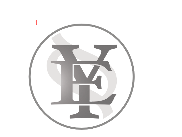
Hey, hmm unfortunately I'm back with my problem here. By using the method you guys showed me, I was able to create Monogram number 1. I did an early version (number 2) which looks a little bit more dynamic, I did this one by using additional forms in the same color of the background an just put them on the letter where I wanted the gap, but this seems way to ineffective and not precise eneough and my client wants the logo to look like number 2 (bad for me ;)). I did the first Logo because it was much easier for me. the second one seems very difficult to do, especially what I'm struggling with is the gap which is skewed. Man I'm going crazy on this one ;/ How can I get the logo version 2? I was only able to get logo version 1 by using the tools you guys mentioned but I'm not able to get the "dynamic" one by using those tools. :( Would appreciate any suggestion and help. Thanks.
-
Madame reacted to a post in a topic:
Metallic Effect For Logo
-
Thanks for the info. So I assume it's nothing which could be done by using affinity designer? The guy in the link yu posted, uses illustrator. I'm not sure about AD though... Or do I have to talk to the guys who print the business cards? Unfortunately I'm not that experienced when it comes to printing. So I have no clue. :S Of course you didn't offend me, just thought, maybe there's something wrong with the logo, but nevermind, I'm guilty of misunderstanding. ;) So thanks for the compliment. ;)
-
Hardouken reacted to a post in a topic:
Metallic Effect For Logo
-
Hardouken reacted to a post in a topic:
Metallic Effect For Logo
-
Alright! Thanks to both of you! Helped me a lot. But I'm still not sure how to manage to get that shiny silver look on the business card. You know what I mean? Like in the picture below. Is it something the printing shop has to arrange or how can we archieve that effect on the business card? :S Um thank you? :) Just wanted to let you know that my logo is still in the "rough" phase, haven't payed much attention to exact position of the logo elements etc. yet. Anyways feel free to critique. ;)
-
Hey, wanted to ask you guys something, I'm currently working on a logo for a friend and he wanted me to have the circle around the logo in a metallic/silver look. The logo will be added to a business card later on and he wants the metallic effect only on the business card, not on his hp, letters etc. I'm not sure how to get that right. I tried the metallic option but every time I use it, it fills the whole circle with that effect and using a blending mode for the circle doesn't even seem to work. I'm not really familiar with Affinity Designer so I would be really thankful if you guys could tell me how to get that metallic effect. Thanks in advance!
-
Hey guys, I think I managed to get what I wanted. Thank you all for the help! ;)
-
Does nobody have a clue on how to do that? Man I need to find out how to put two letters on each other with creating those spaces inbetween... Tried to cheat as best as possible and just tried putting shapes on the letters to achieve those gaps, but it's not quite accurate. There must be an option for that. So If anybody knows how to do that, please let us know. :)
-
Hey, I want to create a Monogram - Logo, but I've got one big problem: I need a clear cut between the edges of those two letters and I don't know how to do it. I want the exact same thing as shown in the image below. Struggling for two days now... Please help me. :S Sorry for my poor english. Hope you get what I mean. ;)