Metin Seven
-
Posts
88 -
Joined
-
Last visited
Everything posted by Metin Seven
-

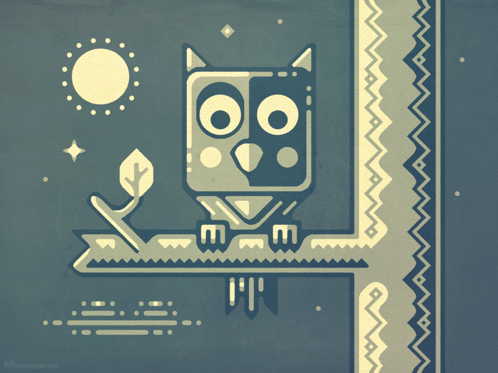
affinity designer Night owl fairy-tale character design
Metin Seven replied to Metin Seven's topic in Share your work
Added more texture, thanks for the pointer, Kevin! -
affinity designer Night owl fairy-tale character design
Metin Seven replied to Metin Seven's topic in Share your work
Thanks Kevin! There's a subtle texture in there, but I agree there could be more. -
affinity designer Night owl fairy-tale character design
Metin Seven posted a topic in Share your work
Night owl fairy-tale character in a graphic design style. Hope you like it.
-
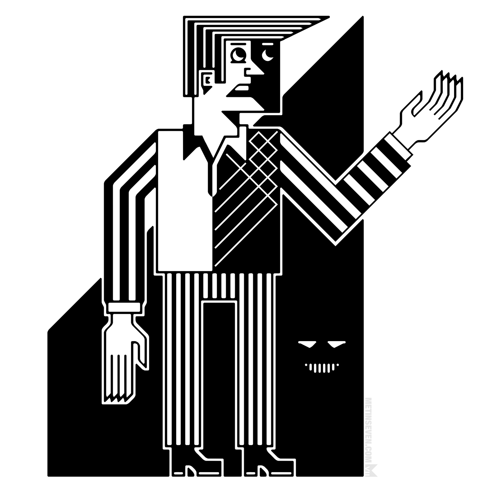
affinity designer Character style experiment
Metin Seven replied to Metin Seven's topic in Share your work
Thanks Alfred! You're right, but it's intentional. I wanted to deviate from correct proportions and other conventions / predictabilities. -
An artistically stylized vector character design. Hope you like it.
-
Same here! Affinity Photo and Designer have saved me from the evil clutches of Adobe.
- 7 replies
-
- 1
-

-
- illustration
- character design
- (and 3 more)
-
Muchas gracias, @retrograde! I see that you're Kevin from Dribbble. Nice to see you here as well!
- 7 replies
-
- 1
-
-
- illustration
- character design
- (and 3 more)
-
Thank you, @Mithferion, appreciated! Kind regards back from the Netherlands!
-
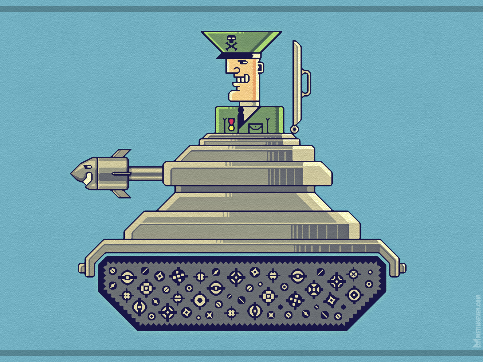
General Mayhem — cartoony vector character design and illustration. Hope you like it.
- 7 replies
-
- 10
-
-
- illustration
- character design
- (and 3 more)
-
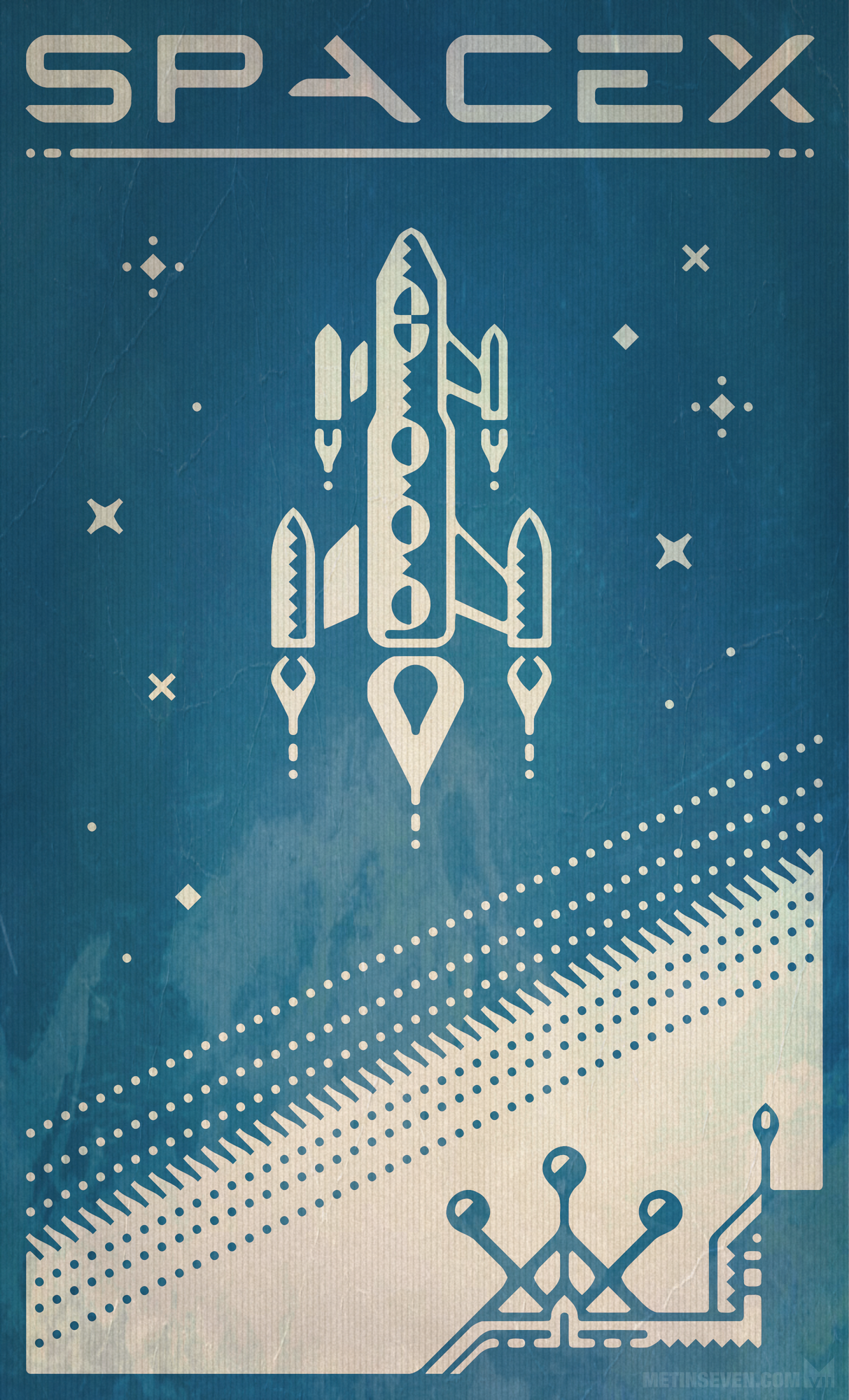
affinity designer SpaceX retro-futuristic poster design
Metin Seven replied to Metin Seven's topic in Share your work
Many thanks, @MEB, I love the Affinity community. -
affinity designer SpaceX retro-futuristic poster design
Metin Seven replied to Metin Seven's topic in Share your work
Thank you very much, @Ros! -
affinity designer SpaceX retro-futuristic poster design
Metin Seven replied to Metin Seven's topic in Share your work
Many thanks, @GarryP, much appreciated! -
affinity designer SpaceX retro-futuristic poster design
Metin Seven posted a topic in Share your work
Tribute to Elon Musk's inspiring SpaceX corporation, in a retro-futuristic poster style. Hope you like it.
-
Hi, I'm pleased to announce that I reinitiated a former activity of mine — training people to learn or improve a visual skill, 2D and/or 3D. Affinity Designer and Affinity Photo are the 2D editors I'm using in my workshops. A training takes place in the Netherlands, in my studio or on location, so it will be mostly interesting for Dutch and Flemish people. More info can be found on my site: metinseven.com Regards, — Metin
-
Me too!
-
Many thanks, @MEB! It's a delight to notice how engaged the Affinity community is.
-
Thank you, @GarryP!
-
I've attached an overview of the logo design's evolution. The client has chosen the last (bottom right) variety. The shifted shadow / reflection on that carriage is dedicated to you, @GarryP. Recapitulating, the client missed a social element in the first version, which is my personal favorite, as I'm a 'less is more' or 'KISS' (Keep It Simple, Stupid!) type of guy. After adding the smiling faces, the client preferred the addition of an element that reflected both food and love, so I added that to the carriage. Personally I think it's a bit too much detail in one logo. In fact, I think it would have been ideal if only the locomotive could have sufficed. But that's not enough to reflect a social factor. Anyway, it was fun creating this. Thanks again for your feedback, appreciated.
-
Hi @GarryP, Haha, I don't mind your detailed thought process, I'm just like you. I did not formulate it correctly, I should have written "rim reflection" in stead of "rim light". Bright reflections can be present on metal without the need for a light source from that direction. Regards, Metin
-
Thanks for your feedback, @GarryP, appreciated. There's a rim of light at the right side of the carriage shadow to stylise a reflective, rounded metal surface.
-
Hi everyone, Many thanks for thinking along, much appreciated. I'm sincerely flattered that my logo design gets so much attention. I also like the first design without the smiling faces more. But you know what they say: the client is always right. @gdenby, I've considered putting the smiling face at the front side of the train, but I'm afraid it would become too childish. Kind regards from the Netherlands, Metin
-
Thanks for thinking along, @MikeW, appreciated. The two smiling faces emphasize the social element of the initiative.
-
New variations.
-
Thanks for the compliments and feedback. I'll revise the typography.
-
Thanks!