loukash
-
Posts
6,396 -
Joined
Everything posted by loukash
-
 Isn't this by design? I.e. a bug fix? I remember the v1 behavior was pretty confusing to me.
 -
Designer V2 and Image Trace
loukash replied to Frank Asci's topic in Affinity on Desktop Questions (macOS and Windows)
Here's a thread with quite some infos on JPEGs with clipping paths: -
On Mac, the 3rd party utility Default Folder can do stuff like that via scripting or a Shortcuts action. I use this to automatically open exported PDFs in Packzview. But it would be also possible via built-in MacOS tools, for example scripting via Folder Actions attached to a specific folder.
-
Unknown missing fonts
loukash replied to Hussard64's topic in Affinity on Desktop Questions (macOS and Windows)
Next to the "Font Family" menu, change the popup menu from "All" to Missing Fonts. -
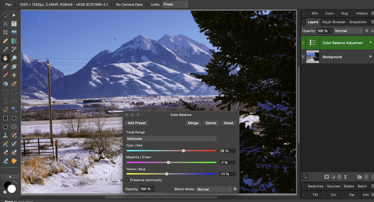
My favorite "quick'n'dirty" tool for this kind of tweaks since my early Shotophop days decades ago has always been Color Balance: Also keep in mind that it's a three-in-one tool: Highlights, Midtones, Shadows. Very flexible.

-
Designer V2 and Image Trace
loukash replied to Frank Asci's topic in Affinity on Desktop Questions (macOS and Windows)
The only "image tracing feature" currently available in Affinity is this: -
And it is "equally useful" because it will then snap to the… wait for it… nodes of the text frame. Remember: Text frames are not just rectangles. They can have any complex shape you want. Vive la différence.
-
Initial doc size doesn't matter because after you have placed the image, simply go Document > Unclip Canvas. That's it.
-
Oh, no need to apologize. We all had to start somewhere. You may want to check out all the nice official video tutorials. They are really helpful: affinity.serif.com/learn/publisher/desktop
-
Deneba Canvas. I think I had a Mac demo over 20 years ago. It still seems to exist.
-
Hm… Copy the content to a master page and apply it to 200 new pages…?
-
Alright kids, here's something more practical of an example that I could come up with this late at night CET. Let's say you're about to design a logo or something, but you want to keep the text live. That's when snapping to artistic text (hint hint nudge nudge @R C-R) may come in handy: ade_snap_to_character_nodes_pen_tool2.mp4
-
Frame text serves different purpose.
-
You want the short version or the loooooooooooooooooooooooooooooong version…?
-
I don't have any practical use for it at the moment, but it works like this: ade_snap_to_character_nodes_pen_tool.mp4
-
With the corresponding snapping options enabled in the context toolbar, you can snap to the nodes or font outline while drawing with the pen tool. Note that to continue snapping while drawing, you may need to reselect the text layer in the Layers panel so that both the text and your new curve layers are selected. The Pen tool has a built-in "node tool mode" via modifier, so you can also snap existing nodes that you've already drawn later.
-
PDF for print export problem
loukash replied to CT15's topic in Affinity on Desktop Questions (macOS and Windows)
For the record, "Erase" will always rasterize. Adjustments and certain other layer blend modes will also always rasterize. If you want to have vector export, use compound subtract:
-
Or you could open a new blank document and place the document that you're working on as linked. It will then always show you the last saved state:
-
So… Taking a random Pixabay image and attempting to replicate what I just learned in that PS video I watched, after about two or three minutes fiddling around I came up with this: Is that what you're trying to accomplish, @dcjohan?
-
I also just watched a random one from the top of my DuckDuckGo search results. In fact, by that I just learned an interesting technique how to enhance photos. So watching it was a Good Thing™ to begin with, not even a waste of time. But my impression was that PS kinda "needs" this, er… "sliced bread feature" to work around its clumsy gradient fill workflows that involve multiple levels of modal dialog windows. Yikes! But I could be wrong, of course…
-
Export the current state as a simple JPEG and open that in a separate tab or in any other image viewer of your choice.
-
Sometimes you need to think a bit "out of the box", and kinda backwards… aph_multiple_paragraph_decorations.mp4 But I agree with this: And there are also other major limitations with decorations. For example, gradients can only go from left to right because there is no angle field
-
MUCH NEEDED Symbols Feature
loukash replied to Jonathan A.'s topic in Feedback for the Affinity V2 Suite of Products
https://affinity.help/designer2/en-US.lproj/pages/SymbolsAssets/symbols.html It's documented there. -
MUCH NEEDED Symbols Feature
loukash replied to Jonathan A.'s topic in Feedback for the Affinity V2 Suite of Products
Yes, the sync status of a symbol object definitely needs a better indicator. I fully agree with you. The major difference here being that symbols are not a tool. In other words, the Affinity UI has quite some room for improvement, but they already got the basic concepts right. No need to "screw them up" as well (to use your own terms ) -
MUCH NEEDED Symbols Feature
loukash replied to Jonathan A.'s topic in Feedback for the Affinity V2 Suite of Products
There is also the orange vertical bar in the Layers panel which indicates fully synced (solid) or partially synced (dashed) objects. But an additional indicator in the Layers would be useful. There already is one in APh for the Linked Layers which is essentially the same underlying technology as ADe's Symbols. Also, you can actually link/sync and unlink/unsync individual Symbol attributes by switching over to APh and using the Links panel to finetune your individual symbol child objects. It works.