

dhayton
-
Posts
56 -
Joined
-
Last visited
Posts posted by dhayton
-
-
Thanks all for the suggestions. I was out of town for a couple days, so I've been slow to reply.
@carl123 I haven't played around much yet with equations. This could be a good learning opportunity (or a chance to bang my head on a wall). Do you have any suggestions/guidance?
@firstdefence Thanks for the videos. The first one is the way I imagined making this work. I was hoping for a quicker solution, but for this case it's not too bad.
I'll keep you posted.
Best,
Darin
-
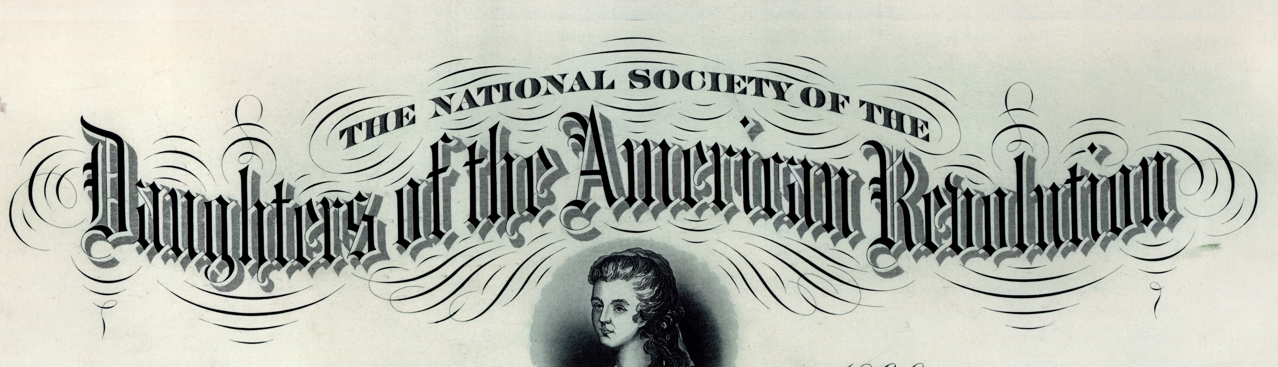
Is there a way (directly or as a not-horribly-time-comsuming-warp-each-single-letter work around) to keep text on a curved path upright? Or is there a better tool than "text on a path"?
What I want to do is create an undulating path and have text follow it, but I want all the letters to remain upright/vertical. A perfect example is the "Daughters of the American Revolution" in the image I've attached.
I have both Designer and Photo, so I can use either/both to solve this problem.
I've searched the forums and found a couple old posts that suggest a) there isn't or b) such a feature might be coming at some later date.
Any suggestions/advice would be appreciated.Thanks,
Darin

-
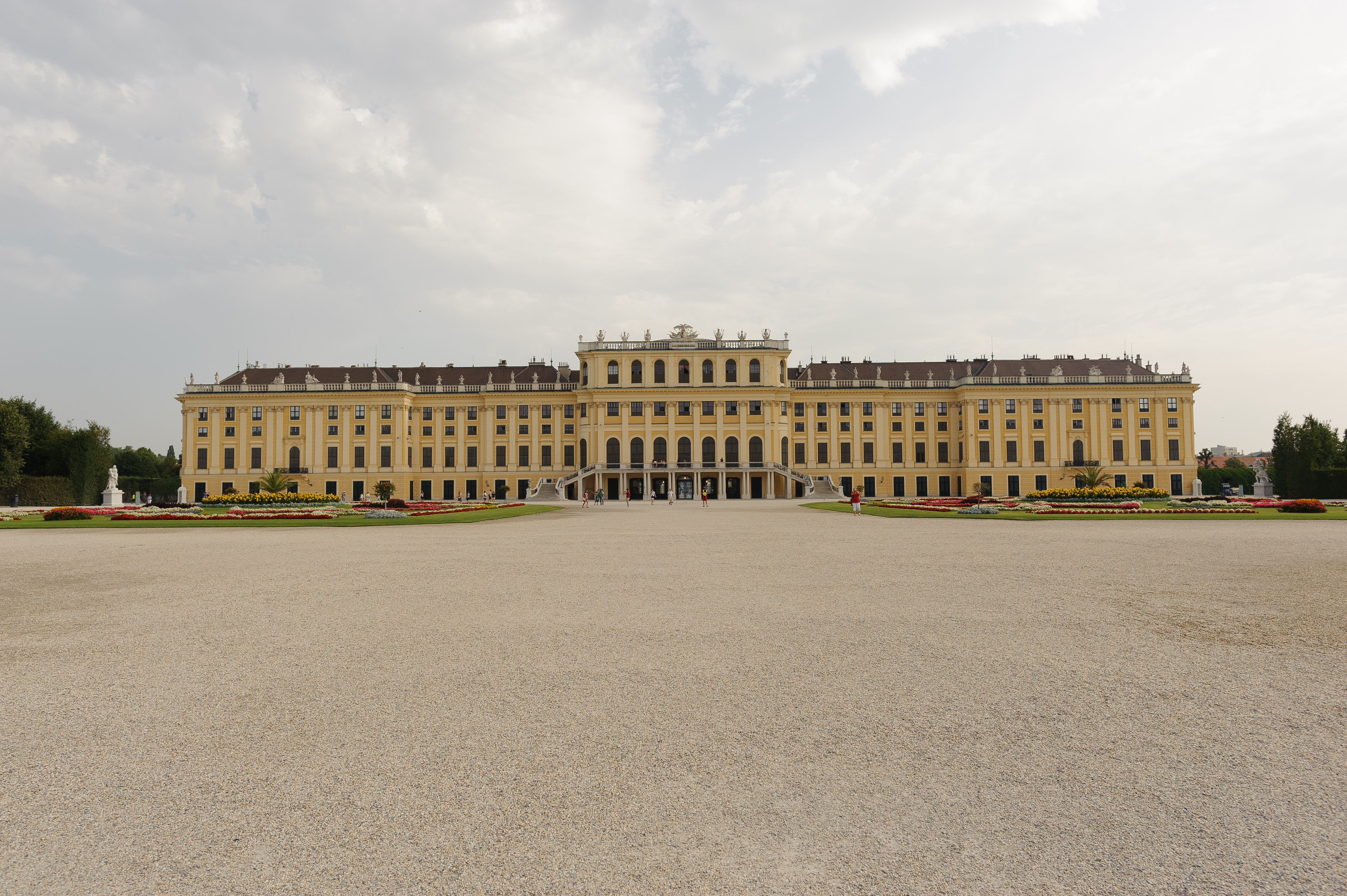
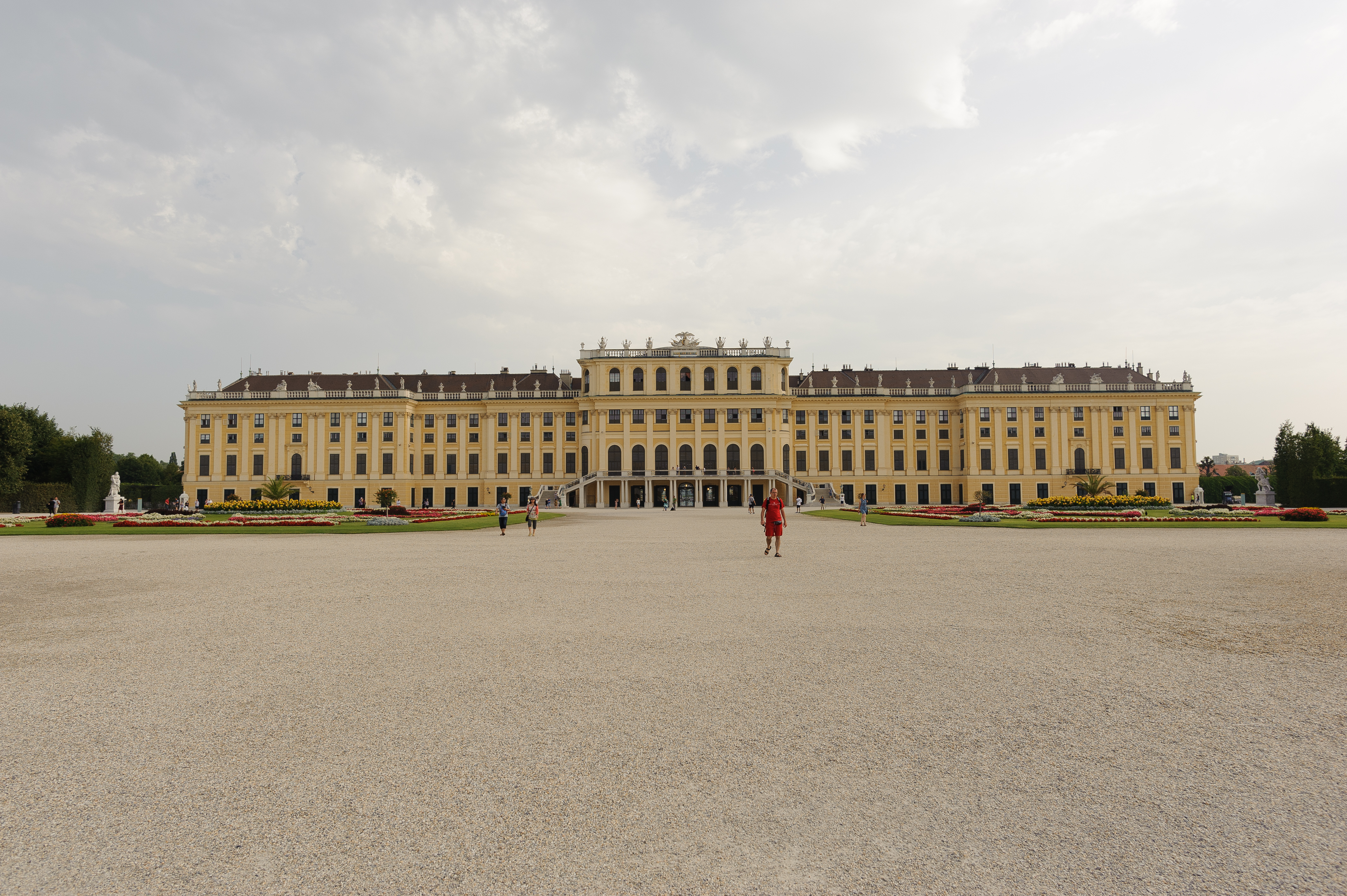
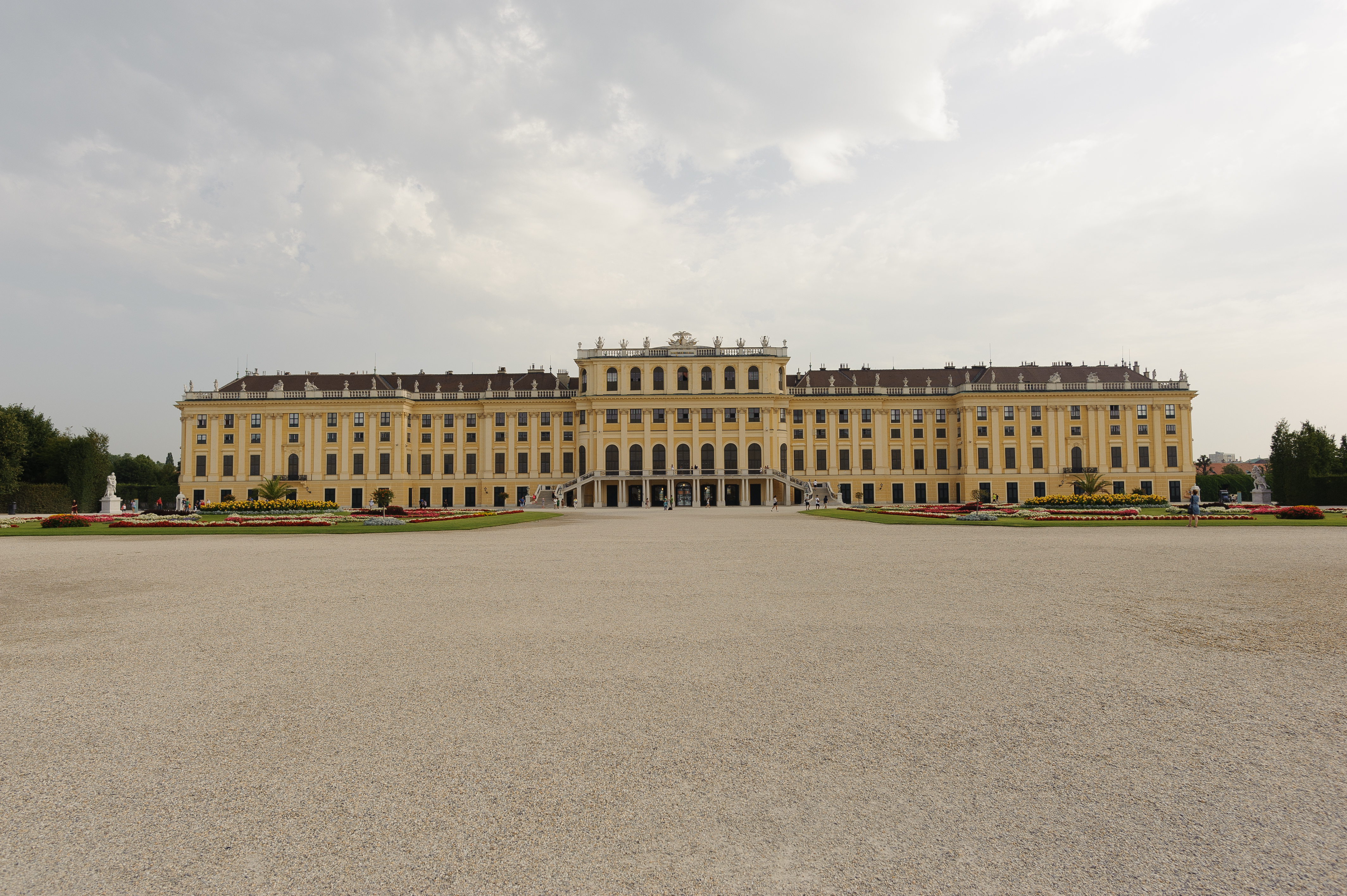
I am trying to auto align a set of photos (handheld) and it doesn't seem to work properly. The very center of the photos align, but out from there everything gets increasingly out of alignment.
I've attached the four jpg files (exported from Lightroom).
I want to align them and use the medium blend mode to get rid of the people.
So I choose "New Stack…" and add the four photos. I choose "Automatically Align Images" and choose "Perspective".
The center tall windows are ok, but everything towards the edges is increasingly out of alignment (see final image).
Any suggestions/advice are most appreciated.
Thanks.
-
-
Thanks. I was really lucky with the sunrise and the sky.
-
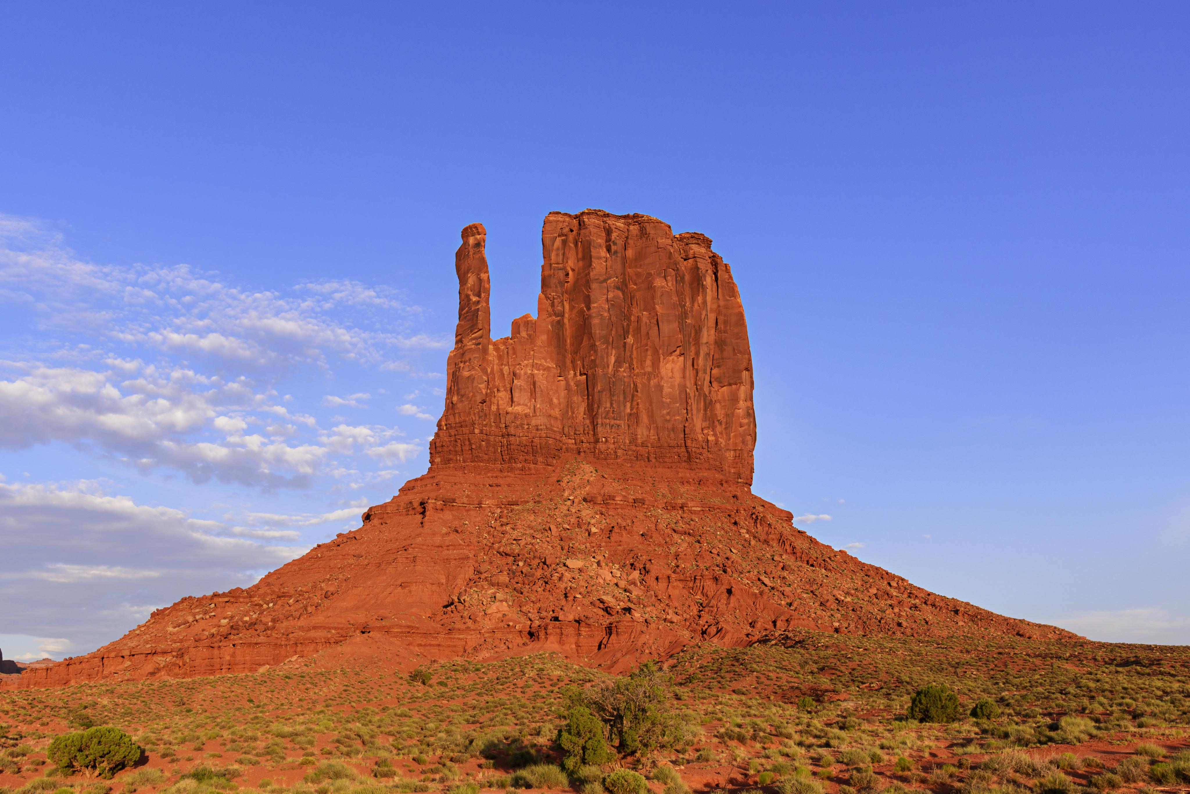
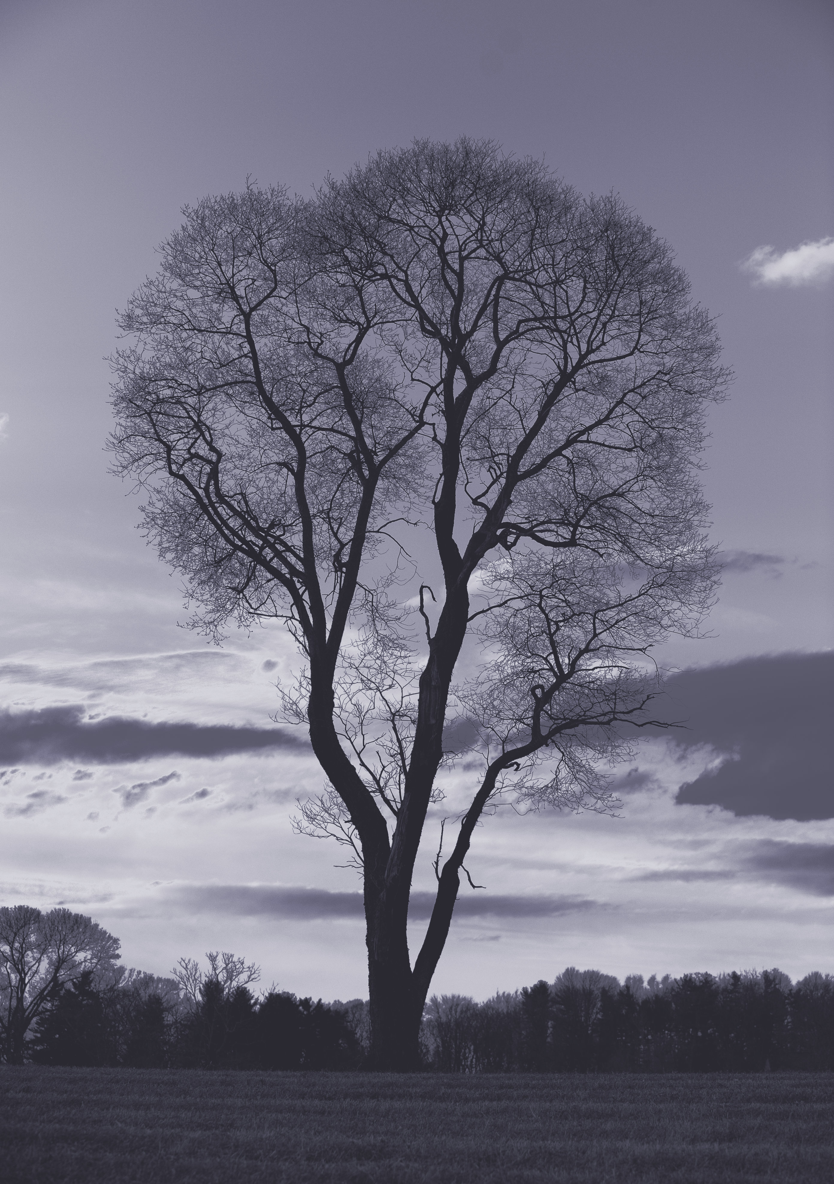
I’ve recently returned from a long road trip across the U.S. and back and have just begun processing photos. Here’s one of from early in the trip out, of West Mitten in Monument Valley (AZ).
I’m interested to see how some of the panoramas come out. More as I get through them.
-
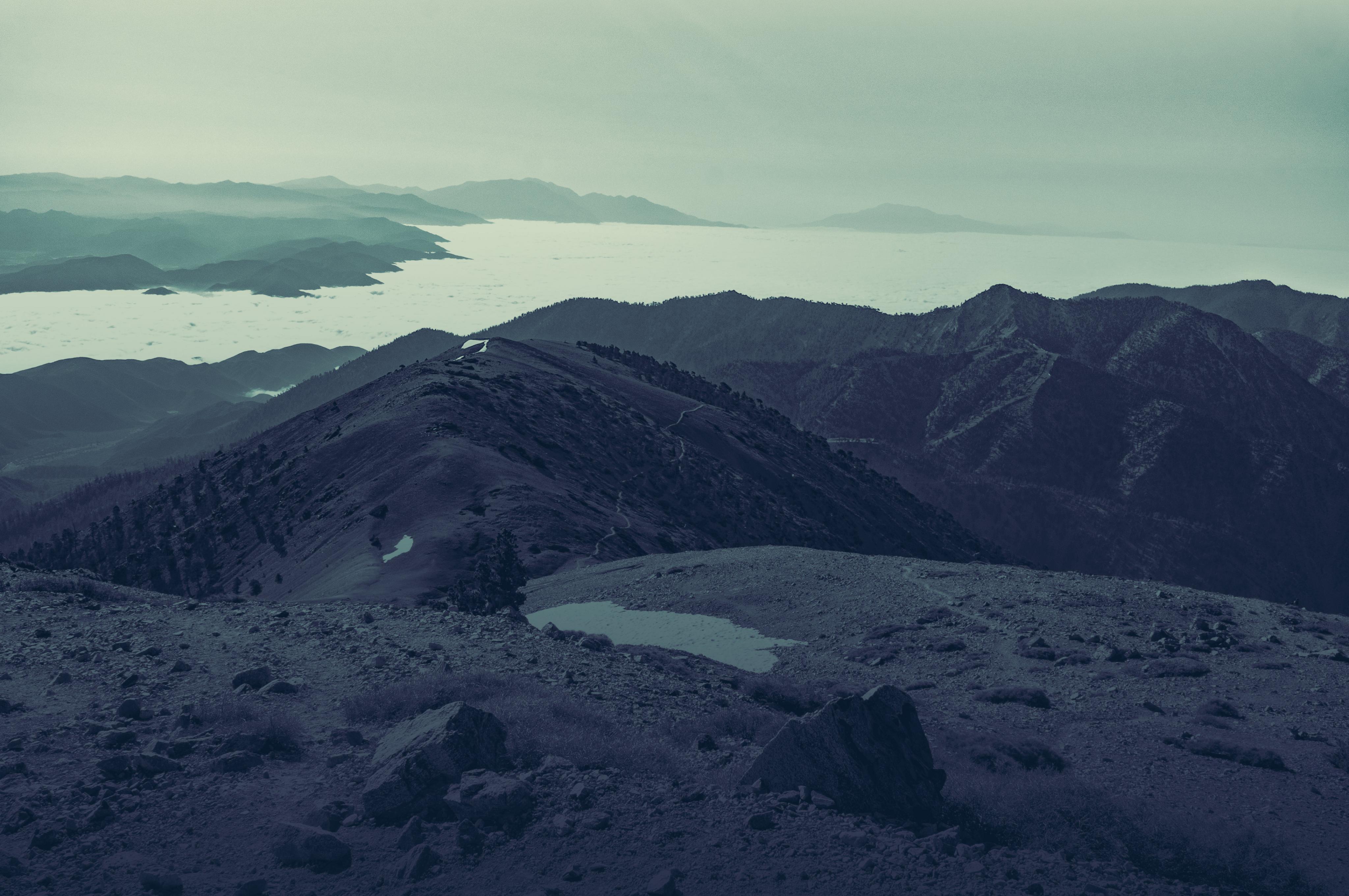
You're right, sunset would be better (sunrise from the top of this particular mountain isn't all that great) provided the Southern California haze didn't overwhelm the image. But this particular hike wasn't built around taking a photo. I had a few free hours to get in a nice hike. Precisely because the images were uninspiring, I experimented with more processing.
-
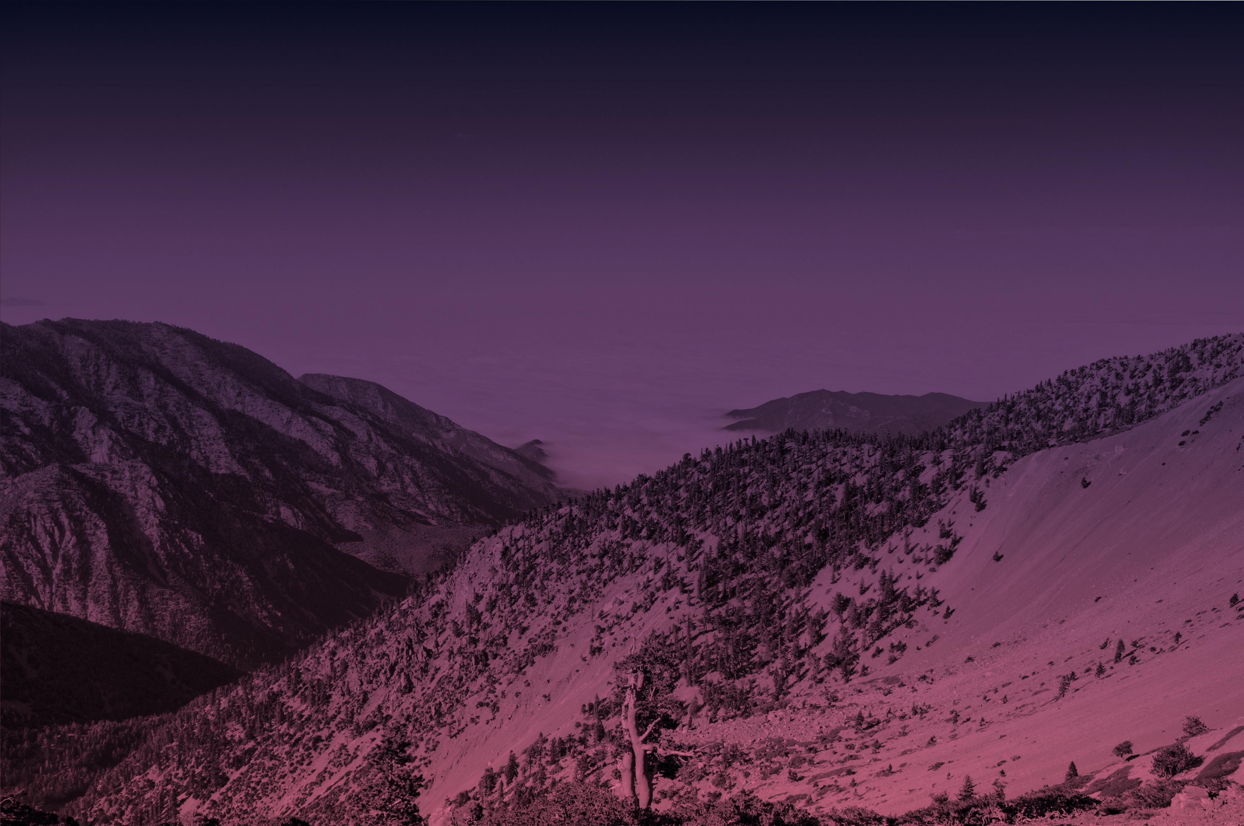
FYI, this question has to do with AP:
Looking at a recent image, I noticed some faint banding that was visible when I applied a color gradient (maybe it was there in the B&W version, but I couldn't see it). See the darker of these two images: https://forum.affinity.serif.com/index.php?/topic/20687-photos-from-a-mountaintop/(FWIW, I see the banding on my non-retina, late 2013 iMac; I haven't checked on other machines).
Searching the forums I came across a comment about the "Dither Gradients" preference and the different effects if you are working in 8-bit or 16-bit (see MEB's comments in this thread: https://forum.affinity.serif.com/index.php?/topic/13742-unwanted-noise-in-gradients).
So, my question: If I'm working in 16-bit, is it better to leave "Dither Gradients" preference checked? Or unchecked?
Thanks,
Darin
-
Alfred,
thanks for the kind words. I keep experimenting.
Best,
Darin -
-
While actions would be nice, I appreciate that they might not be easy to implement. What about a scripting dictionary, so I could write AppleScripts to accomplish a variety of common but time-consuming tasks?
-
-
Just agitating again for ctrl-click to work like right-click. Totally minor issue/point, and perhaps I'm the only person who would appreciate it, but I totally would. Heck, I'd even buy you a drink for it.
-
Thanks for the kind words.
Alfred:
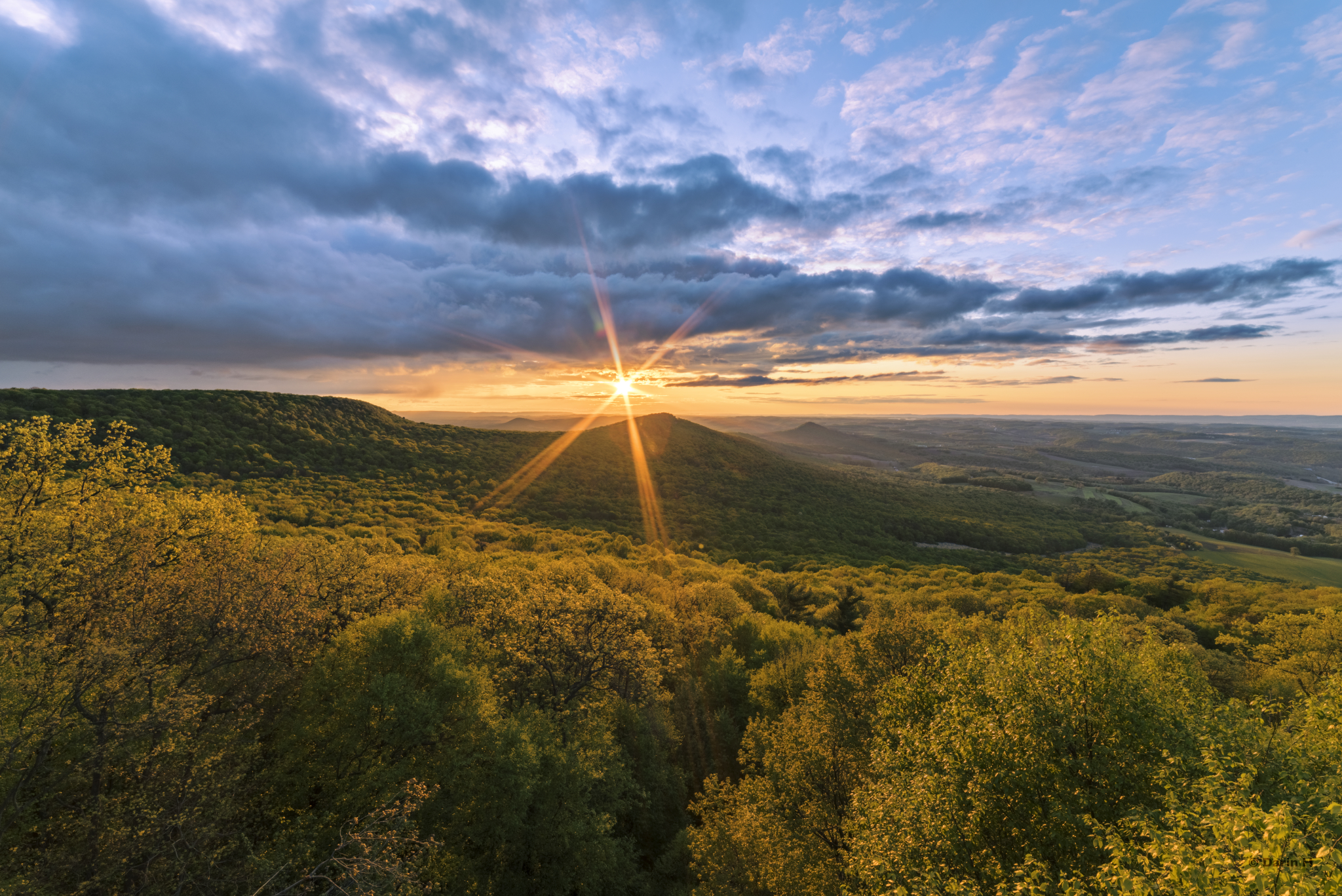
Were my photos like this straight out of the camera, I wouldn't need Affinity Photo. That said, I try not to process too much (and I typically jot down notes when I take a photo like this so later I can dredge up what I thought I was seeing so I don't over process). In this case, here are the adjustments I made:
I typically start by creating a number of luminosity masks for different tonal ranges.
1) used a curves adjustment to darken the shadows in the hills and trees (the camera captured too much dynamic range);
2) used a color balance to bring out the yellow highlights on the trees;
3) used a curves adjustment to lighten the top of the sky (above the looming clouds);
4) used a color balance to bring out some of the tint in the clouds in that light area;
5) used a high pass filter to sharpen the clouds (used a gradient to restrict it to the sky and a luminosity mask to restrict it to the darker clouds).
In each case, the adjustments were light. Once I was in the right place (I had hiked about an hour up to the point) at the right time (I made a cup of coffee and waited about 20 minutes for this scene) and with my camera pointed in the right direction (I guess that goes without saying), I didn't need to do much. Nature had done all the hard work.
Thanks again for viewing and for the compliments.
Darin
-
-
Do I understand you correctly, you've set the left end to yellow with 100% opacity and the right end to some other color (greenish?) with 0% opacity. But you don't want the other color (the greenish) to appear in the gradient at all. Instead, you want the yellow to fade to transparent?
Why not set both ends to the same color and set one end at 100% and the other end at 0% opacity? Does that not produce the result you want?
See screen shots, or use MEB's solution (which he posted while I was making screen shots).
-
NOTE:
I can't seem to upload photos. So there's no photo here. And I can't figure out how to delete a post. Sorry
If you want to see the latest photo in my growing collection of photos from Valley Forge National Park (outside Philadelphia), here's a Twitter link:
-
For many of the functions, e.g., renaming a channel, deleting a saved gradient map, you have to right click.
Any chance you might add a modifier key + click to access these options? The standard is ctrl+click for a right click. Perhaps you've reserved this for some other more specific function. But maybe a shift-ctrl+click.
I never used right click, preferring instead to press a modifier key. So I had to remap my trackpad to register a two-finger click as the right click, but it remains totally counter intuitive to me. So I always forget. And then it feels strange.
Clearly not a big deal, but a ctrl+click would make me happy.
-
-
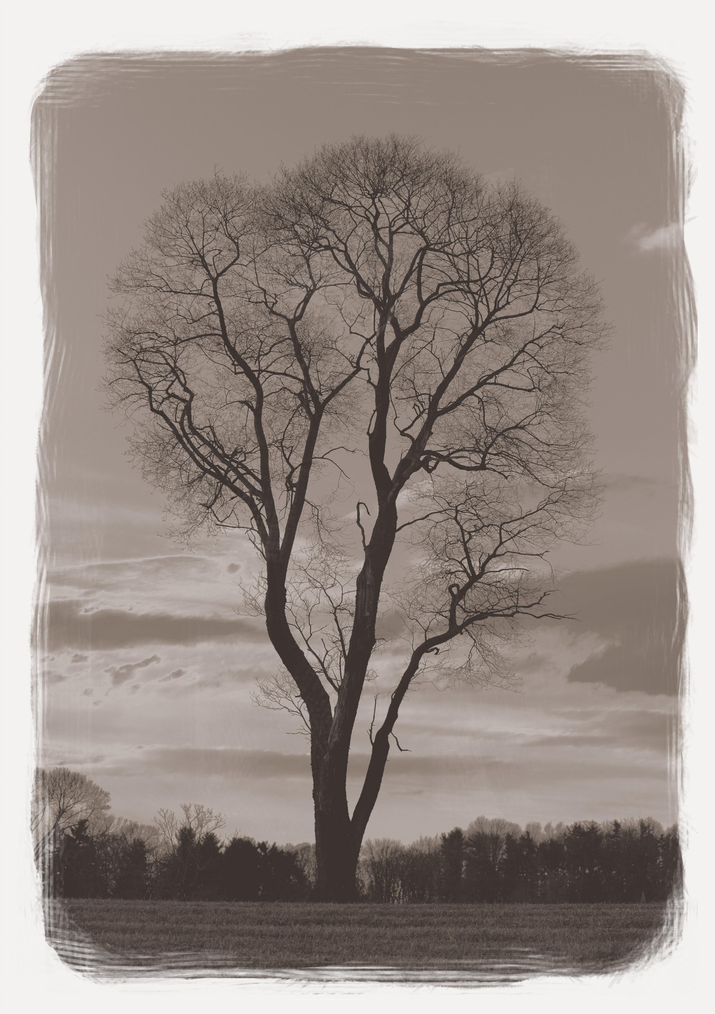
I reworked this photo, inspired by platinum-palladium printing techniques. Thoughts?
-
Sorry, hit submit twice. Can't figure out how to delete this second one, so I'll edit it to draw attention to mistake.
-
I've created a number of similar images using the technique you describe, convert to B&W and then mask out the adjustment around the central object. In fact, just tweeted one. See this tweet:
<https://twitter.com/XVCrosstrek/status/718424648724176896>
I'm on my iPad, so I can't post the photo here.
-
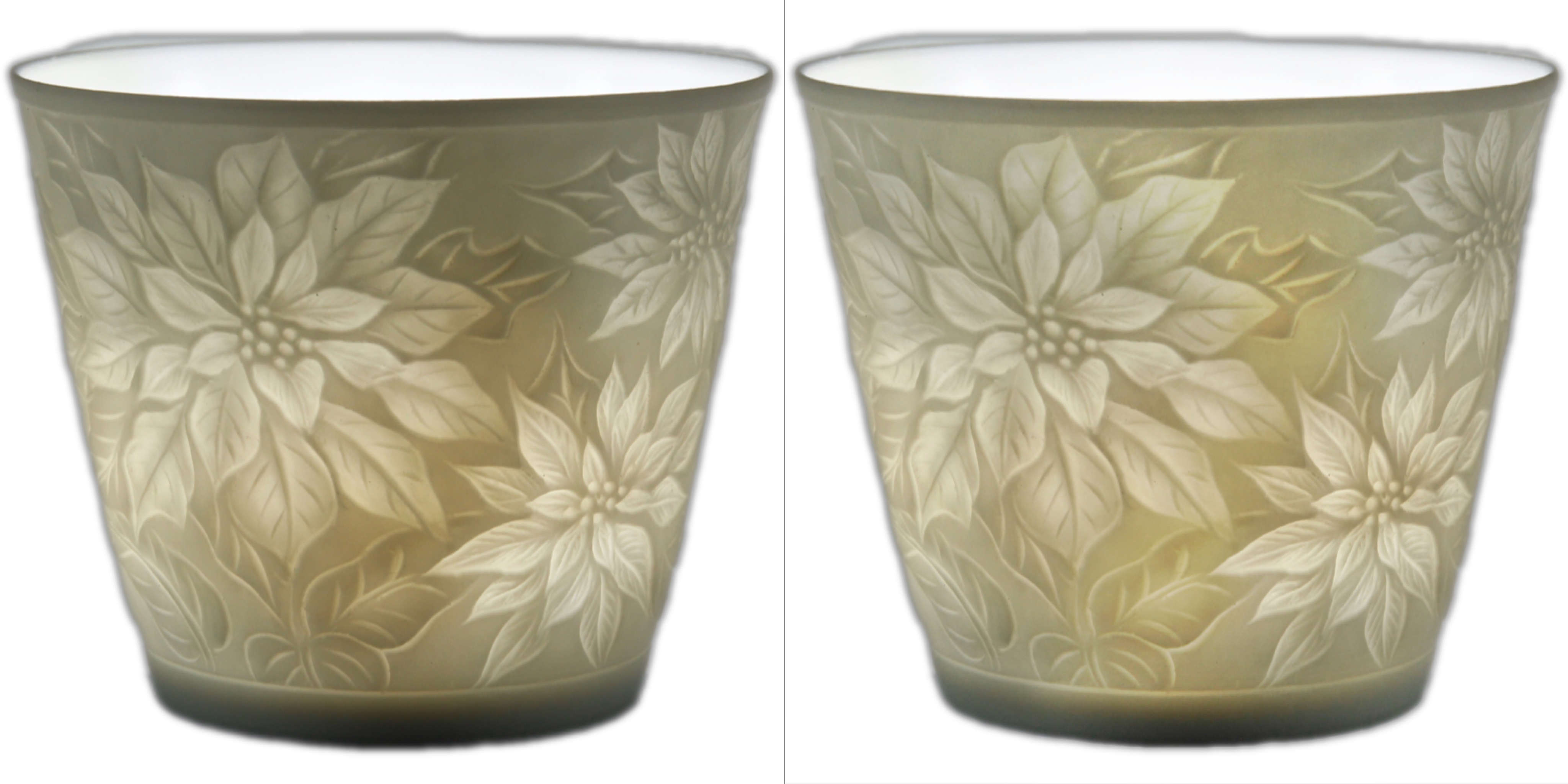
Another way is a sort of dodge and burn technique.
I start by adding a new layer with blend mode set to "Overlay" and filling it with 50%. Then paint on with white (to lighten) or black (to darken) areas. I typically set the brush opacity to about 5% so that the adjustments are subtle. You can always go over particular areas multiple times if needed. And if you lighten it too much, paint back over with black.
Just another option.
I've attached a quick (and I stress quick) example of what I mean (your original is on the left, my adjusted version is on the right).
- justwilliam, Plaristo and Smee Again
-
 3
3
-


Vertical/Upright text on curved path?
in Pre-V2 Archive of Affinity on Desktop Questions (macOS and Windows)
Posted
@Wikinger Merci beaucoup pour la suggestion. Je n'avais ni vu/lu cet post ni pensé des équations. C'est très intéressant. Je vais les essayer.
@firstdefence I have to confess, I was impressed with the falling text. Now I just need to figure out a use for it.
Thanks again,
Darin