rbsund
-
Posts
24 -
Joined
-
Last visited
Recent Profile Visitors
1,176 profile views


-
Ahh I see. Can you forward the edge quality thing with Affinity Designer versus Inkscape? Could be worth looking into... I certainly don't want to fiddle with any setting for every edge I have somewhere...
-
If resampling only triggers when rescaling the content that means its only applied to rasterized content anyways isn't it?
-
 rbsund changed their profile photo
 -
Hi Sean, thank you! Very good to see the video, I appreciate it. Is there any way to influence the edge quality of the default export?
-
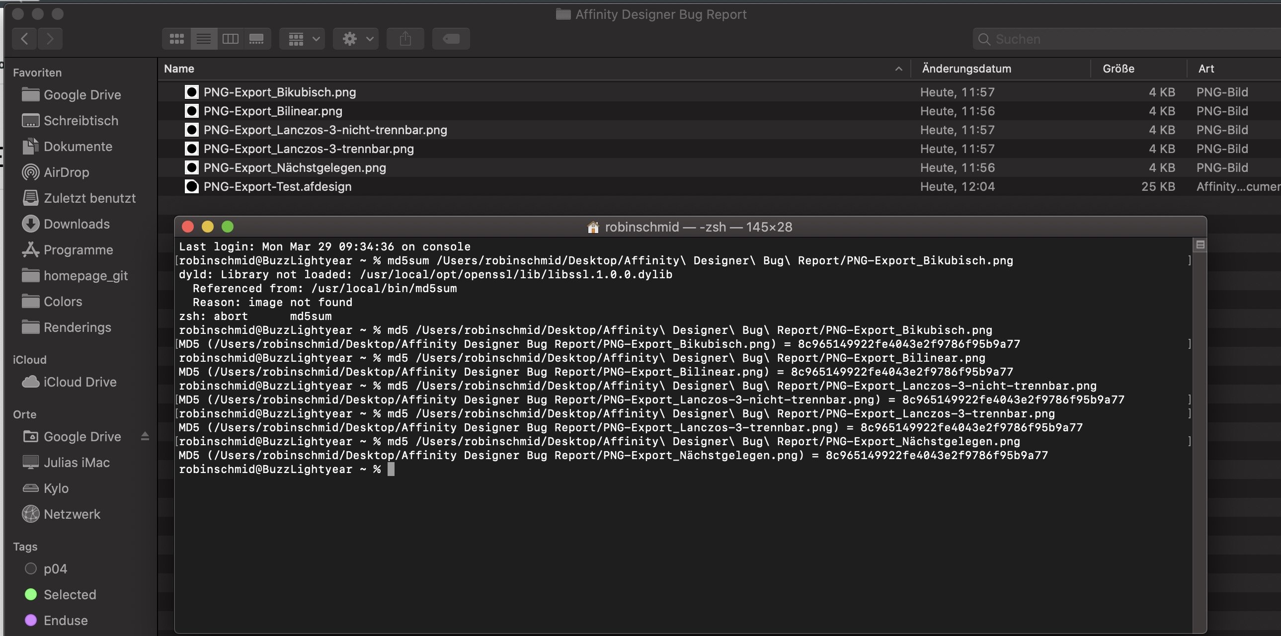
Hi all, my colleagues discovered that the exported PNGs of Affinity Designer have worse anti-aliasing than the ones our boss makes with Inkscape. When we tried to improve on our export quality we discovered that changing the resampler in the export setting resulted in the exact same files. They even have the same md5 checksum. The Version used is 1.9.0

-
 rbsund reacted to a post in a topic:
[Affinity Designer] Symbols with reset instance on specific objects
rbsund reacted to a post in a topic:
[Affinity Designer] Symbols with reset instance on specific objects
-
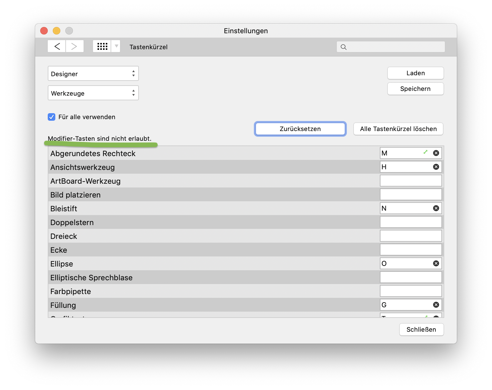
Custom shortcuts in 1.7.0 aren't accepting modifier keys
rbsund replied to rbsund's topic in V1 Bugs found on macOS
Ok guys, I just noticed this here (see Screenshot). Modifier keys are no longer allowed! At least for me. I'm on 10.14.5
-
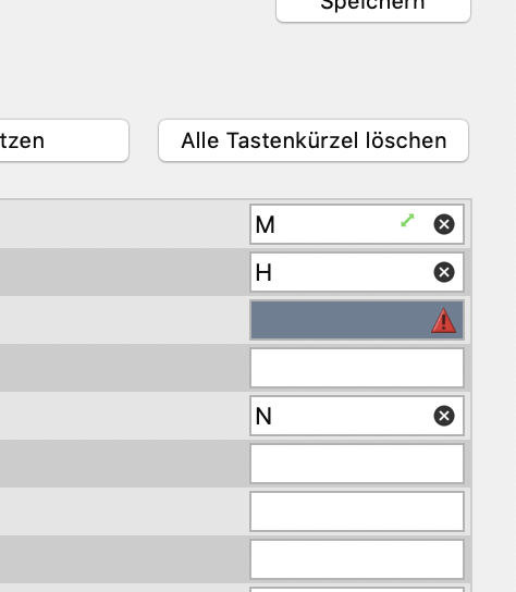
That's what it looks like when I press cmd, alt or shift:
-
 rbsund reacted to a post in a topic:
Affinity Designer for MacOS - 1.7.0
rbsund reacted to a post in a topic:
Affinity Designer for MacOS - 1.7.0
-
When dragging layers around there is this blue bar indicating the hierarchy level I have selected. If I want a layer to be the first item in a group or artboard the indicator is indented further in compared to when I want it to be 2nd, 3rd etc.. I just can't get used to this little confusing detail.
-
The new publisher icon is not great
rbsund replied to bmuessig's topic in Feedback for Affinity Publisher V1 on Desktop
Thanks man, didn't know this talk! (It's on youtube) What were you referring to as "shock"? -
rbsund reacted to a post in a topic:
The new publisher icon is not great
-
rbsund reacted to a post in a topic:
The new publisher icon is not great
-
 bmuessig reacted to a post in a topic:
The new publisher icon is not great
bmuessig reacted to a post in a topic:
The new publisher icon is not great
-
Mark Oehlschlager reacted to a post in a topic:
The new publisher icon is not great
-
ivbera reacted to a post in a topic:
The new publisher icon is not great
-
mac_heibu reacted to a post in a topic:
The new publisher icon is not great
-
Feature Request: Image as bullet point
rbsund replied to rbsund's topic in Feedback for Affinity Publisher V1 on Desktop
Ok, thanks for saving me the time to research. Then even though Pinning is really great my feature request remains -
Feature Request: Image as bullet point
rbsund replied to rbsund's topic in Feedback for Affinity Publisher V1 on Desktop
Ahh nice one! Inline-images are also something I've been looking for. Thank you Do you by chance have an idea how to include such a pinned image in a paragraph style? -
In one of my projects I have to use a certain shape as bullet point / icon. Keynote allows selecting an image as bullet point.. would be great to have this feature in AP as well.
-
Appreciation post for the Publisher team
rbsund replied to 000's topic in Feedback for Affinity Publisher V1 on Desktop
+1 !! -
The new publisher icon is not great
rbsund replied to bmuessig's topic in Feedback for Affinity Publisher V1 on Desktop
-1 As a mac user, I find the old icons really offsetting. They look as if they were designed for a space invader game. I can't see any motivation for most of the details except style (and outdated style at that) which is really the worst kind of design method imho. The new ones pick up this legacy, but they are much cleaner and thus more professional looking, so definitely progress imho! -
Placeholder in Masters
rbsund replied to Stefanoc's topic in Feedback for Affinity Publisher V1 on Desktop
This works really well for me! jfyi