

deeds
-
Posts
626 -
Joined
-
Last visited
Posts posted by deeds
-
-
5. seems to be the best option. Limited as it is.
Blend functionality sorely needed for AD
-
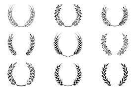
What are the ways to draw a wreath in AD such that it's editable in terms of radius, numbers of wheat grains and the rate of size diminishment from base to tip of the wheat strand?

-
How can Ableton Live and Blender use two different methods of drawing interfaces from two utterly different commercial paradigms, on all major platforms, and get it all right, make it tight and spritely, and fully scaleable and theme-able?
-
try Blender and Ableton Live.
Their UI scaleability is from the future, as far as the 1990's are concerned.
-
Same settings in Affinity Designer.
Though I switch from Metal to OpenGL frequently, hoping one will be better than the other.
They're not.
The redrawing is ridiculous. Can't you cache the rendering so that zooming and panning is smooth?
Why are many of the effects still not rendered accurately, instead changing their dimensions and other qualities based on zoom level? -
I used to think it was the old Intel and AMD combinations that were the problem.
It isn't.Performance on a maxed on m2 Max Mac is atrocious, too.
-
On 8/11/2023 at 9:00 PM, thomaso said:
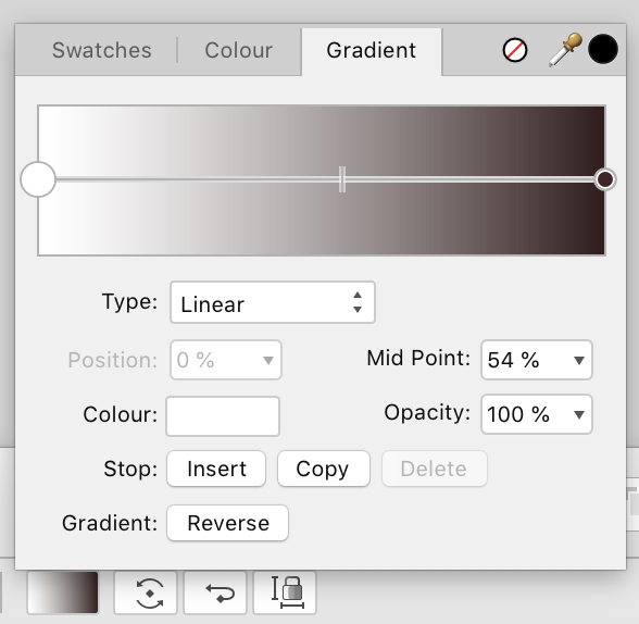
"Least effort" also depends on the options / interface you prefer since their is no Gradient Panel and the pop-up dialog auto-closes.
Once you made a gradient type decision (context toolbar) than it may appear easier for further colour / node edits to use the Fill Tool's options only (shortcut: "G") together with Swatches / Colours panel. As shown in the video above this way you can drag swatches to nodes, and without the need to select them first.
Possible advantages of not using the Context Toolbar Interface but shortcut 'G' only:
1. You can edit the gradient colours directly on your layout object.
2. The interface is less nested than via the Context Toolbar pop-up.
3. It does not disappear (auto-close) if you want to drag swatches.
4. You don't need to select a node to drag-assign a swatch.
• Possible disadvantage:
- No numerical midpoint positioning.
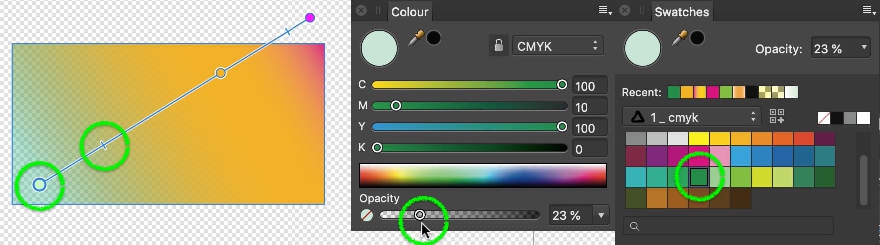
I know all of this... and am specifically asking for all the ways to open the Colour Gradient Editor because these modes of operation aren't as good as using it.
-
On 8/9/2023 at 8:35 PM, MEB said:
Thanks. This is logged with dev now.
Do you know all the ways to get the Gradient Colour Editor Open?
I'd like to find one that's least effort. Preferably one that can be assigned a shortcut.
-
How to activate snaps such that all 8 vertices of an octagon created with the polygon tool become snapping targets?
-
On 8/8/2023 at 7:30 AM, R C-R said:
Fine by me, but maybe consider if you want to add this as a feature request it would be helpful to include if not a mockup that at least a detailed description of the UI for it.
You are seemingly further from understanding what's being discussed than at the beginning of the conversation. Try to take a step back and understand what's being asked, and why it's being asked, and perhaps ask yourself if you're at the quality of vector design usage where you understand any of the potential needs. You might not be.
-
22 hours ago, firstdefence said:
Which version?
All of them. It pisses me off in all of them how I have to keep opening this thing to do refinements... Like you, I want one open, permanently somewhere, or a shortcut (keyboard, at the very least) to keep popping it up when I instantly need it.
-
10 hours ago, R C-R said:
maybe I am just dense but I'm not sure what you mean by "Editor" here. Gradient colors are applied to the stops created by the Fill Tool & their extent depends on the type (linear, radial, etc.) of gradient & location of the midpoints between the stops. Any stop's color can be edited by selecting it & using the Swatches, Color, or Color Chooser panels, but there are no separate presets or other provisions for globally storing the colors of particular stops, if that is what you are looking for.
This is the Gradient Colour Editor:
-
12 hours ago, walt.farrell said:
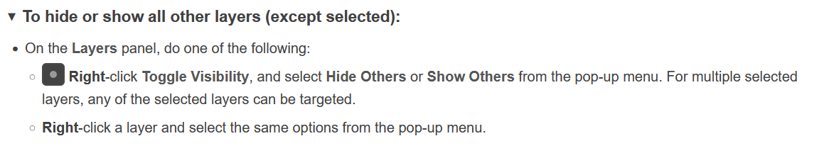
It's provided in V2. From the Designer 2 Help: https://affinity.help/designer2/en-US.lproj/pages/Layers/manageLayers.html
Note: It also works in Photo (which this Feedback topic is about), though I have not found it documented in the Photo 2 Help, yet.Edit: As this topic is about Photo, here's the relevant Help page for Photo 2, which also mentions the function: https://affinity.help/photo2/en-US.lproj/index.html?page=pages/Panels/layersPanel.html?title=Layers panel (Photo Persona)
I know.
And it's so badly designed, and operates so poorly, and is done in such a careless manner that it's beyond a joke.
-
What are all the ways to open the Gradient Colour Editor in Affinity Designer?
-
This is beyond a joke.
Sad.
-
-
11 hours ago, David in Mississippi said:
That's a good thought, fde101. However, I've already tried that, with mostly the same result as here on the forum. Four million results in 0.133929438121 seconds (I just made up those numbers, but they're representative of the true numbers), none of which are truly relevant to my issue.
Thanks for the suggestion.
Try with bing. Weirdly, the last few months, it's become MUCH better than google. Not that google's gotten worse any faster than it normally does slide, but bing has gotten vastly better.
Anything you MUST have in your results, just "put in quotes" as this is the same as using the plus sign like this: +"this phrase" in google.
And don't be afraid to try natural language questions in bing, as it's doing something with AI to help with processing how and why questions.
-
Not only is there a significant size difference, this is further amplified by Affinity's stylisations further negatively affecting the weight of the bodily parts of the symbols, and the odd offsets.
I agree with the OP. Double the size. And remove or otherwise absolutely minimise the stylisations of the symbols, and keep their vertical offsets consistent such that fast perusing, overall observance and tracking and rapid saccades only need go left to right without any consideration of otherwise needless vertical analysis and consideration.
-
Trackpad:
There is no use for two finger slides/drags whilst editing text, so this would probably be the ideal for both zoom and pan. If the initial two finger movement is vertical, then zoom. If it's horizontal, pan.
Please.
-
16 hours ago, fde101 said:
Procreate falls into more of the category that Krita and Painter are in, being primarily focused on creation of original artwork using methodologies mimicking physical media to varying degrees.
there's little to no evidence that anyone shouldn't learn from other related fields.
Except for lockdowns. Nobody should look at any kind of lockdowns of healthy people as any kind of good idea, ever.
-
It's almost as if nobody at Affinity has tried Procreate and then taken the time to think: "how can we do all this better, knowing a keyboard is at hand?"
-
21 minutes ago, nitro912gr said:
yeah, graphic design in general can be demanding, but most of the work doesn't require a ton of horsepower. I still use that c2d mac for light work for example, maxed out at High Sierra on OS side.
51 minutes ago, PaoloT said:Something to be considered is that sales of Macs have been dropping by some 30-40%. It is very likely that many people purchasing Macs not as a luxury toy, but as a work/hobby machine, are remaining with an older OS for long.
Both very good points.... and one more:
High Sierra is far and away the most stable for animations and audio work. As a result of significant later changes, many professionals are stuck on it (10.13.6) for those reasons, on at least one of their machines, and will be for the foreseeable future as subsequent changes aren't ever going to be good. Like font rendering and T2 "security" interrupting audio.
Ableton Live, by way of example, is still supporting 10.13.6 in latest releases, for these very reasons.
- nitro912gr and shushustorm
-
 1
1
-
 1
1
-
as an add-on, how much would you pay for this to be integrated into Affinity?
-
16 hours ago, Pšenda said:
The context between the UI and the type of installation is not mentioned by anyone here except you - so please do not confuse the user unnecessarily.
Not doing that.
Would you like to address the title of the thread?
And this user's concerns about the size of the UI interface operability icons on a high resolution Windows monitor?
Or are you, as it appears, trying to avoid that?

Why I like reading software manuals in .PDF form:
in Feedback for the Affinity V2 Suite of Products
Posted
Tell us about this us?
To the two of you, give the guy a break. He's right, the writing is atrocious. The publishing pathetic, the layout greatly lacking. All things a company making presentation software should have absolutely nailed.