goose22j
-
Posts
9 -
Joined
-
Last visited
Everything posted by goose22j
-
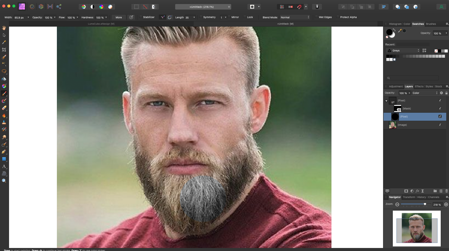
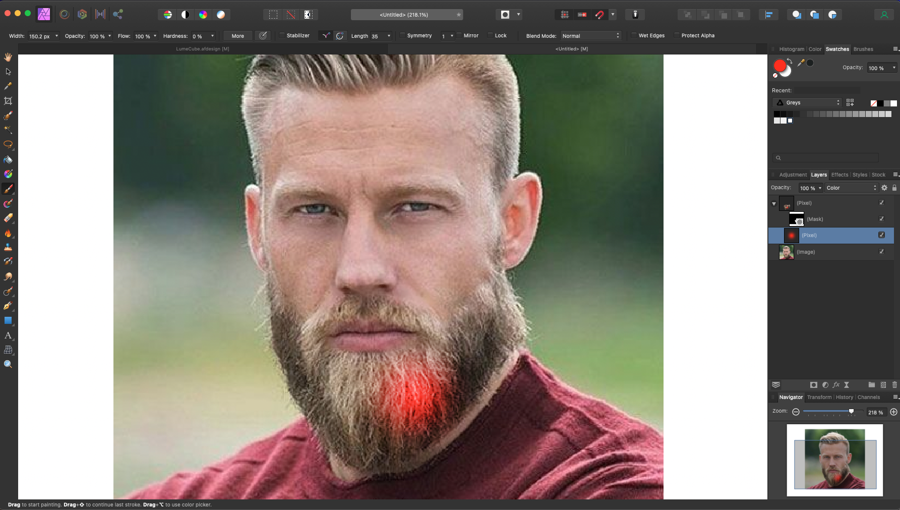
Thanks Old Bruce, Here are a couple screenshots. In one you can see how, if red is selected, I have the option to "color" the selection red. In the second image however, when black is selected, you can see that it shows that the selection will be painted gray. Thanks in advance for any insight!

-
I'm drawing on a pixel layer that is nested within the layer mask. It works fine if I select any COLOR, but if I use black (or even very dark brown) or white, it just produces as gray...
-
Thanks Old Bruce - I'm using the normal paint brush, but then selecting "color" for the pixel layer.
-
Good morning. I'm hoping. you can help me. I recently learned how to use paintbrush on a pixel layer to change JUST the color of the selection (by selecting "color" for the pixel layer). This works great to remove green screen reflection etc. However, I discovered an issue this morning when trying to use this to paint some gray hairs black. I can paint blue, red, green, or any other color but if I select black or white as the color, it just paints the selection gray. What am I doing wrong? Thank you in advance for your help!
-
Thanks for the quick response. I understand AD renders text as vector unless in pixel view mode and can see the difference in AD itself when switching back and forth...it just seems like there should be a way to export more clearly as a png when even a png screenshot is so clear. and you point is well taken about the larger screenshot dimensions, but even when viewed at their appropriate sizes, the screenshot is so much clearer. I was creating an image for Twitter so I was using their recommended ideal size of 1024x512...so unless there is a trick I'm unaware of (and there very well could be), it seems like I'm stuck with that size... Ideas?
-
Here is an example of something I exported. Here is a png - https://www.dropbox.com/s/vrw1rnv312lca2k/TestFonts-01.png?dl=0 Here is a jpeg - https://www.dropbox.com/s/37jl3030uog5zv3/TestFonts-02.jpg?dl=0 and here is a (png) screenshot I took on my 2015 Macbook Pro Retina - https://www.dropbox.com/s/q3y21w0i9bstgp8/TestFonts-Screenshot.png?dl=0 Why is the screenshot more clear then the export, even though they are both pngs? How can I make this text display clearly when I export it?
-
When working in Affinity, obviously everything looks incredibly crisp. But when I have text, if I switch to the pixel view or retina pixel view it, understandably gets a bit blurry. This blurriness naturally carries over to when I export and is very evident with pngs jpegs etc, while svgs and pdfs are much more clear. are there any tricks to make the text a bit more clear? I've tried outlines, i've tried adjusting tracking (i'm unable to adjust kerning for some reason - i can only select "auto"), but nothing seems to make a difference. Is anti-alias available and would that help? Any exporting tips for settings? Just to clarify, it isn't any more blurry then text in photoshop, fireworks, etc, it just seems like there should be a way to make it a bit more clear. (This came up while working on a Twitter background and I feel like I've seen other Twitter backgrounds that are more crisp). Thanks!
-
Selection Tool?
goose22j replied to goose22j's topic in Pre-V2 Archive of Affinity on Desktop Questions (macOS and Windows)
I'm an idiot :-). Thanks for your help! -
I'm using the trial version and wanted to test out the pixel selection tool. The help section describes the tool, but I cannot find the tool. Is it not active on the trial version or...? (see the below image) Thanks!