GoldenGateFields
-
Posts
5 -
Joined
-
Last visited
Everything posted by GoldenGateFields
-
Is there a way to keep track of the brushes used in an artwork? Maybe I'm missing something but it seems that the selected brush doesn't stay highlighted after selecting and using it and it is hard to know which brush I'm using, the problem magnifies itself when using multiple brushes in an artwork as I find it impossible to keep track of what was used. I could make a new brush category for each new artwork and then move the brushes used into that category but then that will lead me to having a tonne of categories with brushes all over the place.
-
Thanks, that does actually look a lot better than my original attempt, I tried again using that textured brush and while it certainly does look closer to the artists original artwork when I increase the stroke to exaggerate the roughness the corners start to loose their sharpness (as shown in the example below, they start to get more rounded), I'm not a fan of the blurriness either but I know that could be overcome with a different brush.

-
Thats hopeful, although that was back in 2015, maybe we will get that feature in a 2.0 release as I don't even see it on the road map yet.
-
Thanks, I looked up examples of A.I's wrinkle tool and that does indeed look like what has been used.
-
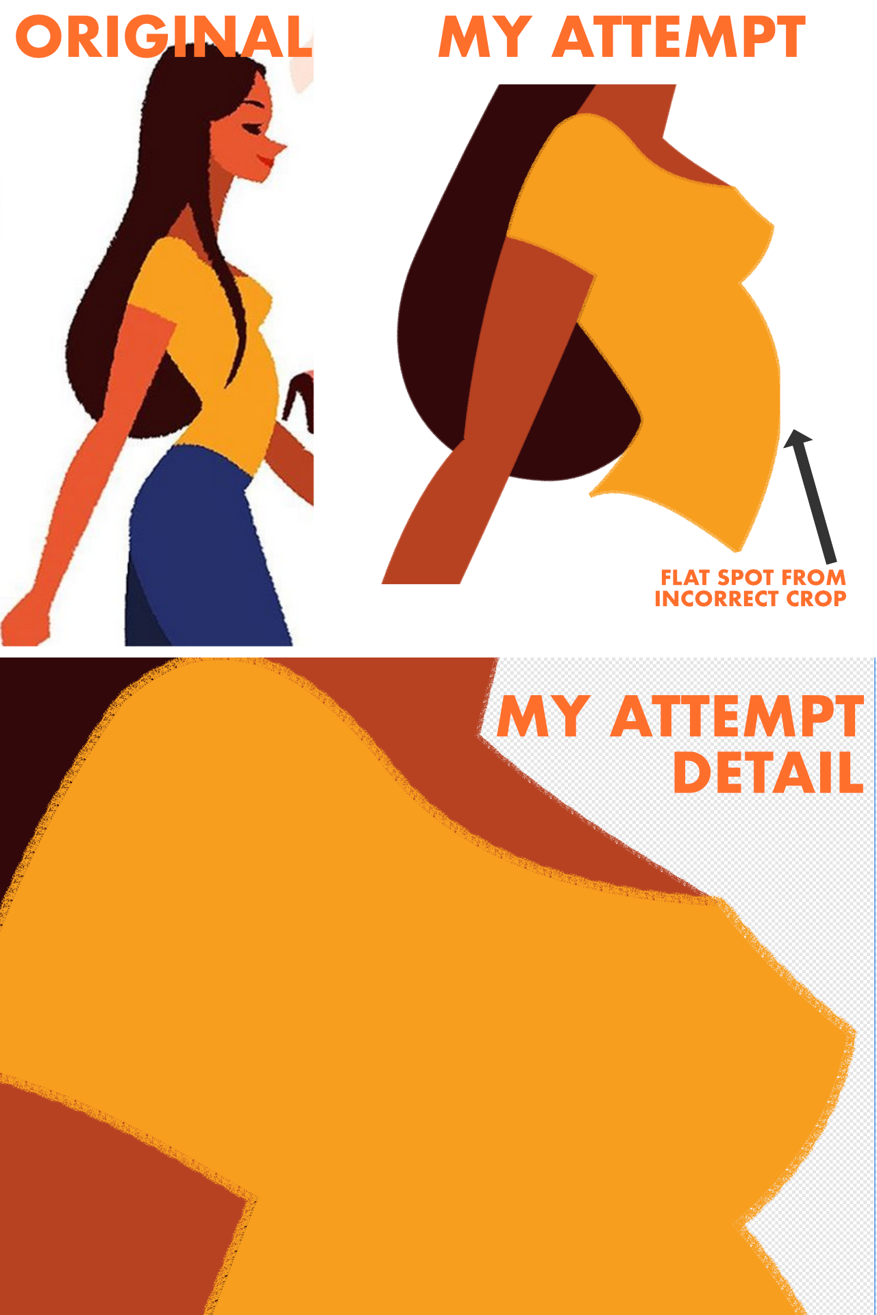
Hey everyone, I was wondering if anyone knew how to recreate the rough effect shown in the attached image in Affinity Designer? I have included my attempt at the effect but as you can see it doesn't look the same. I could probably achieve a similar effect in the Pixel Persona/Affinity Photo when using a drawing tablet but I wanted to keep the smooth bezier curves that you get when using the pen tool. My attempt was achieved by adding a stroke to my shape using the DAUB Moloch vector brush but as you can see the effect doesn't look the same, instead of being one cohesive element as in the original illustration, in my attempt it looks like the stroke and fill are 2 completely separate elements with the stroke sort of just sitting on top of the fill (I hope that description makes sense). Is this a matter of finding the correct vector brush or is this style achieved another way? The original artwork is by Donghyun Lim, I'm not trying to rip off his illustration but just thought copying it would better illustrate the problem I'm having achieving the same effect.