acsr
-
Posts
6 -
Joined
-
Last visited
Everything posted by acsr
-
OK, I am happy you questionized it. I am looking forward to watch if this is persistent or not – and will report here! It is always a singular point of view. I will edit my post to mention your findings! THX
-
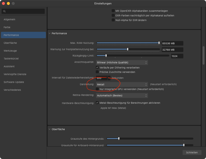
I fixed Slow Startup for me by Changing Display Performance Settings today! All other occult tricks not needed. TL;DR: Change Preferences `Performance`-> `Display` from `OpenGL` to `Metal` Result: Apps start within 3 seconds (for me). Prerequisites: I am on an M1 Max under Ventura and Affinity Apps Version 2.4.0, purchased directly from Serif. Productivity suffered from slow startup over 30 Seconds or longer since almost all Affinity versions on M1. Until then THXalot to this genius! Procedure in Detail In Affinity Designer 2.4.0, purchased directly from Serif. checked the setting the App Preferences Section `Performance` in the menu selection field `Display` (Darstellung in german) value was `OpenGL` changed `Performance`-> `Display` to `Metal`. initialize the setting by Dual Restart of the 3 Apps Close and restart all Affinity 2.4.0 apps 2 times Initial startup maybe still slow. After a second restart now all statup very fast Remarks: Possible Cause: I guess setting up the OpenGL Emulation for the AppleSilicon environment takes ages lo load and initialize. OpenGL was maybe necessary for early versions on M1+ Suggestion for Serif! What the heck is this thread long and Serif should address this in the next update by an automatic suggestion if this strange setting is detected. Armin

-
In Affinity Photo I missed an action I used in Photoshop from Media Militia used to isolate pencil strokes from a white background.. Today I discovered a quite simple order of steps, but had not the time to automate this (I am still not familiar with these steps in Affinity Photo yet). Advice in advance: This description may look long at first read, but you can speed up with exercise quite good or even automate the standard adjustments and layer operations between the manual tasks as macros one day. Knocking out the pencil strokes Adjust the basic lighting and contrast to get an almost white background and strong strokes matching the density of your expectations whenon white background. When using non destrive settings, combine the master and the adjustment layers in one group. Duplicate the group and keep at least one for later adjustments. Change the mixing mode of the copy of the group to multiply. Select the group and render the group as mask Put an opaque pixel layer below and fill with with full density of black (or later with experience with another stroke color) Select the mask and the pixel layer and make sure others are deselected to keep them as backup. Merge the selected layers into one. You now have one layer with isolated opaque black pencil strokes and mixing mode normal Usually you can duplicate this layer to increase density in the dark areas and merge these again or keep them for adjustment or later reuse. Knocking out the background areas of objects in white and or prepare for coloration. Motivation: For cartoon like content it is nice to have overlaying elements like e.g. a hand in front of the body, that covers up content behind. Duplicate the knocked out pencil layer and make the upper invisible and therefore lock it. You can alternatively keep it above , lock it and set transparency to 25% to keep the lines visible during the next task. We now remove isolated strokes and dirt/dust without fills completely from this layer (they are preserved in the backup/invisible stroke layer) Now adjust our pencil to a pencil stroke similar to the regular ones. Diameter, roughness etc. should match, but it is just a coarse match necessary. We use full black as colour Adjust the Eraser similar as well and select 100% opaque white as colour. We now use the black pencil tip to close open gaps between originally and intentionally not closing areas. We get them back later from the strokes layer. We use the white one later to cut back areas filled with white not matching our expectations. So we have a chance to fix minor mistakes later and can speed up the closing of the gaps With the magic wand we now create a selection and add/select all areas outside of intended white fills, and add / subtract holes as well. Now we expand the selection by minimum 2 pixels (more if necessary). It shrinks underneath the black lines, simliar to trapping. Add a new pixel layer under the strokes layer and invert the selection. Fill the whole selection with white. If your strokes layer is now set to visible, you can hide the selection master and keep it for backup. If you are lucky you are already done and have nice strokes with a seperate opaque white background. I prefer to touchup the often too clean gaps in the white layer using the rough pencil style eraser to trim the white contous uín gaps or below lighter grainy strokes to my needs. You can see at one how it ends up. Now clean up your file, keep a masterversion with all you need for later adjustment and use the export persona to export nice PNG or tiffs with white background. If you like you can vectorize the stroke and fill layers and use then as startpoint for vector graphics as well. Example with layers (adjustments are in german)
-
Reproducible in Designer 2.0.4 and Publisher 2.0.4 on Monterey. Windows and iOS not tested I was not able to access and change the existing Backgroundcolor of a Formtext object (rounded corner rectangle) initially created in Publisher and openend in Designer 2. To verify the different options: created a new rounded corner rectangle in Designer 2.0.4 with a grey fill changed the type in the menu "Layer -> Change to Textframe". after the change the object turns into transparent background and only the textcontour and textfill color are editable. and created a new rounded corner rectangle in Publisher 2.0.4 with a grey fill changed the type in the menu "Layer -> Change to Textframe" after the change the object keeps the background but only the textcontour and textfill color are editable in Publisher. after copy paste into Designer 2 it keeps the background and the textcontour and textfill color are still editable but now you can manage to edit colour and thickness of the frame contour from the FX Menu. This is not the first issue with objects preserving attributes coming from Publisher, but not offering an UI Option to edit the attribute. Most annoying for me is the missing feature to link text frames with overflow from one frame into others. Need to create another seperate ticket/topic when stumbling over this again.
-
Please make sure to edit your post to add quotes to the path or Quote the spaces with a prefixing backslash "\". Without it will not work! Correct commandline: rm "~/Library/Application Support/Affinity Photo 2/mru.dat" # or rm ~/Library/Application\ Support/Affinity\ Photo\ 2/mru.dat # if you want to fix it for all 3 Affinity2 Apps: rm ~/Library/Application\ Support/Affinity*2/mru.dat
-
I can confirm this issue as well with Designer, Photo and Publisher 2,.0.4 I want to add two aspects related to file path handling defaults and below a suggestion how to configure them more clever: The hang may also occur later during your work, not only during startup, when a second destination (on an SMB Server) is used for the Export Persona or for importing resources, not necessarily required in advance. This is when the missing SMB share is the default source for the dialogue! As soon as the dialog opens, the hang occurs! Affinity 2 (and 1) uses different pathes for loading and saving/exporting It is not clear if these are or can be saved with the *.af** files and or export presets Export presets remember relative pathes in the subfolder definition not very clever if the root, the source file is changed. Then a subfolder path like "Slices" is lost. It would be nice to have a better handling of source and destination pathes as presets to speed up workflows. It would be nice to have both absolute and relative concepts as well. Having the presets as simple YAML style config files (visible or invisible with a dotted Prefix residing in a parent folder of the source file would be a cool concept (JSON and XML are second clever for our audience). This way you can use inheritance from a master folder downwards. To avoid confusion the behaviour should have an option "Enable default path configs" and a way to load, save and review them. Loading from a list, like the other presets.