Shrinks99
-
Posts
8 -
Joined
-
Last visited
Everything posted by Shrinks99
-
@kenmcdThanks for the offer, I've already grabbed the fixed TTF files from that GitHub thread, but I'll happily take your version and at some point will probably compile my own hah. If this is indeed out of scope, go ahead and disregard this issue, that said things work as expected in Figma so perhaps Affinity could interpret the cuts similairly? Seems like an edge case...
-
I guess I should also mention that there's a GitHub issue thread about this... It may be a typeface specific issue
-
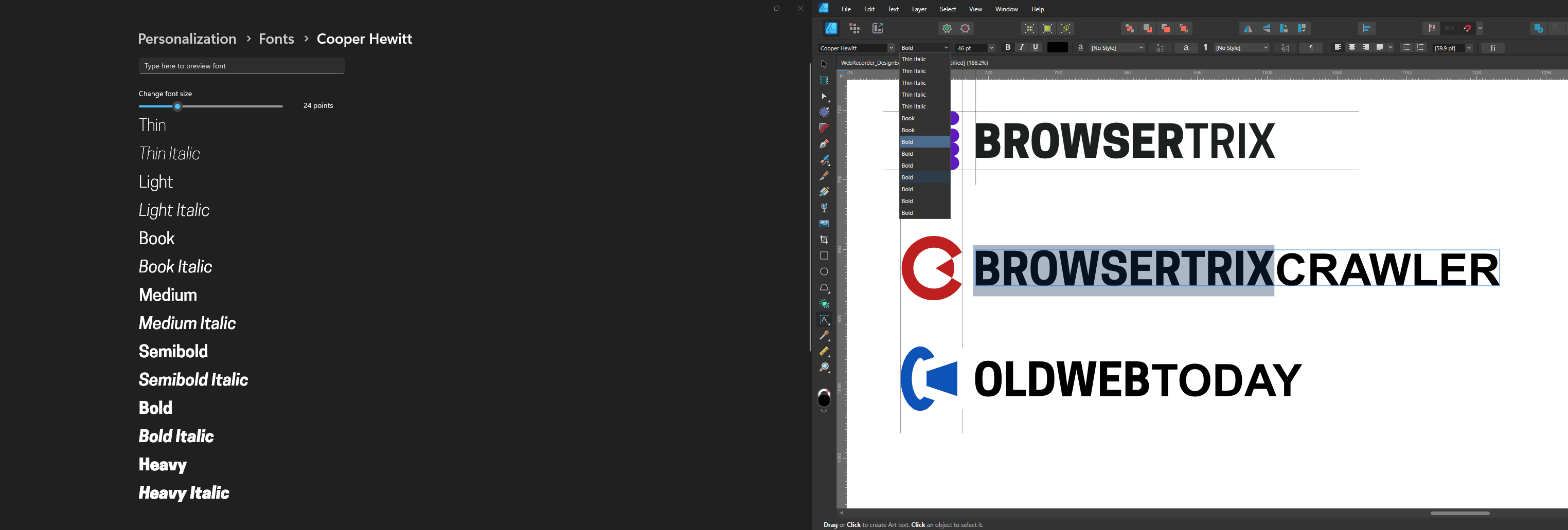
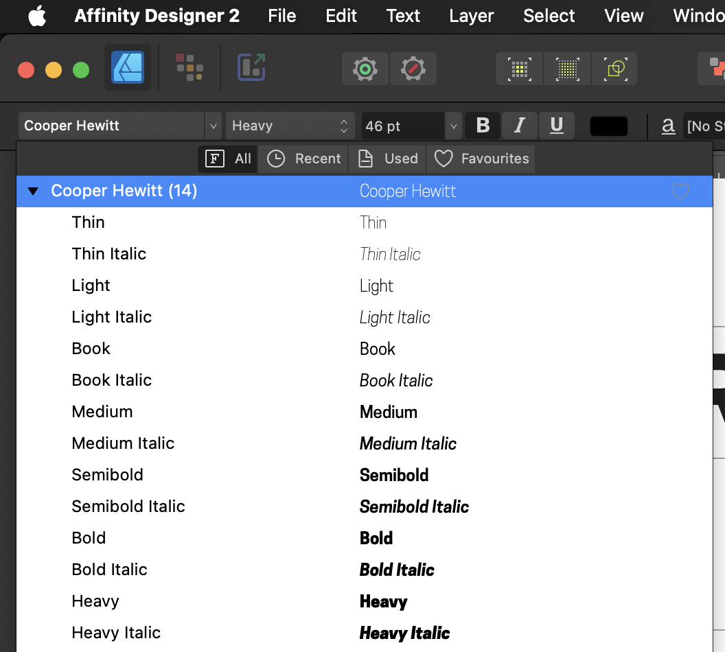
Summary On Windows, Affinity Designer does not properly load all cuts of this typeface. I haven't seen this issue arise with other typefaces, though Cooper Hewitt does seem to perform as expected in the operating system and other applications. I have tried reinstalling the font files but no dice. Steps to Reproduce Tested with Affinity Designer 2.3 on Windows 11 Download the Cooper Hewitt OpenType version Unzip and install the OTF files Check that the files have been installed in Windows' font browser in Settings > Personalization > Fonts > Cooper Hewitt. All the cuts from Thin to Heavy should be listed Open Affinity Designer, create a new text object with the typeface set to Cooper Hewitt, attempt to view all the available fonts for Cooper Hewitt. Observe problem Additionally, I was unable to reproduce this on my Mac... Seems to be a Windows only issue. Screenshots Windows 11's font settings on the left showing all cuts of the typeface installed. Affinity Designer on the right is unable to display them all. The typeface does work as expected in Figma for Windows and macOS, indicating that it is not a platform issue. The typeface and all of its cuts appear correctly in the menu on macOS. They are usable as expected. When the same file is loaded on Windows the typeface gets set to the default.

-
Variable fonts support
Shrinks99 replied to Athanasius Pernath's topic in Feedback for the Affinity V2 Suite of Products
@AffinityMakesMeSmile You may appreciate this article: https://en.wikipedia.org/wiki/Font_hinting- 239 replies
-
- 2
-

-
- variable fonts
- feature request
- (and 1 more)
-
Variable fonts support
Shrinks99 replied to Athanasius Pernath's topic in Feedback for the Affinity V2 Suite of Products
What @DamienG is referring to are not individual kern pairs, but optical sizing: The practice of adjusting a glyph's geometry (in all they ways they mention above) to account for how it is displayed at different sizes. This actually is available with some static cuts of usually expensive digital typefaces which will specify their pt size in the name of the cut, eg: "Helvetica Bold 72pt", however variable fonts offer a much better workflow for this and more specificity. As far as I've seen most foundries have now opted for variable fonts when integrating optical sizing features. Inter v4.0 includes an opsz axis and you can see what it looks like here. --- As I have also mentioned before, those on this forum are not the arbiters of the workflows of others. If you don't feel the need to make use of the advantages that variable fonts offer that's great, don't use them. As a response to my first post in this thread, an employee from Serif indicated that they'd also like to see them integrated and given that they don't share their roadmap publicly as far as I'm concerned that's pretty much the end of this thread? They'll probably be implemented eventually? I'd also love to see them sooner rather than later but given my experiences developing software it's likely going to be an "it will happen when it happens" kinda thing. 100 points from me if it happens in a 2.x release!- 239 replies
-
- 3
-
-

-
- variable fonts
- feature request
- (and 1 more)
-
Variable fonts support
Shrinks99 replied to Athanasius Pernath's topic in Feedback for the Affinity V2 Suite of Products
Getting outside the scope of this topic so I don't want to go too off the rails, but yes! This is a good idea and something I had planned to do actually, the fonttools static export wasn't playing nice with the variable version of Recursive I have installed due to a naming conflict? My attempts to fix this with the Glyphs source files were unsuccessful, seemed to be an issue with the version mismatch & also me being lazy and not configuring the build system properly. I'll try out Slice! I found this repo once before but lost it so thanks for reminding me about it!- 239 replies
-
- 1
-
-
- variable fonts
- feature request
- (and 1 more)
-
Variable fonts support
Shrinks99 replied to Athanasius Pernath's topic in Feedback for the Affinity V2 Suite of Products
@Patrick Connor Ha! Mixed direction text is always fun. We haven't thought about that yet for our applications and I'm sure I'll be dealing with it in the years to come! Lucky for me, ours is web based with all of the affordances and limits that brings. 🙃 @walt.farrell Output format utility would mostly remain the same I think? There's not a lot regarding variable fonts that change the format one might deliver something in. As I understand it, Affinity Designer does not aim to be a 1-1 SVG spec adherient editor so while SVG can include things like animation, I wouldn't expect that to be editable through Affinity's software. As such if I wanted to animate a variable font's axes in an SVG exported from Designer I would expect the ability to edit the file in an external text editor with text exported as <text> objects (not paths) which is something the program is capable of doing today. The axes controls would have to be added to the CSS export that Designer already performs reasonably well. In any case, SVG and PDF are probably the most relevant formats to worry about regarding variable fonts due to the different way type can be embedded in the files. Other than that — as far as I know — exporting is the same as with regular cuts of typefaces. It's less about the specific format and more about having the feature consistency across my pipeline which involves software like Figma, web browsers, Blender (through Coldtype st2), and of course Affinity's software.- 239 replies
-
- 2
-
-
- variable fonts
- feature request
- (and 1 more)
-
Variable fonts support
Shrinks99 replied to Athanasius Pernath's topic in Feedback for the Affinity V2 Suite of Products
Hi there! New to the forum, long time user of design software. I thought I'd throw my $0.02 into the ring here as this has recently been a pain point for me. Variable font support isn't only about what cut of a typeface you prefer using, it's also massively helpful when authoring typefaces. Whereas users get the option of interpolating between different axes, typeface designers no longer have to create and maintain as many individual letterforms and can also rely on interpolation to generate different cuts of the font, either statically or through a variable font file. Don't need that when designing? That's cool! Stick to the regular weights from 100-900 or use static exports (currently the only option we have in this software), but variable fonts are unquestionably the direction the industry is going in because of the flexibility offered to users and lower effort required from type designers for the same product. Another key advantage of variable fonts hold over static cuts lies in web design and animation, two fields that aren't currently served by Serif's software. These use cases don't matter when exclusively using the Affinity suite of tools, but it's not acceptable to be unable to match styles used elsewhere — especially when required by brand guidelines. On our website, variable fonts allow us to serve a single .WOFF2 file with support for both sans and semi-monospaced text at any weight we choose while using a fraction of the size that would otherwise be required when serving static cuts. We also get to smoothly interpolate between weights for things like hover states. In this specific example, we use Recursive as one of our brand fonts. Currently I am unable to use the Affinity suite to set text with Recursive's monospaced axis set to 0.51 (semi monospaced with added slab serifs) due to lack of variable font support. We use Recursive set to mono=0.51 for the better spacing afforded in instances where a monospaced font is good to convey information (this text is data or for branding reasons, we use it for titles), but doesn't actually benefit from actually being monospaced. It's become such an issue when creating graphics for our brand that I'll probably have to buy Illustrator again, what a bummer! In closing, I feel like I read somewhere that this would require a fairly significant overhaul to the entire type rendering engine. As somebody who works in software I understand that changes like this may seem small to end users but can actually be quite a large undertaking to implement. Something that I've been very impressed with regarding Affinity's suite of tools is the care put into creating a software package that is both cohesive for end users while remaining technically consistent, generally with a focus on doing things correctly — especially regarding colour. All I ask is when prioritizing future features, maybe consider bumping variable font support up the list? I'm excited for the day your already pretty good type rendering engine becomes best-in-class!- 239 replies
-
- 5
-
-
- variable fonts
- feature request
- (and 1 more)