bbd10
-
Posts
28 -
Joined
-
Last visited
Everything posted by bbd10
-

Film Emulation With Hald CLUT
bbd10 replied to bbd10's topic in Tutorials (Staff and Customer Created Tutorials)
In AP 1.5.2 and 1.6 procedure (LUT export) is broken! -
Affinity Photo Customer Beta (1.6 - Beta 1)
bbd10 replied to Andy Somerfield's topic in [ARCHIVE] Photo beta on macOS threads
LUT Export/Import is broken. RED and BLUE channels are toggled. -
Can you edit layer masks like a normal layer?
bbd10 replied to a topic in [ARCHIVE] Photo beta on macOS threads
Back to topic... As I stated in my post #10 you can do whatever you want with masks but not with "one click". You create masks "with one click" using selection tools and refine. The problem is: you have some kind of workflow based on GIMP, Photoshop, whatever and with Affinity some operations are different. In this moment your workflow collapsed. My question is: is there anybody here interested in the full tutorial how we can obtain the FINAL result in Affinity? (Not video! with click here and next there) I am not interested in "mimicking" Photoshop or GIMP but rather in particular problems we encounter during photo editing. -
Can you edit layer masks like a normal layer?
bbd10 replied to a topic in [ARCHIVE] Photo beta on macOS threads
What is more important, features of color grading apps should be used in photo editing applications. Grade wheels for lift - gamma - gain or HSL qualification tools for example. You can emulate the behavior of grading app in Affinity but it slows you down. In the same time we have in Affinity vectorscope and waveform graphs but in very small windows and without proper tools in the user interface. This is not a problem when you perform secondary corrections in Affinity but primary one for RAW is a nightmare. So I do primary correction in other software (Capture One, DxO or even RawTherapee) and then transfer results to Affinity for a secondary one. This is a common misconception that color grading or color correction is primarily about fixing problems and dealing with broadcast safe issues. You grade film because you want it to look as good as it can. You "color grade" photographs for the same reason. In my opinion, we should take as much as we can from color grading community experience. -
This is not a reversible process because of blending mode. You can also try screen blending in place of lighten. In the tutorial we have Lighten blending mode applied first and then HSL Shift adjustment to blended channels. In this case, for example, you have two red channels - one from magenta layer and second from yellow and those channels are blended together. When pixels of the upper layer are lighter than the ones on the layers below, then pixels from upper layer are kept in the image. If the pixels in the layer are darker, they are replaced. This is NOT, even with HSL Shift, reverse operation for what recolor adjustment have done. If you add Invert adjustment to each layer and use darken blending mode then an effect will be sometimes more interesting.

-
iOS version will be available with beta 9
-
Film Emulation With Hald CLUT
bbd10 replied to bbd10's topic in Tutorials (Staff and Customer Created Tutorials)
Yes, and sometimes I build my own (adjustments...adjustments) as in the case of V50-ProPhoto. To build your own you have to find original, technical specification of film and replicate response with curves, filters and lot of work. If you have some photographs (negatives) you can scan them and use a scanned image as a reference which helps a lot. The best situation is if you photographed some standard color card. In many cases, you can not properly build "profile" for an original film because a film is unavailable now (to make photography of color pattern in a controlled environment, develop film, scan film and so on). So you have to rely on the other nice people :) -
Film Emulation With Hald CLUT
bbd10 replied to bbd10's topic in Tutorials (Staff and Customer Created Tutorials)
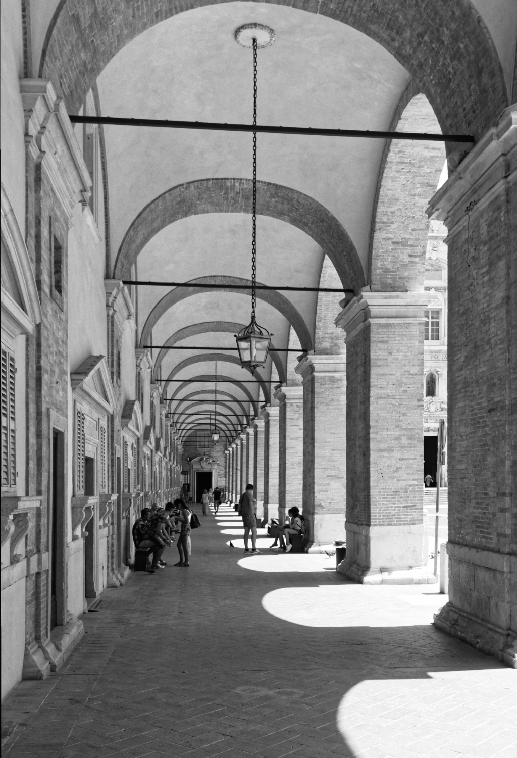
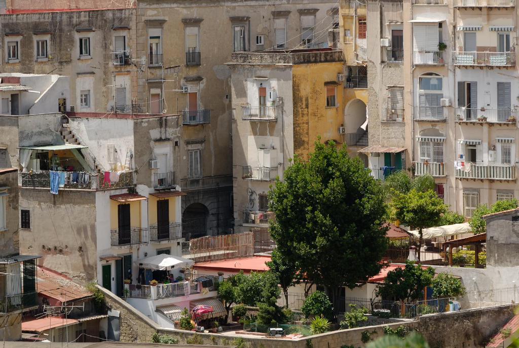
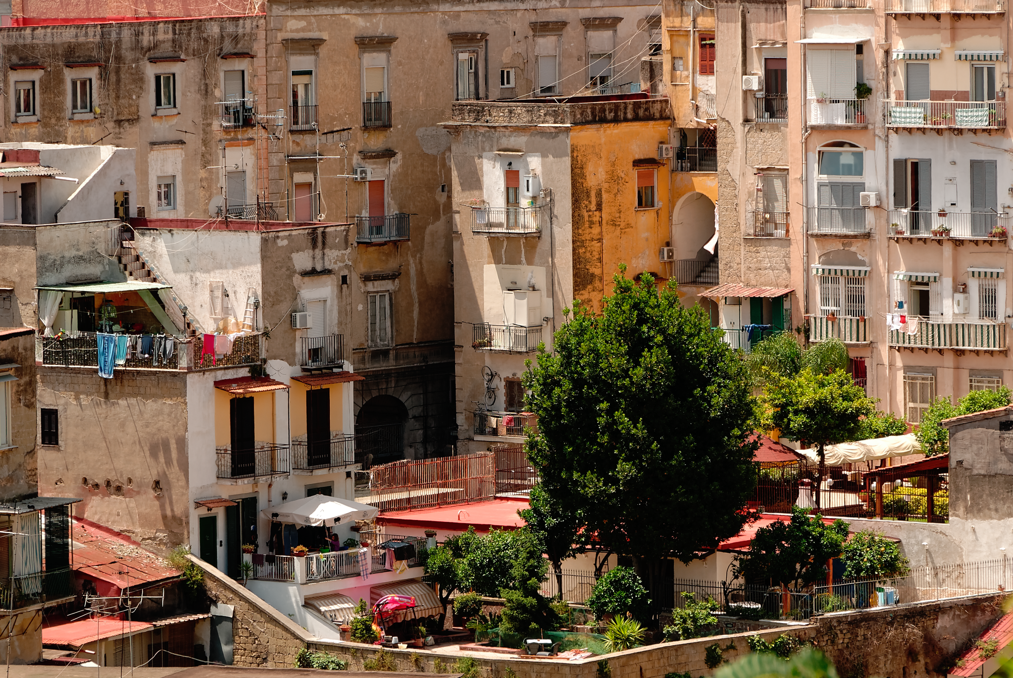
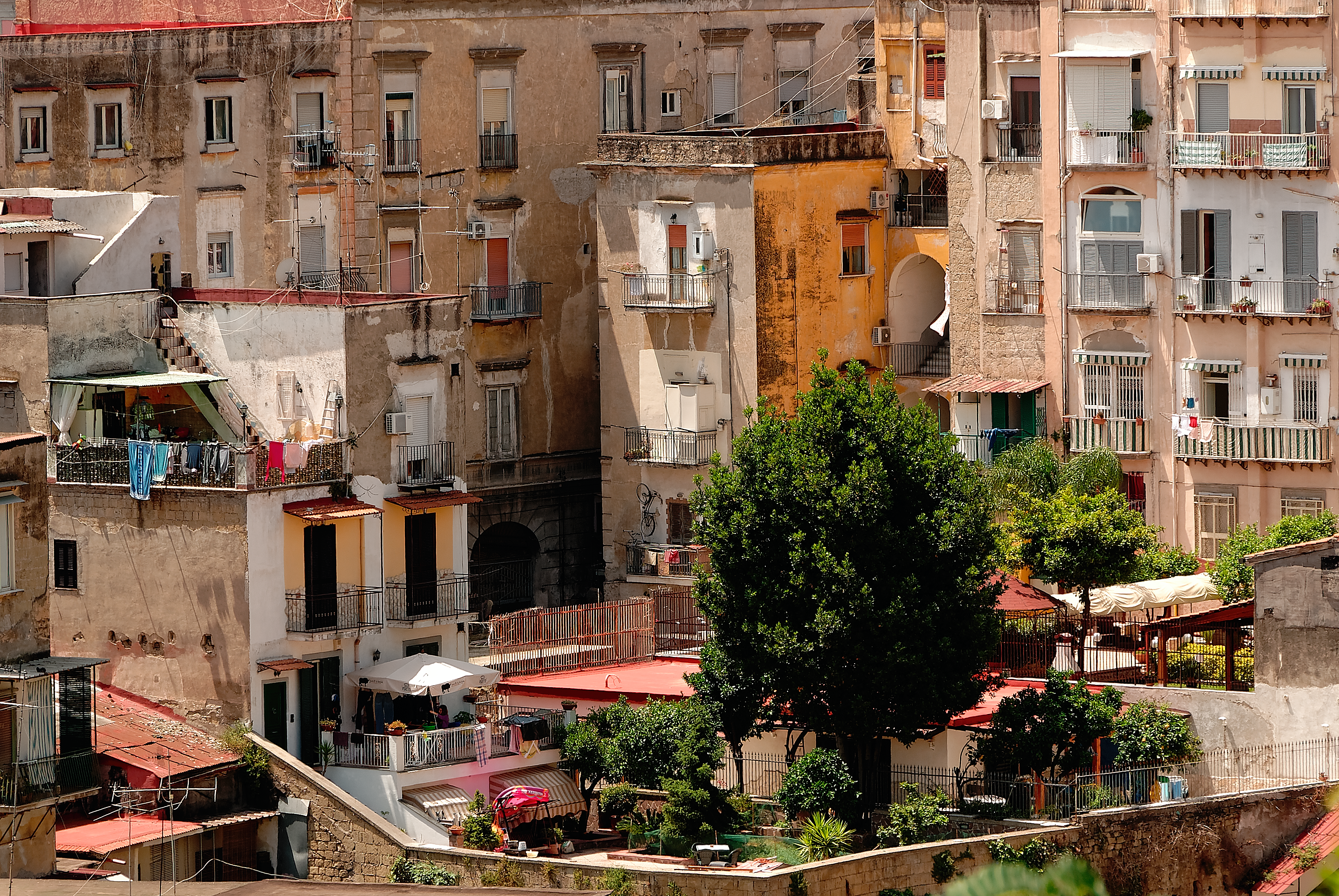
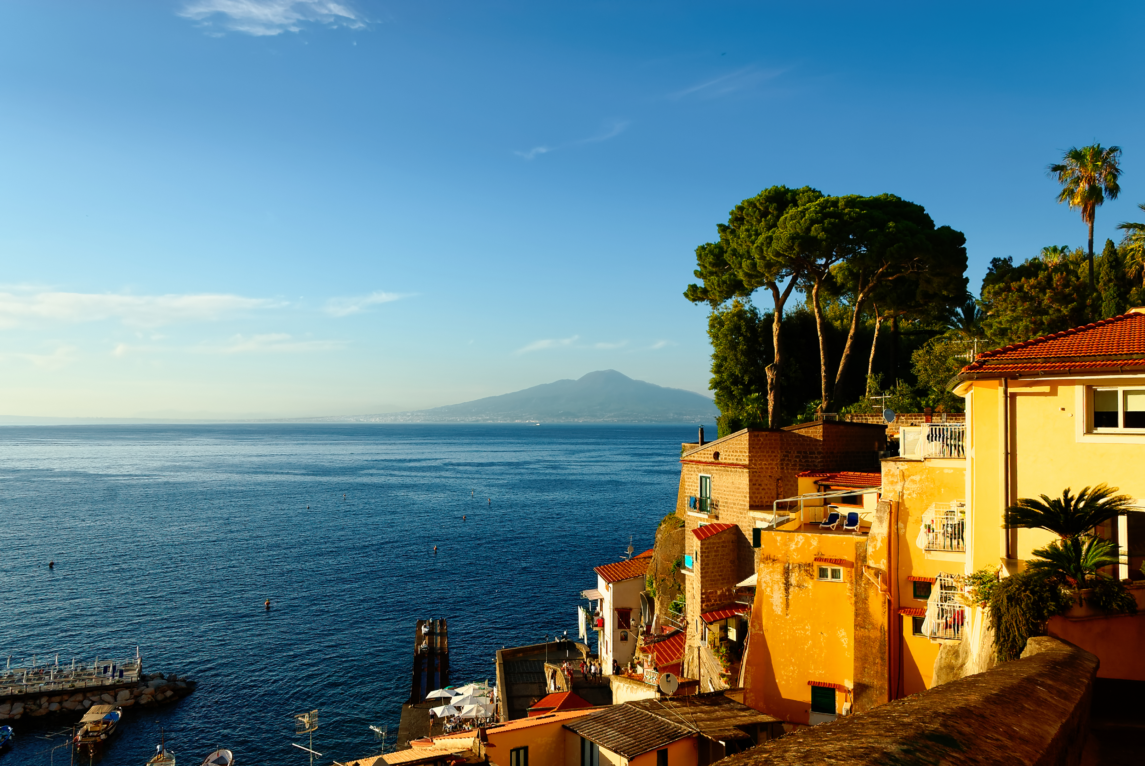
As requested - 3D LUT's for B&W. Now only Kodak T-Max, Tri-X, BW400, HIE. Funky pattern was generated with ImageMagic convert command. In this pattern, there are patches covering full colorspace. In "normal" image only small part of gamut is covered. Procedure: Pattern with "all" colors (Identity) ----> adjustments ... adjustments ----> Export result (Clut) ---> Save ---> Close ---> Open identity ---> Apply 3DLut Adjustmet layer ---> Infer 3D Lut with "Identity" (yes, again!) and "Clut" ---> File - Export 3DLut Credits (Hald CLUT Film Simulation Collection, versions with 1RT in file name): Pat David Pavlov Dmitry Michael Ezra Pictures are my own, the small oasis in Napoli (Italy), Vicolo Miradois. RAW file developed "flat", white balance shifted to warm, Velvia 50 applied + saturation and little vibrancy boost. Important. Remember that working with ProPhoto and other wide gamut color spaces can be little tricky. For B&W you can apply LUT's in sRGB and effect should be correct. And another example (Loretto, Italy) with LUT simulating Adox CHS 100 II film (IMG_2005). Kodak-BW-3dl.zip
-
Film Emulation With Hald CLUT
bbd10 replied to bbd10's topic in Tutorials (Staff and Customer Created Tutorials)
3D LUT Set - Fuji Transparency Color Film emulations (ProPhoto): Fuji Astia 100F Fuji FP 100C Fuji Provia 100F Fuji Provia 400F Fuji Provia 400X Fuji Sensia 100 Fuji Velvia 50 Fuji-Transparency-Color-v1.zip -
Film Emulation With Hald CLUT
bbd10 replied to bbd10's topic in Tutorials (Staff and Customer Created Tutorials)
Samples: MAH_7894_4_Flat: Source image (sRGB) MAH_7894_4_V50: Final image with LUT applied (sRGB) Source-ProPhoto: Source image with ProPhoto color space V50-ProPhoto.3dl : 3D LUT (zipped) 3D Lut generated from two HALD CLUT images in ProPhoto color space. V50-ProPhoto.3dl.zip
-
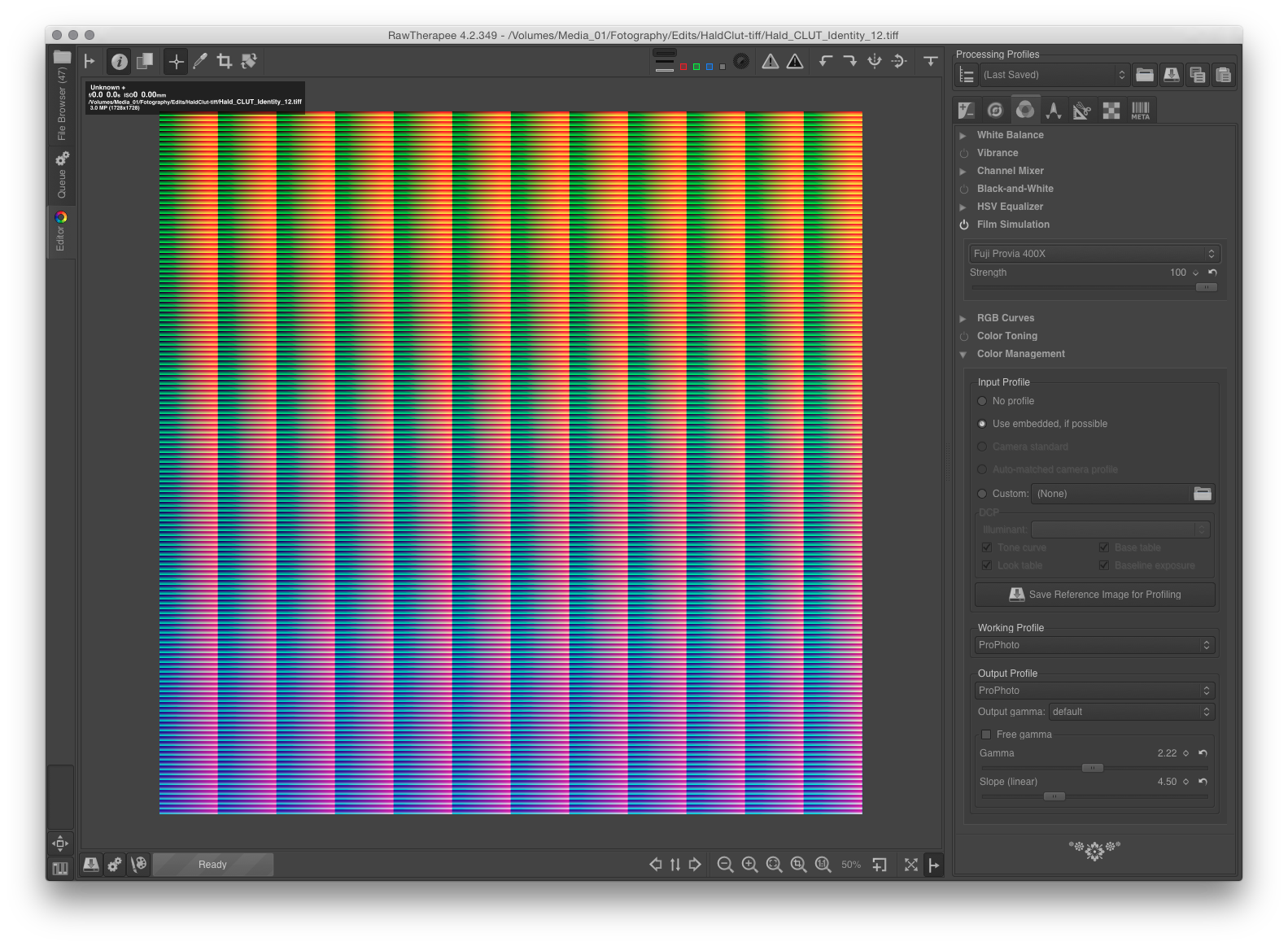
You need Hald CLUT patterns which can be downloaded from: http://50.87.144.65/~rt/w/index.php?title=Film_Simulation and Raw Therapee: http://rawtherapee.com/downloads You can as well use any other program which can perform film simulation, but in any case, identity file is required. To perform film simulation, we require two files: Identity Pattern (file with unconverted colors) Film Simulation Pattern In Affinity Photo 3D LUT Adjustment layer has to be crated. In this layer, we have to use Infer LUT… option. The first file should be identity, second one result of conversion (film simulation pattern). There is one minor problem, though… Hald CLUT identity and film emulation Hald CLUT pattern should be in 16bit format and with the same color space as Affinity Photo image. Here Raw Therapee can be applied. With Affinity Photo or RT you can convert standard Hald_CLUT_Identity_12.tif to desired color space. Processing profile in RT should be neutral, and in Color Tab - Output Profile set to a destination color space. Converted identity pattern file should be opened in Raw Therapee with neutral processing profile. Then in color tab you can apply Film Simulation. The result should be saved as a 16bit tiff file with a target color space. Attachment: RT.png - Raw Therapee
-
Extreme enlargements
bbd10 replied to bbd10's topic in Tutorials (Staff and Customer Created Tutorials)
Enlargement can be also used for sharpening the final image. Procedure: Enlarge image with Lanczos 3 separable (four times or more). You can use non-separable version, but then you have to deal with increased halos. Now you can add some local contrast with clarity and sharpness with unsharp mask. The local contrast will be increased during next step, halos from sharpening reduced. With all adjustments applied export image using bilinear resampling and original dimensions. Attachments: MAH_7894_2_FV50s: source MAH_7894_2_FV50-OSs: result
-
What is extreme enlargement? You can think about this differently depending on final image purpose. Enlargement makes sense if you want to print big. I have to clarify something here. You will never beat the guy with medium or large format camera but do not desperate. You have 16MP or 10MP camera with decent lens and want to print big? Simply print big. What I consider as large format here? I very often have to print 10MP image with dimensions of 80x54 cm (31.5x21.3 inches). This means, that I have to enlarge image 6.5 times. This is what I consider as extreme enlargement. This is a little different meaning that extreme enlargement has for somebody who wants to print image for a billboard. Do you want to discuss huge enlargement with Affinity Photo? Attachments are in JPG format, but this should be an illustration of my idea: high contrast, saturation, and preservation of details. (Idea only, JPG is worst option here) Attachments: (...)_Source: Original take, (...)_W-Mextreme_vlv-2-reduced: On screen result (converted to 8bits for channel and sRGB)
-
Rotating Document?
bbd10 replied to MaryLou's topic in Pre-V2 Archive of Affinity on Desktop Questions (macOS and Windows)
Yes, it is supposed to that. You sometimes want to see the whole View rotated which is helpful with perspective drawings, drawing with tablets or simply designs where you want to see some elements horizontally although they are placed diagonally. You do not change your design this way - you only rotate "virtual monitor". Exported image will do not have any rotations applied this way. (Menu -> View -> Reset Rotation, to clear accidental rotation. Or right mouse click outside canvas area.) To rotate real design elements - layers, groups, rectangles etc. you have to use move tool (V) and rotation handle. You can also use transform panel or Layer Transform menu. :) -
Precise color toning
bbd10 replied to bbd10's topic in Tutorials (Staff and Customer Created Tutorials)
Tricky does not mean impossible. As I know, internal architecture of Affinity Photo allows even more complicated transformations but this has a price. Transformations of color models can be performed with high accuracy but with each transformation, you always introduce some rounding errors. In the case of blending, transformations can start to proliferate like rabbits. You can also find valuable using different color models for different layers;) Yes, I know everything can be done by using curves. Everybody use curves. So why colorists in film industry does not? This is problem of usability. You do not have to think in "curves category" when you color correct image. In Affinity Photo we can use scope panel with RGB parade or with vectorscope. Then it is faster to correct color with Lift-Gamma-Gain wheels than with curves. The same you have with shadow-midtone-highlit wheels. To correct something in midtones with curves you have to enter two or three points for each color curve and adjust every curve individually. With color wheels small move of central point in midttone wheel is everything you have to do. -
Precise color toning
bbd10 replied to bbd10's topic in Tutorials (Staff and Customer Created Tutorials)
Lowering opacity should be considered a first choice in most cases but with source range curves you can obtain nonlinear behaviour of adjustments. Blending with other color models works with other components as expected but blending through different color model can be a little tricky to design as a general solution. I'd rather appreciate an option to work with color wheels for lift-gamma-gain, shadow-midtone-highlit wheels or even color bars. With ranges definition and linear space naturally;) Attachments: Blend Options in Lab - Nonlinear blending and Lab Lift-Gamma-Gain and SMH-Log-Lin - Color wheels for primary color correction Bars - Primaries color bars as an alternative for lift-gamma-gain wheels.
-
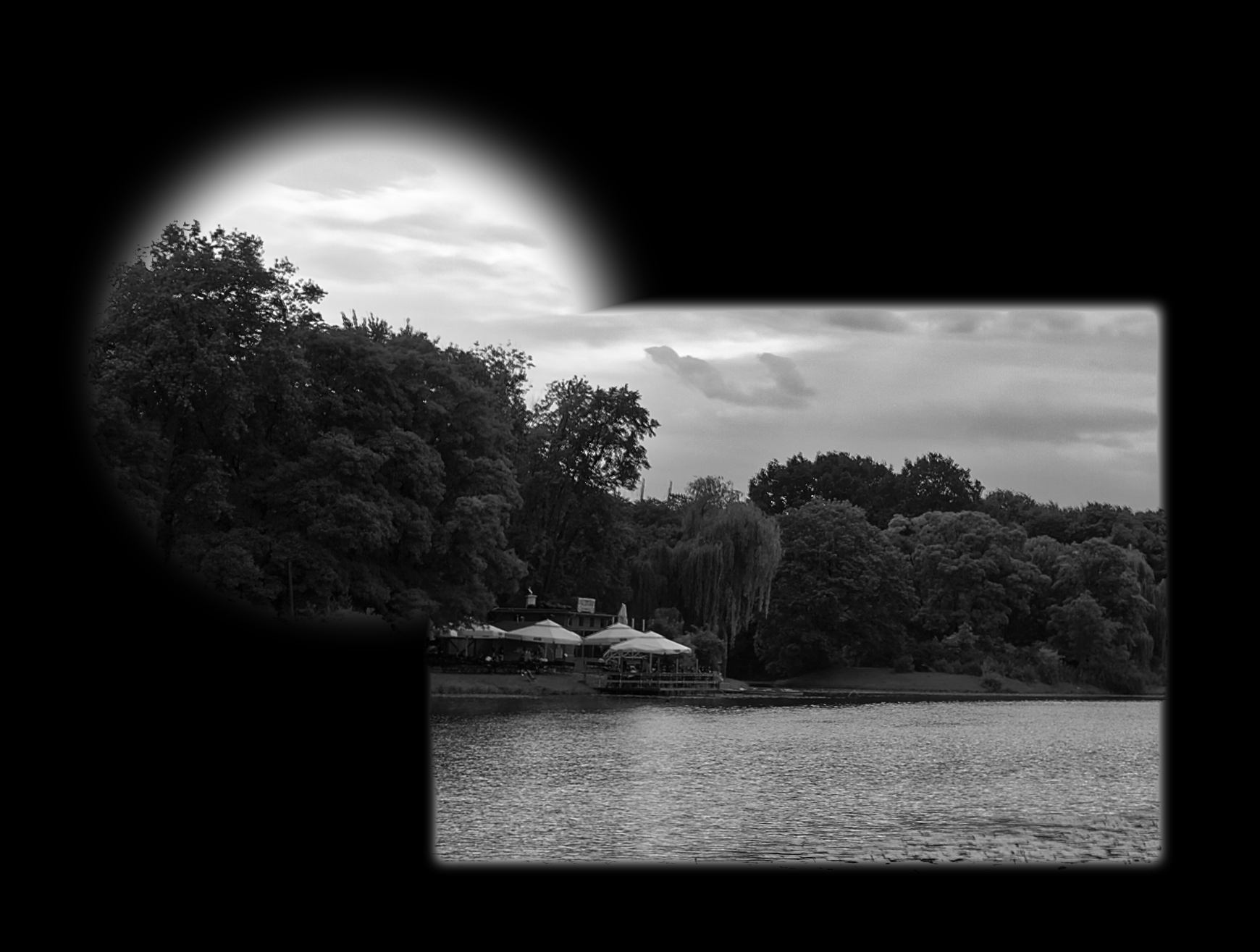
Color correction requires very subtle adjustments. But adjustment layers work like a sledgehammer. In color balance adjustment one percent is the smallest amount you can apply. You need also blacks or mid shadows. Not only shadows, mid-tones, and highlights. In curves adjustment, you need many points to obtain the desired result. Adding points are easy, but the placement of them is so coarse that it is almost impossible to build the desired shape of the curves. In such cases blend ranges option is the rescue. A small cog near blend mode selection list opens blend ranges dialog window. Layer blend ranges dialog has two graphs. The source layer ranges graph can be applied to increase the precision of adjustments. You can simply drag nodes on the source layer graph down to, for example, 10%, and then 1% change in adjustment layer will become effectively 0.1%. This is particularly efficient for curves adjustment. Large node movements result in small effect and you can understand what are you doing. The underlying composition ranges graph allows you to fine tune tonal ranges affected by adjustment layer. Left side means darks, right highlights. You can use different shapes here, but for example, the gaussian-like shape will bring the focus of the adjustment layer to this tonal range where curve maximum is set. You have to be really careful, though. Linear curves or strange shapes can lead to banding and other unwanted effects. Probably you are looking for something more subtle than example included in the Affinity Photo help. Another option found in blend ranges dialog is Blend Gamma. By default, this option is set to 2.2 which is normal for regular sRGB blending. But in a case of a very subtle adjustment, using linear RGB color space can be helpful. In this case, you have to change a value of blend gamma to 1. Mysterious coverage map should be left as is, without any modifications. With this choice, you can change antialiasing which can be important for hard-edged objects like lines or text. Blend ranges can be used with live filters also, but this is not so straightforward like with adjustment layers. There is no cog shaped blend ranges button in live filters. You have to open this dialog window from any other layer and leave it exposed. Then when you switch to live filter, then changes in blend ranges will be applied to the filter. You have to be careful with that, though. Blending options can be applied not only to master but also to red, green and blue channel individually. This is a very nice possibility, but usually not easy in implementation. The combination of complex adjustment layer with a complicated transfer function in red, green and blue can be very difficult to understand. In effect, you can commence using trial and error method which is not a good approach in this case. To use blending options with adjustment effectively you not only should have to just visualize the desired effect, but all actions have to be planned ahead. For instance, you know what is characteristic of Fuji Provia 400X film so you can plan your actions for contrast, color balance, hue and saturation enhancements in very narrow tonal bands. You can apply 3D LUT adjustment in this case, but even then, some subtle corrections are necessary. Attachments: Source Range Reduced - Blend Options with Source Range set to 10% Colour Balance Extreme - Color balance adjustment where Yellow/Blue with 43% means 4.3% when blend options are applied Midrange of Midrange - Blend options composition ranges graph narrowing corrections to midranges and effectively narrowing midranges too. Corrections are applied in linear space. Precision Curves - Curves adjustment which without blend options looks like a straight line. Sorrento - New image colorized with described technique to be coordinated in color with images scanned from old positive film.
-
Can you edit layer masks like a normal layer?
bbd10 replied to a topic in [ARCHIVE] Photo beta on macOS threads
In Affinity Photo you can edit mask attached to layer but with only limited number of tools. Mask editing can be a frustrating process but only in a situation when you rely on other programs behavior. This is a problem for designers because Affinity Photo should not have to be an exact copy of any other program GIMP included. So forget about GIMP, PS, whatever. Try to build the new mindset for Affinity Photo and all frustrations will go away. I am not sure if this is the case, but masks in Affinity Photo are connected conceptually with an idea of selection or qualification. This is in my opinion better approach than thinking about masks as normal layers. -
Can you edit layer masks like a normal layer?
bbd10 replied to a topic in [ARCHIVE] Photo beta on macOS threads
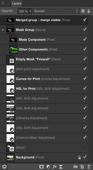
When you require to do something complicated with a mask, then it is sometimes easier to play with a mask as with normal pixel layer. To do this you have to convert the mask into greyscale pixel layer. You have to choose mask layer first and then in the channels panel find "your mask name" alpha channel. For alpha channel, there is the menu (right mouse click) with "Create Grayscale Layer" option. This option lets you to create the normal pixel layer which can be edited as usual. Other layers can be deactivated or blocked with an additional black pixel layer or what is sometimes better newly created mask layer. When you are happy with the result you can create a new mask using Rasterize To Mask from layers menu. In this case, the whole group will be converted to mask. If you want to keep group, you can use Merge Visible and then convert the newly created layer to mask. You do not have to use groups, but this permits you to keep a history of mask creation. What is more important - such groups can be utilized as templates for other masks. You can also utilize tools which are unusual when we think about masks. For example, you can use vector graphic to make the mask. You can also utilize spare channels for such operations like adding, subtracting or intersecting. In this case, you are going through pixel selection layer. From any colour channel, you can create a spare channel and load this extra channel to pixel selection. It means that in Affinity Photo we have full round-trip: from selection to mask and from a mask to grayscale and from grayscale to selection. Do not forget to deactivate group or greyscale layer when you want go back to normal editing tasks.
-
Problems with pressure of intuous
bbd10 replied to ottopilgrim's topic in Tutorials (Staff and Customer Created Tutorials)
There are two issues here, brush controller settings is the most obvious reason why you have problem with the pressure when using brushes, but if you have used another tablet brand before then there can be conflict with drivers installed. Normally, thre is no problem with pressure recognition for even exotic tablets used with Affinity Designer but when you change hardware and install software over previous one, strange things can happen. It mens, that if you have installed any other kind of tablet previously, then you have to uninstall it's driver and supporting software completly. This can be little tricky, depending of the tablet brand you have used previously. The point is, that you can simply forgot about that old crappy tablet... Try to clean your system and reinstal Wacom software again. There is also another procedure which can help in case if you ar not using MacBook: restart system, shut down system, unplug power cord, wait 20 minutes, plug power cord again and restart system. This have sense only for only specific Mac's models. -
When we develop and edit picture starting from RAW then very often we can lose fine color details during conversion to final color space. The typical remedy is to define working color space wide enough to accommodate wide camera gamut, but still, our final color space should be smaller so finally, a conversion is unavoidable. Leaving aside a discussion about what is real color, for sometimes complex reasons we can allow small color shifts and keep details visible. Often happens that color banding or unpleasant color areas emerge in final result even when you use 16 bits per channel and perfect profiles. To overcome this problem you can try to use wide gamut profile for working space, use the color proof layer on top and then export or convert picture to final color space. Below is the explanation (rationale) for this procedure. For example, let's imagine that there is pixel with R:G:B values of 116:51:32 with ProPhoto D65 profile. For simplicity, I will use here 8-bit encoding. Normally, with wide gamut profiles, at least 16 bits per channel should be used. Now, when we convert an image with this pixel to sRGB its value becomes 164:10:27, but color will not change. Why? Because this particular color is inside sRGB and ProPhoto gamut. When I will use color proof correction layer in ProPhoto profiled picture, then for this particular pixel value will not change, and still will be 116:51:32. Similarly, there will almost be no change in expected value after conversion to sRGB color space. Because of a rounding errors small shift to 163:11:26 can be observed. This particular pixel value is almost on the boundary of sRGB color space, so small changes are possible. The situation will change dramatically if we will try to do the same with a pixel which color is out of sRGB gamut. Let's take saturated red pixel in ProPhoto color space, where the value will be 163:0:0. Now, with proof layer applied, pixel value should change to 170:72:26, but when you directly export this picture to sRGB space then the value will be 241:0:0. Exporting picture with proof layer applied results in 241:8:5. Why there is such difference? The reason is simple: proof copy is still in ProPhoto space, so relative colorimetric routine adjusts not only saturation but also other parameters. When you directly export to small, sRGB space then conversion routine is in a completely different situation. Oversimplifying, zero is zero, so closest pixel value is for conversion routine 241:0:0 - a distance between a pixel value in different colorspaces is simply too large. This behavior leads to "fine tuned" color space conversion routine. This routine gives good results with highly saturated pictures and with RAW workflow, where there are many color details outside sRGB (aRGB) space. You have to remember, that modern cameras have really wide gamuts. Very often much wider than Adobe RGB in reds and blues. What do you think?
-
- 1
-

-
- wide gamut
- banding
- (and 2 more)
-
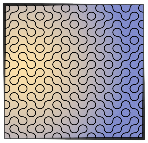
Not everything can be easily done with AD tools or can not be done at all. For example, try to draw what is shown at the picture below. There are simply limitations of graphical user interface and some patterns require a different approach. Luckily, Affinity Designer can open encapsulated postscript files. Encapsulated postscript allows you manual generation of high-quality graphics. It means that you write a program in Postscript language which subsequently is interpreted by AD. To do this, you should only have so-called programmers text editor. It can be Apple TextEdit, Wrangler or Textastic. There is a problem, though. Before you try to open EPS file in AD, you should check if your program contains no errors. Postscript and Encapsulated Postscript files are interpreted by GhostScript program which can be called from a command line in Terminal window. First, you have to check if you have Ghostscript installed. If not, then you have to install it. In Terminal enter command: gs -version When the command was not found then you can download the latest version of GhostScript from Richard Koch page (http://pages.uoregon.edu/koch/). Locate the GhostScript link with the highest version number and click on it. This will start the download of the GhostScript package installer. How the download actually happens is dependent on your browser and system setup. Once the installer has downloaded, open the folder it was downloaded to. Double click the PKG icon and follow the on-screen instructions. Accept the defaults if you don't know what to change. Once the install process has finished you can check if GhostScript is installed and ready for action by entering gs command again: bash-3.2$ gs -version GPL Ghostscript 9.16 (2015-03-30) Copyright © 2015 Artifex Software, Inc. All rights reserved. Now you can write simple EPS program and check it with GhostScript. Using text editor enter Truchet Pattern program and save it using eps as filename extension. The code for Truchet Pattern is from "A Short Introduction to PostScript" by Peter Fisher: (http://sus.ziti.uni-heidelberg.de/Lehre/Tools1213/PostScript_PeterFischer.pdf) %!PS-Adobe-3.0 EPSF-3.0 %%BoundingBox: 0 0 592 842 %% File name: TruchetPattern.eps %%BeginProlog %%EndProlog 2.835 dup scale 5 4 translate 1 setlinecap 0 0 200 290 rectstroke 100 145 translate /W 10 def /W2 { W 2 div } bind def /DRAWUNIT { gsave translate rotate W2 neg W2 neg W2 0 90 arc stroke W2 W2 W2 180 270 arc stroke grestore } def -95 W 95 { /x exch def -140 W 140 { /y exch def rand 4 mod 90 mul x y DRAWUNIT } for } for showpage %%EOF In Terminal, go to directory where your EPS file was saved and open it with gs program: bash-3.2$ gs TruchetPattern.eps GPL Ghostscript 9.16 (2015-03-30) Copyright © 2015 Artifex Software, Inc. All rights reserved. This software comes with NO WARRANTY: see the file PUBLIC for details. Error: /undefined in setroke Operand stack: Execution stack: %interp_exit .runexec2 --nostringval-- --nostringval-- --nostringval-- 2 %stopped_push --nostringval-- --nostringval-- --nostringval-- false 1 %stopped_push 1951 1 3 %oparray_pop 1950 1 3 %oparray_pop --nostringval-- 1934 1 3 %oparray_pop 1820 1 3 %oparray_pop --nostringval-- %errorexec_pop .runexec2 --nostringval-- --nostringval-- --nostringval-- 2 %stopped_push --nostringval-- -85 10 95 --nostringval-- %for_pos_int_continue -130 10 140 --nostringval-- %for_pos_int_continue --nostringval-- Dictionary stack: --dict:1181/1684(ro)(G)-- --dict:0/20(G)-- --dict:87/200(L)-- Current allocation mode is local Last OS error: Invalid argument Current file position is 428 GPL Ghostscript 9.16: Unrecoverable error, exit code 1 Here we have syntax error: Error: /undefined in setroke After correcting this error, subsequent GhostScript run result is: bash-3.2$ gs TruchetPattern.eps GPL Ghostscript 9.16 (2015-03-30) Copyright © 2015 Artifex Software, Inc. All rights reserved. This software comes with NO WARRANTY: see the file PUBLIC for details. %%BoundingBox: 12 9 583 835 %%HiResBoundingBox: 12.738234 9.903234 582.611748 834.926740 >>showpage, press <return> to continue<< You should press <return> and enter quit command to exit from GhostScript interpreter: GS>quit bash-3.2$ Such created eps file should be visible in Finder, and Preview program can open it without complaining. When you are sure that EPS program is correct, then you can open it in Affinity Designer, select, copy and paste object into your design. TruchetPattern.afdesign TruchetPattern.eps Square.eps