yanksno1
-
Posts
35 -
Joined
-
Last visited
-

Change banner color?
yanksno1 replied to yanksno1's topic in Affinity on Desktop Questions (macOS and Windows)
That pretty much went over my head haha (no surprise there). Would love to see a tutorial on it! Does doing it your way keep it as 1 layer? Mine creates 2, but works well at least. I'd like to learn your way haha. -
Change banner color?
yanksno1 replied to yanksno1's topic in Affinity on Desktop Questions (macOS and Windows)
How'd you do that? I ended up copying the layer, and masking out the rest of the image besides his head and then using a background removal tool to cut it out. I'm sure there's a better way to remove the background in Affinity Photo I don't know yet.
-
Change banner color?
yanksno1 replied to yanksno1's topic in Affinity on Desktop Questions (macOS and Windows)
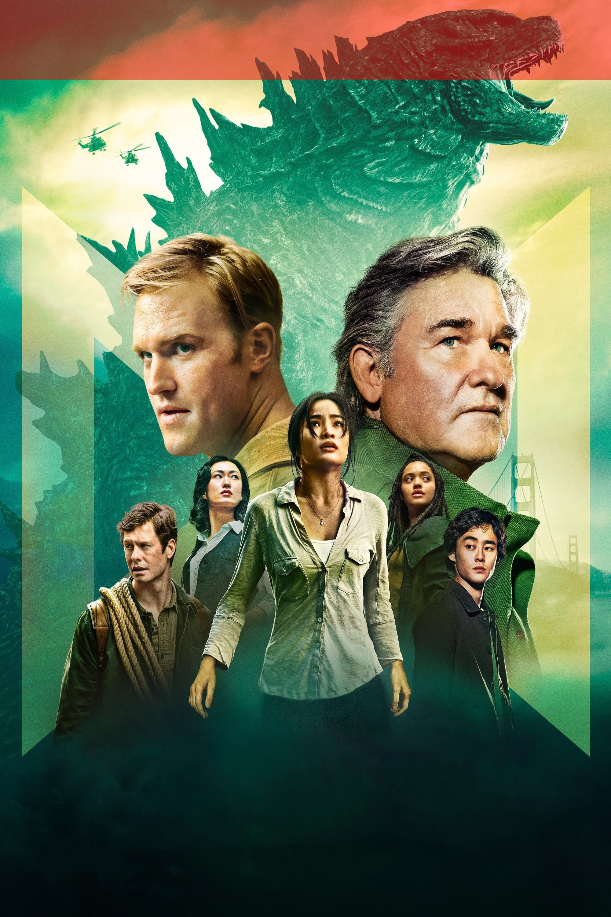
Now here's a new one for you guys. What's the best way to remove just a portion of a background? Like here in the red highlight. Want Godzilla's head overlapping the 4K banner.
-
Change banner color?
yanksno1 replied to yanksno1's topic in Affinity on Desktop Questions (macOS and Windows)
Just wanted to show you guys the finished project. Liked the way it came out haha.
-
Change banner color?
yanksno1 replied to yanksno1's topic in Affinity on Desktop Questions (macOS and Windows)
Sorry, not following you there. Ended up re-working the title a bit and like that result better. Still not sure on the font for Collection and feel it's missing some cloud's heh. But def a step in the right direction. I did learn how to do the proper way of a color overlay and drop shadow though!
-
Change banner color?
yanksno1 replied to yanksno1's topic in Affinity on Desktop Questions (macOS and Windows)
Here's it slightly adjusted with the gradient on the top. Think that's good enough?
-
Change banner color?
yanksno1 replied to yanksno1's topic in Affinity on Desktop Questions (macOS and Windows)
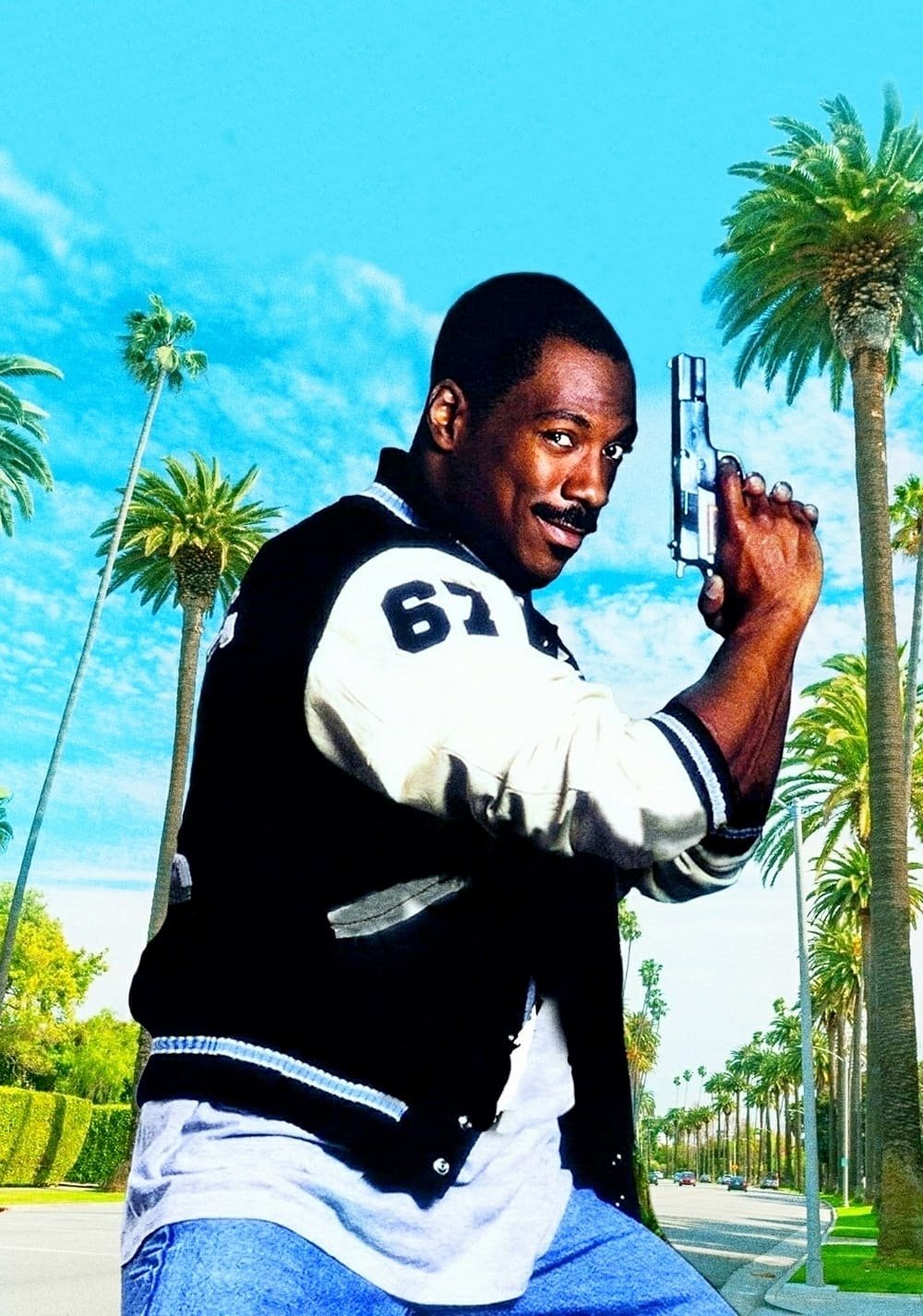
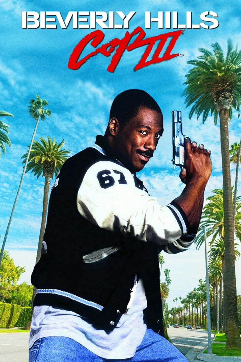
Want some suggestions from you guys. Trying to create a Beverly Hills Cop Collection movie poster and it's almost finished but think the top looks off (kinda empty there). I was trying some blue clouds, a gradient (that was tricky to get a hang of). What do you guys think? I was also wondering about the font I used for "Collection". I tried the Beverly Hills Cop Font that's out there but didn't like it. You guys have any suggestions that might work better? Attached the other movie posters for reference.
-
Change banner color?
yanksno1 replied to yanksno1's topic in Affinity on Desktop Questions (macOS and Windows)
No I don't (or glasses). Am planning on getting an eye exam soon since it's been a while since I've had one. There was def something on it with the banner image I was using. I just couldn't find it when I zoomed in. When I used the SVG one (thank you @firstdefence!) it went away, best as I can tell at least. -
 yanksno1 reacted to a post in a topic:
Change banner color?
yanksno1 reacted to a post in a topic:
Change banner color?
-
firstdefence reacted to a post in a topic:
Change banner color?
-
yanksno1 reacted to a post in a topic:
Change banner color?
-
yanksno1 reacted to a post in a topic:
Change banner color?
-
Change banner color?
yanksno1 replied to yanksno1's topic in Affinity on Desktop Questions (macOS and Windows)
Yeah I'm thinking there must of been something on the banner image I was using. This SVG seems to have cleared it up right? Think it looks good to me now. Gonna use it on my new one's now too.
-
yanksno1 reacted to a post in a topic:
Change banner color?
-
yanksno1 reacted to a post in a topic:
Change banner color?
-
Change banner color?
yanksno1 replied to yanksno1's topic in Affinity on Desktop Questions (macOS and Windows)
That def looks way better! Anyway to get it without the TM there? I'd want that inverted for the normal movies. -
Change banner color?
yanksno1 replied to yanksno1's topic in Affinity on Desktop Questions (macOS and Windows)
Here you go. It's very faint, but I see it there. I appreciate the help! 4K.afphoto -
Change banner color?
yanksno1 replied to yanksno1's topic in Affinity on Desktop Questions (macOS and Windows)
Here's the image. Hopefully you can see it now. On the left there's 1 pixel wide faint line covering the banner and image. Also looks like one below the banner too. The top and right sides are nice and clean.
-
Change banner color?
yanksno1 replied to yanksno1's topic in Affinity on Desktop Questions (macOS and Windows)
Another question for you. On the left I seem to have a pixel overlay or something that's on the left that is 1 pixel wide. I tried dragging everything over so it should be gone but it's still there. Hopefully you can see it in the screenshot here. I turned everything off below and above it. Didn't show that much on the black, but does on the pink haha.
-
yanksno1 reacted to a post in a topic:
Change banner color?
-
Change banner color?
yanksno1 replied to yanksno1's topic in Affinity on Desktop Questions (macOS and Windows)
That's what I was looking for! Thank you, much appreciated. -
Hi, I'm looking to change a banner color I have that I'm using to make movie posters. My Googling failed me here and can't find a solution I'm looking for. Basically I want to change the black background to pink. I was thinking a mask would be a good solution here, but not sure how to do it. Hopefully you guys can point me in the right direction. Thanks!