Kos
-
Posts
7 -
Joined
-
Last visited
-
 Thank you, Red Sands. Great, I didn't know about this feature. I'm just getting started, I haven't found it before. The only thing that is unclear is why touch the keyboard if you can always show rounding manipulators, red dots when object is selected? scr 2023-08-03 в 09.28.12.mov
 -
Hello, do you plan to add corners rounding like in an illustrator in any curve form? Watch an example. Thank you so much for adding option: Select object when intersects with selection marquee :))))) Round corners.mov
-
Kos changed their profile photo
-
It's not about liking it or not. The tool should always be instantly associated with the function, if the switches on the plane do like Christmas toys, what will happen?
-
It is also VERY annoying that it is impossible to turn on and off with the same command, for example. Cmd/Ctrl + T, why do I need extra movements to close a specific panel? WHY disable all TAB tools or hide the ToolBar when you need to disable only one panel by pressing Cmd/Ctrl+T twice. This is beyond my understanding.
-
I can't support your attitude. There should be no beauty in the controls, it interferes/distracts the process. The tools should be invisible and the content can be beautiful. It's all about the size, if we consider the icon as a separate element, as an application icon, then in this case it works as an advertisement and a recognizable and attractive element. Tool icons must be clean and neutral.
-
3D gives extra noise, very annoying. If you evaluate the main competitors have long switched to flat. Pixelmator Pro, Illustrator, Fima, Procreate, Victorenator and even CorelDRAW did.
-
Kos joined the community
-
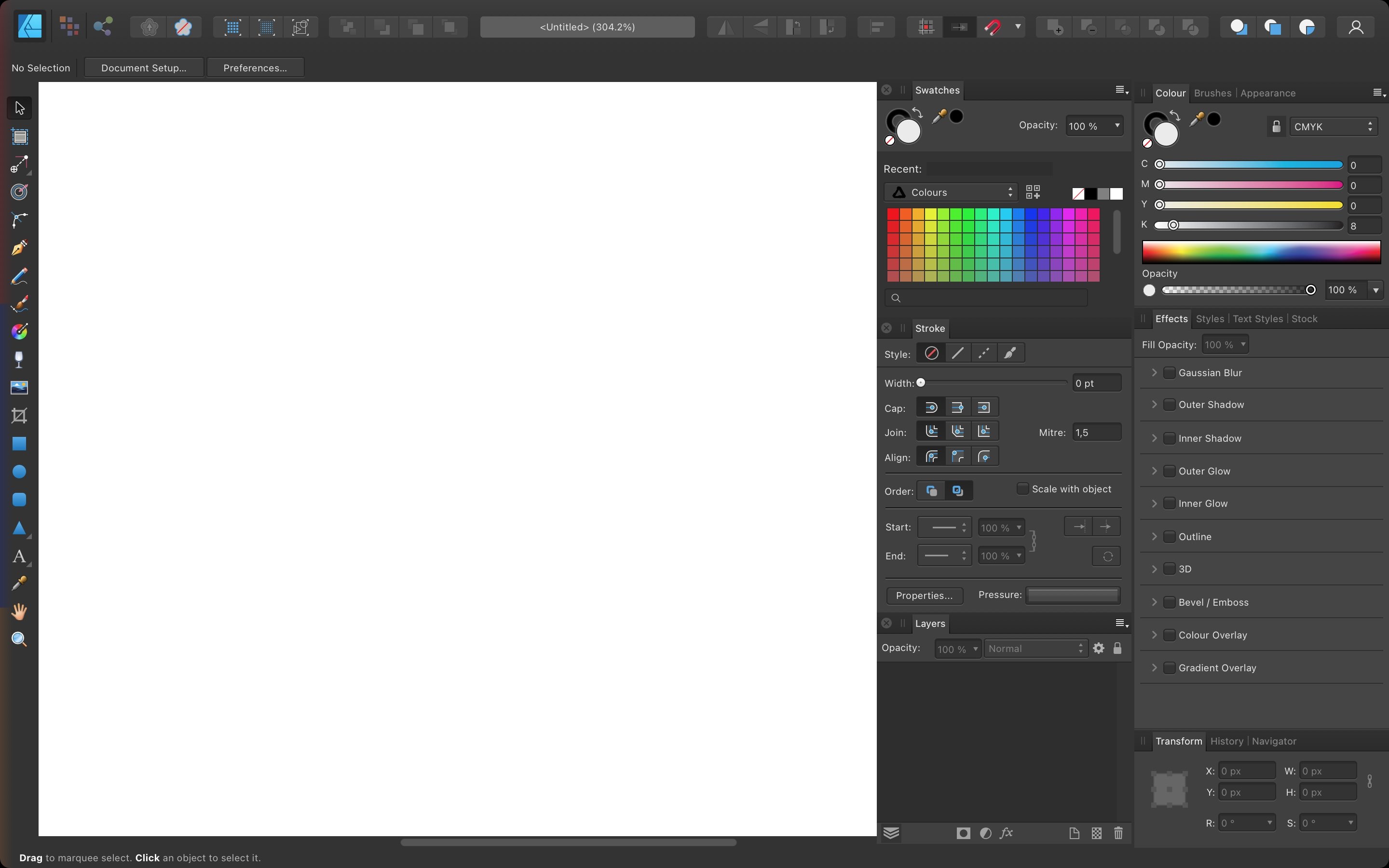
Damn, well, when will you update the design of the application for Mac Os to a flat one without 3D squeezing? Please get rid of the strokes of the interface elements, simplify the tool icons, take an Illustrator as an example, with Pixelmator Pro better. It is not necessary to add new functions forever, it is necessary to improve what is there and optimize some tools. For example, work with rounding the corners of a rectangle, color palettes, stroke. In the illustrator, everything is in one window, no need to switch anywhere. There is no way to collapse the editing tools, all palettes are only unfolded, clicking on the icon can be expanded, so as not to steal the working area. Set a goal not to switch tabs, but to select tools and edit immediately in the configured panels. Damn how uncomfortable all this is for you, why not take the usual clean interface design from Illustrator? You have a lot even better, but working with color palettes is impossibly wild, you have to switch all the time. Everyone who is tired of using the Illustrator because of their paid subscription goes to your program, so satisfy their users. Arrange a vote. And please, please update the interface at last, at least as on the iPad or give them to the development team, and they will improve. You haven't been able to improve the desktop version for so many years. INFURIATING! We are in general in 2022 already. I attached the Affinity interface, the Illustrator and the Pixelator Pro, see how in the Illustrator all the main tools are in one window, without having to click tabs. Sometimes transparency and others need to be switched, but these are not the most popular tools. In general, the most necessary by mouse click and hot keys and there is a lot of space for the work area and this is also the screen resolution of 1440x900 (retina).