peterdanckwerts
-
Posts
23 -
Joined
-
Last visited
Everything posted by peterdanckwerts
-
I tried creating a PDF with variable fonts in InDesign and I checked – there are only two fonts embedded in the PDF but all the weights that I chose are displayed in the PDF. I then imported the PDF into Affinity Design and the the file did not display correctly – there was roman and italic but no weight variations. This was no surprise, as Im afraid that Affinity is not very reliable at importing PDFs with embedded fonts, variable or otherwise. However, I could see that the full gamut of weights was available within the program. In case this was related to opening the PDF, I then created a fresh document from scratch using the font, which I only have as a variable font. I saved as a PDF. Despite everything looking OK in Affinity Design, the resultant PDF had only regular weight. I should mention that InDesign embeds the variable fonts in such a way that that show up as the Regular and Italic, as though they were static fonts, but they are not. In contrast, Affinity Design produces PDFs which appear to be static fonts – and they are. Incidentally, the InDesign was saved as PDF/X-1a:2003, which is a very old standard as the name suggests, and it caused no problems. I do hope Affinity supports variable fonts soon. I use some fonts which don't have a full set of weights in their static versions.
-
As I mentioned elsewhere, Affinity Photo's Box Blur does a very good job of descreening. You lose a bit of detail, but that is inevitable. Here are much-enlarged details before and after.

-
I see that this is quite an ancient discussion, but there is still no dedicated descreen option in Affinity Photo. The Denoise options were useless. However, I have found that enlarging the image considerably and then applying Box Blur works very well.
-
I think it's a big mistake to apply styles to the names of those styles in the style panel. It can make them extremely hard to read.
-
Affinity Publisher
peterdanckwerts replied to Wolfi's topic in Feedback for the V1 Affinity Suite of Products
Of course database connectivity would be useful, but let's get Affinity Publisher out and handling the essential publishing functions first. -
1bit / bitmap mode colour format?
peterdanckwerts replied to Clyde's topic in Feedback for Affinity Photo V1 on Desktop
I should have added, that the halftone screen will inevitably be lower resolution than the maximum resolution of the raster engine because halftone dots are of variable size, so evey dot is made up of several scan lines. By the way, I see that Graphic Converter, which I have, can convert to 1-bit. -
1bit / bitmap mode colour format?
peterdanckwerts replied to Clyde's topic in Feedback for Affinity Photo V1 on Desktop
Believe me it does. I don't pretend to know how these rasterising programs work but they seem to work on the assumption that there is no such thing as pure black or pure white in a greyscale image (a reasonable assumption). In any case, a high halftone screen resolution might be 200 dpi (many digital presses use less), a fraction of the resolution of the raster engine (or a typical 600dpi 1-bit image), so you'd end up with what was effectively a very low resolution image with jagged edges. Indeed, if you applied a screen to the text, it would look terrible. There might also be cases where you are reproducing an existing halftone (say from an old book). There are two ways to avoid screen clash (the moiré pattern when two screens have been applied to an image): (1) soften the image to remove the visible screen (which will inevitable reduce image quality); or (2) reproduce dot-for-dot, where you maintain the original screen pattern. This can only be done with a 1-bit image. -
1bit / bitmap mode colour format?
peterdanckwerts replied to Clyde's topic in Feedback for Affinity Photo V1 on Desktop
I work in book publishing and 1-bit TIFF files are essential. If you have a greyscale image, the printer's software will automatically apply a halftone screen, which degrades the image. This is really a sine qua non of a serious graphics program. PNG and GIF images are often rejected by printers. -
DPI is dots per inch, not drops.
-
I have a slightly different problem. The UK App Store lists 1.5 as the latest version of Designer. I have version 1.4.3 but no upgrade is shown as available (just the Open button). Should I delete Designer and re-install? I imagine that it's just the App Store being flakey (again).
-
InDesign CC (2015) is pretty good but the subscription is killing me.
-
I would say that InDesign's handling of notes is rather poor. It has no facility for endnotes so I have to use InFnote from Virginia Systems. I don't expect Affinity Publisher to improve on InDesign in its first version but it would be nice to see support for endnotes at some stage.
-
Beta - Affinity Publisher
peterdanckwerts replied to andyajon's topic in Older Feedback & Suggestion Posts
Well, I'm using InDesign CC at the moment and it is fantastic but it is also horrendously expensive. All the other programs mentioned here are not in the same league. If Affinity Publisher is as good as Photo and Designer (and I'm sure it will be), then it will be a worthy replacement, although I'm not sure what I'll do with my last 20 years' ID files. -
Fascinating discussion. I have an Adobe CC subscription which I really can't afford and a mid-2007 iMac (max 4GB RAM) which I can't afford to replace. I can't get Illustrator (which, like others, I consider inferior to Freehand) or Photoshop CC to work at all, while Affinity designer works very well on my decrepit machine. When Publisher becomes available, I'm hoping I'll be able to dump my Adobe subscription – but I may well go bust before then.
-
Math functions and parametric drawing
peterdanckwerts replied to ALx's topic in Older Feedback & Suggestion Posts
That would be great. -
Hi! I'm Peter. I'm a publisher and I've been designing and setting books and book covers since the 1970s. I produce both print books and ebooks. The first decent vector drawing program I used was Freehand when it was still owned by Macromedia. I never liked Illustrator much. Affinity Designer is by far the best and most intuitive vector graphics program I've come across. If the photo-editing and DTP programs are as good, I might actually be able to escape the horrendous burden of an Adobe CC subscription. Mind you, I think toppling InDesign is a massive task.
-
That's good to know. A very small, but annoying, bug in a fantastic program. I can't wait to see what your other programs a like.
-
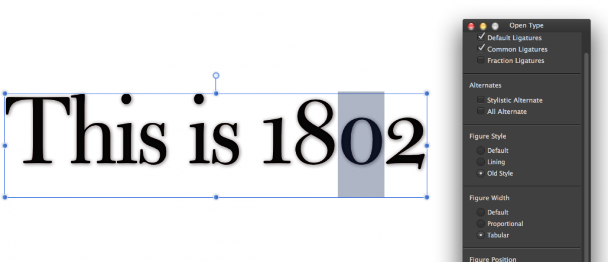
There are some very odd behaviours with the numerals. If I select all the text and choose Oldstyle proportional numerals, some of the numerals are lining. If I make one of the numerals tabular, all the numerals are Oldstyle. I have tried this with several fonts.

2018-08-3015-52-57.jpg.c7f39ea65ff9d0ce711f5174cd84bd99.jpg)