DuvLady
-
Posts
16 -
Joined
-
Last visited
-
 Pixelplucker reacted to a post in a topic:
Colors Appear on Import in swatch panel
Pixelplucker reacted to a post in a topic:
Colors Appear on Import in swatch panel
-
appaulmac reacted to a post in a topic:
Leading not working
-
DuvLady reacted to a post in a topic:
Leading not working
-
DuvLady reacted to a post in a topic:
How to make text background transparent without a white box?
-
Alfred reacted to a post in a topic:
How to make text background transparent without a white box?
-
 Ok thank you all for your many suggestions and reminders about correct verbiage, and rasterization. I am sorry if I was short. Time is of the essence some days. I may be a newbie to affinity but I am not a newbie to graphic design. Too many years to count. I know rasterizing type isn't good - it was just a method, like checking a car to find out what the problem was. The problem was not an effect, the problem I was having was the dratted white box behind my type that filled the type box. I finally figured out the problem. I had copied and pasted my web link from my email. For some reason maybe because it was a hyperlink, I am really not sure. It created a white box when pasted into affinity photo. When I created a fresh text box, there was no white box. So I simply retyped the wording in a fresh box. Easy-peasy. I have noticed a similar problem in affinity publisher when copying and pasting from email or text. It is not as easy as adobe with their many years of refining the programs. Hopefully, some of these little tiny weird issues will go away with future updates. There was absolutely no reason to copy and paste text from designer of publisher. Thank you all for trying to help me with this very strange issue. I appreciate it.
 -
No, I wasn't really worried about effect. It was just irritating that to get rid of white background in a simple text box, I had to apply the layer effect "multiply" - just seems such a simple thing. I know I must be doing something wrong. Or there is a setting somewhere for text in affinity photo that needs to be changes?
-
I simply typed it in using the text tool. I tried using both the affinity photo text frame tool and the artistic text tool with same results - white background box. Am use to this not being an issue in photoshop. so I'm not sure what I am doing wrong? the background on colors appears to be set to "none". I even tried rastering the text with same results. still have white background box.
-
I have tried a couple different ways in affinity photo. I can use "multiply" under layers panel to get transparency, but If I want to add an effect, it only applies the effect to the outer box. Have tried creating text with both frame text tool and artistic tool. still inner white box. Even though I go to swatches or color, it says there is "none". What am I missing? I'm sure it is something simple. Help!? Thank you in advance. file attached I was working on. linkedIn background 4.22.afphoto
-
DuvLady reacted to a post in a topic:
Font Auto Activation For Extensis Suitcase - Let's Make Extensis Take Notice!
-
MikeW reacted to a post in a topic:
Leading not working
-
Old Bruce reacted to a post in a topic:
Leading not working
-
DuvLady reacted to a post in a topic:
Leading not working
-
Leading not working
DuvLady replied to DuvLady's topic in Pre-V2 Archive of Affinity on Desktop Questions (macOS and Windows)
hopefully, Thomas you saw MEB figured it out. Some of us old indesign/quark users are just trying to figure the affinity publisher ins and outs. No reason to lash out. Thank you so much to all those who helped me out on this. It was truly frustrating. One more issue figured out. One day at a time. I truly try to figure things out on my own, before posting. -
Leading not working
DuvLady replied to DuvLady's topic in Pre-V2 Archive of Affinity on Desktop Questions (macOS and Windows)
Aaaaaahhhhh.... MEB - you have solved the puzzle!!!! Auto fixed issue. Now my leading is working again!!!!! Who would have guessed??? I have been fighting this in multiple documents, and finally thought to post on forum thank you thank you thank you!!!! -
DuvLady reacted to a post in a topic:
Leading not working
-
DuvLady changed their profile photo
-
Leading not working
DuvLady replied to DuvLady's topic in Pre-V2 Archive of Affinity on Desktop Questions (macOS and Windows)
I have checked everything I know to check. I have changed the text styles to none. Still no change on leading. It seems I can only use the over-ride on leading to change leading. Where is this 150% you mention. I don't see that. attaching new file that looks correct. just cannot change leading normally 4477 recruitment_7.afpub -
Leading not working
DuvLady replied to DuvLady's topic in Pre-V2 Archive of Affinity on Desktop Questions (macOS and Windows)
I was just randomly sticking numbers into leading to get it to change - and no matter what number I put in leading, it stays the same. the only fix is to use the leading over-ride. let me see if I can find this 150% in text styles. I haven't touched upon text styles yet as I'm still learning program. I will check that also. thank you for any help!!!!! -
Leading not working
DuvLady replied to DuvLady's topic in Pre-V2 Archive of Affinity on Desktop Questions (macOS and Windows)
Okay so in other words leading on affinity is useless. lol seriously? I've never seen this before. So, I use the "leading override" instead of leading. One more question then, where is the "auto" you speak of for leading override? I must be missing that somewhere. I'm an old bird - I come from quark, and now indesign for many years. This is the very stuff that scares me from quitting my adobe membership When leading doesn't change anything. No matter what number you insert. It just sits there. It shouldn't matter if there is a hard return or not. Thank you for all your help!!!!! -
The only way I can get leading to work is to use leading over-ride under "character" I have tried in "paragraph" and also in top menu. Nothing changes. Baseline grid is off. Any help would be most appreciated. 4477 recruitment_7.afpub
-
DuvLady reacted to a post in a topic:
Paragraph leading not working
-
DuvLady reacted to a post in a topic:
Paragraph leading not working
-
DuvLady reacted to a post in a topic:
Paragraph leading not working
-
Thank you ever so much Lagarto!!! That was an extremely good explanation and makes total sense to my brain
-
DuvLady reacted to a post in a topic:
Color Changes from Illustrator to Affinity Publisher
-
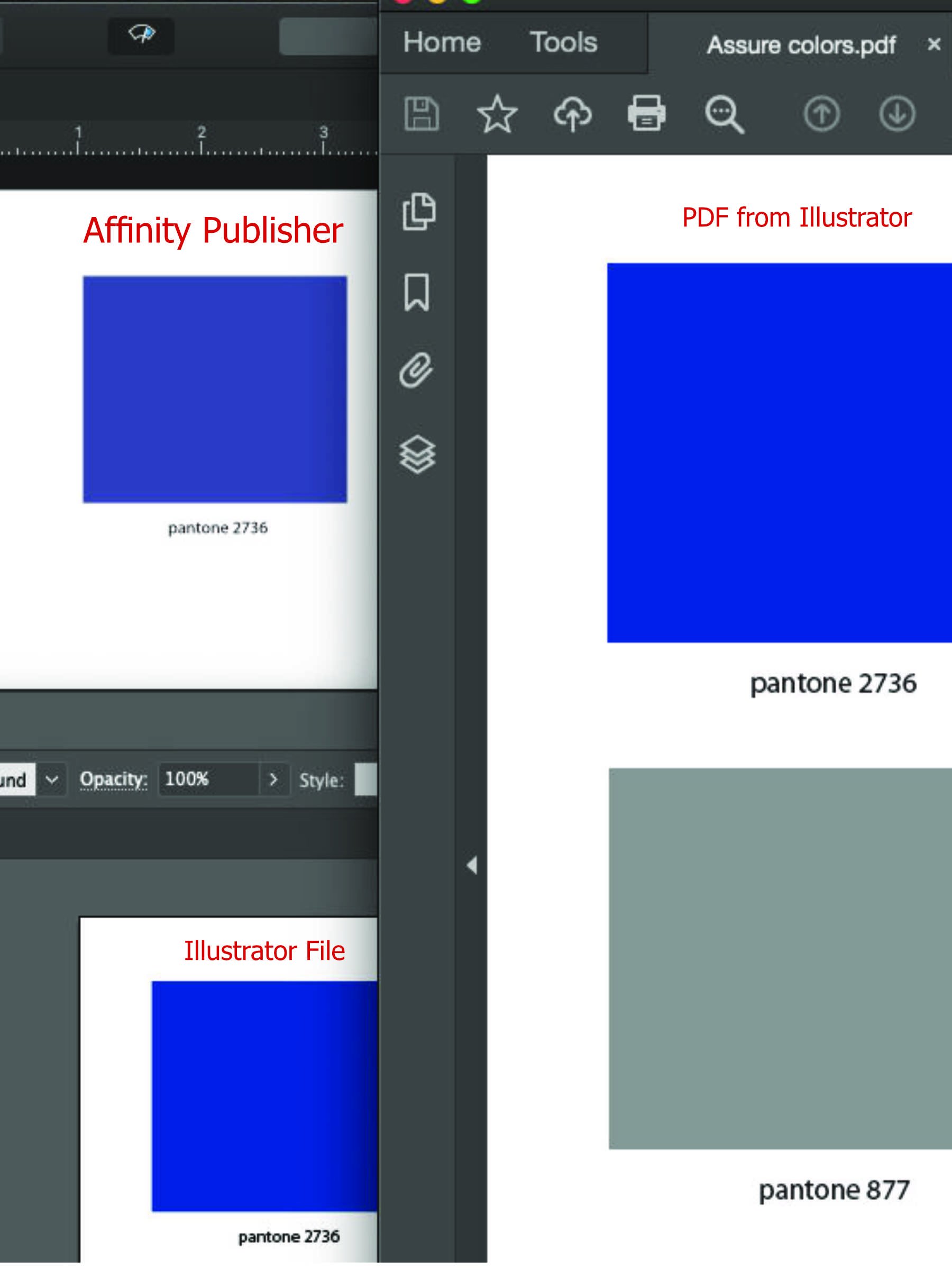
All programs were set to cmyk doc setup. The image attached is a color swatch from adobe illustrator - a spot color. You can see how much it changed opening it in affinity publisher. I've never experienced anything like this. Can anyone help? Right now, I still have all my adobe programs, but am hoping to switch over completely to affinity products. (I am a newbie to affinity) My clients would kill me if their color is printed incorrectly from files.

-
Colors Appear on Import in swatch panel
DuvLady replied to DuvLady's topic in Feedback for Affinity Designer V1 on Desktop
Thankyou! No - see that is the problem. The small dot is not there on the swatch. (after placing a pdf or ai file with spot color into affinity publisher - and - adding to document swatches) That is why I am wondering is it - or is it not an actual spot color. Everything I read says now I must take the swatch and create a global color and rename it as Pantone 111 or whatever number it is. I just don't like this guess work. I'm liking a LOT of things about affinity, but not the swatch handling of colors. Perhaps I have just had too many years of quark or indesign or illustrator. you drop in a Pantone logo - and you immediately see the correct spot colors pop up in your swatches. Makes it easy to continue working in the same color in your design. -
DuvLady reacted to a post in a topic:
[Affinity Designer] How to export a DXF file?
-
Colors Appear on Import in swatch panel
DuvLady replied to DuvLady's topic in Feedback for Affinity Designer V1 on Desktop
Thank you! That helps quite a bit . It still does not show as specific spot color - or I'm not seeing it. I do see the colors from the document added. When I make pdf from publisher and open in designer it shows it is the correct color. This just drives me a bit batty as a graphic designer wanting to make absolute certain I get the right Pantone/spot color to my printer. For instance, I just loaded a Pantone I had used as a gradient (from the Pantone to white). It had been created in illustrator. When I drop this file into publisher and add the colors to document (1 extra step) - now I have about 30 colors added, because it added every lil color from the gradient - so I am trying to find my 100% Pantone color. Do you feel my pain? Time is of the essence in our work. I actually ended up in this particular one with 8 pallets of the blue that looks like it might be 100% but I have to send to pdf and open in designer every time to check. -
 WKansepa reacted to a post in a topic:
Colors Appear on Import in swatch panel
WKansepa reacted to a post in a topic:
Colors Appear on Import in swatch panel
-
My Account -> register your app (timeout)
DuvLady replied to siapec's topic in V1 Bugs found on Windows
I'm on a Mac having same issue. How do you run as administrator?