Foomandoonian
-
Posts
41 -
Joined
-
Last visited
Everything posted by Foomandoonian
-

multi USS Enterprise, the original
Foomandoonian replied to Foomandoonian's topic in Share your work
Thank you all! -
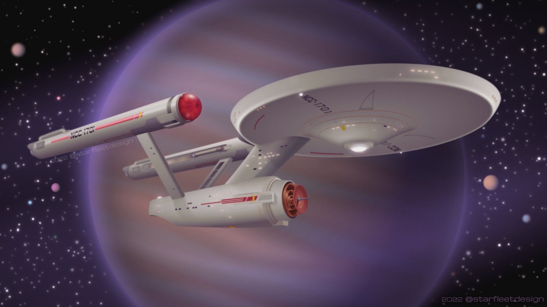
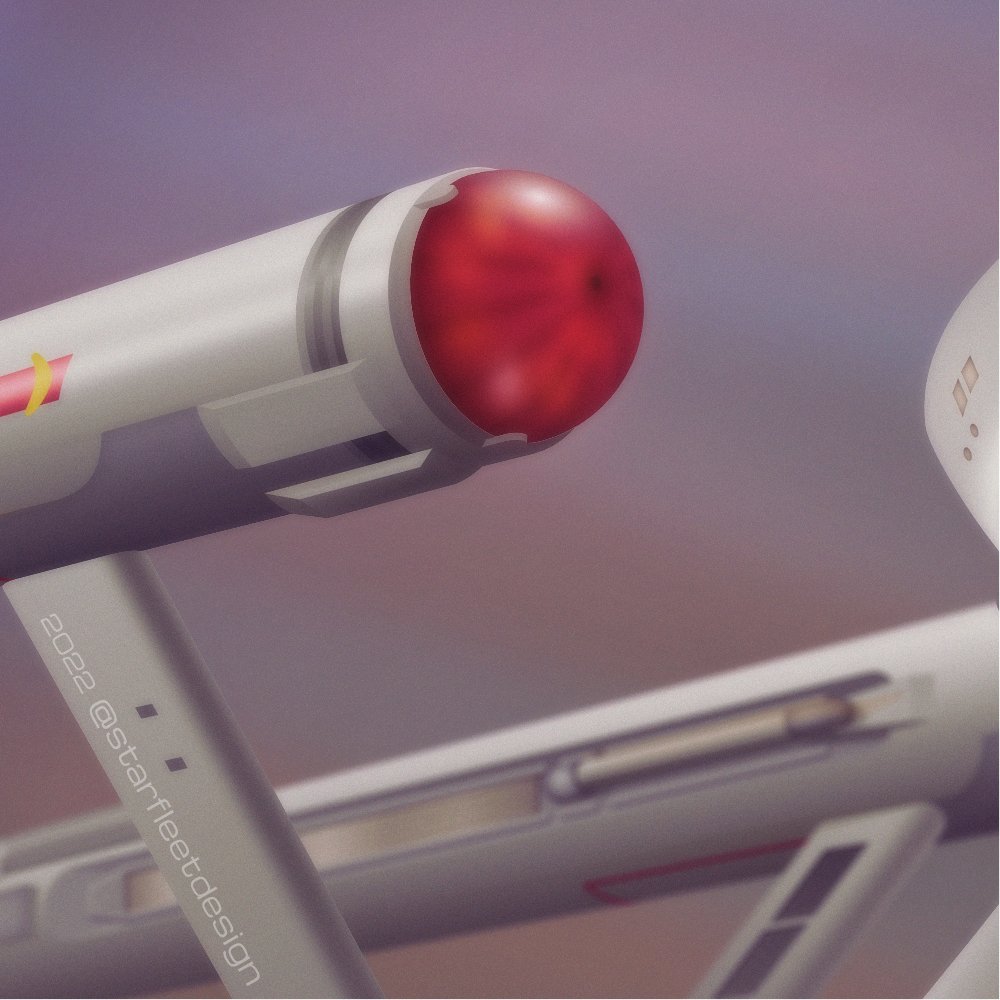
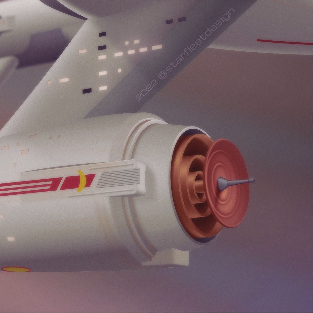
I've just finished what ended up being my most detailed Designer piece and thought it would be worth sharing here. Everything in this scene is vector, including the gas giant, with liberal use of blurs and other layer effects. While I could have completed this work purely in Designer, I opted instead to export various layers into Photos for final processing. Colours were adjusted, some subtle depth of field and grain added and a few other touches. If anyone is interested, I posted my work-in-progress on Twitter.

-
+1 from me too. Another feature I frankly just assumed would be there when I needed it. This is exactly the kind of omission that makes people say "well, I guess I just have to use Adobe Illustrator…"
- 61 replies
-
- 1
-

-
- brushes
- affinity designer
- (and 1 more)
-
If I just want to make a monochrome photograph, the B&W style is fantastic. But I have many uses where I want to quickly and destructively desaturate a layer. Maybe I'm creating a bespoke mask or building some kind of advanced selection or using it as a texture overlay or I don't even know what, I just know that I need to do it a lot and it annoys me every time. Let me ask you this: Do you use Layer > Invert* much? It even has a shortcut (cmd + I). Why not just use Layer > New Adjustment Layer > Invert (no shortcut), then Merge Down (cmd + E)? Because it's a faff. Invert is a common task that has been recognised and supported as such. Now maybe not enough people want to desaturate a layer as invert one, but I'm willing to bet that I'm far from alone. (* Yes, I recognise that Invert is probably given special treatment because it needs to operate on alpha channels, and those would already be greyscale by default. But that's not all inverting is for!)
-
I'm 1000% with @zynexis on this! The lack of a simple Filters > Colours > Desaturate* drives me nuts almost every time I use AP. I know there's an adjustment layer and other ways to accomplish this, but it feels like a workaround rather than the basic function it should be. Just because a task is simple to perform or can be accomplished with macros doesn't mean there shouldn't be a fast and intuitive way when the task is so common and is something new users would expect to be standard. * Or Layer > Desaturate alongside Invert, frankly.
-
Blending shapes
Foomandoonian replied to Phil_rose's topic in Feedback for Affinity Designer V1 on Desktop
Adding my +1 for this feature. Was disappointed just now to find that this didn't exist in AD. -
This is very much what I hoped already existed.
-
Cheers Ben. This is more or less how I am going to approach it, but it is a bit of a faff because I'm going to be using 4-5 different stroke widths for different road sizes. If I widen my background layer black strokes, suddenly ALL the strokes become the same width. I'm going to create my roads with inner and outer strokes as I want, and when I'm done duplicate them and turn off the black outer strokes on the top layers. That should be fairly manageable, if tedious, on big maps.
-
Cheers Mick. Yes indeed, it was my discovery of this and the inclusion of multiple stroke styles per line that got me thinking that maybe the kind of map I wanted to make would be possible. Thanks for all the tips in this thread everybody! I can definitely accomplish what I want with AD, it'll just take a bit of extra work.
-
I figured, so I didn't plan to use that technique. Does the erase method actually delete geometry if you export to a basic vector format? (I will experiment, but I'm guessing it probably will.)
-
Cheers garry! That's a clever approach.
-
Thank you telemax. It's a little more fidgety than I want -- ideally I just want one stroke per road -- but I think this is the kind of compromise solution I will have to use.
-
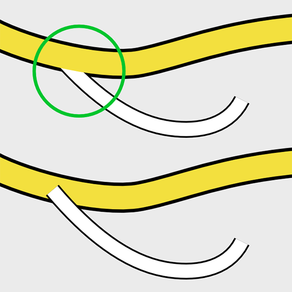
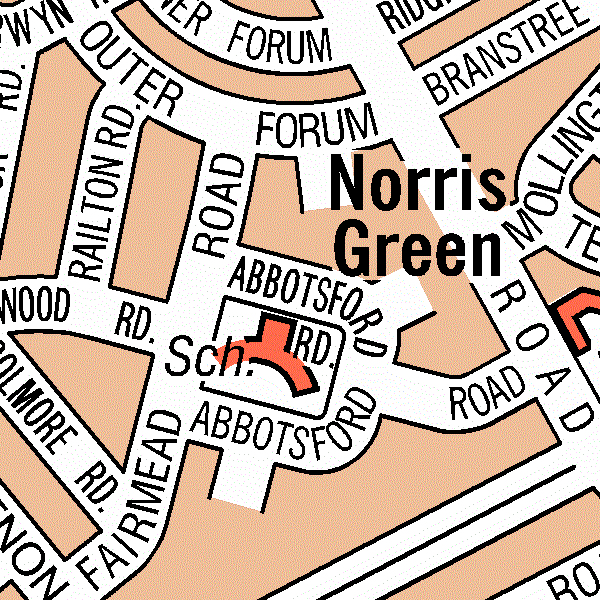
I have been attempting to create a city map and there are two specific looks I want to accomplish... 1. I want to be able to create junctions that look like this: (just the green circled bit) Specifically, note how these two road types have different colours and different outer strokes. I was able to achieve the look I wanted by duplicating my lines and putting the black strokes at the bottom with the coloured inner strokes on the top. While this works nicely, it will become a pain to manage large maps and any edits I make will also need to be manually copied and moved again. I don't know if there's an easy fix. I tried applying a new stroke to an entire group or layer expecting that it would create a new stroke around the outside of all of the strokes within, but instead it overwrote all of the individual stroke settings. I feel like this should have worked as I expected, and while it wouldn't be a clean solution for my needs, it is definitely something that could have helped. Another option I suppose is to have different classes of strokes editable in the appearance panel. For example, the topmost stroke could be considered the 'inner' stroke, and the bottommost the 'outer'. Then there would be some way to telling AD that a particular group should share the inner or outer stroke properties. I doubt this is very intuitive however. 2. I want my labels to knock out the black outlines, like so... I'm not sure if that's the right terminology, but you can see in the example how the black outlines on the roads and buildings are removed, but the fill colours remain. This would be accomplished by using either a stroke or a clipping shape. Maybe something like this is already possible? I know that the map above was probably created using specialist mapping software, but it would be a huge convenience in AD too. My thinking was that there could be a special 'erase' fill type that accepted parameters, so you could specify that those objects erased only content on specific layers, or in my case, the 'outline' stroke types. tl;dr: I'd like to create these specific effects with AD. I have some thoughts on how they could be implemented as features, but I'm very interested in people's ideas for how I could go about accomplishing them now. Thanks!
-
THANK YOU R-CR! ^ I am certain that there have been instances where my patterns have not rendered properly AND they exported the same display issue. BUT I can't seem to reproduce that now, even on older files in which the problem was really pronounced. Now at 100% they look perfect, and export with no issues. Hopefully now I'm aware of a few new things I'll be better able to manage any similar issues should they arise again. Its funny; with pixel art I'm acutely aware of the need to work in at multiples of 100%, but it never crossed my mind to try that here. Thank you for taking the time to help me. I really appreciate it.
-
Thank you gdenby! The precise clipping instantly fixed the fringes around the nested shapes. I also appreciate your tip about the stroke -- I may be able to use that in some places, but sadly it won't always be a solution for me. Do you know if Serif have announced any plans to work on the problem? I suspect (since I have seen the same issue in other software) that it is one of those issues that is surprisingly difficult to resolve. It seems like too obvious and significant of a bug to have not noticed or have deemed unimportant.
-
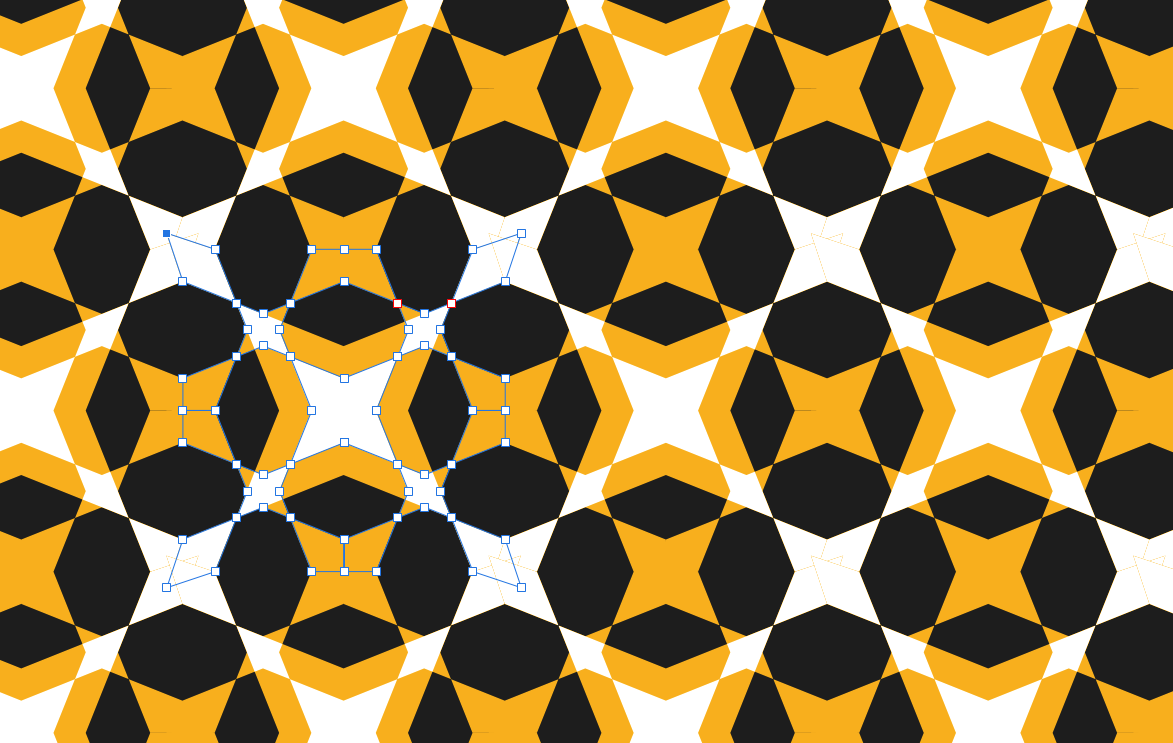
Another quick example from the same pattern, showing my 'hack' fix. Note you can also see overlapping borders that really shouldn't be apparent. Here I have an orange shape with a white shape inside. The white shape goes beyond the extents of the orange shape, yet an orange hairline fringe is still clearly visible.
-
This is something I have noticed in plenty of software over the years, but I'm posting here because I'm currently having this issue with Affinity Designer (desktop). See attached image at full resolution for an example. I am making a lot of tiled patterns that need to connect seamlessly. I create them with a grid and am careful to snap my points to the grid perfectly. The coordinates in the info panel confirm this. Yet my shapes do not always join and I can see the background between the hairline gaps that should not exist. Why does this happen and is there anything I can do to fix it? (I have been moving my points to ensure they overlap in the final product, but I consider this a hack; if I want to continue working on a pattern I then have to snap all of the points back into place manually.) Notes: As you can see in my attachment, sometimes the shapes DO connect seamlessly. There doesn't seem to be any reason why some places have the gap and others don't. This isn't a factor of zooming. I can zoom right out and still see the hairline gaps. This isn't just a AD display issue. I am exporting these as raster files and the gaps are still there in the finished product. Another side effect of this is when I Boolean join my shapes, they often don't add together nicely. This is actually really annoying.
-
Latecomer to this thread and just wanted to give my +1 for this necessary feature.
-
Stroke and rules styles
Foomandoonian replied to GeoffM33's topic in Feedback for Affinity Publisher V1 on Desktop
Thanks! That's not really achieving what I want however: It becomes a shape, not a border and I lose the ability to modify the corners. Good to know tho.
-
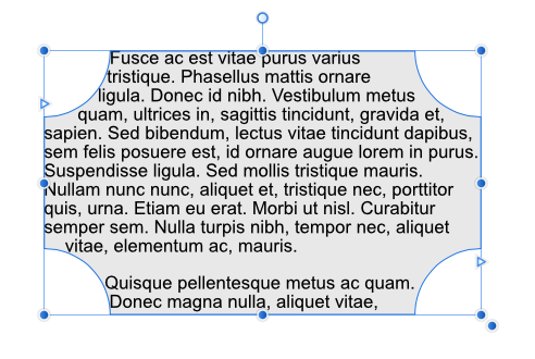
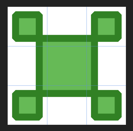
My apologies if this has already been suggested… For the kind of work I do, I would very much like the ability to create more elaborate boxes to decorate page elements. I'm thinking of something like how in ye-olde days of web design you would create a 3x3 table for a boxout and little images would go in the cells to represent the 4 corners, the 4 sides and the middle. This could be a vector version of that, with the 9-tile asset created in Designer. I know that this kind of result can be accomplished in Publisher right now without this feature, but it is a lot more fidgety to maintain, there is no way to make our results into a repeatable style that can simply be applied to a text frame, and the illusion is broken if you stretch or squash the boxes. This kind of solution would be a lot more flexible. if I have missed something that would help me produce these kinds of results, I'd love to hear about it. Cheers.
-
Stroke and rules styles
Foomandoonian replied to GeoffM33's topic in Feedback for Affinity Publisher V1 on Desktop
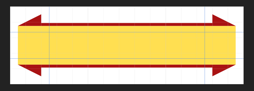
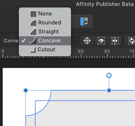
No, I wasn't talking about stroke corners. My fault for not being clear. When you insert a rectangle you have options to create rounded, angled, concave or cutout corners. IMO those same options should be available on (rectangular) text frames too.
-
Stroke and rules styles
Foomandoonian replied to GeoffM33's topic in Feedback for Affinity Publisher V1 on Desktop
We definitely need more stroke styles AND the ability to put corner styles onto text frames. I would also really want to see special corner styles for more elaborate flourishes that don't stretch and squash when you resize the box. -
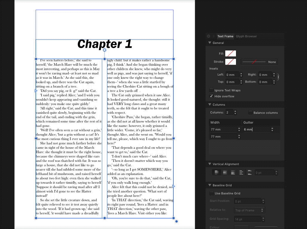
When you change the gutter size for columns inside a text frame, it increases or reduces the overall width of the text frame. I imagine that 99% of the time, the designer has a certain space for their text and when they fine tune the text formatting and gutters, they're not going to want the overall shape of their design to change. Instead I would expect the columns themselves to grow or shrink to accommodate the gutters.
-
No column Grid?
Foomandoonian replied to 3joern's topic in Feedback for Affinity Publisher V1 on Desktop
I was going to post a request for this exact thing, but I'll just add my voice here instead. A simple way to create column and row guides is a must. I actually spent quite a long time trying to find the settings because I assumed they simply had to be there already. I feel like the Text Frame settings (View > Studio > Text Frame) are also a bit buried given how important they are (as the only way to easily manage columns). The option to create a grid with basic margins/columns/gutters should be front and centre, probably presented when you create your new document. -
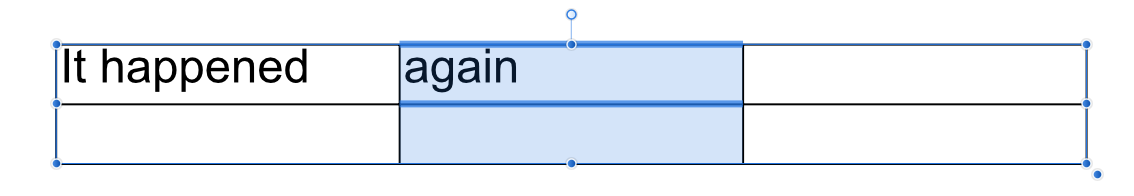
Couldn't activate table controls
Foomandoonian replied to Foomandoonian's topic in [ARCHIVE] Publisher beta on macOS threads
It happened again FYI. I can't think what it could be except that Publisher has had the document open for several hours. I've not been doing anything besides placing and moving elements and editing text.