filoplume
-
Posts
247 -
Joined
-
Last visited
Everything posted by filoplume
-
Hi, Is that the only way? In Photoshop Elements, there is a green checkbox to apply the crop. I thought there was an Apply button in AD at one point time, or maybe that is my imagination.
-
I also set the camera to take RAW pics too in addition to jpgs. There is a good tutorial on the Affinity website about RAW images and I also have some Udemy classes from SImon Foster and others. Affinity Revolution is good too and so is Peter Dam's website. And this Affinity forum!
-
Thanks OB. I do have a flash attachment for the older Panasonic Lumix that I use. Maybe change the bulb on the fly tying lamp to a regular bulb would help too, instead of the natural light one I use for tying flies.
-
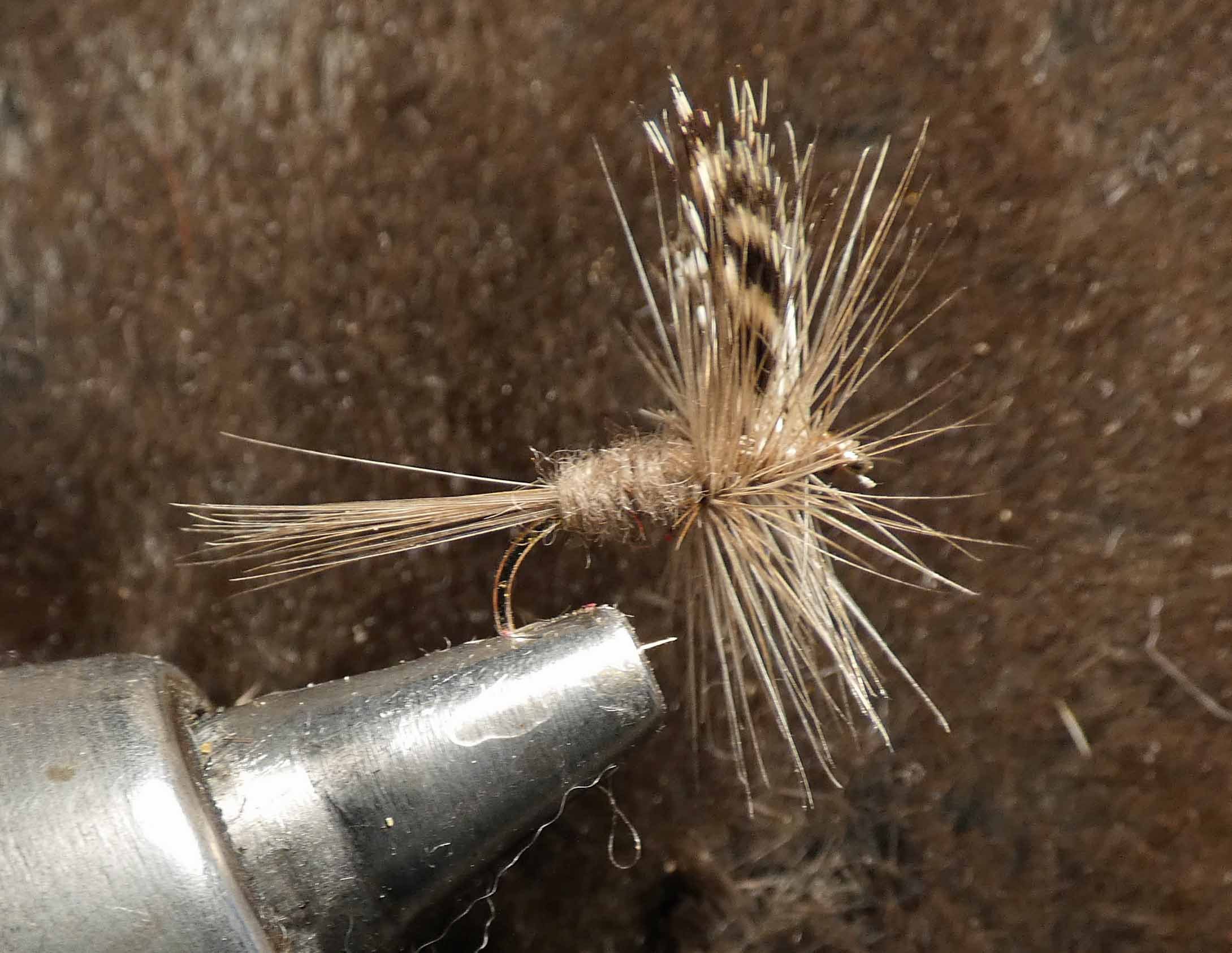
That colors are just about exact now! Good going! I learned a bunch from you all. Certainly will come in handy as I doubt I will get the white balance setting correctly all the time when taking photographs. Thanks again!
-
The "hackle" (the up and down feathers around the upright wing is actually a little tan, along with the wing, in real life. And the body is more gray but this adjustment looks good! Now I know what to do if I leave auto-white balance on in a camera. I am going to keep on trying adjustments. Thanks!

-
Hi! I applied some Vibrance adjustments and it is much better! I couldn't get Color Balance to make it look closer. 50DegreesCatskillFlyPatternVibranceAdj1.afphoto
-
Yes thomaso. In real life, the vice is steel gray like what the filter Lisbon used shows. I have some Ohotograhy-RAW stuff but not any NIK adjustments. The colors look a lot closer to what the fly and background actually looks like but the vice color is right on! White Balance adjustment isn't quite doing it so far. Probably because I am not doing it correctly or finding the correct blend mode. I will continue with your other adjustments now! Thanks!
-
HI I took this picture of a trout fly in my vice that I tied and it is supposed to be mostly gray. From the research I did, I think it was because I had auto-white balance set on my camera and also my fly tying lamp has a natural tint LED bulb. The background I used is a natural gray muskrat pelt and it is gray for sure.
-
That is what I had to do! Deactivate and then reactivate the font. I had CC open so maybe that helped. Now I see the fonts in Designer (and MS Word). Thanks guys!
-
Never mind. I think I remember trying to do this a while ago and I think the answer was that activated Adobe fonts can only be used in Creative Cloud apps. But, they are not even showing up in the CC software interface. I will try and find a similar font that I can install on my computer and use.
-
Hi, I activated the Vectora fonts from the Adobe website, but I do not see them in Affinity Designer. Is this possible? Thanks
-
$10? What the heck! It sure is worth a try, Any way, it seems fun to me! Now I have to practice my writing a little bit, especially in their grid. Thanks. I am also going to try calligraphr.com and the other suggestions here. Thanks so much! If things turn out acceptable, I may post a sample image here.
-
It was something I read in the docs for some brushes and styles for Designer and Photo. I will try and find what he wrote. I just tried adding the base AD styles to a font and they looked fine. Not sure what I am remembering. Thanks Walt!
-
Thank you. I forgot about that but I did remember that adding effects to text does not work well. I am so glad that Affinity-Serif keeps making improvements to their incredible suite!
-
Thanks everyone! Good stuff. Maybe if it turns out, I will post an alphabet 🙂 I do have some add-ons by Ian Barnard but it wouldn't be my handwriting. I would also like to do something simple with black (or colored) letters with a shadow of some sort. That is what made me think of using my own handwriting. I taught myself architectural lettering like architect's daughter but in the process I discovered that the writing really isn't that neat and orderly after all hehe. I don't like the bars in an A and others extending past the rest of the letter, ...
-
Hi! Just thought of this. Don't ask me why 🙂 I have a Wacom tablet and a color scanner. I guess they would be brushes? Or fonts I guess would be the right answer. How could I make them good enough so I can use them legibly in something? Thank!
-
How about that! I do have Affinity Photo. To steal your line: "Due to the fact that Joe Biden is now our President, the lack of a pulse or brain waves will never be worried about ever again."
-
Thank you. Works great.
-
How would I insert content into the picture page? Can I duplicate that picture frame then? How do I make sure that they all are the same size? Thanks!
-
Thank you Bruce. Good suggestion as I want to use Publisher any way. Didn't think of using a Picture Frame instead of Place.
-
Thank you Alfred. Both width and height, right? If so, I might as well type them in.
-
Hi, Without having to painstakingly type in the dimensions in the transform panel for each object? What if I wanted to have alphabetical letters, say B-Z, be the same size as "A"? Just an exaggeration, but not by much! I am using Place to line up rope letters (that I bought) one after another. They came in .png format. -pw
-
Hi Walt, This is why I asked a stupid question and asking if I had to use the view menu to rotate the image over and over again: Geesh, can't I just post a link and not the video?
-
Yes, that is all I need! Thank you!
-
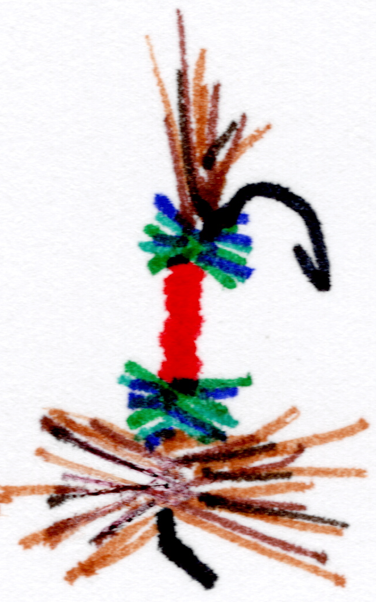
Hi Walt, I would like this image I sketched horizontal. I would also like to resize it to make it larger. Right now the fly is facing the wrong way. Hard to hook fish like it is now 🙂 I don't know what uploaded. It is taking forever to upload a couple of small files. Maybe the png file made it. I doubt the APhoto file did. Thanks

.jpg.e00df65095fb06f05eb2bb5c7759ba43.jpg)