Waveluke
-
Posts
12 -
Joined
-
Last visited
Everything posted by Waveluke
-
Sounds like a tough situation, only having limited windows of time given weather and the city employee pressuring you further. Kind of curious why you tried to composite in in focus shots of the cell tower you shot through, given that it wasn't part of the subject, the cityscape. In my opinion, ghosts from out of focus foreground junk elements aren't as distracting as trying to add them back in. Also, the halos I was referring to was the halos from brightening the land relative to the sky with hdr software or shadows/ highlights, rather than an edge fitting mask, visible in the crop you put in the original post, and more prominent elsewhere in the pano.
-
Nice. That takes a lot of commitment in both shooting and editing. Did you have an automated pano/camera control rig? What were you using for the raw processing stage? The noise reduction looks a little excessive, along with the HDR tone mapping effect with all the halos. Maybe next time you can do the tonemapping manually with creating a mask of bright areas of sky and bringing them down in brightness then adding contrast globally? Really easy to do in Affinity Photo with auto-refine selection. Of course, the fact that you got such a massive undertaking done is an achievement all unto it's own.
-
So cool.
-
Different raw editors have different default looks for interpreting raw data. Looks like Capture one adds a default tone curve, whilst the Affinity Photo Raw editor does not, or is more subtle. Raw files start out as linear, undemosaiced images that look like this, a checkerboard of red, green and blue pixels from optical color filtration and raw capture on the original image sensor, also would look really dark since in linear color space, so pretty green, and pretty useless (zoom in to see checkerboard pattern) Next we have an example of a neutral raw processor render of the image, the checkerboard pattern has been remove, it's in the proper colorspace, but, depending on the raw editor, a 'neutral' edit can look pretty flat or dark, but not as weird as an undebayered image. Some raw editors add a base contrast curve to make it look more contrasty, but here is an example processed with Rawtherapee (Free and Open source Raw editor, check it out here: http://rawtherapee.com/), that can get pretty close to "true" neutral. Still going to be background interpretations going on, in terms of gamma, and black point rendering, but still looks pretty flat. Now for the final image, showing some basic contrast curves, sharpening, noise reduction, and slight white balance adjustments to get a more contrasty look, all done in Rawtherapee: Bottom line is, there is a lot of subjectivity to what is 'correct', so the default image out of a raw editor is a starting point, and it is up to you to use the tools in the raw editor to get to the image you are looking for, and when you have the general look you want, you can then save as jpeg and call it good, or then save as tiff and import to Affinity Photo if raw processing in a third party editor, or continue editing in Affinity Photo after hitting the develop button in the develop button in the develop persona, to do more "photoshopy" things to the image. Generally, I'd suggest you edit raws in Capture One instead of Affinity Photo, and export to Affinity Photo if you want to make "photoshoppy" tweaks, as the debayering algorithms used to process raw images are much more refined in programs like Capture One and Rawtherapee than in Affinity Photo. Also, be sure to save adding contrast last, so that you don't lose detail in shadows and highlights in the middle of your workflow, IE export a flat looking tiff if doing further work on a photo, do the detail work in Affinity Photo, then add contrast using levels, curves and/or LUTs at the very end through topmost adjustment layers.

-
Affinity Photo part at 4:10, specifically using it for a feature Photoshop doesn't have, synched multi-layer cloning, and video has nearly 5 million views. Pretty cool if you ask me.
-
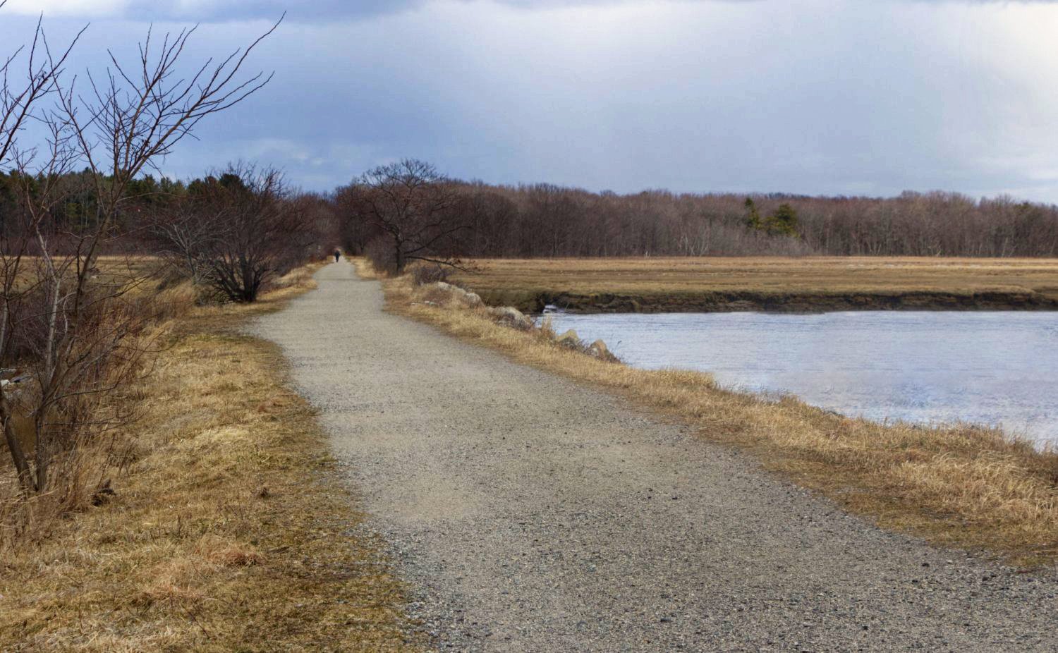
affinity photo Saltmarsh in Autumn
Waveluke replied to Richard Fillebrown's topic in Share your work
Why do sky replacement, when you can just add a bit of contrast to the original sky? Would look a bit better if I was working with the original raw, but here is a 'slightly artifacty' edit as a proof of concept. Also did some adjustments for enhanced detail using an inverted version blurred with noise reduction.
-
Woah, that's cool.
-
That's actually a good tip, forgot about the recent G'mic 8bf conversion, will have to give that a go. I do need to use an Imagemagick command anyway, as the uncompressed tiff out of Imagemagick works better with the raw data import in Audacity than the Affinity Photo uncompressed tiff.
-
Doesn't look like I can edit my post...
-
Doesn't seem to like getting played back by browsers, but in a lot of different social media, loading works fine. Kind of a shame, as h.265 is much more efficient. I'll try the other h.264 file for it, though bigger.
-
Is this forum supposed to be able to handle h.265 media?
-
I found a random waveform hand drawn on the internet, downloaded it, cleaned it up in Affinity Photo, and actually sonified it, by using the photo as a mask for a rainbow gradient. Then used an imagemagick command to convert to hsl colorspace and resize to one pixel high, and voila, the hue channel level value matches perfectly to the height of the waveform, and you can then use it to get actual sound when importing to Audacity as raw data. Timelapse video with final result heard at end: small2.mp4