Kingwhistle
-
Posts
26 -
Joined
-
Last visited
Everything posted by Kingwhistle
-
Vector brush names
Kingwhistle replied to Alex A.'s topic in Feedback for Affinity Designer V1 on Desktop
AGREE!!! Brush organization is really not very good! The app should highlight the chosen brush in the brush panel when the curve is selected AND the name of the brush should display at the top when selected. This is causing me such SLOW DOWN in creation time. The Brush panel should FOLLOW (highlight) (link to) the selection on the canvas (should be able to turn on/off "follow selection" in preferences !!!) -
Brilliant! and btw, I love your art! the mix of nature, fantasy and grungy elements, all very cool.
-
Yes, very helpful! Thanks for all the help. Good Luck in 2022!
-
a little off topic; Would you recommend any YouTube tutorial specifically on brush use in AP ? Or better yet, what is your take on: -should I create a category for my fave brushes? -shortcuts for switching between brushes? -can fave brushes be preloaded with different color/size settings so I can switch between them quickly?
-
Thank you. I very often am augmenting and refining my images in AP and AD, they either start as analog drawings or photographs. I haven't yet created any art "in the box". I would like to be able to do a better job of: -smoothing out and repairing jagged digitization (sometimes I work with images which are already digitized). bad captures are the worst. -recreating pencil-paper smudge and smears. -layers of pencil strokes (5 or 6 strokes which add up to a line, or 10 -15 strokes with the side of the tip which add up to shading) -stipple effect, and also stipple effect with G. Blur over top I think these brushes will help! Thank you.
-
OMG I am in love with ProjectBrush 03-Big-T V2 Wow! Finally! This is a milestone moment for me of finding ways to humanize my results in AP Thanks again!
-
Thank you all SO much. I will play around with these and see what I can do.
-
Is it possible to create a brush which paints dots? size and frequency +/- depending on pen pressure??

-
Thank you Libre and Alfred!!
-
Thanks GarryP. Your time would have been better spent elsewhere.
-
The font is called Staudel Xenotype J ,similar to Roberta, but not the same thing. It's for a specific project where I must match exactly. I could not find it,,, anyone?
-
@Chris26 I understand. My response was meant to be playful, I apologize that it came off otherwise. I have searched for anything in Photoshop tutes as well, but nothing like what I am trying to learn how to do. @firstdefence Thank you, yes, I think I see where you are headed. Using the filtered down image as a "map" of where to spray paint? @Fixx I think that's a good idea, as the end product I am talking about is usually done with an airbrush!
-
I appreciate it, but I know how to do a google search haha! Seriously though, I was hoping for someone who could show or explain a process for getting to a spray paint portrait as I posted above, not just how to make a spray painted stencil, do you know what I mean? The quality of the hand sprayed portrait is quite unique looking to me. There is certainly a limitation of color palette, and highlighting which all uses the same spray can. I can see that much, but I'm not sure how to filter a photograph portrait so that it limits down to perhaps only 12 colors. That might be a good starting point, and then grab spray brushes and work it. What do you think?
-
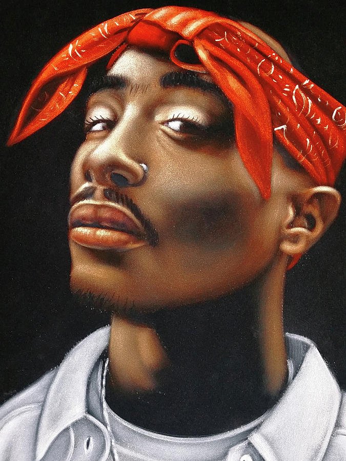
I can't find a tutorial anywhere. I would like to know how to create a spray painted portrait from a photo in AP. The exact style of finished product is often seen on T-Shirts, occasionally on walls. If there is no tutorial, then just some hints on the process. I hope to end up with something like the attached image of Tupac
-
OMG, thank you! So very newbie of me, even though I've been using AD and AP for a couple years now. Thank you again!
-
Great! I know it's a bit extreme, but I wish there was a way to make a gradient that gave a choice on exactly how it transitions. A way to customize the "curve" from A to B instead of strictly linear. I know that we can choose the midpoint of the curve, but having two "midpoints" would give the possibility of transitions which are "S" shaped as well.
-
Thank you. Yes, blend modes! Thank you !
-
I hope someone can point the way for me I can't find an answer in forum. I have several circles. Each circle has a color which fades (gradient) radially to transparent. These represent light sources. I want to place these circles overlapping slightly AND have the color blend/multiply appropriately as they stack up. BUT, this is not occurring. Instead Any help or examples would be appreciated.
-
OMG, please please bring out your DAM software. I do not trust Adobe with regard to the future of LR Classic. My experience with LR has been extremely buggy with it's connection to my online galleries and sharable "collections". It doesn't connect 99% of the time. I need a DAM that I can manage client shot approvals (with notes and favorites) quickly and easily, and on the phone. No big deal right? Just whip out that software? Please help me dump Adobe.
-
I understand. I try to do all of my noise reduction in the "developing" stage when it is still raw format.
-
Thank you Leigh and Fixx, So, it seems that if I want to preserve every little bit my images in layers, I should avoid rasterizing layers. I have rasterized layers (images) in the past, and not realizing that I was set to 96 dpi, the image became degraded, but I didn't notice until later when zoomed in. Previously, I was only rasterizing to make the box and handles more manageable on a cropped image. But now, I work in 300 dpi, and I will avoid the raster and just deal with the less convenient box/handle placement. Does this reflect the way any of you are working? Thank you.
-
Sorry to bump, but maybe I was not making a clear question. Exactly how does raterise work on a pixel layer after cropping that layer? Does the DPI setting matter to rasterising?
-
Hello, After cropping a layer which contains an image (pixels not vector), I have been "rasterising" that layer, so that the bounding box resets. This works well for me, but I have a question: Does rasterising an image (which is only pixels) change the quality of the image? Does it change the pixels which were available to edit before rasterising? I work at 300 dpi, and have not noticed any change. But, I don't really understand what is being done to the image when I rasterise. It is not a vector, soooo....?
-
Thank you Chris !
-
Hi , I'm new to AP. Right now, I am doing many many touch-ups on product shots, very zoomed in. Needing to remove dust and fibers. Huge pain in the rump. I miss the "remove dust and scratches" filter from PS, but I am trying to learn AP !!!! So, I had been doing most of my touch up with the stamp tool, when thought to try the Paint Mixer Brush. It's brilliant, but I can't find any tutorial on it anywhere. Or even examples of how it works. So , I have just been guessing. Can someone make a tutorial please ? --I guess that you pick your color by alt+click ?? Then paint away.... --auto-load occurs every time you click ? --hardness is for the definition of the edges of the stroke ? --flow is how fast it runs out of the color ? --Should I set blend modes ? --what happens to the blend modes if I don't ? --favorite uses ? Thanks so much. Are there any plug-ins which would make fiber and dust removal faster ??????
- 1 reply
-
- 4
-