

User_783649
-
Posts
228 -
Joined
Posts posted by User_783649
-
-
23 hours ago, jmwellborn said:
Typeface is a joy to work with.
Fully agree. Wonderful app. A perfect blend of pleasant user experience, nice features and great performance. The man behind this app is a very passionate developer and type lover. Thank you very much, @Floor, for your truly incredible work on Typeface.
- jmwellborn, Boldlinedesign and Floor
-
 2
2
-
 1
1
-
42 minutes ago, Patrick Connor said:
Also, where's the poster? Could do with a giggle
Are we talking about these little guys? I've heard they're on the road!

- Patrick Connor and moi.cool
-
2
-
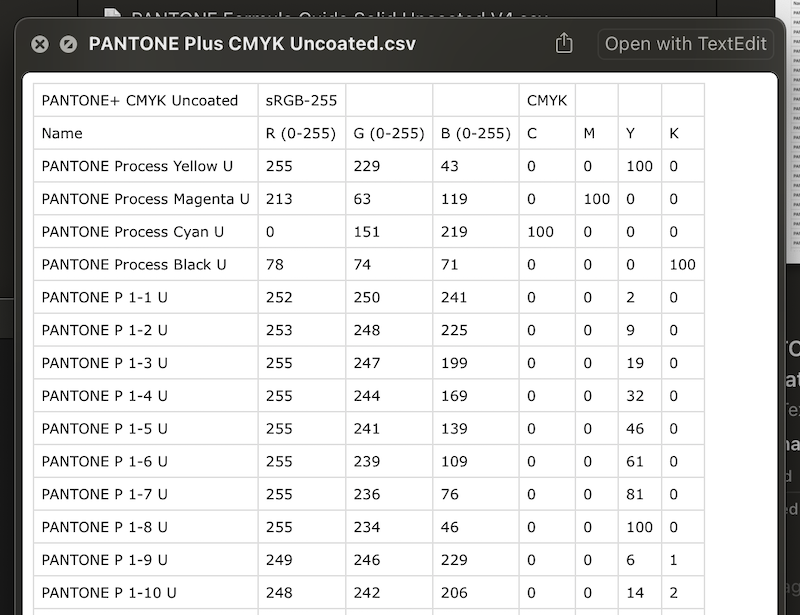
@lacerto Great finding! You're absolutely correct. Seems like all Pantone values in Affinity apps are "hard-coded" to sRGB color space. Which is totally wrong in my opinion. I take a look at Contents/Resources/Pantones folder of my macOS Affinity Publisher. There are .CSV files with all Pantones listed.
-
@icetype Please, excuse my curiosity, but what is the purpose of making a PDF with 16bit grayscale image data?
-
1 hour ago, euronesia said:
They are 22" monitors
Are they both 4K monitors? Please post a screenshot of About This Mac – System Report – Graphics/Displays.
-
20 minutes ago, Aaron Martin said:
i'd think they could not only catch up, but be ahead if they have some sort of true live collaboration functionalities. prototyping functions could be added overtime.
Agree, Aaron. To beat the others in UI/UX field, Serif needs to implement three key things:
- A really fast, low latency multi-player editing mode with state-of-the-art built-in conflict resolving so file damage will never happen whatever everyone does. Existing incremental file saving model may be super beneficial here in order to reduce network overhead.
- Symbols should be taken to the next level. They should evolve into powerful interactive components with multiple states support and proper encapsulation (nesting).
- There’s also a need for powerful prototyping tools with optional, customizable animations/micro-interactions.
All the rest and truly great stuff is already here (think about existing StudioLink, very powerful text editing and image editing abilities and other useful stuff).
- pcote and Aaron Martin
-
2
-
Another and possibly more simple way of doing this is visually analyzing both images before making any adjustments.
Let's look at your first image. The sky area is clearly the brightest part of the image and is clearly separated from the rest. The second image is overall dark and horizon line is clearly visible.
We may try to utilize Multiply blending mode here so light area of the first image will be merged with dark area of the second image in the same spot. And by adding a simple gradient fill to the mask we may tell where we want it all to stop.
After all we may get something like this (and hey, we haven't even touched those selections yet):
-
18 minutes ago, cosmickid said:
i'm guessing nothing will happen with this
Until everyone will finally learn that using any kind of cloud synced folders for storing current project files during working with them is a very bad practice and should be avoided.
It may lead to all sorts of syncing errors and unwanted partial fragmentation that might occur when one app is using incremental saving method and cloud service is uploading file by parts at the same time.
It’s always better to temporarily pause syncing while you work on the files and then just turn it back on once you’re done for today.
That should save you from most kinds of possible file damage. -
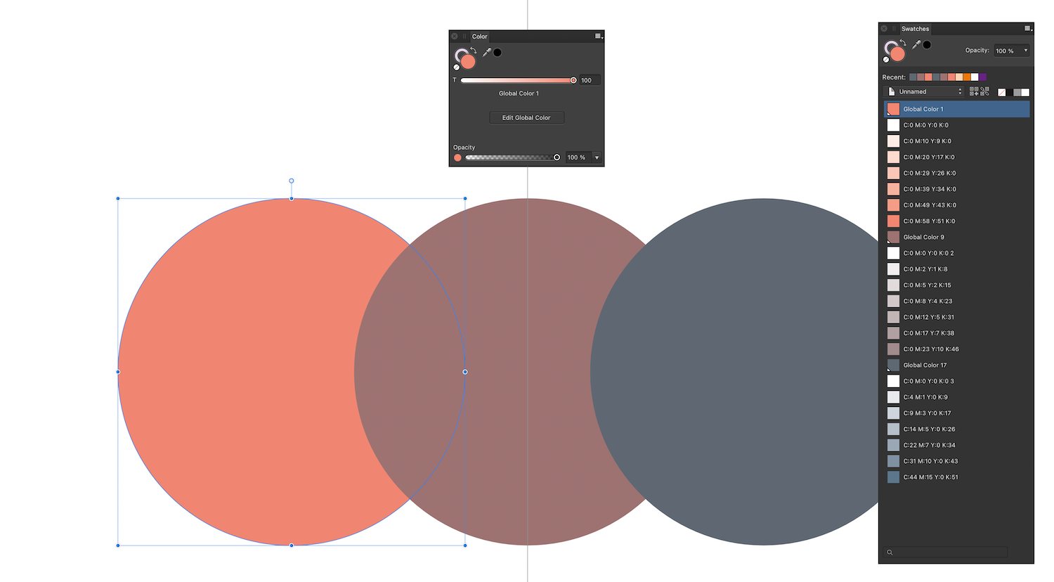
@lacerto And what if you try to add tint chord from Swatches panel? Try selecting newly created color swatch in Swatches panel and then create tint chord (via the same icon at the top of the panel or by right clicking the swatch). In your video I noticed that you always creating tint chords from Color panel. Try Swatches panel this time.
-
@lacerto Seems like I found the way to keep the desired color mode for tint chords — we need to explicitly (re)set the color picker mode when choosing the color. Please see the video attached.
-
5 minutes ago, lacerto said:
I wonder if this could be an OS version or chip related issue.
I'm on Monterey 12.6 as well, just on Intel based iMac. Latest Publisher 1.10.5. As far as I know, NotMyFault is using M1 machine so we can quite rule this chip related thing out as both of you are on M1 machines.
-
1 hour ago, lacerto said:
The tints are simply just always RGBs on macOS
That's not the behaviour I'm seeing on my macOS machine. So I'm with @NotMyFault here. No problems with adding tint chords in CMYK colors.
The only difference I noticed is that if I'm adding color chord straight from Color panel — in that case chords added as RGB colors. And if I create a swatch first (global or not) and create a color chord from it (in Swatches panel) — then it will honor its color mode and create proper CMYK chords.
-
21 minutes ago, Fritz_H said:
..but there are still those 90% who had to wait very long for e.g. HW-acceleration.. which still often causes issues ...
or are still waiting for support of variable fonts.. etc.I have truly big hopes for these to be solved in v2. Along with other new cool features, fixes and enhancements.
-
It’s really great to see Affinity apps gaining more and more recognition from Apple in their product launch marketing content.
-
@Nightjar Just create a document with canvas width equal to the widest image in your set. Then drag and drop all the images to the canvas. Then set up your slices once in Export persona. Note, in Export persona there's Layers panel and Slices panel. Once you've set your slices just toggle layers one by one and click Export slices.
Here's a video for you:
-
25 minutes ago, Twolane said:
This entire thread and the like will be redundant when V2 lands.
Or... it may be continued further so everyone here can predict company death and development stagnation until v3 lands 🙂
-
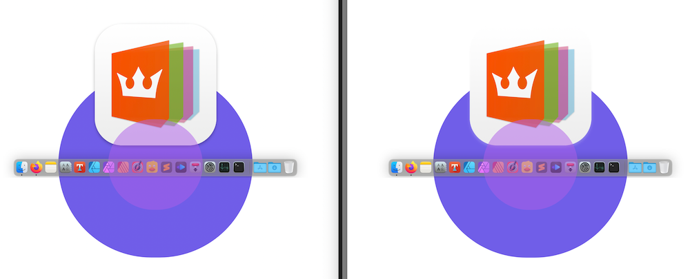
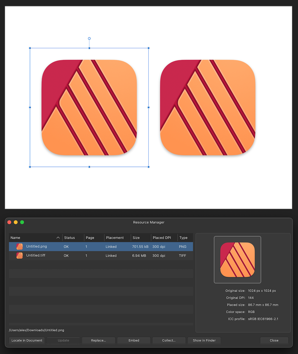
Now, the most interesting part. I made another file containing another PNG image and couple of transparent shapes. I also placed Bryan's PNG image there. Turns out everything exports just fine using default Print preset. The only thing that fails is Bryan's PNG icon.
-
@Bryan Rieger Actually X-1a doesn't look like a solution because according to specs transparency will be flattened (baked in). Once you will want to edit it you'll get the following:
-
15 minutes ago, thomaso said:
it is strange that PDF/X-4 (attached above) exports the shadow correctly
Why it is strange? PDF/X4 is based on PDF 1.6 according to specs and fully supports live transparency. PDF/X-1a is based on PDF 1.4 which supports transparency, but according to X-1a specs all transparency needs to be flattened.
-
-
A possible solution would be using AD artboards. You can place different versions of your images on separated artboards in your external AD document. Then in APub you can place this document and choose which artboard do you want to display for this particular instance of placed document. You can have as many instances as you want. And good thing is that changing one instance’s state has no effect on others.
Benefits: you keep all the editing process in a separate source AD document utilizing AP if needed. And in APub you focus on layout. Seems to be very close to your Adobe workflow.
-
Just now, Pikay said:
1. Before resizing 39.2 %, after resizing 117.6%
2. 3440x1440
3. 100%
Try pressing Ctrl+1 to set zoom level to 100%. Is image better now?
One thing that Affinity Photo does really bad is that it distorts image roughly on any intermediate odd zoom levels between 100% and 200%.
Try to avoid values like 117.6%.
-
@Pikay Couple of questions to clarify things.
1. In Affinity Photo toolbar what zoom level do you see next to filename after you resize your image?
2. What is the resolution of your monitor?
3. And if you're on Windows – what UI scaling percentage you have in system settings? If you're on a Mac – what scaled resolution do you have set in System Preferences?
-
6 minutes ago, NotMyFault said:
you again see that documents in RGB/16 only use 8 bit color depth rendered to the display
Fully confirms my findings as well, thank you very much. I believe that needs to be logged as potential area for improvement for future releases.


Alfa Romeo P3, 1934
in Share your work
Posted
The level of details is truly remarkable! I mean, even those subtle dust particles... Metal texture, lighting...You are the true God of Vectors, @VectorVonDoom. Thank you very much for sharing with us. Can't wait for seeing more teasers from this. Wishing you the very best with current and all your future projects!