justwilliam
-
Posts
189 -
Joined
-
Last visited
Everything posted by justwilliam
-

No Request, just News!!!
justwilliam replied to Broicher's topic in Older Feedback & Suggestion Posts
Any link to that review? -
eejits (George), Aside from the happy pleasure which I take in seeing such a well done image, such as this very one, I also try my best to 'take' something that will help me in what I attempt to create (or at least to 'borrow' it). Please, do not take the following statement the 'wrong' way. The shadows, clouds, blade-less grass, and the very forms of the windows which you have so 'playfully' created all have helped me to see that I need to try to 'lighten up' and stop trying to force all that I do to be' proper', 'natural', or 'realistic'; I mean this in the very best way possible. I was absolutely delighted by your elliptical shadows and those cute 'curley-Qs' in the clouds actually brought a big smile to my face. Were I to have even attempted a comparable illustration, I undoubtably would have been hunched over fiddling around trying to pop in some bits of grass blade here and there or making a conscious and serious effort to keep in mind my light 'source' as I toiled with the shadows. Silly me. I now think that I need to schedule a bit of time to just work on something for fun and play around a bit more. Thanks eejits for posting this and the other wonderful work you do - for our enjoyment and my education! :)
-
ronnyb ! Are you saying that you do not perform a Save As pretty much the moment that you have started a new document!?! Oh my! I suppose some folk like to take risks and live on the edge...
-
North Sea Coast Shooting - Frequency Separation Extreme
justwilliam replied to Broicher's topic in Share your work
Ok, this 'wedge filter' is a new one on me; but I would like to know about the process - perhaps it could be a new tool for my toolbox. But I didn't really grasp the technique; could you explain a bit more (or maybe make a video)? The lingerie photo looked as if you had done some dodging and burning; was that the case, or was it an effect of this 'wedge tool'/ retouch-layering process? -
After a quick look I am undecided whether or not I like the football background to the blue circle behind the text 'East Tuczępy community sports club' - however, I really like how you have placed the appropriate ball for each depicted sport as a backdrop behind the three coloured (red, white, blue) sections. That I like very much and I think it was quite clever. I, too, would like to know how you do in the competition and hope the best for you.
-
Do you shoot Canon? If so, the CD that came with it has software to allow tethering. If you already have Aperture, you also have tethering capabilities for a large number of cameras.
-
affinity designer My First 'Real' Project
justwilliam replied to justwilliam's topic in Share your work
Peter, I tried, repeatedly, to put a bit more colour and definition in her eyes and hair - I failed. And there really was not so much detail there waiting to come out as this is an actual clock and I was trying my best to mirror, or at least 'echo' that object. The female figure has a finish almost like white gold (but it is not 'real' gold) I, too, liked that font; it is the first font which I have downloaded and installed - it was also free! jmac, I conceived the frame and background to have a sort of a period 'postcard' feel. My grandmother's house had last been decorated in an art deco type of style (wallpaper, furnishings,pictures, and knick-knacks, etc.) so I have always felt 'comfortable' with art of that period (although I think nouveau is truly my favourite 'style'). I just gave the black background a gradient so the black clock had at least a fighting chance of appearing separate from it (with very limited success) and the 'golden' border was meant to look like 'paper-making-an-attempt-to-appear-to-be-gold', if you follow that. The border was meant to be a 'border' and not a major element of the whole so hopefully it worked as such. I'm pleased that you liked it. As I mentioned in my original post, this began as an activity for me to become accustomed to Affinity and some of its tools; that it turned out to be anything even slightly more than an exercise in futility amazed even me. I was stunned at the amount of detail which I somehow did manage to get into her face (such that it is) - a simple 'smiley face' is more my speed. BTW the hands and feet were also such a nightmare that they almost concluded my effort. When attempting them I felt like the silly old man who cannot draw that I am. Buy, hey, no one knows how to draw (or paint, or cook, or play the violin, or..) before they begin - and this 'beginning' was fun and cost nothing but a bit of time. I do plan to continue and I do hope to improve. Between all of the videos that are available and the kind people on this forum I think I will. -
Thanks again, MEB! Tried it and it worked; I did have to go in and try to make some adjustments (not completely successfully) to blur and opacity and it still isn't the quite same as the first one was in Designer - but the exported .jpg is a lot better. (I tried to improve the text a little as well.)

-
affinity designer My First 'Real' Project
justwilliam replied to justwilliam's topic in Share your work
Hi jmac, Thank you for your kind comments and for providing your constructive criticism. When originally trying to get the shapes right (as best I could), I had consciously made the left arm and the left leg thinner as I thought that perhaps this would be necessary in order for it to appear more realistic; i.e., they are farther away from the viewer and should therefore be 'smaller' - that was my thinking anyway. That was done during the 'outline phase' and, to be honest, it not only seemed to look 'OK' to me then but it was subsequently pushed completely out of my mind as I was too focused on detail to see the big picture perhaps. I have looked again, after your comment, and can readily see that you are absolutely correct - I should have caught that at some point. Out of curiosity, would a distance that short generally be too small to require me to even consider doing what I did (even to a lesser degree)? I use this same principle in photography; such as making note if a model has one eye smaller than the other so that I can try to have that eye closer to the camera or to move the forehead slightly closer to the camera to create a more slender neck, etc. Thank you again for all of your comments as I am only beginning to learn with Designer and although certainly inspiring to read were someone to say, "nice image"; it alone does not really help me to improve - and that is ultimately what I am after when I post something that I have done. -
bamboo8R, 私はこれを試みるでしょう。ありがとう。 :)
-
Thanks so much for the tip, MEB! I will try this as soon as I can make the time.
-
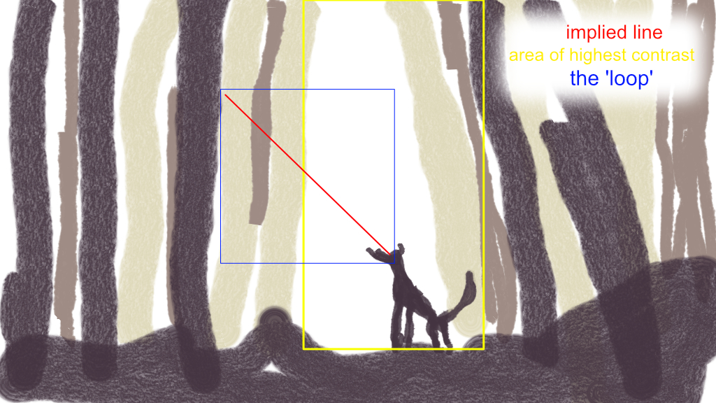
paolo, My comment concerning the squirrel was merely meant to be taken as a part of my compliment on your excellent work. I left any comments about brushes or technique to those with the talent and experience with such to make such comments. What I was referring to was the work as a whole; especially the implied leading line which directed the eye up and to the left. What you did there was actually quite brilliant in that this 'line' did not align with a corner to corner diagonal, as would be more common, but rather it was 'separate' from the format of the rest of the image being steeper and only through a part of the scene. Add this to the way that you had placed the (also implied) eye position slightly off-center and to top it all off placed the space surrounding this 'line' to the left as well, which brought it to the left of the subject and the 'light' thereby pushing the eye from the area of highest contrast. OK, perhaps I cannot express what I want to say in simple English, so I can show you. In any case, this is the type of thing I try to accomplish with my photography - to guide the viewer's eye how I wish. I am not always so successful. And your image accomplished this to a very high degree. My eye only 'wanted' to find what the subject was looking at and therefore became caught in a loop following the red line I drew back and forth. Occasionally it could temporarily escape long enough to look at the trees but their verticality constrained it and sent it back on the loop. (the elongated landscape format was perfect for this effect - even though there were plenty of trees the eye could not remain there). The brightest spot and the darkest spot were in one place and that is where the eye will want to be but that implied leading line caused the eye to want to see what was there at the other end - even though nothing was there. I hope you can understand what I meant now about "is it a squirrel?". BTW the perfectly formed and placed squirrel is wonderful in its own right (especially as it is staring directly back, thus reinforcing the implied line), but these are now two completely different yet equally excellent works! And if I was still unable to convey my meaning with all of this just know that I really liked this illustration; it captured and held my interest for quite some time, and isn't that exactly what is supposed to happen.
-
I am so sad! I worked so hard on this vector face and then added the quote which inspired me, only to see at the end that my document size was way to small. So now when I export the image it looks awful compared to what I see in Designer - oh well, lesson learned. I wanted to share it anyway because it is such a good quote. And hopefully someone can tell me how I can rescue the vector part (face).
-
Is it a bird! ... A squirrel? What did he find? Is it behind that tree... Excellent work!
-
The coffee itself is so very well done; I am especially impressed by the reflection of the rim of the mug in the coffee and by the sense of realism and depth which you so skilfully added by letting us see the bottom of the mug - just like real coffee! (but I do think whomever made this coffee should add a bit more coffee to the water next time, it almost looks like what the Americans would call 'coffee'). :rolleyes: The stain was a like a typographer's flourish - well done!
-
Jonathan D, I can imagine that even with separate sections there would still be a lot of 'cross-posts'. Some might be in error. Some might be about a topic which affects both (all three). A project on which I am presently working uses both Designer and Photo; where would I post were it such that I was having difficulty doing something that requires them to work 'together'? This could also possibly present some issues/difficulty for the developers/moderators who are being so active here. Imagine how often it could happen that someone might ask a question only to have a number of people tell them that they posted in the 'wrong' section. I, for one, am exceptionally pleased that Photo and Designer were designed to work 'together' and do so quite well; this will become even more apparent (and important) once Publisher goes live. I also generally like how the forum is set up; as I use both apps and thus have an strong interest in both, I would not want the forum to become over-complicated and difficult to use. I especially would not want to see the Share Your Work section being split in two. However, we do already have one section, Affinity Beta Support, which is composed of two parts: Affinity Designer Beta and Affinity Photo Beta. Were there to be two additional sections under the heading of Support, would that be what you had in mind? I guess what I am asking is, are you thinking of splitting the entire forum or do you just want two separate sections for support of the individual apps. Searching need not be an issue for anyone even with the current system in use: One can simply 'google' the terms they wish to search for and then append "affinity forum"; a google search done in this manner can often be more effective than using the forum's built-in search function. Separate sections wouldn't really be of benefit when it comes to 'search'. (I just queried Google typing "split the forum affinity forum" and your thread was the first 'hit'!)
-
I can definitely see how that might be seen as an improvement for those who only use one or the other of the two programs - but some use both. (Would it then need to split again when Publisher arrives?) Or, perhaps you mean that there should be separate sections in this one forum? I can understand how some might want that. To garner support for something such as you are asking you may want to be more specific in exactly what you are asking..
-
affinity designer My First 'Real' Project
justwilliam replied to justwilliam's topic in Share your work
I did not use any layer masks at all. I only applied a mix of gaussian blur and then adjusted the opacity for each element. 任意のレイヤー マスクは使いませんでした。私はのみぼかし (ガウス) を適用し、各要素の不透明度を調整しました。 -
affinity designer My First 'Real' Project
justwilliam replied to justwilliam's topic in Share your work
Why thank you, miss LilleG. -
affinity designer My First 'Real' Project
justwilliam replied to justwilliam's topic in Share your work
[Ok] をここでは、様々 な 'ゴールデン' 効果を持つセクションの画面キャプチャ (それらを行っていると確信しているがそれを行う最良の方法)、うまくいけば、これは役立ちます。 OK, here are screen captures of a section with various ‘golden’ effects (as I have done them; which I am sure is not the best way to do it), hopefully this helps: Outlines Capture.tiff Colours Capture.tiff -
You have learned English and you will probably learn more - if I can learn English, everyone can!
-
私はいくつかの異なる機械翻訳を試みた。彼らはうまく機能しません。日本語は、非常に異なる文法を持つ必要があります。
-
affinity designer My First 'Real' Project
justwilliam replied to justwilliam's topic in Share your work
bamboo8R, Regrettably, I do not fully understand your comment. This is a shame because, having seen some of your work, I feel that I could really benefit from any input which you were to offer. Perhaps you could post your words in your native language and I could feed them into a few different online machine-translation sites (like Google or Frengly) and in that way there might be a chance that I (and others) could profit from your comments. I very much appreciate that you took the time to post your comments and only wish I could comprehend them. -
Yet another example of your fine work, bamboo8R! I really like how you have done the accompanying video for this and for the phone which you created earlier - and I sincerely hope that you continue to do the videos. I truly enjoy seeing your work but it is an unexpected and added bonus to have the videos. I do look closely at what you have done and how you went about it in order to improve my own efforts. Thank you again for sharing!
-
affinity designer My First 'Real' Project
justwilliam replied to justwilliam's topic in Share your work
Thanks, Paul and Madame!