

MoonaticDestiny
-
Posts
476 -
Joined
-
Last visited
Posts posted by MoonaticDestiny
-
-
I was thinking about the context toolbar in v2 again and I wanted to give another reason why its bad to have it at the top.
In Affinity Designer v2 for the DESKTOP app, the reason why the context toolbar works at the top of the UI is because you dont have a hand holding a pencil covering the artwork when you make control changes. You have a tiny little mouse that doesnt cover the artwork when you make control changes so it works there on the desktop app. But it doesnt work when you put the context toolbar at the top of the UI in the ipad app because you have a hand holding a pencil cover your artwork so you cant see the control changes youre making.
So this is why I say that theres 2 different devices with 2 different tools. A mouse and a hand holding a pencil. You gotta design the UI with those tools in mind. You cant just design the ipad app like the desktop app and say, "oh. if the desktop app has the context toolbar at the top of the UI then it should be like that in the ipad app." No. it souldnt.
--------
I was also thinking about sliders. Sliders are for when you have a min input and a max input. Min being 0 and max being 100. It depends on what max input you want the slider to have. Its usually 0 to 100. Think of the opacity slider and the stroke slider. Or your brush might have a max brush size of 2000 px. Lets just say that so the slider would go from 0 to 2000. So the sliders is registered to go from 0 to 2000 and if your finger is at the top of the slider youre at 2000 px. You cant use your finger to slide beyond the slider. The top of the slider stops at 2000 px.
The issue is some FX controls dont have a max input. The max input can keep going and going. Thats where I think its weird because the max input on a slider should fill up until it reaches the top of the slider because thats the max slider input. You shouldn't be able to swipe beyond that because you reached the top of the slider. That slider only goes from 0 to 100 or 0 to 2000. So some sliders let you slide beyond the slider and this is an issue because when you increase your control input by swiping up on the slider and you've reached the top of the screen of the ipad you've hit the max input of that slider. You cant swipe any further up to increase it. So if you wanted to keep increasing your max control input you cant. You would think you could go back down to your slider, tap, and swipe up more to increase your slider control input but it just takes your slider down to a lower input. so increasing your slider only decreases your slider and this is why I hate sliders for controls. Each slider already has a max input depending on where they're positioned on the left side of the UI. top sliders have less space to swipe up. bottom sliders have more room to swipe up.
check out the video below.
the top slider goes from 0 to 100 which is correct. the middle slider however goes beyond the slider. which is weird because sliders should only have a min and max input. not go beyond the max input. but pay attention to my touch. the little blue circle. as I increase it all the way up i hit the max input at the top of the ipad screen which is 340. if I wanted to increase it even more i cant because i dont have more ipad screen to keep swiping up. so you would think you would go back down to your slider and swipe up more to increase your input but no. it just decreases your input. so theres no way to increase your input because of the limited iPad screen. if you want to increase your input you have to type it in manually. you cant just keep swiping up because youve hit the max input and swiping up more only decreases your input. you cant even swip right to increase it more. the bottom slider has a max input of 502. if I want to go beyond 502 i would swipe up again but swiping up only decreases my input so i have to manually type in 1000.
sigh.
-
4 hours ago, fde101 said:
writing online books
Heheheh 😅 I love that you said that because I could talk about affinity designer v1 for the ipad all day. I love it so much. I have this burning passion and love for AD v1 on the ipad. I dont communicate through voice, so I express my thoughts in writing. I have to write a lot because I have to justify what I'm saying through design logic, reason, and examples. I cant just say, "this is bad design. change it. k thanks. bye"
4 hours ago, fde101 said:most of whom are not wearing themselves out
I think I wear myself out because I have so much love for AD v1 on the ipad. Its a beautiful app. My love for the app and the graphic designer in me REALLY wants to fix this AD v2 issue and theres still a part of me that still believes that things can change if I just voice my opinion. If I just start the conversation something will happen.
4 hours ago, fde101 said:the developers at Serif will probably never take the time to study it
But then I remember things like this 👆and what happened in the AD v1 for ipad forums a year ago and Im just like.......sigh....... why do I bother? what am I doing here? I'm really wasting my time trying to help. I should go.
A part of me still wants to believe. 😕
-
Im exhausted. I really need serif to bring back the context control design from v1. I provided you with so many reasons why the context control in v2 is bad. I'm not even done. Theres more reasons. I could go on. This isnt going to happen right now. Its going to have to be for another build but you really need to bring it back.
I want to use AD v2 on iPad, and I cant because of this badly designed context control. I can not use the app with this design. Its unusable. Theres so many great things in AD v1 that you cut out in AD v2. I dont know why those changes were made. I have a whole list of good things in ad v1 that should return. I continue to use AD v1 on ipad. i love version 1 so much. its so beautifully made. I love it. I just wish it had all the ad v2 features, updates, and bug fixes.
-
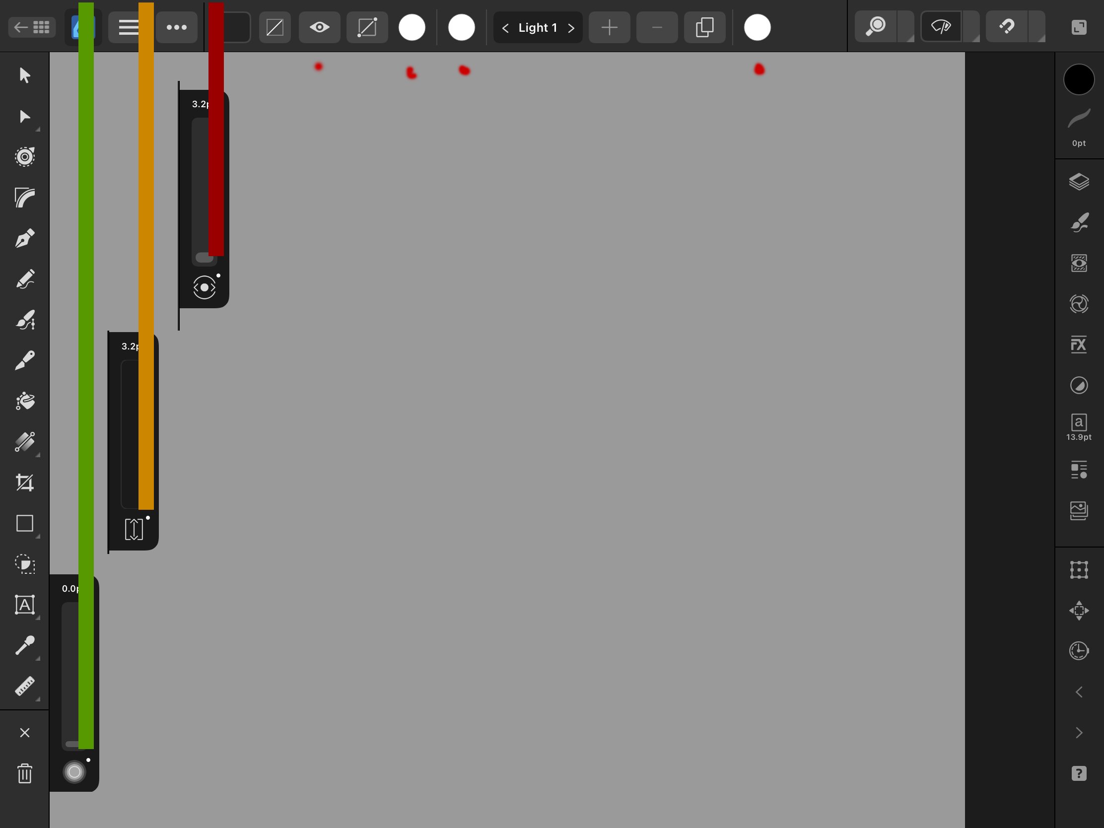
Theres also another reason why sliders as controls are bad. Id rather show that one in video but I dont know if I want to right now because Im exhausted justifying everything. Pretty much having a slider at the top left of the UI above the other 2 sliders is bad because your limiting the distance that you can slide upward. You can only slide up with your finger until you reach to top of the ipad screen. Youre limited on ipad screen real estate. You are limited to how far up your finger can slide because of the slider being positioned that high above the other 2 sliders.
Look at the photo below. The bottom slider is green meaning I have all that green line to swipe up. The 2nd slider in the middle is orange. I have all that orange to slide up. The 3rd slider on top is red. I only have that little red space to swipe up. So each slider is limited to how far they can swipe up. This is bad.
Its also bad because when I swipe my top slider all the way to the top and I still need to increase my control amount. I would have to go back down to that slider and keep swiping up more to increase the control amount BUT when I do that my control slider resets back to a low input. THAT BAD. Its so bad.
This is why the touch gestures on the studio bar are bad. theyre good gestures but theyre badly placed because the higher the studio icon is placed on the studio bar the less swiping space you have.
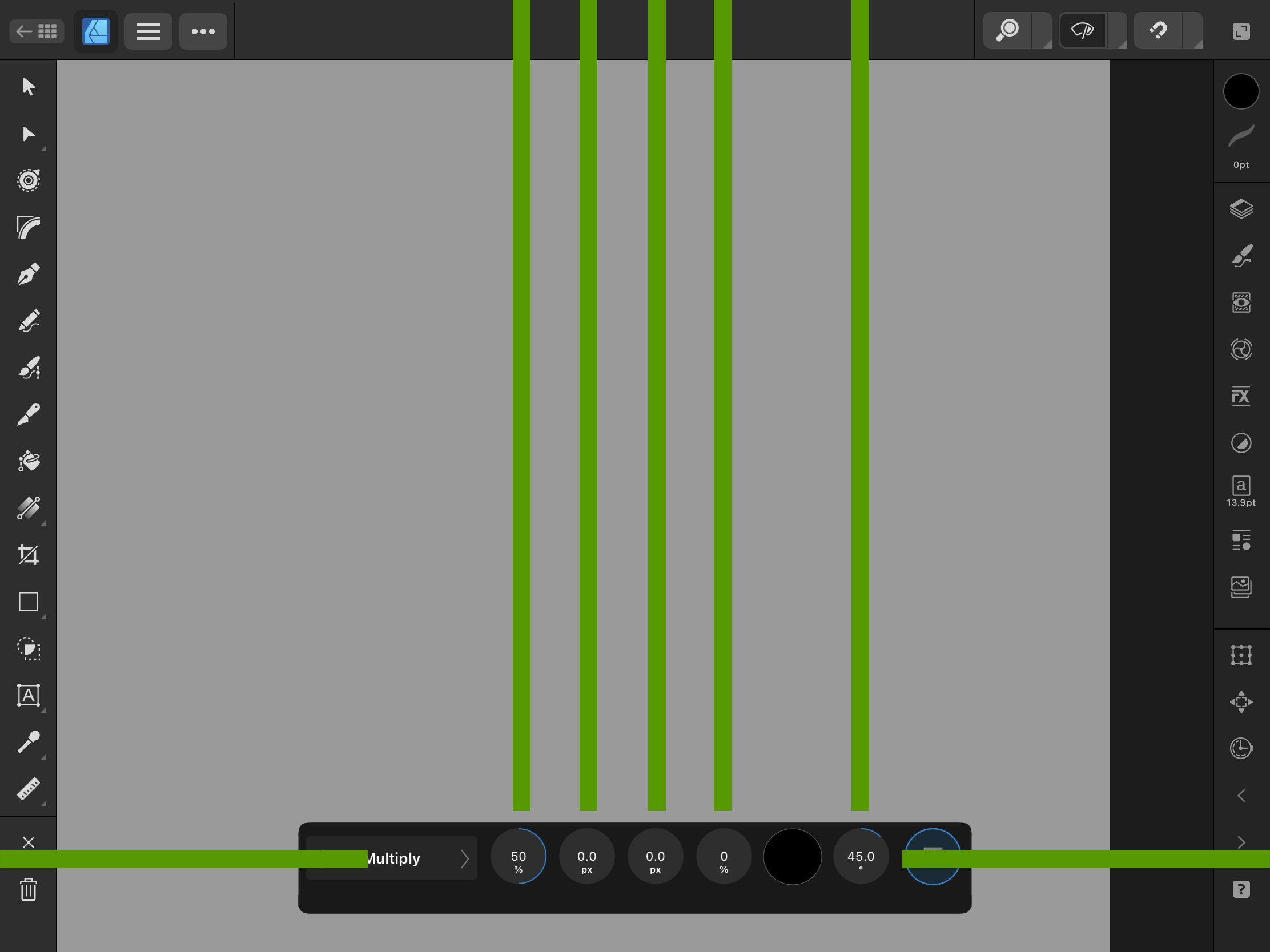
This is why its better to have the context controls at the bottom of the UI because the swiping space is all even. Look at the photo below. the green lines shows each dial having the same equal swipe up or left/right space.

-
Now, I know what youre probably also thinking. Why not use your left hand's thumb to change the sliders? Why not have your right hand holding a pencil and your left hand to change the sliders? Because its still bad design. Theres many reasons why its still bad design. The hand covers the artwork when the context toolbar is at the top. You still have controls hiding within sliders. Thats bad. This isnt hide and go seek. You still have controls that cant be translated into icons. You need to spell them out. Your left thumb can only go so far down and up. Having your thumb go all the way down and all the way up of the ipad screen is crazy. The left thumb is supposed to be centered in the middle and it can only go up and down a certain distance. Wacom doesnt put 3 sliders onto their wacom tablets because they know the users thumb can only go so far up and down. 3 sliders is crazy. Even crazier to hide 4 controls into 1 slider and have 12 controls hiding inside 3 sliders. Like theres so many reasons.
You cant turn controls into sliders. You cant. Theres too many controls. Theres so many controls that serif tries to fit 4 controls into 1 slider. Like, thats so bad. Theyre better off as their own dial like in ad v1.
The only reason Procreate is allowed to have 2 sliders on their UI is because Procreate is a drawing/painting app. You select a brush and that brush has 2 controls. A brush size control and an opacity/flow control. 2 controls, 2 sliders. These sliders have to be displayed because these controls are always being changed when drawing and painting. Unless procreate intoduce a gesture to change the brush size and opacity/flow like the ipad app infinite painter does but affinity has too many controls to fit them all into sliders. It doesnt work. You cant be playing hide and go seek with users.
-
This is the main reason why you need to go back to the context control design in ad v1. It was so well designed. It just needed some improvements because it stayed on when certain tools were selected and it wasn't supposed to stay on in those tools.
Its all about the hands. Youre not desiging the ipad app with the hand holding a pencil in mind. Youre treating the ipad app like a desktop app and you cant do that. they are 2 different devices with different tools. A desktop has a mouse and an ipad has a hand holding a pencil. You gotta design the ipad app around this hand holding a pencil.
When making control changes the hand cant be covering the artwork because you need to see the control changes that youre making to your artwork. Thats why the context control has to go at the bottom of the UI so that the hand doesnt cover the artwork. Photo below. You can change those dials and youre able to see the changes youre making to your artwork.

-
This is adobe fresco's UI. Photo below. When Adobe displays its animation context controls Adobe knows to place it at the bottom of their UI because they want the user to see their artwork/animation while making control changes. They follow the guide. They know not to put their context control at the top or the left of the UI because that would make users cover their artwork with their hand.
-
Lets look at procreates UI when they display their context control bar. Procreate knows to not have their users hand cover their artwork so they know to put their context control toolbar at the bottom of their UI. In the photo below look at how the hand holding a pencil doesnt cover the artwork but is over and above procreate context control and now they can make control changes like hue, saturation, and brightness while letting the user see their artwork when making those control changes. It works out like in ad v1.
Also, look at how procreate writes the helpful text to their controls. They spell out "hue, saturation, and brightness." They dont make 3 unrecognizable icons, replace those icons with helpful text, and put them on the left of their UI as sliders. Or they dont hide 3 sliders into 1 slider. Or they dont force users to tap a ? help button to display those controls. Why? because procreate knows that hue, saturation, and brightness can not be translated into an icon. They have to spell out that control to the user. They also know not to put them on the left side of the UI because they know a hand olding a pencil would cover their artwork preventing the user from seeing what hue, saturation, and brightness control they are making to their artwork.
Procreate follows the guides.
-
Look at the photo below. Heres a guide that all art ipad apps use when making control changes to the artwork.
Its artwork in the middle, the context controls at the bottom of the UI, followed by the hand holding a pencil over and below the context control bar. This is the guid serif followed in ad v1. This is the guide that serif NEEDS to follow in a v2.
-
This is the context control in AD v1. Photo below. It is so well designed. Look at how having the context controls at the bottom now allows my hand to go off-screen and let me view my artwork. i can now make control changes and see what changes are being made to my artwork. there is no hand covering my artwork. its just a control bar at the bottom of the UI that has dials that tell the user what they're changing while displaying their artwork and control changes. THIS is good design. THIS is how the context control in v2 should look like. You had it right in v1 but you designed it wrong in v2. This is how it should be. Theres no hand covering the artwork and this is why the hand holding a pencil is so important. This is why i had to explain it all from the beginning. This is what I mean when I say serif isnt designing the app with a hand and pencil in mind. They think they can put sliders on the left and a context toolbar at the top and be ok with the users hand covering their artwork while making control changes. You cant do that. You need to show the artwork without the hand covering the artwork when making control changes.
-
Now, the context control in v2 was split into 2. The sliders on the left and the bar at the top. When you reach for things at the top "when making control changes" your hand fully covers your artwork and you cant see what changes youre making to your artwork. This is bad. This is very bad. This is why you cant have your controls at the top. That whole bar at the top is already reserved for other actions and buttons. You cant put the controls at the top. The hand covers the users artwork and prevents viewing of what changes they do to it.
-
The photo below fully covers my artwork when I change the top slider. This is bad! You cant change controls and not be able to see your artwork. Youre not gonna be able to see what changes youre making to your artwork because the hand covers it due to the bad design of placing sliders on the left side.
-
in the photo below my hand IS covering my artwork so I cant see the changes being made to my artwork as I change the middle slider. This is bad design. You cant have this. When making control changes you need to be able to see your artwork. This hand position covers my artwork. This is bad.
-
When its time to making a change to my artwork the controls pop up on my UI. The sliders on the left and the context toolbar at the top. Pay attention to my hands holding a pencil.
When my hand goes to the bottom left slider this hand position is somewhat ok. "Somewhat." I say somewhat because my hand isnt covering my artwork to where i can still see the changes being done to my artwork as I change my slider. This is very important. The hand can't be covering my artwork as I change my controls. This is super important to remember. If the hand covers the artwork while making control changes it is bad design. Here in the photo below my hand is somewhat covering my artwork.
-
As I'm vector building it this is what my hand looks like over my artwork.
-
Ok so heres the reason why the context control in v1 is better than v2s. Why v2 is so bad. Its all about the hand holding the pencil.
Lets say I'm making an artwork of an apple. This is what it would look like below.
-
Im exhausted from justifying all the bad design. Theres so much more bad design. I'll come back and talk about the main reason why the context control in v2 is bad. I have to illustrate it first. It goes back to the placement of the hand and how we hold the pencil when it comes to controls.
-
Look at this photo below. It turns out that 2 of the white color swatches change the color to the ambient and specular light. How do I know that? Because the context control from AD v1 is so well designed that it tells me what my controls do. In ad v2 you just have 2 white color swatches. Thats it. They dont tell you what they control. Its just 2 white color swatches. Like........this is so simple to understand in v1 but its a mess in v2.
Theres so many reason why its all wrong. I havent even gotten to the MAIN reason why the ad v2 context control is bad. I keep getting sidetracked by all the bad design. Theres so much bad design. its really bad.
-
It turns out that the eye icon enables the profile. If you had just typed out profile and enable unders those buttons I would know what it does. Look at the photo below. The context control in v1 tells me what each dial and button does. Its so helpful. Controls need helpful text under them. You cant just remove the text and leave them as icons.
-
Look at this photo below. I want you see how theres 3 white color swatches at the top bar. You dont tell us what they do. We're just supposed to guess what they control. This is what I mean when you dont provide helpful text at first glance. Controls need text. You cant just translate them into icons and expect us to know what each icon controls. You gotta spell out controls. We're talking about controls. Not studios or tools. You dont need to spell out each tool and studio for us because those CAN be translated into simple icons. Controls cant. I dont know what these 3 white swatches change. The "eye" icon. What does turn off and on. You dont tell me. What do the other icons mean? I'm not going to be hitting the help button all the time just to figure out what my controls do. Even the help button doesn't tell you what some controls do.
-
Controls go together. They cant be separated. You cant have users looking at 2 areas of the UI for their controls. You cant split the context control.
You also cant put controls where theres already a bar thats holding other actions. The bar at the top of the UI has edit buttons. You already reserved that top bar of the UI for the edit buttons. Why would you put context controls there? Why would you put more stuff there? It doesnt even fit! You sometimes have to swipe left to get the rest of your context controls. Theres a whole space at the bottom of the UI reserved for the context controls. Why squish it in the top bar that already has edit buttons in it? Like, think about it.
You separated the context bar, you removed the helpful text, you made icons for controls that cant be translated into icons, you put sliders on the left, you put the other half of the controls at the top, youre making users look at 2 areas of the UI just to make their control changes, and now you you've placed the controls at the top of the UI where that bar was already reserved for other button, you squished it all in that top bar, and now users have to swipe to get to their controls because it cant all fit.
Like, what are we doing? Its not even the whole top bar. Its half the top bar because the home, personas, zoom, preview, snapping, and full-screen buttons take up half the top bar. Like, we really said lets just squeeze everything in this top bar. Look at the photo below. Whats in red is whats only available on the top bar.
You had a whole bar at the bottom that didnt overlap with other UI buttons. Now, you have the top bar conflicting with the context toolbar. 2 bars are competing for 1 space.
-
I really need serif employees to do this test below.
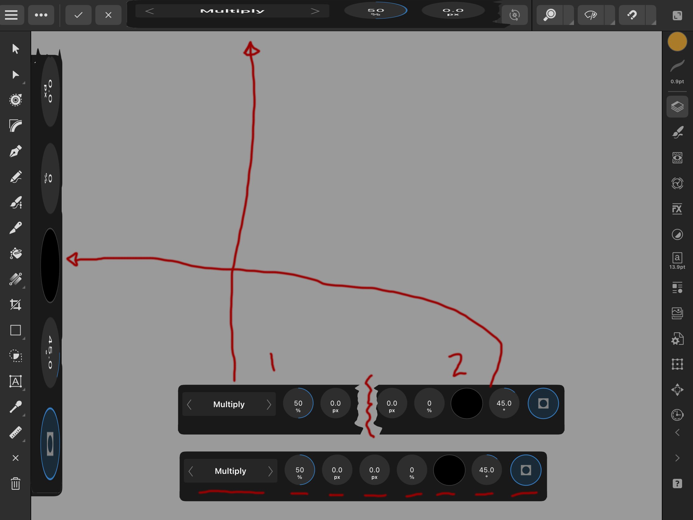
Open up affinity designer v1 on the ipad. Make any shape and give it the outer shadow effect. Open up that outer shadow effect in the FX panel and you should see the context control at the bottom of the UI. Play around with the dials. Change the opacity, radius, offset, angel, and blendmode. Just play with it. Pay attention to how the dials have helpful text to tell you what each dial does. There are no icons. Just helpful text for your controls and youre only working in 1 area of the UI. The bottom part of the UI. Your attention is at the bottom and then back to the middle of the UI at your artwork. .
Now, open up Affinity Designer v2 on the ipad. Make any shape and give it the outer shadow effect. Open up that outer shadow effect in the FX panel and now look for your context control for the drop shadow. its not at the bottom anymore. Pay attention to the questions youre asking yourself in your brain.
What do these sliders do? What do these icons mean? What does this slider change? You have to play with the sliders first before you figure out what it does. Why couldnt you have just been told what it does like in v1? Why does an unnecessary icon have to go with these controls? What do the buttons at the top do? Why am I looking to the left and top of my UI and then back to my artwork. Like, theres so many questions that you have to ask now where in v1 you werent asking those questions.
-
This is pretty much what you did in v2. You took the context control in v1, removed the helpful text, split it in half, made your own unknown icons, placed 1 of the split context controls on the left side and put the other at the top. Like, just think about. Should we have 1 bar that has everything users need or should we make 2 bars and place them on 2 areas of the UI and make them work harder and confuse them with icons they cant recognize and no helpful text.
-
So the positions of the hands are super important here and theyre going to be super important when it comes to the context controls. Now, I can talk about the context control.
When it comes to controls you can not separate them because all the controls are focused on the changes being made to an artwork. You need to have the users looking at 1 area of the UI where ALL the context controls are. You can NOT split the context control in half and put them in different areas of the UI. You cant do that. You cant have users looking at their artwork, then looking to the left, then going back to the top, and then back to their artwork when making control changes. You can't. The controls all have to be together. This is why the context control in v1 was good design because all the controls were together in 1 area of the UI but in v2 you have the controls scattered and now we have to look everywhere now just to find our controls. There are MANY reasons why the context control in v2 is bad. This is just 1 reason. Controls go together. They cant be separated.
Context controls are together below.
Context controls have been split and scattered into 2 areas of the UI. The left as sliders and the top as a context bar.

.jpg.9b84758f2a6c45990ef827ed67b28ca7.jpg)
.jpg.8d962befc428d4786648a860e707760f.jpg)
.jpg.464767cd589521efe8e339073d290a00.jpg)
.jpg.0e35f3463ed0dcf6dd493c702561356f.jpg)
.jpg.5fd27e89f828b383429ff49defe8e443.jpg)
.jpg.d117a97ab7d3af73cd6543ef97e5026b.jpg)
.jpg.1a5b246c2c03a124d7f216e47e8ecd8e.jpg)
.jpg.cdde8e6e00f3b6dfbd0de6195a066a68.jpg)
.jpg.cf2a0767518950131f31ef8a10c20d30.jpg)
.jpg.fcc1ef6edc8067f5cd985c7e32bb1681.jpg)
.jpg.5beeb4d60368eb01494b7aab97782795.jpg)


Ability to change Asset Panel background colour
in [ARCHIVE] 2.4, 2.3, 2.2 & 2.1 Features and Improvements
Posted
Sigh. I can't believe this took 5 years to implement.