imagodespira
-
Posts
77 -
Joined
-
Last visited
Everything posted by imagodespira
-
I also have this problem. I have my MacBook Air M2 around one month and Affinity Photo worked well and started fast. Since some days it needs 30 Seconds to start. And it is the only software with this issue. All other Apps (I use: Blender, Chrome, Office, Edge, OneNote) works well. I did restarts of my system, pressed control while starting Affinity and deleted user settings there. Nothing worked, it is slow like hell the first time I start it.
-
I use CTRL+Shift+V to paste a Style. It works also between documents (just CTRL+C before to copy). You can use the menu.
-
In this case, the software should do it because the font is to small on many places. On my 27 inch 1440p Monitor it is ok, on my 32 inch 4k it is tiny (and other Software not). On MacOS it is standard to be able to adjust the font size and it works already in Affinity products there. It should be not a big problem. It seems only the same stupid decision as not to use Windows UI Windows with round corners and I also work daily with blender and it is a huge improvement to be able to adjust the UI Font! Maybe some people only work some minutes a day in the software but i work the entire day in Blender and Affinity and it helps a lot to be able to read text without problems (especially after 12 hours of work, in the evening ). So serif, it is not a big thing. Just look into the source of the MacOS Affinity projects... Thanks!
-
Arghhhh: Sorry for my post. I mean that V1 does not load V2 Files Sorry! In my opinion V1 Should get a small update to load at least the file and ignore the new functions. Better, as suggested above from others: Export V1 files in V2 with reduces features.
-
I also don´t understand why it is not possible to open V1 files. Especially if you look into the PSD loader. It works and gives a dialog that some functions are no supported. I think this should be the compromise. Open V1 files and if they use critical functions show us a dialog that may gives us some problems. It seems some devs put work into PSD loader but don´t bother own file formats. I think the gap should be smaller from V1 to V2 than from Photoshop to V2.
-
Round Corners - Windows 11
imagodespira replied to imagodespira's topic in Feedback for the Affinity V2 Suite of Products
Thanks @all who understand my little fight @Serif: it does not mean that i don´t enjoy to use your products. But i think it is, beside the also big list of bugs, worth to discuss. -
Round Corners - Windows 11
imagodespira replied to imagodespira's topic in Feedback for the Affinity V2 Suite of Products
First, it is a cosmetic kind. It seems that it is not important for developers of a software which is aimed to professional designers (if you look at the affinity promotion). People who are creative the whole day and makes graphics in any style pays attantion of visual styles. And if it fits seamless in windows 11, it is very useful. But second is maybe more important: It separates better from other windows. Look into my images above. It is often hard to see the activated window or the content. Is it Photo or is it designer? Round corners and shadow are not only cosmetic choices. They are helping to separate content from each other. Some people does not understand it.. maybe they are not creators, more coders or what else. In the public version of affinity it is sometimes also hard to see the windows within the app, especially it one makes UI Designs, maybe in a gray color... Now it is much better, because the round corner and the shadow helps. The round corner around windows 11 have a slightly lighter line to separate it better. On top the drop shadow. It is the same in Macos (here a better visuall line around, they have a second more darker line... again, it is not only because it is nice!!!). With the tool, it works better. The app itself but also within the app the tool windows. A problem is left: The drop shadow seems to be only the "disabled window" one, a much lighter version than in other apps. The Affinity Apps itself have no shadow, so it is maybe not better to make for this "hack" tool. But better than nothing. It could be better if Serif would use the Windows 11 Design guidlines instead of this Hack It is strange, a third party mini tool can do it and the coders of a professional Design Software not. I know it was a decision and not a bug. But it was not the right one! For my workflow it is much better now. But it could be better if the Apps would have its own round corners and drop shadows (the shadows could be more visible, not possible with the "hack").
-
Round Corners - Windows 11
imagodespira replied to imagodespira's topic in Feedback for the Affinity V2 Suite of Products
bitegr: Thanks! It is great and now i can separate the window between other dark mode apps. @Serif: Please try it and you will see that your decision to make no round corners where wrong! It is no problem to make it, so please do it!!!!! For me, it is a game changer! -
Thanks for your reply. I tried on windows again and i can not drag outside. The focus seems to be on a list item and scrolling starts...
-
What? It is not a bug when i can´t get the trashcan icon? Sorry, i think you don´t want to address bugs. Have you tried? Not only with 3 layers, then it works and in the new videos are also only some layers and this function is shown there.
-
But i think when i resize the whole project it should be scaled completely. For me, it is a bug...
-
Many thanks for your reply. I will look into the document and learn how it works!
-
Export Workflow Downgraded in V2
imagodespira replied to powsimian's topic in Feedback for the Affinity V2 Suite of Products
You forget that the software is not made for the developers, it is made for users who use them! Look at the iPad version. There we also have no icons but there is no senseless drop down menu. Here you have at least the buttons side by side and you don´t have to make a click and then search in the list. I would prefer a small icon for fast finding my preference but a solution as on ipad version is better than nothing. -
Affinity Photo 2 2022-12-02 18-26-22.mp4 When i want to drag the FX icon to the trashcan, the layer list scrolls down and i have lost the focus to my active layer. I think the problem is that the focus goes instantly to the next layer (for copy the FX ?) and the focus of the list entry starts scrolling if the page is too long and needs a scrollbar. Waiting 1-2 Second over a layer before activating the list entry could help to prevent activating before you are on the trashcan. In Photoshop the scrolling is only occurred the first time if you reach the End of the list and then wait a second. Here i also have much time to go to the trashcan icon. Better from usability standpoint, in my opinion, would be not to bring up the FX setting window with a single click. Instead with a double click maybe? And then activate and deactivate the FX for the layer with a single click. It also would fit into the mechanism to lock a layer or hide a layer... It works both with a single click on the icon on the right side of the layer. As adjustment layers etc. also gets its setting with a single click it may be a problem (also here i would prefer a double click to open the settings but also my opinion). But this just by the way, a better handling with the scrolling to get to the trashcan would be enough
-
I just tried the trial of photoshop. The quality there is better. I understand that vector graphics may also have a half pixel sometimes but after rasterizing it should be in every case on a full pixel position. So maybe it helps, my suggestion is to use the pixel snapping after rasterizing an object. I think in some cases it takes the rounded position and makes problem. When i move such an object with the mouse and have disabled the snapping setting "move whole pixels", then it snaps with mouse to a good position. But when i copy and paste it into another (different sized) document, i have half pixels... here should be snapped too, at least with rasterized objects. Also the keyboard moving should be do this. I f i use the keyboard to adjust a pixel it snaps from 0.5 pixel to 1.5pixel (with mouse, the option is used and it is snapping into a full pixel). Both things, use the snap function after rasterize and also move rasterized layers with this function could bypass this problem. Maybe only once use the snap to a full pixel after rasterizing could be enough... it should be easy to test
-
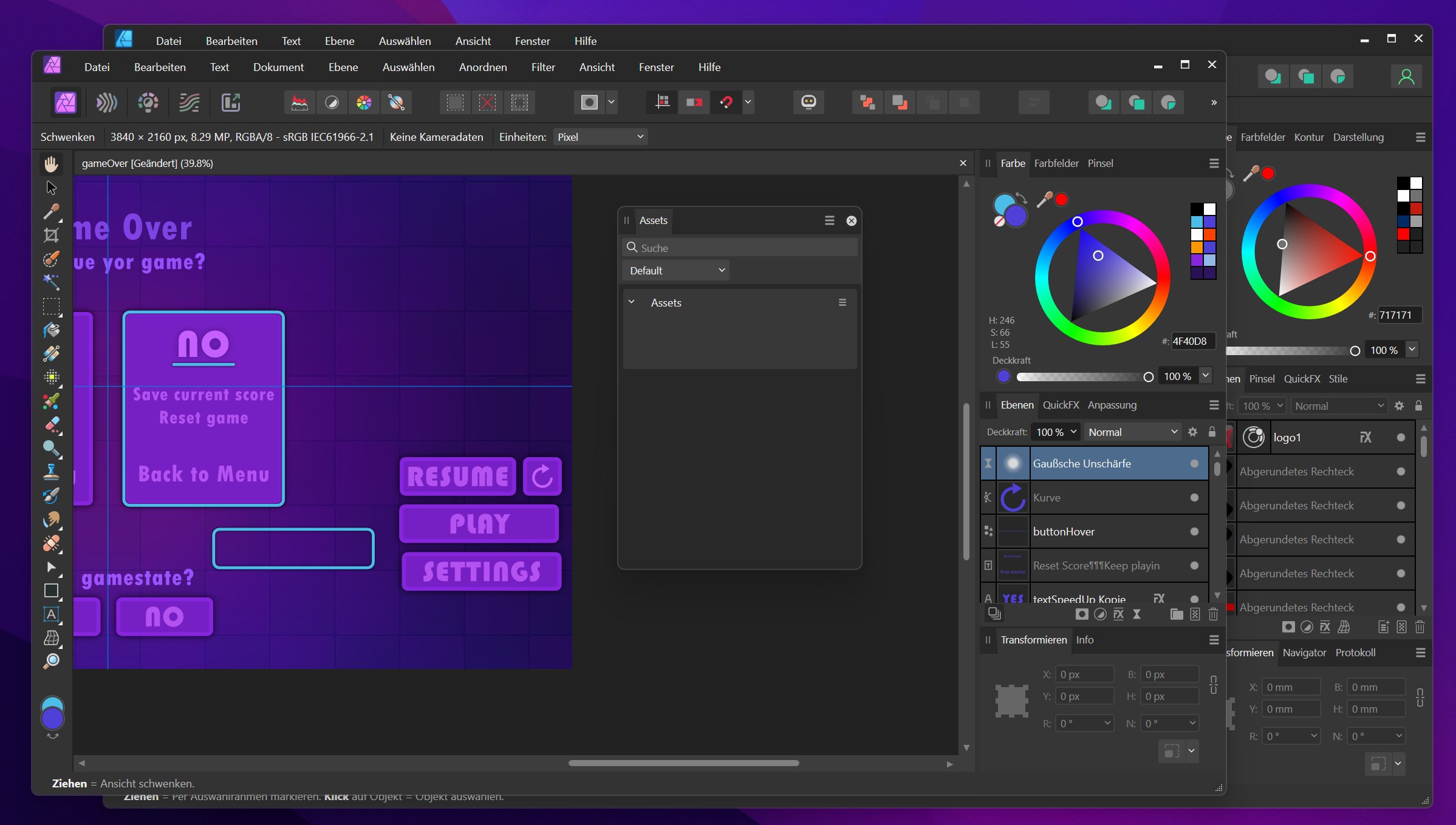
Affinity Photo 2 2022-12-02 15-07-04.mp4 Quality with positioning is terrible. In the video i just copy and paste some objects into a new document and all is blurry. I also switch between the documents, both 400% zoomed. Position is 0.5 pixels (see it in transformation panel). It should never happen! A PIXEL is a PIXEL! I turned on and of the decimal numbers in the settings but it seems to be not a rule which is used, only an integer value is shown but rendered in halve pixels. With the snapping tools i can set to snap into pixels. When i move around with the mouse i get sharper pixels. When i use the keyboard it only moves 1 pixel (from 0.5 to 1.5) and don´t respect the snapping... so it is almost no possible to position it, only if i set the numbers in the transformation panel. The workflow is awful!!! Anyway. The image should not be blurry, no matter which position the layer/object/image is drawn. Hint: Also if i export the selected layers (select only selection in export window) it is blurry like hell. It should never be blurry because a Pixel is a pixel and not a half pixel Note: When i only paste the content as "new from clipboard" it works because the size of the content is taken. But i need a fixed object size (also because of rounding errors, my buttons needs to have exact the same pixel size). This is only one of the bugs/problems i found. My list is very, very long and i try to post it here piece by piece. Thanks for look into it!
-
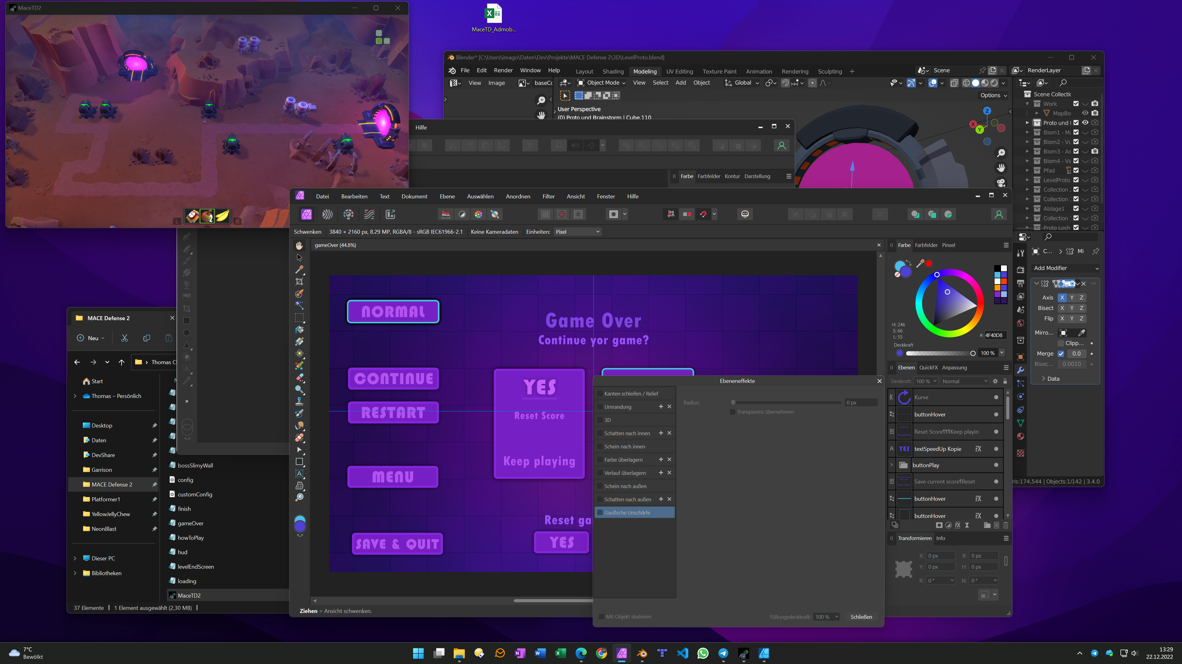
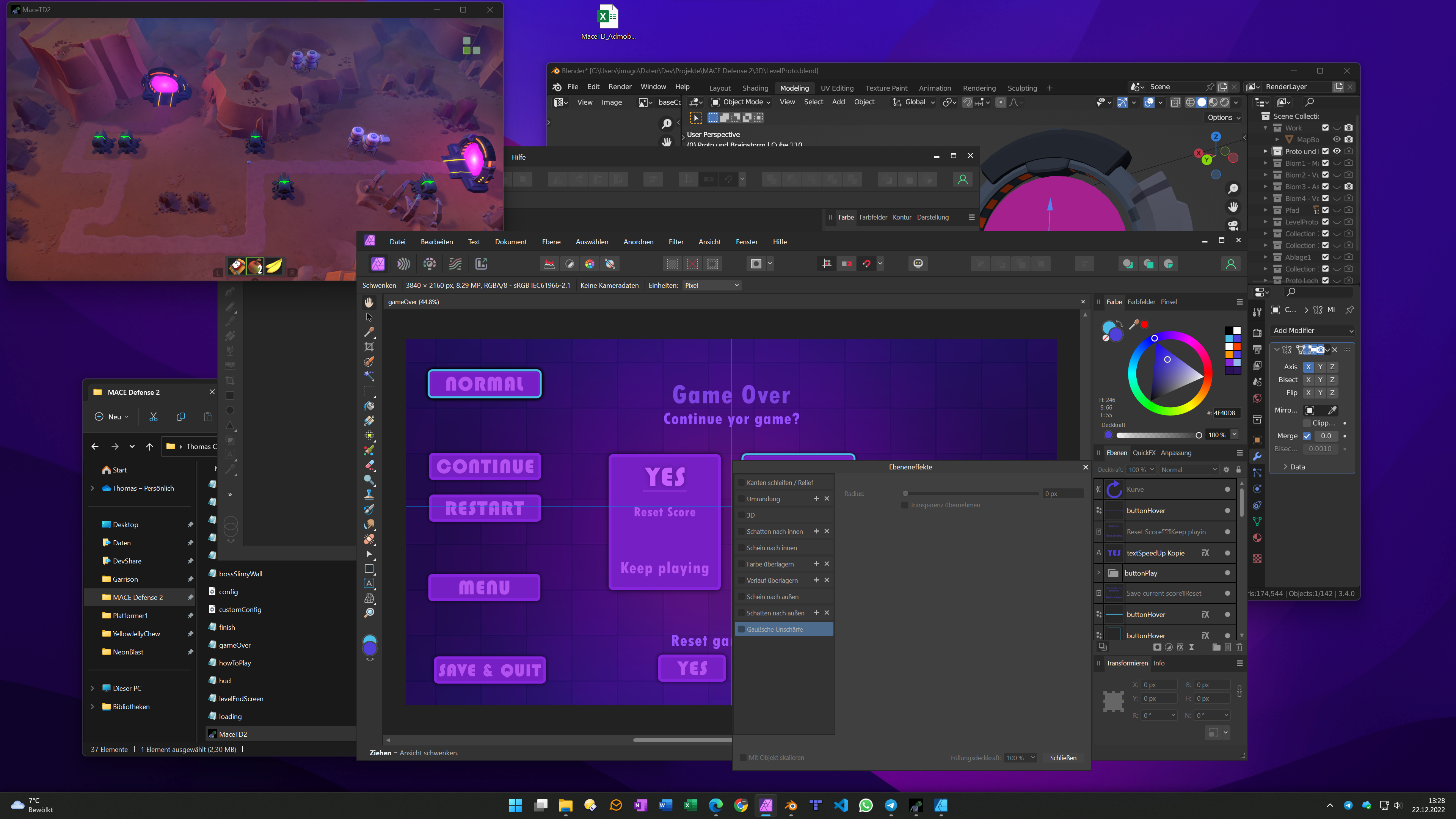
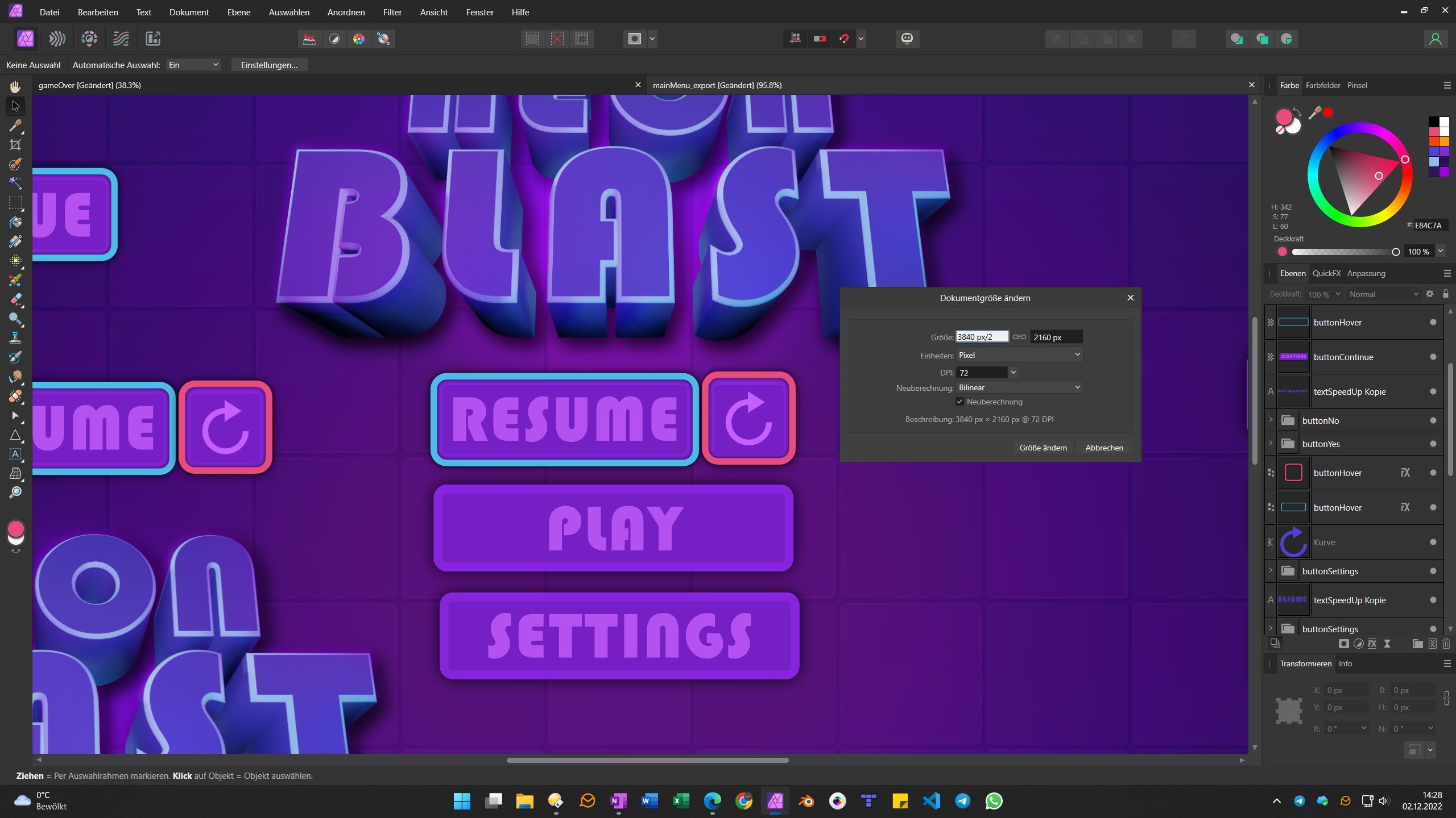
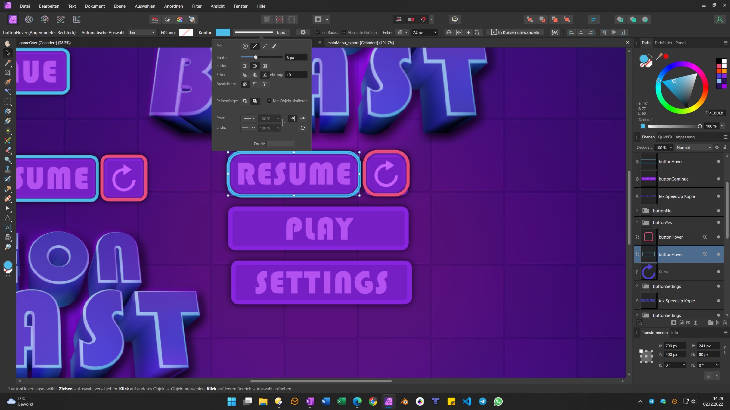
Before exporting single UI parts which i build in 4k, i have to halve the size of my document to FullHD, then i rasterize the layers i need (export without rastering... it is a next bugreport ). On some objects, the round corners are not scaled correctly. I also played around with "scale with object" but it does not help It only occurs if i set the contour to "absolute size". Before resizing -> look at the resume button: After resizing: This is only one of the bugs i found. My list is very, very long and i try to post it here piece by piece. Thanks for look into it! Version: 2.0.0 Windows 11 MenuTest.afphoto
-
@hm933: I use glasses but also cannot separate it, the icons makes no sense in this way they are used. In the toolbar i am searching also after 2 weeks the icons i use, some of them are simply not recognizable or visually separable. @ChrisB: "They took me a while to get used to but now I cannot go back" Really? and no thought of giving the designer a tip to improve something? Do the devs know what the meaning of an icon is? (Wikipedia: "The icon itself is a quickly comprehensible symbol of a software tool, function").
-
It works with the hover. But it is almost invisible and if i am near with the mouse often the icon is hidden... Without your hint, most people won´t know it. Anyway, i also thing if you collapse the group, the "main" lock icon should be work for the whole group and not for the last selected layer which is non visible if collapsed, makes no sense for me.
-
Here an image of Firefox on Windows. It seems to be possible to follow the new Win11 Design guide with a menu (it is open source if you need the code ). To be fair it needs a bit more space around but it works and is better than we have in V2.
-
A quick note to menu bar height: I assume that people with lower resolution and smaller montiors will use fullscreen, maybe here you lost some space. But almost all software does it, it is a windows design. For this people it does not matter if the window has a shadow or round corners. But i also assume that many designers works with bigger screens and have enough space. Also for bigger resolutions and bigger screens the workflow is a bit different. There is much space also for reference images or note apps and more. Since i have my 32 inch 4k monitor i don´t use very often fullscreen because i use the space for other stuff and there, the current design version is not great. I also would have space for an empty window border, i work the whole day in blender and it works fine (i switch between blender, Affinity Photo TileEd Editor, OneNote, our game Engine, Explorer window and chat etc. ). Separating windows in a visual way if they are stacked it important for my work. It seems the technical decision is a coder´s one. A designer would never decide this way In my years of working with coders, it is a common problem... Usability is not the way they think...
-
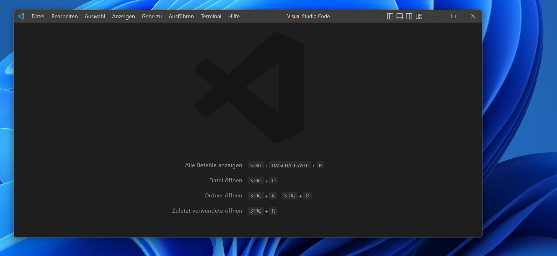
Visual Studio Code does it this way. It is for shure not a native window (as transparency is missing) but it works well. For me it is also a problem of visually separating windows. And the guidline in windows 11 brings us a drop shadow and the gray transparent line around windows to separate different windows. Today is saw a video from affinity photo where is described to make a floating tool window, in macos it also inline windows/panels have a shadow ... and it is better to see and separate the content from each other... on Windows... i don´t understand. And if it is by design and wanted, i really don´t understand it. And yes, bugfixing is more importand. But V2 has as much bugs and problems, you never get it fixed all and 100 answers in Threads of UI problems should be not pointed as "made by design".
-
For me it is much slower. When i zoom out the image to very small. I can smoothly move the layers. If i zoom in, it is getting slower and slower and slower When i rasterize, it is getting faster. Opening the files in V1 does not work. A workaround is to copy all layers and paste into V1 I wish they had included a solution like PSD files where only missed features are ignored. The same works well when i copy all my layers and paste it... works well and without problems. But it is not a good workflow when someone have to work with the software...
-
Just tried on my "old" ipad Air 4. It works much smoother. Also copied the layers into the Old Affinity Photo and it works well... I think, the release is not mature enough to sell it.
-
Yes. Currently i rasterize all layers and then i can work. But the workflow ist like 10 years ago and i need to work, so it is not great to have this I have a huge list of problems and small bugs and i think other peoples too. I don´t think that serif can fix this stuff soon, it may need month until a first update and we can really work.