Johanness
-
Posts
4 -
Joined
-
Last visited
Everything posted by Johanness
-
It would be nice to be able to format character background. When I add a background to a character it vertically extends to the highest and lowest character in that line. Depending on the font and line-spacing this doesn't always look right - especially when the highlighting spans across multiple lines. My current solution is to increase the groundlines of spaces surrounding and inside the highlighted text - but that's tedious and doesn't work to decrease the height of the highlighted area. A lightweight solution would be to have two additional variables in the positioning part of character format: either background height in %, and background groundline-height, or background correction-top, / -bottom. A more luxurious approach would be to have a separate "background" partition of the character panel with color, horizontal and vertical size and postiion of the background (in pt and % of the respective character) and border (with thickness, color and style for top/left/right/bottom border)...

-
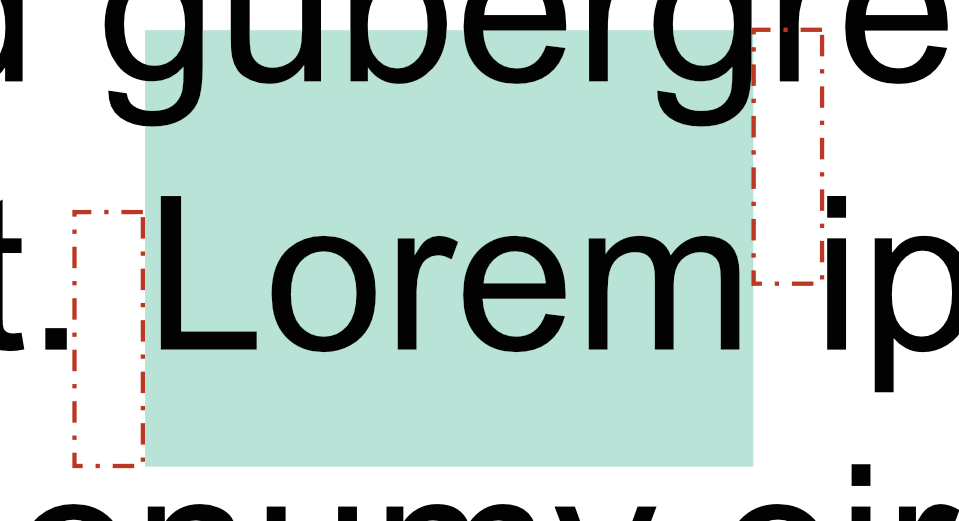
I know its an old topic, but I came across a siomilar problem and found, that the character background extends to the highest and lowest character in that line. My workaround for now is to adjust the groundline for the space directly before the highlighted text with a positive value and the one directly after the highlighted text with a negative value. The spaces dont have to be part of the highlighted box - they just tell the highlighting box how far it has to stretch vertically. And the good part is, the space doesn't get compressed horizontally and doesn't affect the line-spacing, so apart from the desired effect nothing changes. (see picture, where the doashed boxes represent the spaces with shifted groundline - even expanding into the line abouve without affecting it.
-
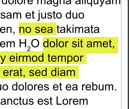
hi @thomaso, Thank you for the quick reply. The problem with decorations are the same as with text-frame backgorund: you color the whole paragraph, which as i mentioned, doesn't look good with ragged right text.
-
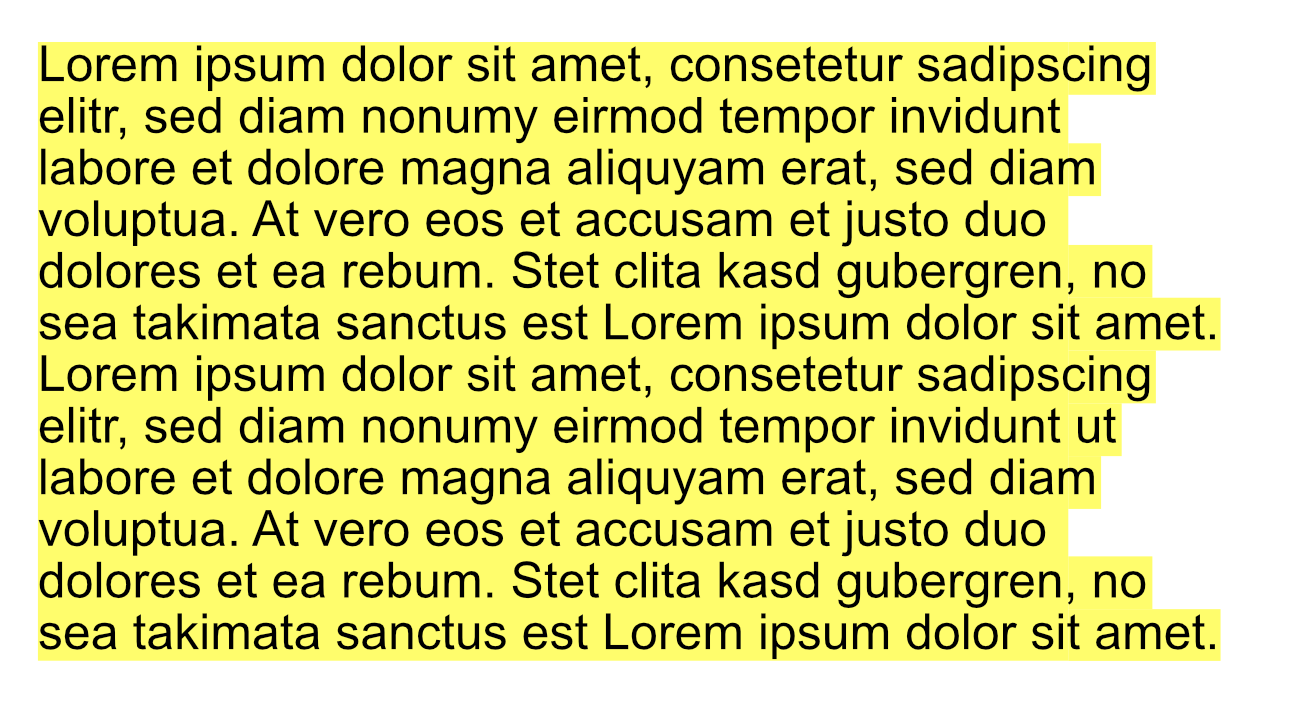
I use character background color to highlight several lines of text. Now my preferred line-spacing is just a bit greater than the background of the individual lines and I have ugly lines of paper-backgorund shining between each line. Is there a way to make the background (not the characters themselves) a bit larger? Since the text is set ragged right, I dont want to use text-frame background.