hm933
Members-
Posts
22 -
Joined
-
Last visited
Everything posted by hm933
-
I have to reposition text on artwork all the time. The handles are incredibly distracting when I'm trying to get just the right placement. Actually there is a workaround - awkward, but the spacebar hint helped. The arrow keys (with and without the shift key) will move the text while the spacebar is pressed. The mouse (or keypad), however, doesn't do anything to the text while the spacebar is pressed. And I just discovered that the "hide while dragging" button does work - sometimes - if you can find it. It's buggy and unreliable and it's not always in the same place. I hadn't bothered with it b/c the first time I tried it, it didn't work and it didn't help that I couldn't find it when I wanted it.
-
That is a very helpful insight. Serif has shown by their actions and the occasional forum comment that they are uninterested in fixing what matters most to me - and indeed their V2 changes made my experience worse. So why should I plunk down $41 hoping that they'll come around in the future? I should concentrate instead on getting better at finding workarounds in V1.
-
After trying out (Mac) AP v2, I'm really on the fence about whether to actually buy it. Not only are the most annoying features of v1 not fixed, but new annoyances (not necessarily bugs) have been introduced that make it unusable for my purposes. If I buy it, I can't see ever launching it in its present form. I'd be buying hoping that some sort of progress will be made going forward. I have until later today to decide, so I'll be checking back to see what others say. The main thing I learned from trying AP v2 is that I'm stuck with Photoshop.
-
Icon Style in Affinity Photo v2 + more...
hm933 replied to fotomak's topic in Feedback for the Affinity V2 Suite of Products
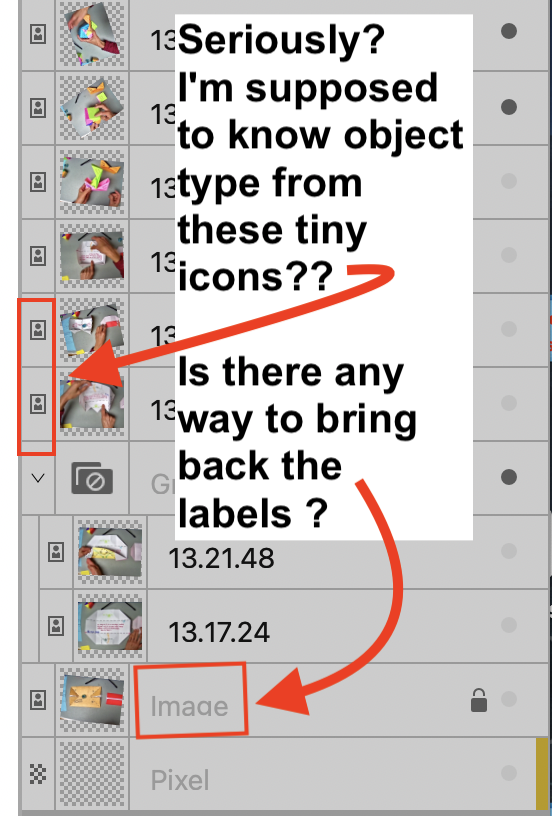
I apologize for not knowing the correct terms for the symbols in the GUI, but I have fiddled enough with the preferences to do all I can (or at least all that's obvious that I can) to support my vision issues. My point is that in general, tiny symbols with low contrast that can't be picked out from the background or easily distinguished from one another are a real problem for folks with vision issues - and this is not just a matter of "getting used to" a new GUI. I think your designers need to have a hard look at the entire product line with this issue in mind. -
Icon Style in Affinity Photo v2 + more...
hm933 replied to fotomak's topic in Feedback for the Affinity V2 Suite of Products
@Pšenda it's not that I don't understand the icons or understand their purpose. I can't see them well enough to tell at a glance what's what - and having to hover over the icon to get the tool tip is a huge time-waster. Same with the lock/unlock icons - it's not that I don't understand what they mean - but they're so small and similar I can't tell the lock from the unlock at a glance. Please have your designers study this document from W3C, "Accessibility Requirements for People with Low Vision" https://www.w3.org/TR/low-vision-needs/ They needn't adopt all the recommendations in the document, but they are leaving many people behind with their design choices. -
Icon Style in Affinity Photo v2 + more...
hm933 replied to fotomak's topic in Feedback for the Affinity V2 Suite of Products
-
I prefer to have my tools docked and I just discovered that if I undock the tools panel I get the color picker, which I sorely missed (I thought it was just lousy GUI design that it wasn't there). I tried "customize tools" but it's not there for me to drag when the toolbar is docked (or undocked). Am I missing something?
-
Icon Style in Affinity Photo v2 + more...
hm933 replied to fotomak's topic in Feedback for the Affinity V2 Suite of Products
I have mild vision issues and absolutely deplore the current design trend towards "form over function" when it comes to GUI's and websites in general. There are a bunch of things in the new GUI that make it really hard for people with mild vision problems (which includes many otherwise healthy seniors) to use the product (V1 was bad enough). (In)ability to use the GUI is a make-or-break feature of a product like this. Hoping that some of the serious workflow issues had been addressed in Photo v2, I was considering a more serious trial of v2, but if other people are already complaining about the GUI, I am less inclined to slog thru the process of learning a new GUI and new program. It doesn't help that there's no option to export a document for use in v1. I'll be getting a new computer that will require a Photoshop subscription and sadly, looks like I will have to bite the bullet and pay Adobe. -
Styles seems like an inordinate amount of work if f I'm testing out multiple different color possibilities and going back and forth between possibilities. If there's no better way, I'm thinking I could create a temporary dummy layer masking out all but the single letter, because you can change the color of an entire block of text without highlighting. It's still a lot of work for something that should happen automatically.
-
Shortcut for applying macro
hm933 replied to larsbre's topic in Feedback for Affinity Photo V1 on Desktop
+1 -
I am a Photoshop user who has been using desktop Affinity Photo for several weeks and I sadly have to conclude that AP is a long way from being a Photoshop replacement. Photoshop has many ways to simply accomplish what takes multiple un-intuitive steps in AP, but the deal breaker is turning out to be that neither the app or the documentation is friendly if you have mild visual impairment. So, for example, I can use the "edit all layers" in the layers panel as kind of a way of turning off "autoselect layer," but I couldn't easily tell from the documentation what the button looked like or where it was located and in the app itself and worse, the contrast between the on/off state is so low, I can't tell if I've selected it or not. I would have a hard time recommending AP to older folks who need high contrast and are more than casual users of an image-editing program. You are not the only folks who seem to be completely unaware of the needs of even mildly visually-impaired people (think all seniors) who use computers and I really deplore the general trend in design that seems to want to make things look "nice" instead of being functional. If I had to recommend one other GUI change besides the ability to enlarge elements of the GUI, it would be to increase the contrast between different elements.
-
Editable Macro Steps
hm933 replied to Tashfin Awal's topic in Feedback for Affinity Photo V1 on Desktop
I would also like to be able to edit a macro - it's a pain to have to re-record one you goofed up in. -
rasterize multiple layers
hm933 replied to karumba's topic in Feedback for Affinity Photo V1 on Desktop
Definitely need - I use Affinity for collage work and it is a giant pain to have to have to rasterize 20 layers! Even better would be the option to bring in images as pixel layers rather than have to covert them after importing. I was however, able to create Alex_M's macro. When you move to the next, it's important to tick "one layer below" in the dialog box that pops up during macro creation. Thanks. -
Mac OS 11.3.1, M1 Macbook Air, Affinity 1.9.3 When I import pdfs annotated in Mac Preview, annotations (symbols, lines, text, etc.) do not get recognized - only the "base" image is recognized. If I re-export the image as a pdf in Preview, Affinity Photo now sees everything as an image, but exporting to a new document destroys my ability to change the document in Preview. Adobe Reader and the inbuilt pdf reader at Google Drive can see the annotations just fine. Attachments A) "test.pdf" (I'm not sure what uploading it will do, but there should be a small screenshot with black text "annotation added using Preview markup tools" underneath and if opened in Mac Preview, that black text should be editable.), B) "test.png" what test.pdf looks like if opened in Preview, Reader and Google Drive C) "AffinityImport.png" - screenshot of the file as imported into Affinity - the screenshot image comes in, but the text does not Test.pdf


