Glyphs
-
Posts
174 -
Joined
-
Last visited
Everything posted by Glyphs
-
Yes, in my Publisher document, the pixel layers should be the Comic book Designer flattened file and the fill layer (that I copied from an Affinity Photo document). Fill layers help me create a resizable background for each of my documents, be it Designer, Photo or Publisher files. Kindle Support sent me the attached file about the PDF document I sent them. It shows that there really is a difference between the blacks. I did the same with the eyedropper in Affinity Publisher and didn't find any color difference in the blacks, so It looks like the difference appears only when the PDF is exported. I don't see any visible problem with the text. The colors are as they should be. The only problem is the background on which the pages have been pasted, but I can't seem to reproduce it. I even opened the original PDF in Affinity Photo. When I used the eyedropper on a page, there was no difference between the blacks either. I don't know how Amazon ended up with this result, but I do see that it has to do with the pasted images onto the black background. I am at a loss of ideas, at this point. Maybe I should try to flatten the layers in the publisher file, and send them the resulting PDF, to check if it solves the problem. If anyone has an idea, suggestions are welcome.

-
Actually Amazon Kindle Direct Publishing is OK for RGB files, especially since the books are primarily intended to be published digitally. The print-on-demand service is an option Amazon offers to KDP publishers. It allows us to create a printed version of the book with Amazon's digital printing service, but it's not offset printing, so there's no real need for a CMYK file. Amazon can handle any conversion necessary, so I've always sent them RGB files (and everything has been fine with this process, so far).
-
That's the problem. The Designer images and the Publisher file are both in sRGB/8 with the exact same profile, because I left the Default options as is in both apps. The black color is RGB = 0,0,0 in all the Designer files, and in the Publisher file. It's obvious in the printed book that the source of the problem is the difference between the black color in the Designer file and the black color in the Publisher file, but I don't know what option to change to make this right. At worst, I'll simply put a black fill background layer in each Designer file and paste the fill layer along with the image into each page. If the problem comes from pasting the Designer files, this solution might work, but it won't solve the overall problem. Is there some option to change in the Publisher and Designer files I posted to just make the Publisher file right?
-
OK, so this means that the software is fine, but the files have to be converted. All the book pages are RGB Designer files, and I need to send KDP an RGB PDF file. I suppose the fastest way to do this should be to paste each flattened RGB Designer file into an RGB Publisher file, and then export it into PDF. I thought that’s what I did, but obviously, I have it wrong. What would be the options to check in the Publisher file so that the pasted RGB Designer files, and the black background rectangle into the Publisher file have the exact same black values?
-
It will be faster with the real pages, since they are already done. Sorry about the free publicity, I'm really trying to have this book released. Here is the flattened Designer document, with its associated Publisher Page. The designer Page has been cut and pasted onto the Publisher Page, and a black background has been created as a master for the Publisher Page. Rage_Page_Designer_Sample.afphoto Rage_Page_Publisher_Sample.afpub
-
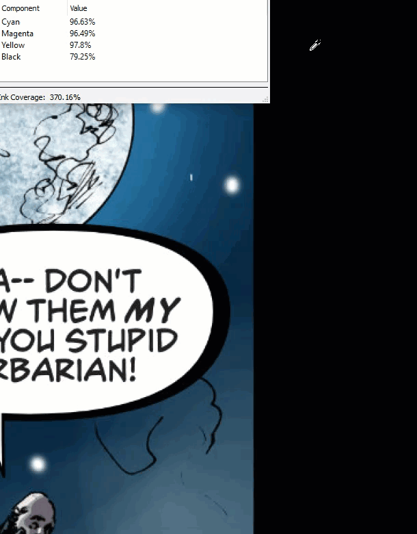
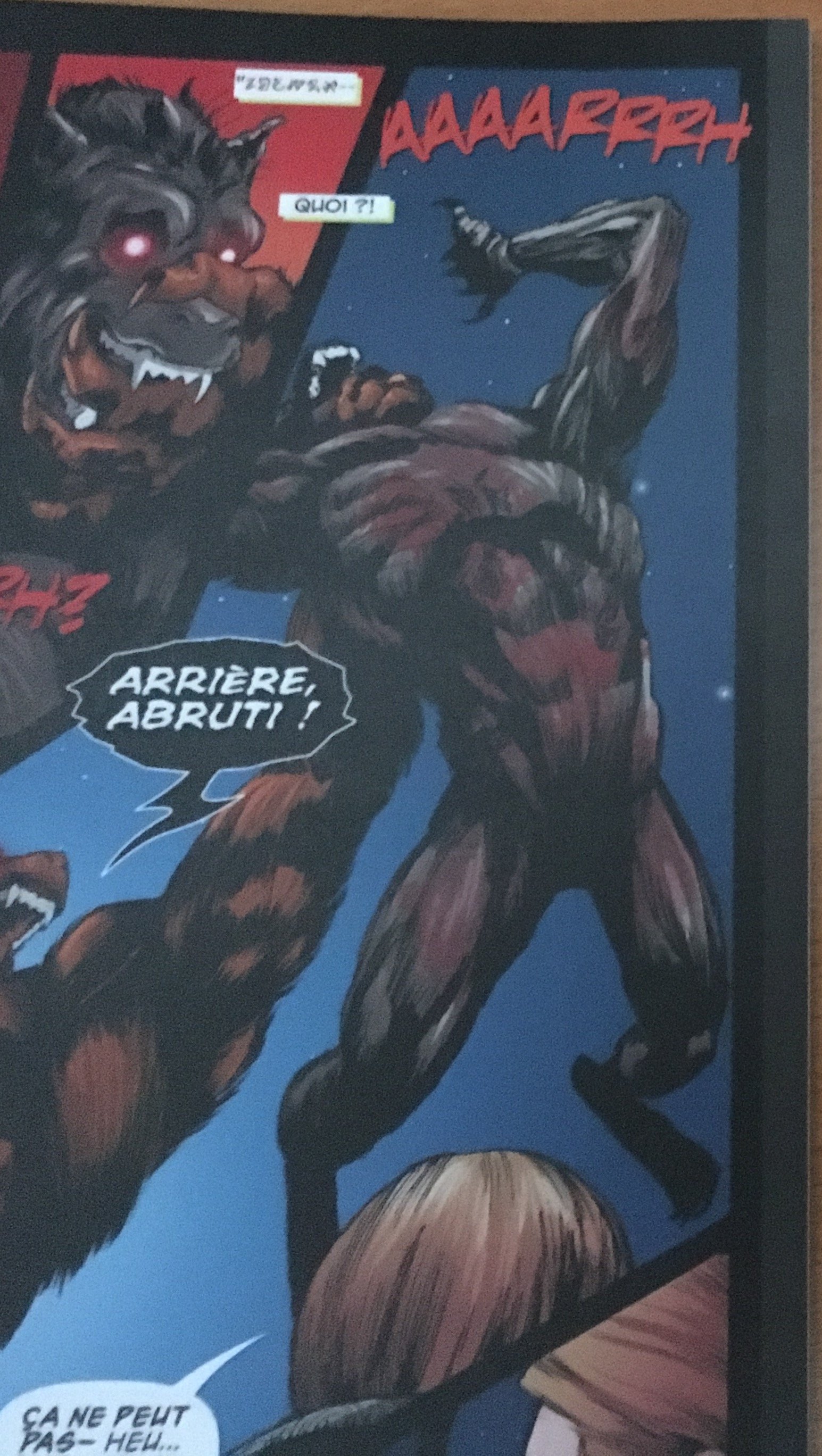
Sorry about the black values:) You're right for the Designer and Photo values, so the problem might not come from it (which is kind of worrying) Here are the images I sent to Amazon Kindle Support once I received the proofs of my books (photos of two of the book's pages). As you'll see, there's a difference between the black values, and I know for a fact that the differences are between the images I pasted into Publisher from Designer flattened files, and the Background rectangle I created in the Publisher Master Page of the book. I am trying to solve this, and am open to any idea.
-
Same reply as for Alfred: The files are in RGB/8 and I let them as is.The only thing I do is exporting the document to PDF. What I find is wrong is this: Create a new document, choose the Print option in the Type menu, set the Colour Format to RGB/8 if it's not already set this way, click OK, then create a rectangle. Click the Fill color thumbnail on top of the document. In the Color Tab, set every slider to 0 in the RGB Sliders menu to fill the rectangle with black. Then click the RGB Sliders menu, and choose CMYK sliders. You'll see that the sliders have been automatically set to C: 72 M: 68 Y: 67 K: 88. Choosing CMYK Sliders isn't like converting the whole document to CMYK. It would be more akin to checking if the CMYK values are right. I believe in this case, the values for Black should 100 for every slider.
-
It shouldn't be an issue because I don't convert the files. The files are in RGB/8 and I let them as is.The only thing I do is exporting the document to PDF. What I find is wrong is this: Create a new document, choose the Print option in the Type menu, set the Colour Format to RGB/8 if it's not already set this way, click OK, then create a rectangle. Click the Fill color thumbnail on top of the document. In the Color Tab, set every slider to 0 in the RGB Sliders menu to fill the rectangle with black. Then click the RGB Sliders menu, and choose CMYK sliders. You'll see that the sliders have been automatically set to C: 72 M: 68 Y: 67 K: 88. Choosing CMYK Sliders isn't like converting the whole document to CMYK. It would be more akin to checking if the CMYK values are right. I believe in this case, the values for Black should 100 for every slider.
-
OK if we create a document for offset printing, but we publish eBooks too nowadays. And then, there's Print-On-Demand services, who tell us to send them RGB files, and handle the CMYK conversions themselves. If it has to do with the TAC, I believe it should be part of a setting instead of being here by default.
-
Thanks:). The penciler is Alex Nascimento, and it's been colored by Dijjo Lima. The color format is RGB/8, so I don't see any reason why the CMYK option shouldn't display 100 for each value in this case. Maybe this has to do with the color profile, but I can't be sure. To check it, just create a new document, set it to RGB/8, then create a rectangle. Click the Fill color thumbnail on top of the document. In the Color Tab, set every slider to 0 in the RGB Sliders menu to fill the rectangle with black. Then click the RGB Sliders menu, and choose CMYK sliders. You'll see that the sliders have been automatically set to C: 72 M: 68 Y: 67 K: 88. I still don't understand why that is. At this stage, having a way to change color values for all objects at once would be a great help.
-
I have been trying to publish the latest issue of my comic at Amazon Kindle. Usually, I just create the pages in Designer, then compile a PDF to create the comic, and send it to Kindle in RGB. Kindle then handles the RGB to CMYK conversion, and the printed result is always fine. But this time, I used Publisher. I cut and pasted the flattened Designer pages into a Publisher document, then exported the book to PDF, and sent it to Kindle. As I needed a black background for the pages, I created a black fill rectangle in the Master Page, and applied it to all the pages. As you can see in the sample page I added to this post, the black color looks right (to my eyes, at least). But actually, it isn't. There's a slight difference between the blacks of the Designer page I pasted in the Publisher document, and the black background I used for the fill rectangle. So I checked the colors of the fill rectangle, and the RGB sliders are all at 0, as they should be. Then, I chose CMYK Sliders and I have the following values: C: 72 M: 68 Y: 67 K: 88. To be sure, I created a new document, created a black fill rectangle and checked the values. These are the same default values. I suppose this is where the printing problem is coming from, and these CMYK default values might be a way to have the black color look better in offset printing, but why are these values displayed by default instead of being part of some kind of Color Conversion setting, and why are the RGB sliders all at 0 while the CMYK values are not at 100? Shouldn't the RGB values reflect the CMYK values in this case? PDF Page Test.pdf
-
Master's items on top of the layers palette
Glyphs replied to Glyphs's topic in Feedback for Affinity Publisher V1 on Desktop
Thanks! I didn't notice the "Replace existing" option in the Apply Master's dialog. It's going to make me save a lot of time! -
When you apply a Master to a page, all the Master's items are placed in a layers group at the bottom of the layers palette. Is there also a way to create a Master so that some items are also placed automatically at the top of the layers palette in each page? Or in other words, is there a way to create a Master so that it generates several layers groups for each page?
-
Translation and Localization in Publisher
Glyphs replied to Glyphs's topic in Feedback for Affinity Publisher V1 on Desktop
I actually find it faster to just right-click a layer and choose Merge Visible in Photo than exporting to TIFF. And it's easier to manage too, since all I have to do when I have my FR and US merged layers is copy and paste it into a Publisher Page, then delete only these two temporary layers in the original Designer or Photo document. Exporting TIFFs into a pages-layout software is how DTP is usually done, and we always end up creating a file for each language, but it's still too slow, and prone to errors. I find my way better (even though it's mostly subjective), but it's still too much work. That is why having in every Affinity app a special layers palette exclusively dedicated to Localization would be useful to me. The goal here would be to import a Designer or Photo document into Publisher, and have it appear in the layers palette along with its localization layers (one layer for each language). When all the pages are imported, you check one option in Publisher, and all the French layers are displayed exclusively. You check a second option, and all the US layers are displayed the same way. And every time the original Designer or Photo file is updated, it refreshes in Publisher without loosing it's Localization layers. I am not sure how such an option could be implemented in future versions, but I am pretty sure it would be a great time saver for all of us. -
Translation and Localization in Publisher
Glyphs replied to Glyphs's topic in Feedback for Affinity Publisher V1 on Desktop
Better if I send you a page. I have rasterized the layers so that you can read the text without having the fonts, but I usually have a group of layers called FR and US with vector shapes for the balloons and text on top of it. If I need an US version for a 24 page comic, I would need to show the US group and hide the FR group in each Designer file. For now, the fastest way to have an FR and US version of a particular page would be to click the US group, merge all layers so that I have an image of the US version, then hide the merged layer and the US group, show the FR group and merge all layers again to create an image of the FR version, select both merged layers, cut it and paste it in the Publisher page. If I just place the image on the page, I would have one version of the file only, and it might be updated in the Publisher file with each correction to the Designer file. As you can guess, the fastest way isn't fast at all, but it's still the fastest way. The other way would be to have two versions of the same Designer file, but I would then loose time when I make corrections to the file. Rage #3 Sample.afdesign -
Translation and Localization in Publisher
Glyphs replied to Glyphs's topic in Feedback for Affinity Publisher V1 on Desktop
Actually, there can be many other differences than just text: All the localized layers contain graphic elements, meaning all the balloons and some sound effects. This is what makes it difficult. And yes, I do have 24 Designer or Photo documents for a 24 page book. -
I am a French Comic Book writer and publisher, and I am creating each issue of my comic in French and in English. Before Publisher, I created each final page in Designer, then compiled the pages into a PDF using Apple PDF Services. In each of these Designer files, there was an FR layer group for the French version, and an US layer group for the US version, so each time I needed to create a book, I had to check the right language layers group for each page in the Designer files, export each page to JPG, and compile the book in PDF, then check the other language layers group in each Designer file, and compile another book the same way. Not the easiest way of doing things. Now that I'm using Publisher, I am transferring all these pages into Publisher documents, and many things are now easier, but not the creation of localized versions. Now, for each page in Publisher, I have to create FR and US layers groups (to avoid confusion in case I have to add a page between two pages of a book). Which means when I want to export an US version of the book for example, I have to check all the US layers and uncheck all the FR layers on each page. It can still take a long time, and of course, it's prone to errors. I do need to optimize this workflow, and I think the best way to do this would be to create some kind of "Localization Layers" in all the Affinity Apps. Let's say I create pages of a book in French and in English in Designer or Photo. In each of these files, I put the French version of the design into a French Localization Layer, and the English version into an English Localization Layer. When I place the files into Publisher Pages, all the Localization Layers are recognized by Publisher (instead of the pages being updated when I uncheck a layer group in the original file), and all I have to do is check the US option in a Localization palette for example, to have all the US Localization Layers displayed, and all the other language Localization Layers hidden. Same thing for all the other languages. I think this kind of option would be a great time saver, but I'm open to any other idea to save time for these kinds of workflows, which can be quite exhausting.
-
It took 20 minutes to extract the 1.7.0.227 update, then, less than 1 minute for installation.
-
I am working on an interactive book, which will be available in print and in digital formats, and for the digital version to be truly interactive, I would need its text links to lead to specific parts of the book. Would it be possible to add such an option directly in Publisher's interface in future versions?
-
Text Styles Settings
Glyphs replied to Glyphs's topic in Feedback for Affinity Publisher V1 on Desktop
Thanks! It's not the easiest way to create a TOC, but it does work. I also noticed that a new TOC style is created each time a new TOC is generated. I am trying to have a TOC with dots in Tab Stops, but each time I am creating a new TOC, the Tab Stops are reset. Is there a way to create a TOC style, and have it be the TOC style by default for every new TOC, instead of having a new style generated for each TOC? -
Text Styles Settings
Glyphs replied to Glyphs's topic in Feedback for Affinity Publisher V1 on Desktop
OK. I have a chapter titled "CHAPTER". I need to create a TOC with chapters titled "Chapter". Is it possible to do this with a TOC Style? -
Text Styles Settings
Glyphs replied to Glyphs's topic in Feedback for Affinity Publisher V1 on Desktop
On another subject: is there a way to have a TOC Style with Initial Cap only (like in the word "Cap")? -
Text Styles Settings
Glyphs replied to Glyphs's topic in Feedback for Affinity Publisher V1 on Desktop
Thanks! I finally found out how to do it using the Designer Help. -
Text Styles Settings
Glyphs replied to Glyphs's topic in Feedback for Affinity Publisher V1 on Desktop
I actually have some trouble accessing the online help. Here is an image of what I have (in French, sorry).
-
Text Styles Settings
Glyphs replied to Glyphs's topic in Feedback for Affinity Publisher V1 on Desktop
Yes. What I don't know, is how to put text styles in a group styles. I see it's possible, but I don't understand how it happens.