OllyH
-
Posts
14 -
Joined
-
Last visited
Everything posted by OllyH
-
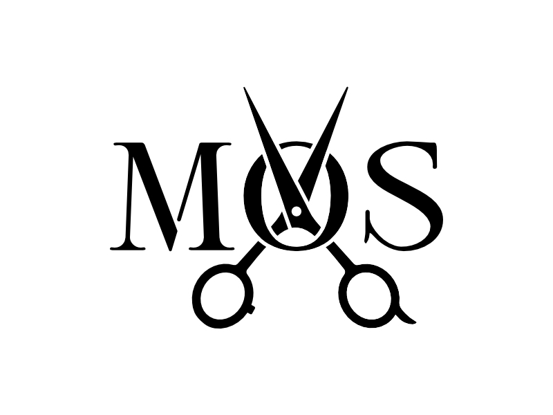
affinity designer Logo Design - MOS - quick and dirty progress
OllyH replied to OllyH's topic in Share your work
I have to admit, the original brief was sent to me by a third party, so it was a bit 'lost in translation'. Overall, it was an useful, if a little frustrating, technical exercise (which is always worth it.) -
affinity designer Logo Design - MOS - quick and dirty progress
OllyH posted a topic in Share your work
Recently dealt with a small logo project for a barber. Was a cheap job and needed to be done 'soon'. Below is the progress... - 1. This was the original logo, not 100% clear on the 'MOS' initials, but this is what they wanted adapting. Remove the lion and add some scissors. The colour was also preferred to keep (a kind of 'gold'.) - 2. This was my first pass, thinking that the staggered 'MOS' wasn't clear, I went inline and moved the scissors over the 'O'. Traditionally, for a fairly simple logo I've always made sure the silhouette of it reads well before introducing colour. - 3. Unfortunately my initial idea was 'too far away' from the originally produced logo. This was my next attempt which was signed-off. I feel it's a fair representation of the original brief and proof that sometimes doing what you think is right is sometimes wrong. - I thought this would be worth sharing as it was a learning experience for me using Designer. Especially merging, splitting and cleaning up nodes (so many nodes) and the like.
-
affinity designer Dragonfly, Yellow Winged Darter
OllyH replied to VectorVonDoom's topic in Share your work
Wow. Next-level stuff, amazing. Definitely an example of 'CGI' in terms of what's possible. -
THANK YOU! This has been driving me nuts (also, doesn't help my MacBook doesn't have a CTRL key on both sides of the keyboard.)
-
Nice work on those renders OP. I'm not at all surprised at the colours, imitating the original colourful iMacs whilst being very thin, possibly too thin? The power brick feels like a regression, but thinness wins I guess. These aren't for professionals, not that they aren't capable, these are very much an iMac 'for all'. Pro models will almost certainly come in the darker shades with black bezels. Black accents/colour-ways have almost always been reserved for the higher-end models (remember the black MacBook that had no other features than the colour that was an optioned cost.) Spec/Ports are very modern Apple, the Pro models will almost certainly be more as expected.
-
This has just saved me hours on a particular logotype job. Thank you! Can't believe it didn't spot this before.
-
Hi all. I'm Olly. Based in the south-east of England. Getting back into design after a slightly traumatic experience at an agency that set me back a lot. My main passion design-wise is branding and print media. I was able to do some basic website stuff, but a few years away from that industry has me left in the dust. Tried the trial versions of Designer and Publisher (still using Pixelmator for image work, which might well change in the future), felt right at home and bought them outright. Looking forward to seeing where all this takes me...
-
Gradient fill and noise filter not working anymore (v1.8.4)
OllyH replied to valorbyte's topic in V1 Bugs found on macOS
OK, this seems to be solved, having downloaded a file that had the Gradient Noise already used in it. Now the feature works even after closing the document and Designer, then re-opening. Very weird, but seems in line with the experience a few posts back. Seems to be reproducible at least. EDIT: Spoke too soon. Functionality is gone after a second load of the app. Very strange. -
Disable Option + Middle Mouse to zoom
OllyH replied to eon Designs's topic in Feedback for Affinity Publisher V1 on Desktop
I second the request for this. Magic Mouse is very prone to accidental "slippage" resulting in zooming in/out. Option to disable ALL trackpad/mouse zooming would be great. -
Cheers. I think it'll be and A/C variant. A has less H effect. Which is good.
-
Fair point. Think I got carried away with an attempt at symmetry. Edit: Added new approaches... I think 'c' works best now.
-
I've recently started to get back into design on a freelance basis and decided to update my older logo with something that's a little more fun. Used Designer to cut up some basic shapes and created some overlays, etc. Also looking into a "worm" version that uses the curves as an inter-twined continuous line (harder to do nicely due to the ascenders in the logotype.) Might also do a version with some transparency for watermarking, etc.
-
+1 for this. Agree with the previous that the Freeform version of this feature looks easier, but the Illustrator Mesh tool is probably more compatible with other formats. I'd imagine either would be difficult to implement for the most compatibility, especially if it had to be converted to pixels, detail could be lost (especially with large-format reproduction.)
-
Gradient fill and noise filter not working anymore (v1.8.4)
OllyH replied to valorbyte's topic in V1 Bugs found on macOS
Hello. I'm also having the same issue. Have had Designer from (from Affinity website, 90-day demo version initially) v1.9.1, recently updated to v1.9.2. Issue still persists (it's not a deal-breaker for me, just when trying stuff out found it wasn't working.) Running Mac OS Big Sur, 11.0.1 on MacBook 12" Early 2015