Stephen_H
-
Posts
269 -
Joined
-
Last visited
Everything posted by Stephen_H
-
Just speculating. Maybe there's more need for that rumors section after all?
-
Especially if updates to a common feature can happen once. e.g.: If there's an update to support a new font type. If all three are sharing the same plugin/resource/code/library, then it's just a single update, not 3 separate updates.
-
There's so much secrecy and uncertainty around Publisher, that perhaps Affinity needs a forum just for rumors? (Apple has entire websites for them)
-
This will also fit into their philosophy to allow all of their apps to read the same file. (I suspect it's this philosophy that's holding up Publisher's release – every feature they add to Publisher, has to be supported by 2 other applications so the document doesn't get damaged when saved by another app. Just imagine the headaches that multi-page spreads with master pages are causing in the other 2 applications. They can barely get art boards with bleed to work nicely, and don't get me started on 'tabs'. They might be rewriting Designer and Photo to support Publisher so when they release Publisher, they will have to re-release Designer and Photo as well. Perhaps, Publisher will just cost $130 and will come bundled with Designer and Photo that are integrated like plugins???)
-
I'd like to think they are for a round-trip work flow. Select an image, click the Photo icon and boom, I'm editing the pic in Photo. Save and I'm straight back into Publisher. Much better than building image editing feature into Publisher. Or maybe... We're going to get "Affinity Studio" where those 3 app icons are actually personas. We never leave the single app, but all tools, panels and menus change to those of the relevant app. It might be a bit RAM heavy, but you're always being presented with the appropriate tools for the task at hand. I hope this gets added to the other apps as well.
-

Affinity Publisher
Stephen_H replied to ONSO's topic in Pre-V2 Archive of Affinity on Desktop Questions (macOS and Windows)
It's interesting that in the top left corner where you usually have Personas, you get the icons for the other 2 apps. I wonder if that means you can select an item and jump straight to another app, edit it there, and save back to Publisher for a round-trip work flow.
-
Affinity Publisher
Stephen_H replied to ONSO's topic in Pre-V2 Archive of Affinity on Desktop Questions (macOS and Windows)
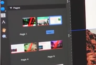
Yup the basics seem to have been covered. (Text styles, rules, baseline, text wrap, page management, rules, drop caps, text box columns, text box linking, baseline, spell checking, picture frames special characters, master pages – I wish I could see that far set of panels) I find their Pages panel a bit confusing... Spreads are named after the left page. I can see this terminology causing confusion. e.g.: "Go to page 5 which is on the 3rd spread that's actually called page 4" (see my screenshot) Even here, they are working on page 4, but page 3's thumbnail is highlighted with page 2's name is highlighted. Yeeesh... I hope page and spread shuffling will be easy. They are a bit of a nightmare in InDesign if you want to pagenate (page imposition) a 32 page booklet. It'll be fantastic if that can happen automatically at export.
-
Affinity Publisher
Stephen_H replied to ONSO's topic in Pre-V2 Archive of Affinity on Desktop Questions (macOS and Windows)
Just seen this demo of Publisher in use. It was released in December last year. (Did anyone get notification of this video?) At 1:30, they demonstrate text wrapping... thank goodness! In the description they mention releasing a Beta version this summer, which I assume is coming up in a few month's time. -
Affinity Publisher
Stephen_H replied to ONSO's topic in Pre-V2 Archive of Affinity on Desktop Questions (macOS and Windows)
????? Huh? Have I missed a post or just not up to speed on the latest cute cat video on YouTube? -
Affinity Publisher
Stephen_H replied to ONSO's topic in Pre-V2 Archive of Affinity on Desktop Questions (macOS and Windows)
Thanks for the offer to help, but I just found a simple work-around to my problem... I browsed Quark's shop through Opera browser. It has a free, built-in VPN so the shop didn't recognize me as coming from South Africa. It thinks I'm in Germany so it let me in. Everything was in German but it allows me to select a different language. My point is: it let me in and will accept a purchase. The €399 competitor upgrade option is looking very tempting. It even looks like the PDFToolBox offer might still apply to this offer... -
Affinity Publisher
Stephen_H replied to ONSO's topic in Pre-V2 Archive of Affinity on Desktop Questions (macOS and Windows)
QuarkXpress + PDFToolBox is pretty much the whole reason/solution I can't/can leave Adobe completely. I haven't found decent [yet affordable] replacements for InDesign & Acrobat (purely for it's preflighting features). I hope the guys here at Affinity are watching this thread and see the lengths we're willing to go to in order to get off Adobe. The longer we wait for Publisher, the more business Quark is going to get from us. I'd even be prepared to put my money where my mouth is and pay as pre-order (I'm willing to fund it as a "Kickstarter program" if they are struggling with allocating staff resources) -
Affinity Publisher
Stephen_H replied to ONSO's topic in Pre-V2 Archive of Affinity on Desktop Questions (macOS and Windows)
I enquired about QuarkXpress about 4 months ago. It was a huge mission to just get a 30 day demo. I had to deal with a local sales rep and the price I was quoted did not match the online price in Dollars. (it was about 50% higher) This makes me doubt whether I'd be able to take part in the online specials. That German magazine offer is interesting. Though it seems to be a 2015 version, not the current one so I'll be in for an upgrade cost. I also wonder if the software will be in German or English? -
Affinity Publisher
Stephen_H replied to ONSO's topic in Pre-V2 Archive of Affinity on Desktop Questions (macOS and Windows)
Yup, me too. In fact, when I started out out, the trinity of apps was Photoshop-Freehand-QuarkXpress. Apart from changing from InDesign back to Quark, what real choices do I have? (and Quark costs a small fortune compared so a professional, sub-$100 layout app will be a winner) I actually think that the average home user would be better off with a Publisher-Photo combo rather than the current Designer-Photo combo – there are a lot of overlapping features. -
Affinity Publisher
Stephen_H replied to ONSO's topic in Pre-V2 Archive of Affinity on Desktop Questions (macOS and Windows)
Publisher's release date has already been pushed out many times before so expecting early 2018 is a bit optimistic. I personally can't wait. I have my credit card ready and waiting for the release date. Skip the beta testing phase and just release it – bugs and all. Give me a discount as a launch deal and fix everything in the first update... I won't complain, promise. (It must be the implementation of the 'impossible' arrow heads that's holding up its release... ) -
Arrow heads for line ends
Stephen_H replied to pjmnikon's topic in Older Feedback & Suggestion Posts
Arrowheads, arrowheads... where for art tho'? (Scuse the spelling) Big update today to 1.6, and still nothing. There must be some technical issue here. The developers know how much we want/need them. -
Creating Animated GIFs?
Stephen_H replied to Stephen_H's topic in Feedback for the V1 Affinity Suite of Products
I've found this for Macs.Can someone tell me if it's any good? http://www.sixfingerapps.com/video-to-gif-converter-for-mac/ Otherwise I see there are a few really cheap options in the Apple App Store. Search "gif animator". Almost all are under $10 (I think... I'm seeing prices in my local currency). I just liked this one because it allows for adjusting final image quality. I'm okay with making a looping video in a video editor like FCP, Premier or AE, and then run it through a convertor – it gives me way more control anyway. -
Creating Animated GIFs?
Stephen_H replied to Stephen_H's topic in Feedback for the V1 Affinity Suite of Products
Fantastic post. Thanks SrPx. -
Affinity Publisher
Stephen_H replied to Wolfi's topic in Feedback for the V1 Affinity Suite of Products
Wow, database functionality... I've never considered that before, but now that I do I can imagine fantastic benefits. Half the web has moved towards database-driven page layout for good reason, so why not page layout? It would immediately put itself ahead of InDesign and Quark upon launch just based on the concept alone. (They will both have tough times rewriting their software to implement this feature) It would be a bit like Final Cut Pro X. It's a database-based application which is why it has no Save command, nearly unlimited un-does and no work ever gets lost in the event of a crash. Much better than being interrupted with spinning beachball autosaves every 15 minutes (yes Premier, I'm looking at you). This might also have the added benefit of being able to add DRM-style photo management at a later stage. Page layout always "links" to images rather than embedding them, so why not put the link management on steroids and push it all the way to image/resource management? Fantastic concept. -
I know it's a long, heated discussion, but I have to agree with the OP. The icons are more like mini illustrations. I stare at them interpreting what they represent. Icons should be symbolic and immediately identifiable which I believe they are currently not. The monochrome option doesn't solve the problem. In fact, I find it even worse – they actually need their color to be better recognized. When I design a company logo, I start on paper in black and white using a thick, clumsy marker knowing that I can always add color & detail later, but I can't always remove them. These tool icons feel like "show-n-tell" illustrations rather than universally recognized, iconic, symbols. RonnyB created a sample set of flat, B&W icons and posted them here: They are phenomenal and exactly what I expect from a professional-grade application like Affinity's suite. And to all those who say the features are more important that the interface, I have to say they need to go hand in hand. This is a basic principle of professional graphic design and the heart of marketing. When I launched both Affinity applications for the first time, I immediately created an initial impression on whether this was going to be a pro tool or a prosumer substitute. The illustrative tools told me prosumer, my efforts to drop Adobe made me stick around and dig deeper into the actual workings of the software. Most of us using these apps are employed in some form of design or marketing. To say that the appearance of the software's interface is irrelevant, is a rejection of the core values of our industries and ourselves.
-
The 500th thread about GUI …
Stephen_H replied to mac_heibu's topic in [ARCHIVE] Photo beta on macOS threads
RonnyB... these are absolutely FANTASTIC!!!!!!!!!!!!!!!!!!! -
Hi all I'm importing a set of 36 photos carefully photographed for the purpose of creating a 360 spherical image. When I create a new panorama, I select my photos and it auto-stitches my image quite accurately, except for the fact that each row of photos is offset bay about 180 degrees. Here's screenshot: Is there any way to fine-tune the panorama to indicate where the photos should be positioned?
-
Combining panels for fewer clicks & repetition
Stephen_H replied to Stephen_H's topic in Older Feedback & Suggestion Posts
Since the "triangle within the circle rainbow" is a graphical representation of HSL. (Hue in the ring, Saturation and Lightness in the triangle) and I've included RGB sliders beneath it, I think I was reading your mind – 2 colour models represented at the same time. Perhaps a simple checkbox to "snap to web-safe" will add your HEX request? -
Combining panels for fewer clicks & repetition
Stephen_H replied to Stephen_H's topic in Older Feedback & Suggestion Posts
Yup. I understand that lockable panels might be patented by Adobe thereby blocking Affinity's ability to copy this feature, but Affinity has already implemented buttons to open/close panels. There are character and paragraph buttons in the context tool. Let's just get a few more like this to include colors, strokes, fills, layers etc.
-
Combining panels for fewer clicks & repetition
Stephen_H replied to Stephen_H's topic in Older Feedback & Suggestion Posts
You joke... but think about it a bit – it might be a great way to expand & collapse panels. It would be a lot quicker than going through the menu each time. Perhaps there need to be buttons to open/close panels in the top bar. It would be more useful than flipping and flopping. -
Ability to design icon (.ico) files
Stephen_H replied to neville's topic in Older Feedback & Suggestion Posts
Ooh, what a nice idea. I'd love to be able to export .ico files.