bibliomatic
-
Posts
8 -
Joined
-
Last visited
Everything posted by bibliomatic
-
I thank you very much, Iacerto, for all your research on this issue! I have tried a few of combinations with optical alignment and this could be the most cost-effective way of solving it as you have pointed out. Previously I had set the optical alignment to None. Adding your setting of 100% Left in Manual, with the non-breaking space (not the narrow one) solves it partially, because an em dash at the end of a line when it is a "beginning" em dash is not recommended at all. As we can see, Publisher put the non-breaking space out of the text frame frontier. This is caused I think, because, as you have said before and I ignored, a regular non breaking space is width variable, so Publisher adjust it on its own way to obey to this additionnal optical alignment order we have given to it. But the thing is that if you give the order to Optical alignment instead, with the narrow one, so a non width-variable character, there you have the best and most conservative output which is to respect the whole train of so supposed non breaking characters: ",(NarrowNonBreakingSpace)—(NarrowNonBreakingSpace)ce" is mantained in the previous line unbroken. Note also that for this second time I have not erased all the Manual Optical Alignment presets that came already in Publisher. UPDATE: In another part of the text it still doing the same thing with the narrow non breaking space, so we can conclude that the optical alignment solves the issue partially, and one has to set it manually, however in case of a missed one which acheives to pass unnoticed, the bad effect is considerably lesser for the reader eyes!

-
I mean a non breaking space, whether it's narrow or regular, not quite sure if these type of non breaking spaces are fixed in length or not. This also happens with the regular non-breaking space (see attached photo). I use auto-hyphenation, if you are not able to reproduce this with the en/em dashes it has to be something related with my own settings!
-
Perhaps, as lacerto has said, there is certain "finesses" a graphic designer must still be accustomed to deal with manually, and consider in this particular case of the pair of em dashes to introduce a pair of tags in a previous step of the workflow so as when you have your text in Publisher you can Find and replace it with the No-Break style (as OldBruce has pointed out) at once, with the same regex as e.g. with italic text. But, still, I don't quite understand why Publisher would allow a "NarrowNonBreakingSpace" to be the first character of a line in a text box! The purpose of such a character is to prevent the break between both of the previous and next words, but, once this command is overridden, as we clearly see it happens, it could just treat the "NarrowNonBreakingSpace" as a simple space and let it just surpass the text frame at the end of the previous line (as the normal behavior).
-
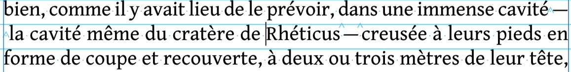
The hyphenation language is set to French, I think Publisher consider the em dash as a hard hyphen (same thing happens with the en dash), so, as in french (I think in english too) it is allowed to make the break at the end of the line just using a pre-existing hyphen, it considers"cavité(NarrowNonBreakingSpace)—(NarrowNonBreakingSpace)la" as a compund word. It could be solved if the first NarrowNonBreakingSpace is replaced by a simple Space, but then you have to check all the pair of em dashes which go along. In english language this is not a problem as the pair of em dashes has no spaces before and after and are glued to the text itself. Perhaps there is some trick to parse all the text and use only the NarrowNonBreakingSpace after the first em dash and before the second em dash, but I'm not well versed in Regex so… I don't see any reason why Publisher should consider an em dash or an en dash as a hard hyphen in a compound word!
-
Same thing happens to me with the em dash — (alt+0151) in between two non-breaking spaces or two narrow non-breaking spaces. ?
-
I downloaded it yesterday in order to avoid InDesign excessive subscription fees but I have been finding out some flaws that even for a novel book formatting level, these are quite disappointing. Don't know how to solve some issues without some sort of GREP formulations. I would not transcend it here as this will be out of topic and will dive into the forum for previous concerns. Thanks again for your help!
-
When it's correctly implemented I think it's not so bad and also it has been a common practice in much of the latin-based languages. Thanks for your mention to the affinity tips about drop caps. The second solution brought by prophet seems to be the better approach, however the way it could be done through InDesign involves much less steps I think. Nevertheless, it would be great if this feature could be added in upcoming updtes of Affinity Publisher. Thank you for your replies!
-
Me too! The workaround used in InDesign modifying kerning after introducing a zero-width-non-joiner just after the drop cap is not possible, all options are greyed and only auto is allowed when you select this zero-width-non-joiner and the next letter. If you place the cursor just before the non-joiner, all the lines move instead of only the first line. Is there anything to work this out?


.png.cf9469455d7040626ba1aa2aee5035a4.png)
.png.f20a38610d5780ce99023ba1c760e69c.png)
.png.6b7f1f285aa47a1673088ef8d31f85d5.png)