

Catherine M Evans
-
Posts
14 -
Joined
-
Last visited
Everything posted by Catherine M Evans
-
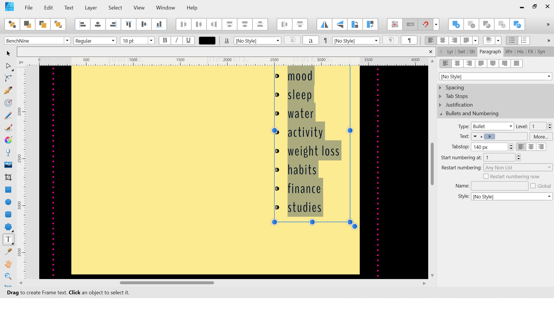
The bottom line for me is that Designer SHOULD have the Sentence case / Title Case / lower case etc options, end of story. As has been said above, the ability to use text should include all basic text features, which most definitely includes this! No one should have to swap software to do such a simple, quick edit. I'm using bullets in Designer right now...? (Pic attached) First app or first app?? I have been using Serif software for... probably 12 years now, maybe more. I used PagePlus and DrawPlus for so long I have a lot of source files that I can only open in PP or DP and copy across to AFD or AFP with varying degrees of success. Anyway, not sure why the release dates are relevant to this thread?

-
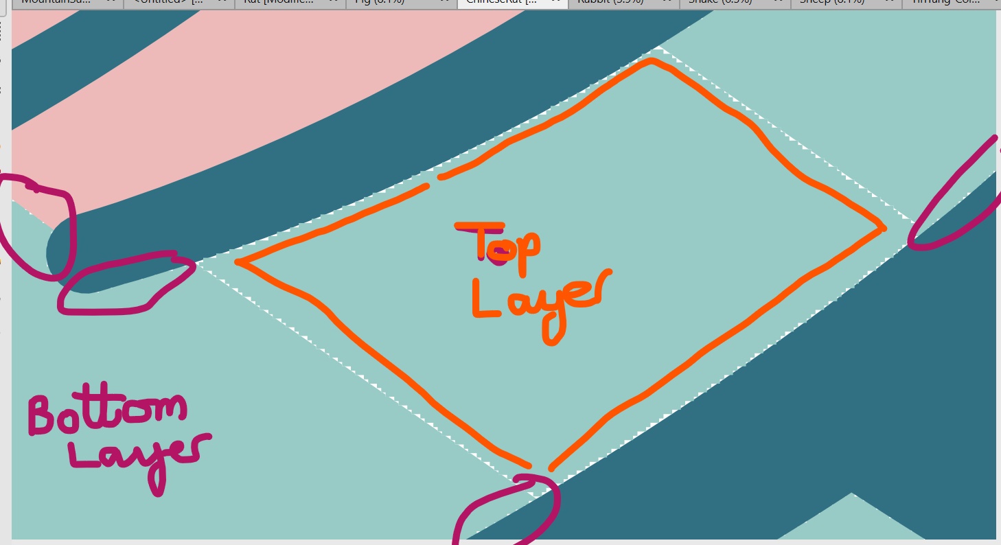
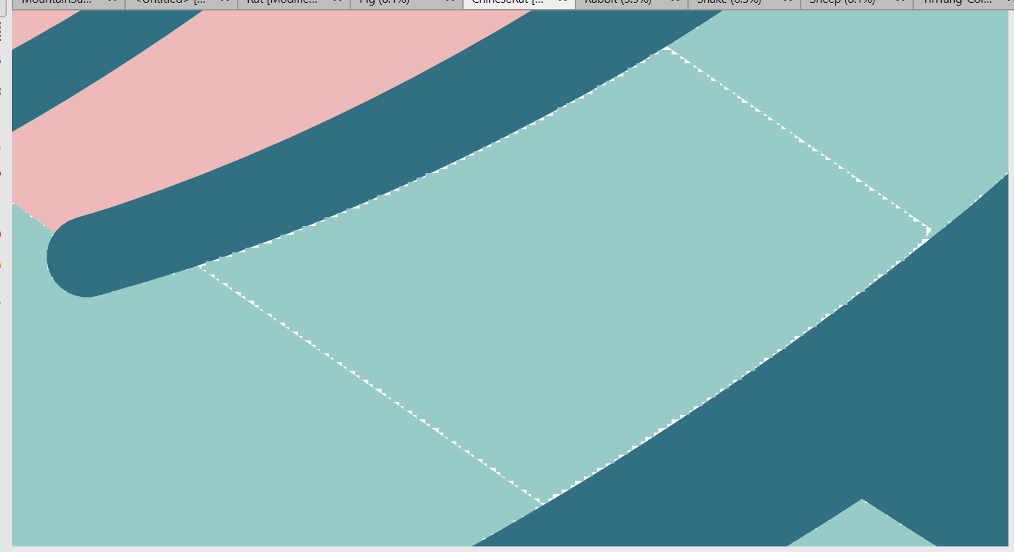
Hi Lee, my apologies for missing your post! I'm so sorry, I just didn't see a notification. I will attach the file (it's a Chinese zodiac rat) - the close-up screenshots above are the rat's ear. Since I posted this I have been advised that I should be able to do everything I want in Export/vector mode, but I have yet to figure out how. I wondered if I might be able to create a shape from curves (e.g. the clouds and the rat itself in the attached), and then just Fill them as I would normally with a shape. But I can't seem to get the curves to create a fillable shape - I've tried Add, Merge etc but nothing keeps the curves exactly as I've drawn them yet joined together to make a fillable shape. Any advice gratefully received. Kind regards, Catherine ChineseRatTEST.afdesign
-
Designer 1.10.0 Desktop crashes
Catherine M Evans replied to Bamboli's topic in V1 Bugs found on Windows
That's good of you ask, thank you - it seems to be fine now. It only happened a few times after installing 10, and it hasn't happened since then. Thanks! -
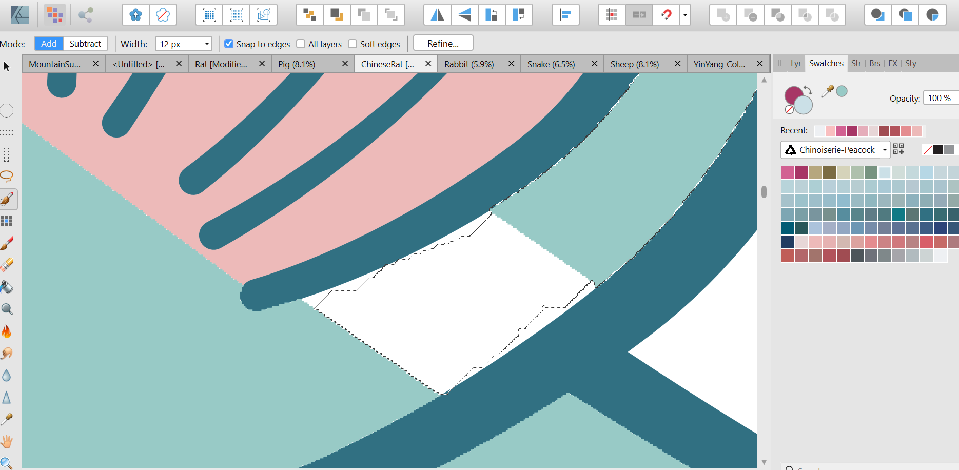
Hi smart folks! I'm having trouble using the Selection Brush Tool in Pixel Persona (AF Designer). 1. I experiment with different brush widths, but most of the time I can't seem to successfully select the exact area I want. Sometimes it works perfectly, but most of the time it drives me crackers! Screenshots attached, showing how the selection is really rough, and jumps into an adjacent area even with a small brush width. 2. And how do I get the flood fill to fill an area properly, without leaving raggedy edges? (3rd & 4th screenshots attached) I know I had a high tolerance figure, but then when I lowered it the fill didn't work at all And regardless of where the pixel layer is, you can still see the ragged edges. It looks so easy on the tutorials! Thank you, Catherine
-
Designer 1.10.0 Desktop crashes
Catherine M Evans replied to Bamboli's topic in V1 Bugs found on Windows
I have also had a couple of crashes since installing 1.10. It used to happen regularly with PagePlus and DrawPlus for no apparent reason, but I'd never had a crash with AF Designer or Publisher since getting them, till now! It's happened twice so far, I couldn't really tell you at what exact point as I'm just working on some product listing pictures, so I'm just doing basic stuff - moving objects around, resizing shapes, using swatches, adding text... really mundane things in a small file! Thanks to Matt for the above information. I bought direct from AF so if it remains a problem I will reinstall the previous version. Catherine -
Great question, pomme27! Did you do it? Did you use the recommended format? If so, how did you get on? Did you have any images in your book or was it just text? Thanks in advance! Catherine
-
Thank you, Carl & Bruce, for your replies and attached templates. Really kind of you and very much appreciated!
-
I am creating a Publisher document that will be exported as a PDF. Apart from the cover page, I have 80 pages with one master page and one different thing on each subsequent pair of pages. Each pair of pages is one day number, so in the end I need the cover page and then page 1=Day 1, page 2=Day 1, page 3=Day 2, page 4=Day 2, p.5=Day 3, p.6=Day3 etc up to Day 40 on pages 80 & 81. I've set up my master so that all I'll need to change is the number 1, 1, 2, 2, 3 etc - is there a quick way of doing this? I've looked at adding a page number field on the master, which would be perfect if they were just in sequence 1, 2, 3, but I can't see a way of adapting it. If there isn't a repeat action kind of facility, then is there a way of creating the 40 days twice and merging the files so that the pages merge alternately, giving me the 1, 1, 2, 2, 3, 3 that I need? Thanks in advance! Catherine
-
Very much needed, I hope the developers see this and realise the need is out here!
-
You're all wonderful, thank you! I really appreciate your time and patience. Hugs to you all, Catherine
-
And one more quick question, Chris26 if you have time (or anyone else, all opinions welcome!) - if I create artworks specifically to sell on Etsy, that people would download to print, what would be the best profile to use, assuming most of them would get them printed outside the home (I've read feedback like "I got it printed & framed at Walgreen" etc) or maybe online? Mostly because they can then be printed on bigger & higher quality paper. Thanks, Catherine
-
Thank you so much v_kyr, BofG & Chris26 for your answers! And thank you for keeping them relatively simple for a relatively simple person like me 😄, they help a lot. I've just realised I sent 2 screenshots of the same thing, I meant to send a screenshot of all the CMYK options (I won't do one now as I know you'll all know them inside out). So does this mean all those options, like Japan Color 2001, U.S. Web Coated etc etc? What would be the best default CMYK profile for general use, if I choose to create something in CMYK? And what is the difference between coated and uncoated? Thanks again all, I'm really grateful for your help.
-
In Affinity Designer & Publisher, what do all the various colour profiles mean, and how do I choose which one to use? I have searched and searched and found lots of articles and videos about colour management, but I cannot find any layman's information on choosing a profile when setting up a document. There is a lot of detailed information about RGB/CMYK (which I pretty much understand), monitor colours, colourometers (or something like that!) etc, but as interesting as that detail is, I am just finding it overwhelming when all I want to know is how to choose the settings that would be best for my particular projects. Generally I create graphics and documents for printing, both on my own basic home printer and for professional printing. E.g. I have created graphics for books that I have self-published on amazon (for kindle and print paperback), and I am currently creating graphics to sell as digital downloads on Etsy - these would be printed by the buyer, either on their own home printer or possibly by a professional printing company. So my main aim is to create graphics that when printed will match the online pictures reasonably closely, and deliver a high quality end-product. Many apologies if I've missed the answers I need somewhere else in this forum! And thanks for taking the time to read this. Catherine


_LI.jpg.aaf3c583d994a44113d782027d202383.jpg)
_LI.jpg.876aabffc97437d447f757fda7f4a7e0.jpg)