pagelayoutt
-
Posts
27 -
Joined
-
Last visited
1 Follower
-
 pagelayoutt reacted to a post in a topic:
Is AFFINITY dead?
pagelayoutt reacted to a post in a topic:
Is AFFINITY dead?
-
 Lisbon reacted to a post in a topic:
How can I (1) blank out old comic captions and (2) retype them inside a text box
Lisbon reacted to a post in a topic:
How can I (1) blank out old comic captions and (2) retype them inside a text box
-
lacerto reacted to a post in a topic:
How can I (1) blank out old comic captions and (2) retype them inside a text box
-
lacerto reacted to a post in a topic:
How can I (1) blank out old comic captions and (2) retype them inside a text box
-
@lacerto: Adding a bit of noise is a great way to make the revised speech bubbles blend with the original artwork. I was unhappy about the sharp contrast, but had no idea how to resolve the problem.
-
@lacerto: I can't thank you enough. Your suggested workflow seems perfect for my situation. I agree that the work is best done page by page (too many special cases on certain pages). The colored background for speech bubbles is merely designed to make it easy on readers' eyes: My gut feeling is that black text on an off white background increases legibility.
-
pagelayoutt reacted to a post in a topic:
How can I (1) blank out old comic captions and (2) retype them inside a text box
-
Thank you for the macro. I had no idea that Affinity commands could be programmed. Are these techniques documented anywhere? In a dusty corner of the Help file?
-
Thank you for mentioning these unfamiliar tools and settings. I'll have to play with them and work out an optimal workflow. Most of my comic work requires paraphrase, "translation" from verbose, high falutin' 1950s English to 2022 English suitable for readers with a more limited vocabulary and shorter attention span.
-
pagelayoutt reacted to a post in a topic:
How can I (1) blank out old comic captions and (2) retype them inside a text box
-
Thank you, Lacerto. I have indeed purchased the entire suite. Most of my texts are already typed up and ready to be inserted into the correct comic bubbles. I don't know how to "[use] flow control to ensure that text is ... correctly divided between frames". Because each comic page has multiple pages with panels that vary in number and size, I only know how to insert text chunk by chunk. @Dan C gave me some useful pointers which I modified. I used the Selection Brush Tool to select the inside of the speech bubble #1 > #2 I then refined my selection and placed a text box completely enclosing the speech bubble. The result had the wrong background color (black text on plain white is too stark a contrast). The interline spacing was also off, but I poked around in the menus and found the correct command to bring the lines closer together. The only real problem in #3 was the plain white background. *** #4 After a bit of experimentation, I was able to use a Black and White mask #5 By poking around near the color wheel, I was able to choose better HSL values #6 Now the colors are better (off-white) *** How am I supposed to get all the text to flow in Publisher? Do I ... (1) First prepare comic pages consisting of panels with blank text boxes in AffPhoto? (2) Somehow insert them one by one into AffPublisher? I hope to have each comic page occupy the top 2/3~3/4 of a Publisher page, with the bottom 1/4 left for annotations. The process is unclear, however. Despite the lessons I have studied, my experience with inserting text and images into Publisher has been rather frustrating.

-
Dan C reacted to a post in a topic:
How can I (1) blank out old comic captions and (2) retype them inside a text box
-
Thank you so much! The step by step walkthrough makes your answer very clear!
-
Is AFFINITY dead?
pagelayoutt replied to J.T's topic in Pre-V2 Archive of Affinity on Desktop Questions (macOS and Windows)
BTW, Yandex Translate does Polish to English very well. BTW, Yandex Translate bardzo dobrze radzi sobie z polskim na angielski. I fully agree with Grafkom. PLEASE don't go disappear on us (or get sold to a corporation that will start charging rent instead). I'm eager to give Serif my money (while my family still has an income) for additional programs (Video editing? Comic creation?) or useful plugin modules for specific tasks. -
pagelayoutt reacted to a post in a topic:
Is AFFINITY dead?
-
For over a year, I have been trying to (1) blank out old comic captions and (2) retype them inside a text box. This is probably a trivial task with Affinity Photo (My comics are in JPG form with many lines and complex colors, so I figure Designer is not suitable), but my search for answers has been fruitless. I have done the following: (1) Read the official Affinity Help File, (2) Paid for and gone through Beginner’s courses in Affinity Publisher and Affinity Photo (including compositing and photo restoration from Affinity Revolution: I searched the index to their 679 page Affinity Photo eBook and their 840 page Affinity Designer eBook). (3) I have also gone through YouTube lessons by Rory Mole, Robert Chalmers, Olivio Sarikas, Rachel Harrison-Sund and Elaine Giles: all to no avail. Clumsy Workaround: I am using an old version of Photoscape (Korean software) to process my images, but the resulting images cannot be edited. I used Photoscape to make the animated GIF. Whenever I want to revise any old work, I have to start from scratch each time, so progress is rather slow. I really like the Affinity suite, but I am still taking baby steps. Nature of Help Needed: I have a few hundred pages of comics to process, so I am hoping to find a simple solution to my caption problem, which will probably involve three steps: (A) select each caption one by one (is there an AI program that can do this?); (B) insert an opaque text box (there must be a way to reuse old settings); (C) type in the new or revised text (again, I need to reuse settings: typeface, color etc) Non-Proficient Advanced Beginner: Despite all the Affinity lessons I have watched and practiced with, I still consider myself a slightly advanced beginner: I am familiar with a fraction of the basic menus and operations, such as first creating a pixel layer. I hope somebody can point me in the right direction for caption revision (YouTube overlooked lessons?) or tell me which commands I need to use on a laptop with AffPhoto 1.10.5 running under Windows 10 with decent specs (DDR4 3200 MHz, Rysen 4000 series, Nvidia Geforce GTX). Thank you!
-
Wow! Thank you for making this video based on my forum question. The eraser adjustment part is a bit tricky, but I'll tinker with the settings until I get it right. The image edges definitely look more professional after the "shine" is removed.
-
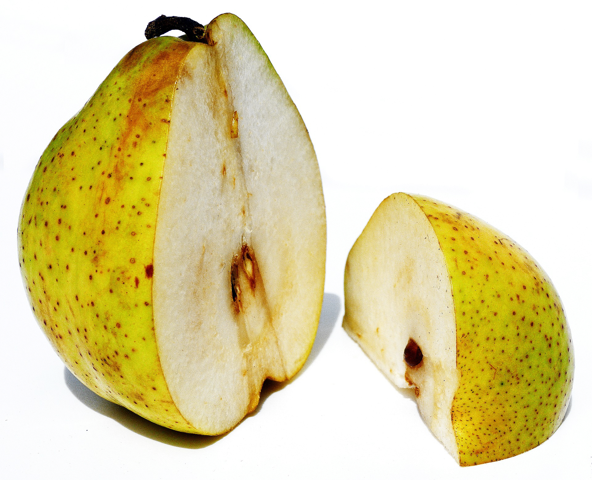
Sorry, but I'm an absolute newbie here. I was racking my brains trying to figure out where the flood select tool could possibly be: "Maybe you were using a different version? Maybe there is a synonym on the select menu that I don't understand?" Finally I noticed that FLOOD SELECT is NOT on the select menu at all. It's an icon on the left hand vertical menu! The dancing ants now appeared around the two bits of pear, but ... "What do I do now? How on earth do I set the tolerance? A message appeared on the bottom of my screen telling me: "Drag to set tolerance and flood select." But nothing happens! I finally noticed "tolerance" appears at the very top, but selecting 12% doesn't do anything. When I saved the image (transparency checked), the pure white was still there: no transparency whatsoever. I have no idea what's going on. Sorry to waste your time. I'll have to plow through tutorial after tutorial to figure out what I'm supposed to do. I'll figure it out eventually. I feel totally out of my depth right now, but thank you for trying to help,
-
Aha! Now I know what those words really mean. Is removal also possible for scanned 60- and 70-year-old black and comics (with inevitable yellowing) or is it strictly white? Do you think penciled-in colors on those comics could also be removed by tweaking? When it comes to AffPhoto, I'm still a newbie. Thank you for the clarification. 🙂
-
I assume 12% is a matter of trial and error (different with each image). Thanks! I'll give it a try.
-
Not directly related, but another thing that puzzles me is why did the file size grow by ~.5 MB when I erased (i.e. REMOVED) the white bits? {JPG, lossy compression = 876 KB} --> {PNG, relatively lossless = 4.08 MB} --> {erase WHITE = 5.57 MB?}
-
The topmost image is the original JPG. The second image is the result of supposedly "ERASing white PAPER" (whatever that means). Part of the offwhite pear flesh also gets erased. I suspect there is some setting to specify "erase pure white only", but maybe I should have painstakingly erased each bit of pure white by hand?