Colorwaves
-
Posts
25 -
Joined
-
Last visited
Everything posted by Colorwaves
-
I know this well and appreciate this quick way of making image adjustments. Exactly that, adjusting many images at the same time, often and quickly adding or subtracting some in the middle of the process depending on the results. I've used this often with groups of photographs, but also with thousands of scanned or photographed document pages where I wanted to achieve consistent visual properties: color, brightness, alignment, cropping, etc. And all this quickly applied over and over again to large image selections with near spontaneous and permanent feedback in the side thumbnail panel. Wonderful time saver! Only Affinity is not useless without this feature, just significantly less efficient 😉
-
Select/Deselect and history
Colorwaves replied to ashf's topic in Feedback for the Affinity V2 Suite of Products
This. It might be slightly annoying at times having to go through countless "select/deselect", but other times it will also help to understand how and why I got to where I was now. Agree! And there are also times when the undo action takes me back to a sometimes complicated object selection that I made before and would like to keep using. E.g. to apply other styles to it or to transform or move it in a new way. I find that time-saving Fair call though. The call for an alternative option is understandable. However, I would not want this option as a replacement. I like the current setting more than the one I had in Photoshop. -
You are not alone in wanting a blend/morphing tool 😉
-
My tendency: Not using V2 right now
Colorwaves replied to joe_l's topic in Feedback for the Affinity V2 Suite of Products
I also continue to use only the V1, which works well and stably on my computer. After some testing I think that the current V2 is immature and since my current projects don't allow me to play the beta tester, I didn't install V2 on my work computer. I bought the V2 as soon as it was released and even though it only introduced part of the features I was hoping for, I am grateful for these and other improvements (including the universal license) and look forward to more features in the coming updates. For three years, I've found V1 to be a reliable Adobe replacement that performs well enough to leave the top dog. This created a certain trust in Serif, which is why I reacted calmly to the current development status of the V2. Despite the problematic start, my overall impression is rather positive. I assume or rather hope that Serif will be able to fix the software soon. Then V2 would definitely be a step forward. -
You are not alone with your request for blending / morphing. Check out the link below and join if you like it.
- 1 reply
-
- 1
-

-
Blend tool in Designer
Colorwaves replied to Athanasius Pernath's topic in Feedback for the Affinity V2 Suite of Products
The clear need for a blend tool is reinforced by the fact that given the complexity of such special requirements, even the most exotic affinity internal workarounds can usually not bring any relevant/efficient relief (except maybe for simple constructs). This is not a trivial "just know how" situation.- 122 replies
-
- 1
-

-
- blend tool
- blend
- (and 1 more)
-
Those interested may wish to continue supporting the blend tool in the linked topic. You are not alone!
-
This is probably the healthier choice, provided the beaming process went as expected 😉
-
I was expecting a movie about a girl vampire, one who was 12 but had been twelve a long time. 😃That's right, there's that one too. That's the scene I remembered from seeing the title.
-
Check the buttons Scotty and decide where you want to beam me! He yells... The type of lighting, color temperature, etc. unsettled Kirk. He doesn't feel fully integrated into any of the worlds, either inside or outside. Scotty not only beamed Kirk, but happened to also beam some typical attributes of the original location. The picture looks exactly as you describe, like a quick manipulation, so I'm not saying that with all seriousness, but if you enjoy manipulating such aspects, you could help Scotty allay Kirk's worries. Fortunately, Affinity is a properly equipped beam device 😉 (By the way, when I read the topic title, I was more expecting Negan behind the window pane.)
-
Blending shapes
Colorwaves replied to Phil_rose's topic in Feedback for Affinity Designer V1 on Desktop
Those interested may wish to continue supporting the blend tool in the linked topic, as it is not in the archive and therefore also more explicitly related to V2. -
Blend tool in Designer
Colorwaves replied to Athanasius Pernath's topic in Feedback for the Affinity V2 Suite of Products
+1 I mention it here too, as I don't know if the archives are still being given enough attention. The Blend Tool would be a powerful addition to Affinity Designer. Not only would it allow for a wide variety of textures and shapes that are difficult to construct by hand, it would also save us a tremendous amount of time in the process. In my work context, the morphing functionality is not only required frequently, but often to a considerable extent. As I write this, one such project is waiting for me in the background. There really shouldn't be a need to stress the importance of the tool. It's already a justifiably established standard in the creative environment.- 122 replies
-
- 1
-
-
- blend tool
- blend
- (and 1 more)
-
Blending shapes
Colorwaves replied to Phil_rose's topic in Feedback for Affinity Designer V1 on Desktop
Really nice illustrations! And I agree: the creative possibilities of the blend tool go far beyond the support of lazy contemporaries -
Blending shapes
Colorwaves replied to Phil_rose's topic in Feedback for Affinity Designer V1 on Desktop
+1 A blend-tool would be a great addition. Not only would it help create interesting structures faster, but its morphing ability would allow us to construct mediating shapes and curves that are just terribly time-consuming by hand. So I don't just want it, I need it! 😉 -
THANK YOU SERIF! Thank you for the helpful new features, for the aesthetically and meaningfully redesigned interface, and for the promising prospect of exciting updates due to the reprogrammed environment. COMMUNICATION I appreciate Ash's answer! Serif shows the ability to learn and act accordingly. We are listened to, we are informed openly and they try to accommodate us benevolently. There's no reason we shouldn't behave the same way. Important questions have been answered in the forum and revised in the FAQs. They are working on providing us with an additional installation method if required and in the forum they provided us with interim solutions quite quickly. An additional package for the upgraders will be provided, which is very nice given the already fair price. UPGRADE PRICE OVERREACTIONS I understand the rationale behind the expressed desire for price differentiation between V1 owners and new customers, especially if they bought V1 just a few months before. But the oversized drama of some users, who even carry their frustration so extensively beyond the borders of this forum into the www (as already seen), I find questionable in view of Serif's courteous reactions. Given the quality of the tools at such a human price point and without the obligation to subscribe, one might also choose to smile happily at the creative opportunities that are available to us over the long term. Our concerns have been answered and Serif is already working to accommodate us. Plunge wildly into the wonderful creative work, enjoy the new features and stop complaining! We are holding a great piece of software in our hands...
-
Please increase the number of attributes recognized by Power Duplicate, and let it use them all at the same time. E.g. Imagine you could start with a square, round its corners a bit, add some color, change the transparency and line thickness, and only now would you apply the power duplicate. You would end up with a chain of objects resembling more and more circles instead of squares, having more and more of the added color, being more and more transparent, and, and, and... That would make life a little easier. Alternatively: a blend/morphing tool as in some other applications. We would choose a start and end object, and Designer would allow us to transform them into each other, producing an adjustable number of intermediate objects.
-
Direct delete and position feedback while editing (the proposal would be of interest to Affinity Photo and Affinity Publisher alike). A. You right-click on a guide and a new context menu appears. There you can select delete or edit. An alternative to a right-click could be a double click. B. The editor that opens would be the same as currently, BUT three new features would exist: If you have opened the editor via the context menu of a guide, then the corresponding guide is highlighted in the editor list. At the same time, the guide would also be highlighted in the workspace. E.g. it could be pink instead of blue. Great feedback when there are many guides. As soon as you select another guide in the editor guide lists, the same thing would happen, the corresponding guide would also be highlighted in your workspace. So you always know exactly what you are doing.
-
- 1
-
-
- affinity designer
- affinity photo
- (and 6 more)
-
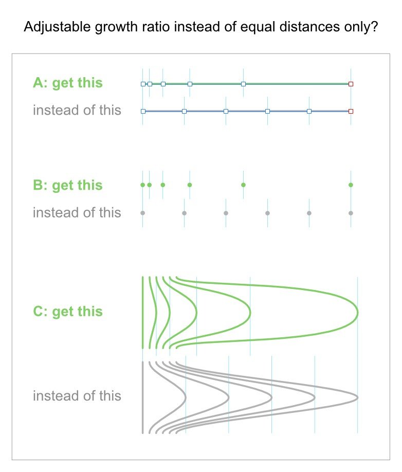
Is this somehow elegantly possible? To distribute selected objects or nodes with an adjustable growth ratio instead of equal distances between them? Of course we can use numerical positioning of single objects or construct special geometries to orientate ourselves, but do we have a more simple or direct solution, I don't know yet? If not, then please see this as a suggestion: It could be a small tool with a slider that we can use to define the growth ratio. And it could also be part of an extended power duplicate. The ideal solution, and a bit different, would probably be something more similar to the blending/morphing tool found in other vector apps. The progressive distance change would just be a part of such a tool.

-
That's not quite true 😉 a) Only nodes of a single curve were explicitly selected. That is possible. An usual aligning is very well possible b) And it is also possible to do node spacing for nodes on several curves in one go. The node distances are then correct, but the curves may change unfavorably. So it is only interesting in very special cases. However, the buttons themselves must function identically in both cases.
-
Thank you for the answer! Yes, there is a case spacing does work. See the new attached screenshot. From my point of view this is either a bug or an inconsistency in the interface design. Identical looking icons do not work identically. The reason for reporting was uncertainty. That's why I didn't click on the video. The answer came extremely quickly But the posting person doesn't seem to be a member The link seems to point to another page The image showed Affinity Publisher and not Designer. On various other forums I have often seen malicious links posted in a similar manner. Sorry again for the reporting. I was wrong.
-
Hi! I'm using the newest Affinity Designer (1.10.5.1342) on WIN 10. 1. I select some nodes on a curve using the node tool. 2. I would expect to be able to use the node spacing tools in this situation. But they stay disabled. Only the alignement tools are active. Videos seem to show this feature working properly. Has this function been removed? Is this a bug, or some kind of wrong settings or mistake I do? See the screenshot. Thanks!
-
My example was more symbolic (one of the first symbols I found on the internet), and was more of an illustration that even much less visual information can still be understood very quickly and clearly. I am not advocating simplicity at all costs or flat design because it is used a lot right now. "Fashion" interests me very little. It is the overall context in which the degree of simplicity or a meaningful balance will result. And in this context, details that have no further advantage in terms of conveying information should be scrutinized very carefully. It's about interface aspects, not about our images. They can be as colorful and realistic as everyone likes In my opinion, the current realism is an unnecessary visual overload with no particular aesthetic advantages at the price of a somewhat reduced legibility. And I know, tastes are different, so I don't argue about that. I just want maximum clarity with minimal visual effort. And no: I don't wear glasses or contact lenses None of this is directed against Affinity Photo. I really like the software! So peace
-
Hi, and yes, I do know the monochrome icons, but thanks for the hint! From my point of view, they can improve somehow the light mode situation, and I also used the interface that way for a while. In the dark mode the hard contrasts kills the smooth icon shades. There only the colored icons can survive from my point of view. So it remains a clear wish: a) Simpler icon design b) Specially designed for the black & white or however reduced color situation c) The icons can also have colors, e.g. in the case of mouse over, but the more calm and clarity, the better for our work. So every detail, be it color, shading or whatever, should only be added if absolutely necessary, if it can be proven to help.This also makes the interface look more professional and cool. Unnecessary colors do the opposite.
-
Overall, I find Affinity Photo very good and helpful, but the colorful icons aren't that successful. Their realistic design doesn't help them be recognized or understood, it just makes them distracting and annoying. In general, simpler and color reduced icons would allow us to concentrate better on our work, which is colorful enough. Also, please do not use so many brush dominated symbols. I see more the brushes than their functionality. The problem could also arise because they are too colorful and too realistic. However, simpler is better... Thank you!