Ducati
-
Posts
25 -
Joined
-
Last visited
Everything posted by Ducati
-
Thank you - NotMyFault. I sell printable products online, so I have no way of knowing where or how they will be printed. It may be on a crappy home computer, uploaded to an online printing co or taken to a specialised printer. Any of my work that is in colour, I choose CMYK colours and create both an RGB version exported as a JPG and a CMYK version exported as a PDF (for Print selected at export). I do also have SVGs in my shop, but these are always 100% vector with no effects. Thank you - I'm reassured
-
Hello experts! Does anyone have any recommendations &/or resources that I could consult for designing in Affinity Designer for printed artwork? I have asked over in the Facebook group, but only got one piece of advice ("Rasterize gradients, transparency, and complex shapes and you should be fine. Leave text and logos.") but would like to ensure this advice is factually accurate and find out more detail. If I should be avoiding specific tools (eg. Gaussian Blur) and doing things like rasterizing, I would think these should be specified somewhere. Many thanks
-
Thanks Patrick. Yes, I saw this a while back when I was just starting out.
-
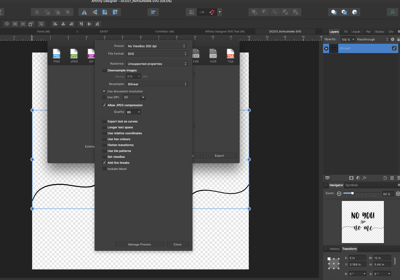
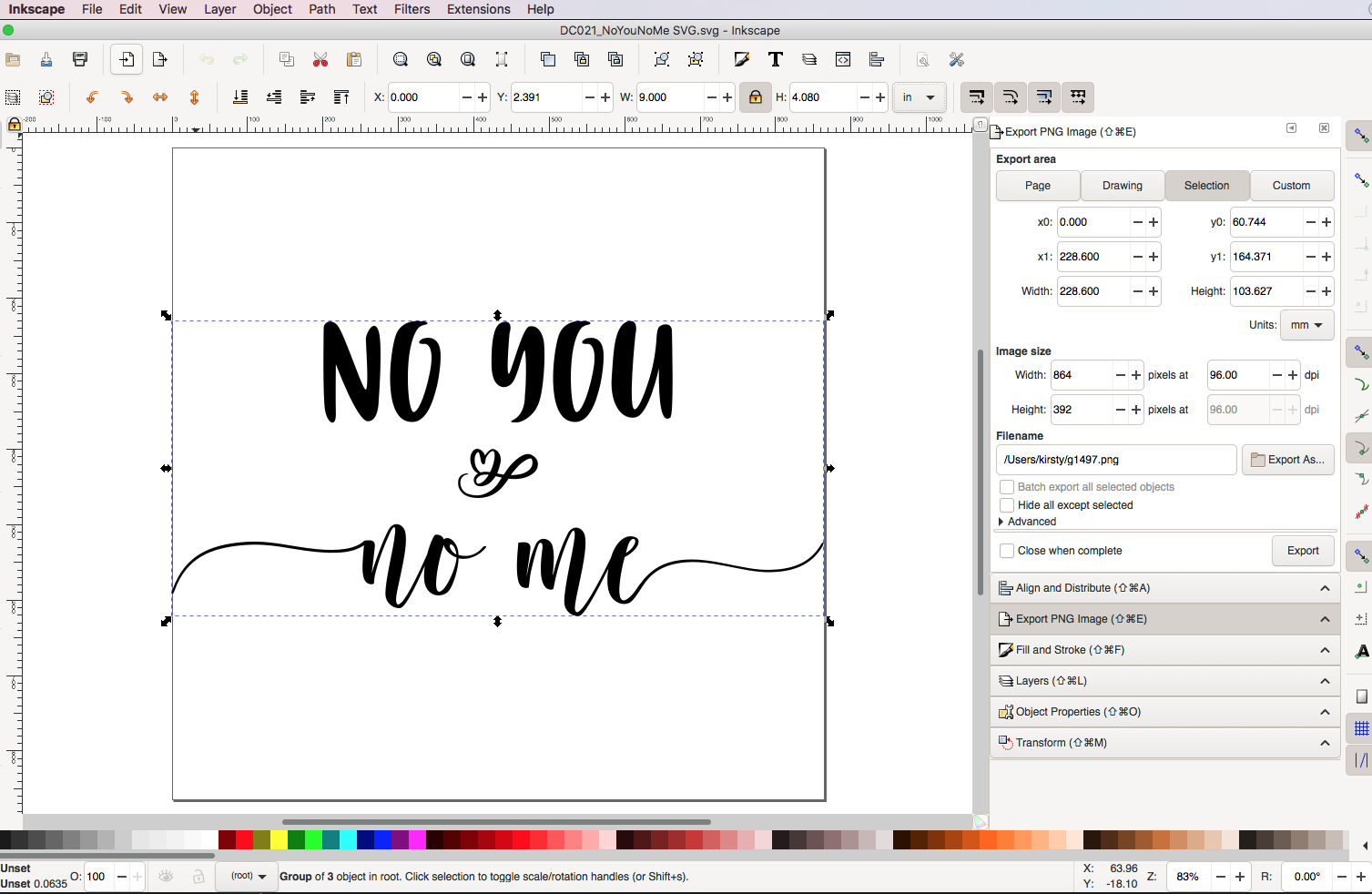
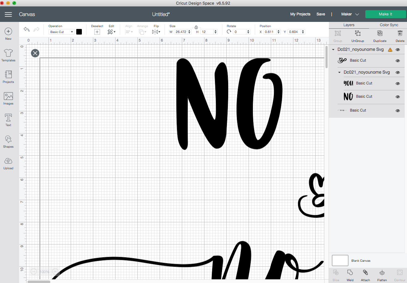
Hi Patrick! Thanks for responding! Many crafters seem to have issues between AD & Cricut. I had found that setting DPI to 72 and exporting (Selection without Background) without Viewbox means that the resulting SVG is the same size when uploaded to Cricut. Until recently. I cannot 100% say when the change occurred. An SVG I made on 20 Feb was fine. One I made on 28 Feb - and all since - had this issue. It is worth also noting the Cricut has had 2 updates in the last month, so it may be that something they changed just doesn't like something in Designer. Attached is one of my problem files. I made it on a 12x12" canvas in Designer Persona - the image itself is 12"x5.44". Settings as above (screen shot attached). After saving the file, I export as described above. If I open the resulting SVG (also attached) in Inkspace, it says the image file is now 9" (screen shot attached). When I open it in Cricut (screen shot attached), it says the image is 26". On the Facebook Group I belong to, the moderator had posted a workaround for Windows users (I'm on Mac). This involves opening the SVG in Notepad (it opens with text/metadata) changing the sizing manually there and resaving the file. Not ideal, but seemed to work for Windows users. She posted a PDF which I would be happy to send to you, but don't want to attach it here as she put a copyright on it. Would appreciate your feedback! Here for any other info you need. Thanks! DC021_NoYouNoMe SVG.afdesign C021_NoYouNoMe SVG.svg

-
OK...not the response I was hoping for! Anyone know how I can escalate this to get it fixed...? I'm a member of Affinity Designer for Crafters forum and many people are suffering from this issue. It's actually holding up my business. Thanks
-
Hi. Until the update 1.9 I was able to export SVGs from Affinity Designer to Cricut Design Space at actual size - meaning if I design something that is 30x30cm, it opens in CDS at the same size. DPI needed to be set to 72 to achieve this. Since 1.9, the resulting SVG now opens in CDS a lot larger than the size it was created at. Fine for me, but not for my customers who buy the SVG. The 1.9.1 release does not fix this. Any reason why this is now happening, and is there a work around? Thanks.
- 8 replies
-
- 1
-

-
- affinity designer
- svgs
- (and 2 more)
-
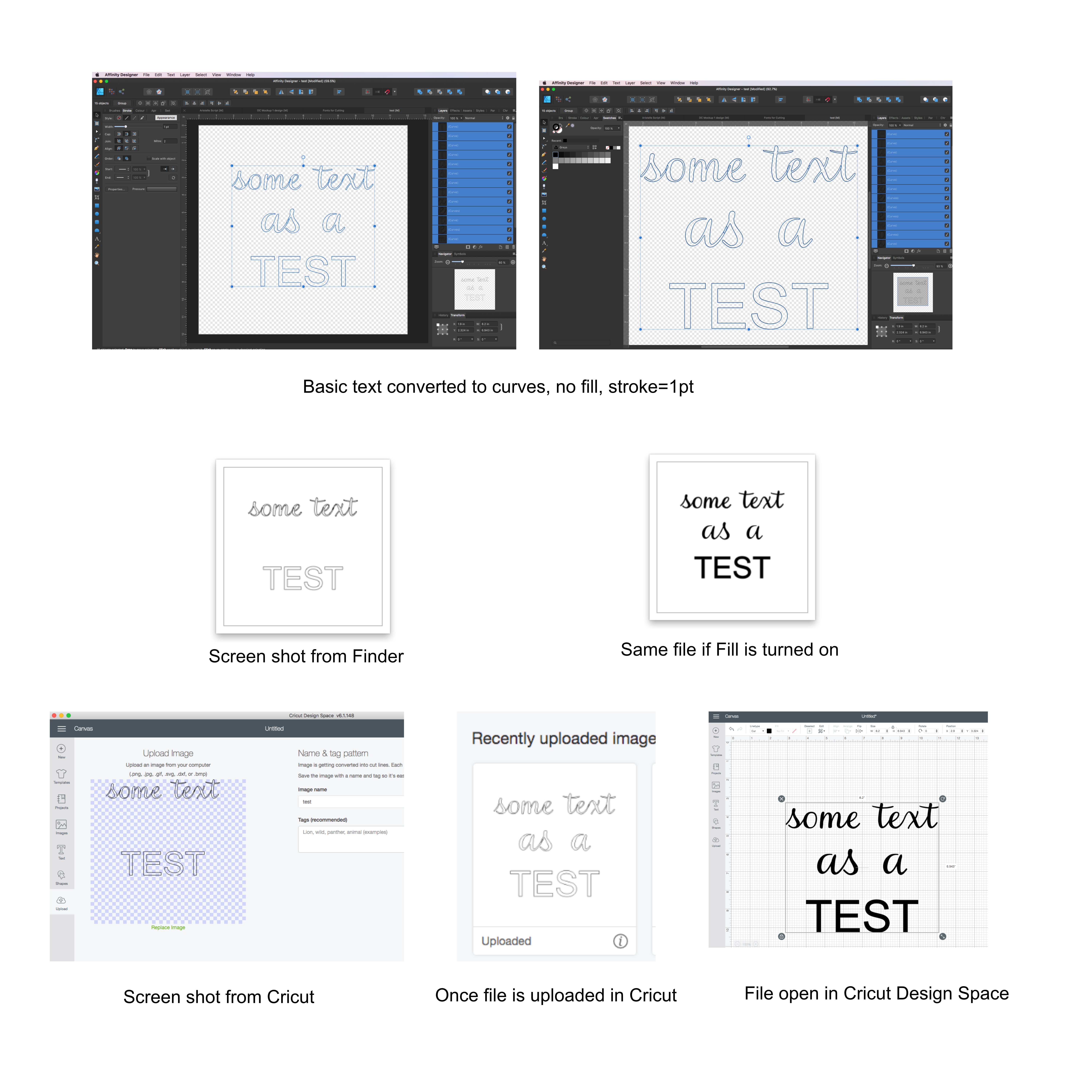
Hi. Sorry I'm a bit late into this conversation. I actually came here looking for help with SVGs for cut files, but feel I can add a little bit of additional information. Firstly David is right, you deffo need to deactivate the View Box as this will impact the size of the final SVG. Also, make sure your dpi is set to 72. I make my SVGs on a 12x12 inch file with dpi at 72 and this opens at the same size in Cricut. I also convert all text to curves, clean up the nodes if necessary, and then 'Create Compound' with any joined up text. Also grouping your text helps preserve the layout for when it is opened in Cricut. Hope that helps a bit. I am having a bit of a strange issue in that when my SVG is saved, the thumbnail only shows certain parts of the text. I've gone right back to basics to try to understand this. In the attached, I have written some text and converted it to curves. The Fill is turned off and the stroke is set to 1. If I export the file at this stage (Export settings with Viewbox disabled), you can see that without making any other changes to any of the 'text' the middle 2 words are missing. The thumbnail in Cricut shows the same thing, although once uploaded it understands all the text. Once fully opened in Cricut, the text is showing as filled instead of stroke only. Last time I posted a request for help on SVGs, I didn't get any, so I'm not expecting much, but if anyone has any pointers for resolving this, I would be grateful. The reason it is an issue, apart from being annoying, is that these files will be sold, and many purchasers will not look past the fact that the thumbnail is missing parts of the image. Many thanks
-
Hi Callum (Thanks 😊 ). Yes. It's to do with the file being used by a cutting machine. If you don't create a compound then when the file is opened in the cutting machine software you basically get a pile of individual letters all stacked one on top of the other - you lose the outline of your word effectively.
-
Hi I want to create an SVG for a cutting machine. The file contains text (which has been converted to curves for exporting) and, to make the cutting easier, it is recommended to add a little 'padding' around the text area. The Affinity Help pages actually cover this: The Cricut Design Space app will push all layers within your document to the edge of the material when cutting. Again, this is to prevent material wastage. If you would like to add padding around your document, you can add a Rectangle Layer around your Curve Layers before merging all Curves into one layer Sadly, I cannot work out how to actually do it. I have managed to put some padding around the text by making a rectangle and dragging the text into it on the layers panel (presumably this is the rectangle layer). If I click on the rectangle, Create Compound is not selectable. If I Create Compound using only the letters (now curves), then the padding from the rectangle is ignored. I could do with a helping hand please.
-
Even better. Thanks for your help!
-
Works for me! Thanks Walt
-
Can you have a mixture of artboards but only one with a transparent background? I have 2 artboards, one to export as jpg, eps & svg (with bg) and the other to export as png, without bg. Is this possible? Thx
-
Hi Honestly, I can't remember the specific brush I used in this example, but it doesn't matter so much, because I get this behaviour with 'all' of them. Just to be sure, I just tried - a brush from all the following categories: Ink, Watercolours, Oils, Pencil, Basic and (one I imported,) inkBrush Vector - Render. As far as I can tell, it doesn't matter the brush, or the corner setting, they all do this.
-
Hello This seems like such a basic problem, I'm a bit embarrassed I can't work it out myself, but here I am. I'm using Designer on a Mac desktop. I'm trying to 'paint' a mountain scene and I want to not use pixel persona. I have drawn a basic mountain skyline using the pen tool. I want to add some highlights and shadows. I was going to select a brush with some texture and add strokes that made a sort of upside down V shape - or perhaps more a ✓shape. The problem is that all brushes add this loop when I try to make the turn. I've tried looking at the brush properties, and can see the corner options, but they don't actually seem to do anything. I had to go into Krita to show you what I mean. They have a knife tool (like an oil painters palette knife) that works really well. So this is what I am trying to achieve: I can't find anything similar to the palette knife in AD, but with a and this is what I get in AD (the 3 images are with the corners set to fold - overlap - pull): Can anyone please advise how I can stop this swirling? Occasionally the 'overlap option creates a flat top but it's such a strange shape it doesn't help with what I'm trying to acheive. Many thanks!
-
Thanks Lagarto! I saved some love for you too...for teaching me how to correctly use this snapping option. I did have it turned on, but I was missing the crucial piece that I actually needed to select the adjacent shapes. I also had Construction Snapping and Align Handles turned on (not got round to looking these up yet 😳 ) so that was probably muddying my muddy waters. All working MUCH better now. I'm so grateful for your support!
-
Haakoo! I might just love you! Actually when I read your comment, it didn't make sense to me. A quick google of the 'affinity designer x shortcut' informed me: 'Switch between Stroke/Fill (or Color 1/Color 2) color selectors'. When I first tried it, I didn't quite get the result I wanted. With 'Fill' selected, select shape, select Dropper Tool, click in shape to get the average colour (shape fills with average colour). Hit 'x', Fill switches to Stoke, click in shape again to get the colour. Well because my Dropper is set to average, the stoke colour picked up the average of the average, so came out just slightly lighter. So I just changed my work around to start with the stroke selected. Then when I select the average colour in the shape, I can select it once for the stroke, hit x, and use the dropper again on the unchanged Fill to fill the shape. Genious! Thanks for taking the time to help me. I really appreciate it.
-
Hi Andy Yes, I think that is a good point, but it's a lot easier said than done 😀 I've been using the lines to see where I've drawn already, and to easily align the nodes. At some junctions of the shapes, there might be 5 or 6 lines/nodes to line up. Obviously I don't want any gaps, but overlapping looks a bit crap too. I have my snapping on (obvs) but once there are a good number of shapes, it wants to snap to everything and anything. You're quite zoomed in as well, so it's not always easy to know what it is snapping to. Anyway, I spent quite a while yesterday working with the stroke on and filling/changing colours as I worked, and it was pretty tedious, so I might give your suggestion a go today. Thanks for your help.
-
Hi GarryP & Lagato thanks for your responses. I'm sorry my message wasn't clear enough. I didn't want to teach anyone to such eggs, so I guess I thought 'Low-Poly' was a known technique. Apologies! Low-poly art is where you take an existing piece of art or photo and randomly draw a load of shapes over the top - more often triangles or sometimes 4 or 5 sided shapes. I use the pen tool for this and align the nodes of each shape with adjacent shapes so there are no gaps. When the image is covered in shapes (curves), you fill each individual shape with the average colour of the shape. If you google 'low-poly art' you will see some amazing pictures, but here is my first attempt (with the help of Tigger)? So, you can't set the colour of the stroke when you are drawing the shapes, because at that point you don't know what the colour is going to be. You could set it straight after you draw each shape - draw, fill, set stroke colour, but I like to make sure all my lines and nodes are aligned before I start filling. I guess it's just one little extra step to have to change the stroke colour, but an image will have hundreds of shapes, so it's just a bit frustrating. Anyway, it's a slow way to build a picture, but I like the effect, so I'll persevere BTW - I'm using ADesigner. I put it in the title but forgot to mention it in my plea for help. Thanks again for your time.
-
Hello Still very new, so be gentle with me! I'm doing some low-poly art. When I'm drawing the polys, obviously I don't know what colour the fill is going to be, so my stoke is just set to black. When I've finished drawing the polys, and start to fill them (I'm using the Colour Picker Tool set to an average) I want the stoke colour to be the same as the fill colour. It feels like quite a long winded way, as I select each poly, grab the Picker, fill the poly, then switch to the Stroke colour and have to re-use a Picker to grab the same colour. Is there a way to just (maybe when I've finished filling) just grab all of the polys and say make the stroke the same colour as the fill? I would have been happy to just turn the strokes off, but then the shapes don't match up neatly. Any other shortcut tips appreciated!! Thanks.
-
Colour integrity
Ducati replied to Ducati's topic in Pre-V2 Archive of Affinity on Desktop Questions (macOS and Windows)
OK, thanks. I appreciate the response. -
Hi I am using Designer to create digital artwork to sell online. If this sounds impressive, don't be misled, I am a complete novice! In the last month I have moved from Gimp - Inkspace - Krita to here, and am learning as I go. I have done a lot of research into how to maintain colour integrity in my work, but am still struggling to make a final decision on my workflow. I could really use some advice. I understand RGB & CMYK, at least enough to know RGB=device and CMYK=print. At least traditionally, although nowadays most print companies should accept RGB... My customer base is generalised as a bunch of people who know very little about digital files - might even struggle to unzip something - so they really don't want to be bothered with decisions regarding file type or colour profiles. For this reason, most of the other sellers just design in RGB (to get the best colours I guess) and embed the profile in the finished files. Most designs are supplied in a variety of file types (usually JPG, PDF, PNG) and a variety of sizes (so the customer can just pick the size format they need). The customer might print the artwork at home on their 20 year old printer or (hopefully!) they will send it to some kind of professional to print. This is more likely to be a Whitewall/Jessops/Staples kinda place than a high end bespoke printing service. So I have no way of knowing how or where it will be printed. What I need to avoid is any significant change in colour from when the customer viewed the image on their device (where it is shown as a jpg) to when they print it. For this reason I think (happy to be persuaded otherwise!) that I have decided to do end to end CMYK. I'd rather limit the scope of my artwork and set good exceptions. BUT, I am not sure how to actually achieve this in AD. I have set my colour profiles as shown. My questions are: 1. Do I need to limit my selection of colours when I am designing? I think I am OK to use the colour wheel, because the colours available change to only offer me CMYK values when I select the CMYK profile at creation. What about the Swatches - should I only select from the CMYK (pantone) palettes? What about Styles, are they 'safe'? 2. What ICC profile should I use to export. Doc? sRGB? One of the CMYK ones...my customers might be anywhere in the world, so hard to pick one. 3. Do I have to be careful about black? I keep reading about the dangers of picking the wrong black, but am not sure how to achieve/avoid that. I'm grateful for your time in reading my blurb and would really like to hear your advice. Thanks so much! K
-
Thanks so much for your response and help Alfred. Now makes perfect sense! Have a great weekend! D
-
Hi! Just registered for help! I'm using the 10 day free trial (and LOVING it) but quite a steep learning curve. This post has exactly the question I need answered. I'm actually trying to recreate the 'Captcha I am not a robot' arrows. Unfortunately, I don't understand the response from @G13RL. I got the donot tool, and the centre of rotation, but: "Transform into a portion of donut the length of a shape (total of the 60° angle)" has me stumped. Could someone please elaborate? TIA/D