T4Z
-
Posts
22 -
Joined
-
Last visited
Everything posted by T4Z
-
affinity designer Porsche 917K Daytona Winner (AD)
T4Z replied to VectorVonDoom's topic in Share your work
Aa a petrol head this is astonishing and bravo on being included in the V2 promo. Really gives me an insight into your work flow and managing layers. I’m working on an Alitalia Stratos, Huracan GT3 and a couple of my road cars! Really top effort! -
Did this get added with Designer V2 in the iPad?
-
iPad Air 5th Gen Canvas is 3480 px x 7632 px @ 300DPI I’m new to Affinity on iPad but not on PC. Whenever I slow down using the pen tool or dragging items around on the canvas, a small magnifier appears for helping with movements, which is great, except for the lag that come with it. Is it possible to toggle this off, or nullify the lag?
-
@Gear maker Thank you! This is exactly what I'm trying to achieve. The work flow I had in my head didn't seem quite right to me and just wanted others opinions. The file you shared is exactly what i had in mind and actually seems to work better than I expected. Appreciate your help and time putting that together. 😃
-
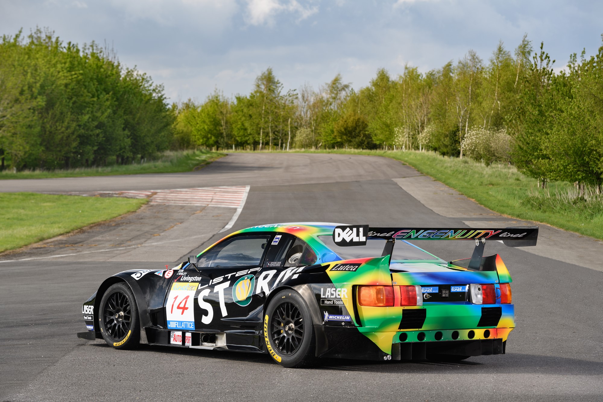
Sorry, reading that back it is quite vague. I plan to trace this image, starting with an overall outline of the car (the shell) and fill this shape black and black is the majority of the car. As for the multi coloured section of the car from the rear and going up over the sills/roof, i was going to outline that and mask it to the black shape. Then within this new shape i would add several other shapes that make up the multi-coloured part and use the gaussian tool to create that effect.
-
Hi guys, Looking for advice on how to colour the back of this Lister Storm accurately. The work flow I have in my head at the moment is to create an overall outline of the car. Then a second shape using the pen to outline the coloured section and mask it inside the car and maybe fill this green as this is the bulk of the colour. To achieve the coloured 'splodges'(?) I'm considering doing rough shapes and then gaussian blur as opposed to using any gradients. Does this seem logical? If not does anyone have any tips. Many thanks!

-
Hi Callum, I have had a bit of success keeping everything in designer at the moment. I've been keeping my line work on one layer then duplicating the work onto another and colouring on that layer. I've been breaking curves at intersecting points when unclosed line crosses a path. This seems to work well, however when I need to go back and make a change its a bit fiddly. Thanks for your advice
-
Just wanted to say that when i pressed Alt + Subtract Boolean i got the result i was after. Many thanks for the help!
- 5 replies
-
- 1
-

-
- affinity designer
- boolean
- (and 1 more)
-
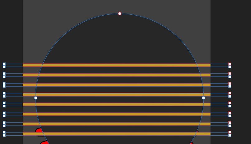
Hi there. I'm not at my laptop right now, but I've literally just got 8 rectangular shapes and a circle behind. This happens when both curves and actual shapes.
-
PS. It looks like the top rectangle is trying to join at the mid point of the circle.
-
I'm expecting smooth cuts when I subtract the lines from the circle. I happened before but i made an error, now it keeps staggering near the top few lines. Any pointers as to what im doing wrong? The circle and rectangles have been converted to curves. I have tried doing them individually but keep getting the same error.
-
I'm currently working in Designer to create vector artwork, and a few of the designs are getting a little more complex than I'm usually used to and I'm having trouble trying to fill in shapes - my designs are eventually printed onto posters and clothing. I have a few options when it comes to filling in but feel they are unorthodox or won't give me the desired print quality at 300dpi. 1. At the moment I have been creating the line work from an image, tracing the main outlines of shapes. This has resulted in a lot of open lines. I have then been keeping the lines in a separate layer from the colour layer. This also includes a lot of duplicating shapes, breaking lines and joining them together with others to be able to then fill the shape on the colour layer and turning off the stroke. Overall this method feels very clunky and effects my work flow, it also gets quite confusing, never quite knowing which outline is connected to which colour and any small movement of a shape will ruin the piece. I feel like this whole process could be improved with a 'smart fill bucket tool' similar to what is is AI. IS there a suitable work around for this missing tool, or is the the quickest method? 2. I haven't actually used this method yet, but it is something I have thought about quite recently which i think could improve my workflow in lieu of the magic fill bucket tool - however not sure if this will hamper the quality of my print by leaving Designer to colour in Photo. I have both Designer and Photo. My idea was to use the appropriate print template i have supplied for my garments all at the correct dimensions and at 300DPI to create my line work. I would then open the line work in Photo and use my tablet and pen to paint in the colours between the lines. I feel like this would improve my work flow tenfold, but advice regarding the print quality would be appreciative - or even if this is a poor method. Look at this is would increase the speed of my design work. I think I'm just scared/paranoid to leave Designer and have my Designs raterized as opposed to working with crips, sharp vectors. Its worth noting that at the moment my designs are flat colour designs without gradients/shading at the moment and my designs are exported asP NGs at 300dpi Many thanks in advance! Would also love to hear your own work flows regarding the filling of complex vectors.
-
I have decided to start from scratch, this time starting with the overall outline and painting it white. I then plan on drawing the rest of the details on top of this layer. Still not sure what the best practice is for drawing like this.
-
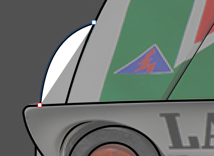
I have tried this but again I've ground to a halt. I have so many singular lines like this one on its own. This section should be white but as you can see its only painting this section, which i fully expected it to. I don't even know if i should have done this drawing this way. Any advice? Edit: Im wanting that arch section to be totally white. Not quite sure the method would work.
-
Thanks for the advice, I've never used containers before. What is the difference between that and just grouping the decals and flipping them (which was my original plan).
-
XP-PEN G640 6x4 inch or the XP-PEN Star03 Drawing Tablet 12 inch with 8 Hot Keys The G640 is £40 and the Star03 is £45 for the next few hours. I would largely be using this in Designer, however never using a drawing tablet before I'm wondering which is the best. The latter of the two has a significantly larger work space which I'm assuming is worth the £5 extra. Could anyone who has drawing tab experience give me some pointers?
-
Thanks very much for this. I have actually been getting a few of their result with Google Searches. Its a great help with tracing.
-
Keen eye - If only graphics had sound!
-
Thanks Cara, that's a really good way of going about this. I will give this a shot this evening. Sometimes you just need a second pair of eyes.
-
I'm struggling here. The colours below are from an image and im wanting to trace the colours but not sure what the best method is considering i have unclosed lines on the top of the the image
-
Hi there. I'm wanting to start giving my drawing colour but not sure where to start. I think i need to join up some of the lines, but not sure what the most effective method is. I have pretty much drawn what i have seen using the pen tool, and not sure how to start adding colour. There are a few "open" lines which have not been closed. How would you tackle colouring this?