
smadell
-
Posts
1,151 -
Joined
-
Last visited
Reputation Activity
-

 smadell got a reaction from thomaso in Weaning myself from a long-term addiction to Photoshop
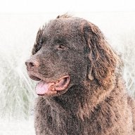
Here's another option for an edit. This harkens back to the OP's use of Curves instead of Levels. I actually added two separate Curves adjustments – the first one for tonality and the second for contrast.
The first adjustment (called "Curves for Tonality" in my screenshot below) brings the black point up from the left, bottom corner to increase the luminance of the darker pixels, while leaving the brighter pixels alone. This gives me more detail in the blacks and shadows, but it vastly diminishes contrast.
The second adjustment (called "Curves for Contrast") brings the black point of the image in from the bottom left, which darkens the dark pixels, and it raises the luminance of the midtones, thus creating greater contrast. It still leaves the white point alone.
This version of the edit was done without using any masks at all, nor does it invoke the Blend Options curves. (Note: I tried doing this using a single Curves adjustment, like the OP did, but I was not happy with the result. The blacks were too black, and the image suffered by trying to accomplish too much in one adjustment layer.)
-
smadell got a reaction from thomaso in Weaning myself from a long-term addiction to Photoshop
Hello again, @thomaso. A couple of points to make…
1) A luminosity selection selects the entire layer, but the degree to which pixels are selected is proportionate to their luminosity. Think of this as if every pixel is being described with HSL (instead of RGB) values. The white pixels have a luminance value of 100% and the black pixels have a luminance value of 0%. Middle grey has a luminance value of 50%. When you Cmd-Opt-Click on a layer's thumbnail, the selection strength varies according to the luminance percentages of each pixel. So, in that sense, the light areas are always more strongly selected than the dark areas (their luminance is higher, so they are "more selected.")
2) Like many other apps, marching ants represent the selected pixels, but they only show up for pixels that are 50% selected or more. Therefore, when you Cmd-Opt-Click the OP's photo, you will only see marching ants around the light areas (such as the white jackets, the sky, and so forth).
3) The visibility (or lack of visibility) of the marching ants does not reflect the alpha channel values for those pixels. Presumably, in the original photo all of the pixels have an alpha value of 100% (since they are all completely opaque). Rather, the visibility of the marching ants depends on the strength of the selection and is visible only for those pixels which are 50% or more selected. In a luminosity based selection, the light areas are more strongly selected than the dark areas. (In the abstract, since a pixel selection is an alpha channel, you might get away with saying that the visible marching ants reflect an alpha value of 128 or greater, but it is easier to talk about the strength of selection at this point.)
4) As to the screen rendering of marching ants at the borders, I have seen the situation you describe. I don't know what the explanation is, but have guessed that it is a screen render issue. I don't know if v1 and v2 are different in how they handle this.
5) If I am interpreting your screenshots (at the bottom your last post) correctly, you have created a luminosity selection and applied it to a Levels adjustment. You have then inverted the mask. (In effect, the initial Cmd-Opt-Click selection is a "Lights 1" luminosity selection. The inverted version of this selection, or the mask it creates, is what most would term a "Darks 1" selection/mask.) When you apply this mask to a Levels adjustment, the adjustment preferentially affects the darker areas of the photo, since these are the lighter areas of the mask. This is precisely what the OP did in Photoshop, and represents the method that I suggested to him in my first post. When I used an Exposure adjustment and altered the Blend Range Options for that adjustment, I was using the Blend Options in lieu of a luminosity mask, and I did this because Blend Options allows for more flexibility in deciding where the adjustment is applied or not applied. Please note that if you closely inspect my screenshot of the Exposure adjusted photo, you will see that there is no mask applied to the Exposure adjustment; there is only a Blend Options curve applied.
-
 smadell reacted to Furry in Weaning myself from a long-term addiction to Photoshop
Thank you all for those additional comments since last I posted. My biggest danger now is information overload. That official v1 video looks interesting and I may come back to it.
But I think this discussion has gone far enough for now (at least for me; if others want to take it further, that is up to them). I will now think about the next Photoshop tecnique I use and how it can be translated to APh. Stay tuned!
-
 smadell got a reaction from henryanthony in Weaning myself from a long-term addiction to Photoshop
Hi, @Furry and @thomaso. A couple of comments, especially regarding the questions posed by thomaso.
First, my suggestion (as posed above) was meant to suggest a way to effectively duplicate the method that Furry was using in Photoshop. In copying the original image into the Levels adjustment, he is effectively masking the adjustment to work more in the highlights and less in the shadows. Inverting that will cause the adjustment to affect the shadows more than the highlights. Because Affinity Photo cannot "paste" into the Levels adjustment directly, I suggested a way to mask the Levels adjustment by first creating a luminosity-based selection of the original image. (As I will note below, I think there are far more elegant ways to do this.)
Second, thomaso's question regarding the apparent transparency created with the Cmd-Opt-Click method of selection is best understood as follows. Cmd-Opt-Clicking the thumbnail of the Background layer selects the entire layer, but does so based on the luminosity of each of the layer's pixels. So, a pixel that is 100% luminous - white (255,255,255) will be selected at 100% strength; a pixel that is 0% lumninous - black (0,0,0) will be selected at 0% strength. A pixel that is 50% luminous - middle grey (128,128,128) will be selected at 50% strength. Because the photo provided by the OP is very dark, most of the pixels are selected at very low strength. Because of this, they will appear transparent. Actually, many of them are not completely transparent, but are so nearly transparent that they look that way.
When a luminosity-based selection is in place, any operation that takes place next is applied to the selected area at a strength proportionate to the strength of the selection. So, applying a magenta color to pixels that are 100% selected will be applied at 100% strength (or, stated more appropriately, with an alpha level of 255 (100%). Applying a magenta color to pixels that are 0% selected will apply that color with an alpha level of 0, and the color will effectively be invisible. Applying magenta to a pixel that is 50% selected will apply that color with an alpha level of 128, and will appear 50% transparent.
In the image below, I have added a blank pixel layer above the Background layer, Cmd-Opt-Clicked on the Background layer, and (with the blank pixel layer active) filled the selection with magenta. (See below for notes on the best method to fill a selection.) Hiding the Background layer reveals the magenta fill, which reflects the luminosity selection – opaque where the Background is white; transparent where the Background is black. Actually the entire pixel layer has RGB values of 300,100,50. But, the alpha channel values are different which causes the higher or lower measures of transparency.
Lastly, the method that thomaso has used to fill the luminosity selection with magenta is flawed. Using the Flood Fill tool to fill any pixel layer (with or without an active selection) will always take into account the color directly under the point that is clicked on. Therefore, if I use the flood fill tool and click on the white coat of the woman on the left, only the areas of white are filled. It is only when I bump the tolerance to 100% that AP will allow any color to be affected by the Flood Fill. The better way to do a "fill" with a specific color is to use the Fill… command (in the Edit menu) and specify a "Custom Color". Performing the fill with this command avoids the need to worry about what color you're clicking on.
As far as the Select Midtones, Select Shadows, and Select Highlights commands (in the Select menu) are concerned, I have always found them to be lacking in enough specificity for me. And, they tend to create hard-edged selections (or nearly so) that are difficult to control.
I played with a couple of methods to accomplish the goal that Furry set out, and I think I got the best solution by increasing the Exposure, applying Blend Options to the adjustment (such that the adjustment is preferentially applied to the blacks and shadows).
-
 smadell got a reaction from thomaso in Weaning myself from a long-term addiction to Photoshop
Hi, @Furry and @thomaso. A couple of comments, especially regarding the questions posed by thomaso.
First, my suggestion (as posed above) was meant to suggest a way to effectively duplicate the method that Furry was using in Photoshop. In copying the original image into the Levels adjustment, he is effectively masking the adjustment to work more in the highlights and less in the shadows. Inverting that will cause the adjustment to affect the shadows more than the highlights. Because Affinity Photo cannot "paste" into the Levels adjustment directly, I suggested a way to mask the Levels adjustment by first creating a luminosity-based selection of the original image. (As I will note below, I think there are far more elegant ways to do this.)
Second, thomaso's question regarding the apparent transparency created with the Cmd-Opt-Click method of selection is best understood as follows. Cmd-Opt-Clicking the thumbnail of the Background layer selects the entire layer, but does so based on the luminosity of each of the layer's pixels. So, a pixel that is 100% luminous - white (255,255,255) will be selected at 100% strength; a pixel that is 0% lumninous - black (0,0,0) will be selected at 0% strength. A pixel that is 50% luminous - middle grey (128,128,128) will be selected at 50% strength. Because the photo provided by the OP is very dark, most of the pixels are selected at very low strength. Because of this, they will appear transparent. Actually, many of them are not completely transparent, but are so nearly transparent that they look that way.
When a luminosity-based selection is in place, any operation that takes place next is applied to the selected area at a strength proportionate to the strength of the selection. So, applying a magenta color to pixels that are 100% selected will be applied at 100% strength (or, stated more appropriately, with an alpha level of 255 (100%). Applying a magenta color to pixels that are 0% selected will apply that color with an alpha level of 0, and the color will effectively be invisible. Applying magenta to a pixel that is 50% selected will apply that color with an alpha level of 128, and will appear 50% transparent.
In the image below, I have added a blank pixel layer above the Background layer, Cmd-Opt-Clicked on the Background layer, and (with the blank pixel layer active) filled the selection with magenta. (See below for notes on the best method to fill a selection.) Hiding the Background layer reveals the magenta fill, which reflects the luminosity selection – opaque where the Background is white; transparent where the Background is black. Actually the entire pixel layer has RGB values of 300,100,50. But, the alpha channel values are different which causes the higher or lower measures of transparency.
Lastly, the method that thomaso has used to fill the luminosity selection with magenta is flawed. Using the Flood Fill tool to fill any pixel layer (with or without an active selection) will always take into account the color directly under the point that is clicked on. Therefore, if I use the flood fill tool and click on the white coat of the woman on the left, only the areas of white are filled. It is only when I bump the tolerance to 100% that AP will allow any color to be affected by the Flood Fill. The better way to do a "fill" with a specific color is to use the Fill… command (in the Edit menu) and specify a "Custom Color". Performing the fill with this command avoids the need to worry about what color you're clicking on.
As far as the Select Midtones, Select Shadows, and Select Highlights commands (in the Select menu) are concerned, I have always found them to be lacking in enough specificity for me. And, they tend to create hard-edged selections (or nearly so) that are difficult to control.
I played with a couple of methods to accomplish the goal that Furry set out, and I think I got the best solution by increasing the Exposure, applying Blend Options to the adjustment (such that the adjustment is preferentially applied to the blacks and shadows).
-
 smadell got a reaction from NotMyFault in Weaning myself from a long-term addiction to Photoshop
Hi, @Furry and @thomaso. A couple of comments, especially regarding the questions posed by thomaso.
First, my suggestion (as posed above) was meant to suggest a way to effectively duplicate the method that Furry was using in Photoshop. In copying the original image into the Levels adjustment, he is effectively masking the adjustment to work more in the highlights and less in the shadows. Inverting that will cause the adjustment to affect the shadows more than the highlights. Because Affinity Photo cannot "paste" into the Levels adjustment directly, I suggested a way to mask the Levels adjustment by first creating a luminosity-based selection of the original image. (As I will note below, I think there are far more elegant ways to do this.)
Second, thomaso's question regarding the apparent transparency created with the Cmd-Opt-Click method of selection is best understood as follows. Cmd-Opt-Clicking the thumbnail of the Background layer selects the entire layer, but does so based on the luminosity of each of the layer's pixels. So, a pixel that is 100% luminous - white (255,255,255) will be selected at 100% strength; a pixel that is 0% lumninous - black (0,0,0) will be selected at 0% strength. A pixel that is 50% luminous - middle grey (128,128,128) will be selected at 50% strength. Because the photo provided by the OP is very dark, most of the pixels are selected at very low strength. Because of this, they will appear transparent. Actually, many of them are not completely transparent, but are so nearly transparent that they look that way.
When a luminosity-based selection is in place, any operation that takes place next is applied to the selected area at a strength proportionate to the strength of the selection. So, applying a magenta color to pixels that are 100% selected will be applied at 100% strength (or, stated more appropriately, with an alpha level of 255 (100%). Applying a magenta color to pixels that are 0% selected will apply that color with an alpha level of 0, and the color will effectively be invisible. Applying magenta to a pixel that is 50% selected will apply that color with an alpha level of 128, and will appear 50% transparent.
In the image below, I have added a blank pixel layer above the Background layer, Cmd-Opt-Clicked on the Background layer, and (with the blank pixel layer active) filled the selection with magenta. (See below for notes on the best method to fill a selection.) Hiding the Background layer reveals the magenta fill, which reflects the luminosity selection – opaque where the Background is white; transparent where the Background is black. Actually the entire pixel layer has RGB values of 300,100,50. But, the alpha channel values are different which causes the higher or lower measures of transparency.
Lastly, the method that thomaso has used to fill the luminosity selection with magenta is flawed. Using the Flood Fill tool to fill any pixel layer (with or without an active selection) will always take into account the color directly under the point that is clicked on. Therefore, if I use the flood fill tool and click on the white coat of the woman on the left, only the areas of white are filled. It is only when I bump the tolerance to 100% that AP will allow any color to be affected by the Flood Fill. The better way to do a "fill" with a specific color is to use the Fill… command (in the Edit menu) and specify a "Custom Color". Performing the fill with this command avoids the need to worry about what color you're clicking on.
As far as the Select Midtones, Select Shadows, and Select Highlights commands (in the Select menu) are concerned, I have always found them to be lacking in enough specificity for me. And, they tend to create hard-edged selections (or nearly so) that are difficult to control.
I played with a couple of methods to accomplish the goal that Furry set out, and I think I got the best solution by increasing the Exposure, applying Blend Options to the adjustment (such that the adjustment is preferentially applied to the blacks and shadows).
-
smadell got a reaction from NotMyFault in Weaning myself from a long-term addiction to Photoshop
Hi, @Furry. What you are doing in Photoshop is creating a luminosity mask inside the Levels adjustment. To replicate this in Affinity Photo, first make a luminosity-based selection on the photo layer. Either choose “Selection from Layer Intensity” from the Select menu, or click on the photo layer’s thumbnail (in the Layers panel) while holding the Command and Option keys. With the luminosity selection active, add the Levels adjustment. The luma mask will be incorporated into the adjustment layer. If you need to invert the mask, simply choose “Invert” from the Layer menu or type Command-I with the adjustment layer selected. This should give you the same result that you got in Photoshop.
The difference comes down to how Affinity allows for editing Alpha channels. Photoshop allows alpha channels to be edited as if they were monochrome pixels layers; Affinity does not.
-
 smadell got a reaction from Boldlinedesign in Currency Effect - a FREE macro (NEW VERSION)
Updated Version Available (December 2023)
Recently, @christerdk posted in the "Desktop Questions" forum about trying to achieve the engraved look of U.S. currency. He was given a variety of suggestions (including one or two commercial products). Because of this, I am attaching a macro that I created several years ago and have refined a bit more recently. It is meant to approximate the look of engraved currency.
The macro uses a number of adjustments and filters, all enclosed within a Group. Because of this, the effect can be turned on and off by simply using the Hide/Show checkbox on the group itself.
The attached .afmacros file is a Macro Category and therefore should be imported from the Library panel. It contains a single macro (called "Currency Effect"). Once imported, the macro can be moved to a different category, if desired. The macro was created in Affinity Photo version 2.2 which probably means that it will not be compatible with AP version 1. However, since it is provided as a category, it can be imported into Affinity Photo 2 for iPad.
* * * * * * * * * * * * * * * * * * * * * * * * * * * * * * * * * * *
Clicking on the macro will bring up a user dialog in which you can set certain parameters:
1) Set Line Size (default = 20)
The macro uses a live Halftone filter, and this will vary the width of the lines used. In general, use larger lines for larger images.
2) Set Line Angle (default = 30 degrees)
This affects the angle at which the lines are drawn. Try various settings to achieve subtle but important differences in output.
3) Set Contrast (default = 85)
This setting also affects the embedded Halftone filter, and can change the contrast between the dark lines and the background.
4) Adjust Overall Brightness (default = -20)
This affects a Brightness and Contrast adjustment, and will lighten or darken the final image, to your taste.
When you hit the Apply button, the effect is added to your image at the top of the layer stack. Note that the effect contains only adjustments and filters; because of that, it is completely non-destructive. You can make changes to the underlying image and this will not adversely affect the result. Also, you can open the individual adjustment and filter layers to make changes even after you have hit the Apply button.
Here is an example of a Before and After image, with the User Dialog showing the settings used to create this particular variant.
* * * * * * * * * * * * * * * * * * * * * * * * * * * * * * * * * * *
As always, I am one person using one computer and a single iPad. I have tested this macro on both of my devices, but cannot claim that this testing has examined every possible scenario. Nevertheless, I believe that it will work as suggested. Try it and, if you like it, keep it and enjoy it. It is free for you to use in any project you would like – personal or commercial.
I ask only 2 things. If you've used the macro, please let me know by posting your impressions. Perhaps, even provide a before and after screenshot. Second, please remember that this forum is a wonderful way to learn, and an even better way to share that learning. Pay it forward.
December 2023 Update
The .afmacros file attached below is now an updated category. It can still be imported into the Affinity Photo Library panel (or into the iPad version) but it now contains 3 macros. (1) The original version of the Currency Effect is included. (2) An updated version 2 of the macro is also provided. This update adds a live Ripple filter which makes the engraved lines a bit wavy, better simulating true engraving. (3) There is an Instructions macro, which will place on-screen instructions into your Layers panel.
Please feel free to download the new file, and to replace the previous Currency Effect category with the new one. Have fun!
Currency Effects (v2).afmacros
-
 smadell got a reaction from loukash in can I exclude layers from brightness adjustment
Hi, @AtomTik. I know you solved your issue in the short term, but it occurred to me there’s another method that might be helpful in a more complicated layer stack. First, create an adjustment layer (like your Brightness & Contrast adjustment) and make it a child of one of the layers you want it to affect. To do this, drag the adjustment layer (in the Layers panel) over the other layer’s thumbnail. Now, choose “Duplicate Linked” and drag that linked adjustment layer to the second layer you want to affect (again making it a child of that layer). Basically, do this for all the layers that should be affected by the adjustment, but do not drag a copy to any layer that should not be affected. Since they are linked layers, setting the sliders in any one of the duplicates will affect all of the linked copies. This might be helpful when re-arranging the order of layers just isn’t feasible.
-
smadell reacted to AtomTik in can I exclude layers from brightness adjustment
Thank you @smadell. I'll keep that method in mind for the next time.
-
 smadell got a reaction from markknopper in Affinity Photo, how to create rounded corners?
Here's what (I assume) you are trying to do.
Open your photo (in my case, it's the "Dragon Photo"). Draw a Rounded Rectangle as a new layer – use the Shape tool to do this. The rounded rectangle should be a layer above the photo. Now, drag the photo onto the rounded rectangle layer until a blue rectangle appears just below the rectangle layer in the Layers panel. You have just "clipped" the photo to the rounded rectangle. The result is shown below.
As an aside, the "magic selection" tool is probably the "Selection Brush" and the reason it failed is more than likely that your initial rounded rectangle is a vector object, and the Selection Brush will only work on a Pixel object.
-
 smadell got a reaction from thinkinmonkey in Copy and Paste into channels
So we meet again @jonathanm0… As you've undoubtedly figured out, Photoshop and Affinity Photo treat channels quite differently, at least insofar as manipulating/editing them. In order to do what you want, take the following steps: (1) If you are using the Red channel from a single layer, right click on entry in the Channels panel that contains the name of the layer followed by Red. In other words, if your photo is called "Background" then right click on the "Background Red" entry in the Channels panel. It should be the 4th line from the top. (2) If you have more than one layer – perhaps a Background layer and an adjustment or two – right click on the "Composite Red" entry at the top of the Channels panel. (3) Having right clicked on one of those choices, choose "Create Spare Channel" from the drop-down menu. (4) Make sure that the correct layer is selected in the Layers panel. This will be the one with the Red channel filled but with the empty Green and Blue channels. (5) Right click on the "Spare Channel" you just created at the bottom of the Channels panel. (6) Assuming that the layer you're aiming at is called "Background" choose "Load to Background Green" from the drop down menu. (7) Then, right click that same Spare Channel entry and choose "Load to Background Blue" from the drop down.
You should now have duplicated the Red channel into the Blue and Green channels. The layer should now be a monochrome image (since all 3 channels are the same). You can go ahead and delete the Spare Channel, as it has served its purpose.
-
 smadell got a reaction from Undix Galore in Affinity Photo from 10,000 Feet - Free PDF
I am attaching a free PDF called “Affinity Photo from Ten Thousand Feet.” This is a 41 page book that explains many of the concepts and questions that forum members ask frequently.
Much of the information is based on presentations given to my local photography club. Some of it is based on a series of articles written for the club’s newsletter. Much of the book is newly written material, based on years of working to understand digital photography, how color works, and how Affinity Photo fits into that picture.
Please enjoy the book. All I ask in return is that you look it over and leave a comment.
Affinity_Photo_from_Ten_Thousand_Feet.pdf
-
smadell got a reaction from Boldlinedesign in Currency Effect - a FREE macro (NEW VERSION)
I have updated the Currency Effect macro to version 2. This new version adds a live Ripple filter, which will give the engraving lines a bit of wave. This can be turned off (naturally!) but I think the added touch gives the engraving a bit more authenticity. There is also an Instructions macro, which will place on-screen instructions into a new layer.
The new version can be downloaded from the first post in this thread. The .afmacros category includes both the original and new versions of the macro, along with the instructions macro. You can safely delete the old version of the Currency Effect, since that original macro is included in the v2 category above.
-
 smadell got a reaction from GRAFKOM in Currency Effect - a FREE macro (NEW VERSION)
I have updated the Currency Effect macro to version 2. This new version adds a live Ripple filter, which will give the engraving lines a bit of wave. This can be turned off (naturally!) but I think the added touch gives the engraving a bit more authenticity. There is also an Instructions macro, which will place on-screen instructions into a new layer.
The new version can be downloaded from the first post in this thread. The .afmacros category includes both the original and new versions of the macro, along with the instructions macro. You can safely delete the old version of the Currency Effect, since that original macro is included in the v2 category above.
-
 smadell got a reaction from iconoclast in Currency Effect - a FREE macro (NEW VERSION)
I have updated the Currency Effect macro to version 2. This new version adds a live Ripple filter, which will give the engraving lines a bit of wave. This can be turned off (naturally!) but I think the added touch gives the engraving a bit more authenticity. There is also an Instructions macro, which will place on-screen instructions into a new layer.
The new version can be downloaded from the first post in this thread. The .afmacros category includes both the original and new versions of the macro, along with the instructions macro. You can safely delete the old version of the Currency Effect, since that original macro is included in the v2 category above.
-
 smadell got a reaction from R C-R in Non Printing Layers/Objects
This would be a nice feature. But, as it stands now, there is no "info" panel for a layer in which you can designate its printing vs non-printing status. What you can do, however, is to use "Layer States" to set a global on/off switch for layers you want to turn off prior to printing or exporting a PDF, etc.
The easiest way to do this is probably to create a "Smart State" using (for instance) a color label. For instance, on a document-wide basis, mark the first non-printing layer as Red. (Right click on the layer, and choose the Red swatch at the bottom of the drop-down menu.) Open the States panel and create a new Smart State. When asked for a name, call the smart state "Turn OFF Red layers" or something similar. In the panel, check the top filter "Layer tag is…" and click in the Red circle.
Now, you have a way to designate that layer, and any subsequent layers you create, as non-printing by turning the Layer State to "Hide" or "Show". Before printing or exporting, simply turn the Layer State to "Hide" - turn it back to "Show" when you're done.
-
smadell got a reaction from loukash in Affinity Photo V2 file format conversion question
I just opened a stock landscape photo (using Pexels inside of Affinity Photo) which measured 5,279 x 3,519 pixels. No edits were made at all. I exported the photo to various file formats.
TIFF (16 bit) with LZW Compression - 69.6 MB
PNG - 41.6 MB
JPG (100% Quality) - 21.9 MB
JPG (98% Quality) - 14.7 MB
The TIFF and PNG images are 16 bit files, and the JPG's are of necessity 8 bit files. Obviously the TIFF and PNG files are substantially larger, but also contain more information. Personally, I use TIFF's only as "interchange" files, such as when using a non-Affinity Raw developer and subsequently doing further editing in Affinity Photo. I use PNG files when I need to maintain transparency. I'll also use larger files (TIFF, PNG, PDF, or native .afphoto) when printing.
Otherwise, I rely primarily on JPG's. I've always found it interesting, though, that a huge amount of file size saving can be obtained by exporting JPG at 98% or so, instead of at 100%. The difference in perceptible quality (to me, at least) is nil; the difference in file size is considerable.
-
smadell reacted to stokerg in Cursor is Wrong after Picker is Used
Hi @smadell,
Yes this issue is still marked as open and with the Developers.
Once its been resolved, you will get a reply in this thread from the Serif Info Bot saying its been resolved
-
 smadell got a reaction from Oufti in Non Printing Layers/Objects
This would be a nice feature. But, as it stands now, there is no "info" panel for a layer in which you can designate its printing vs non-printing status. What you can do, however, is to use "Layer States" to set a global on/off switch for layers you want to turn off prior to printing or exporting a PDF, etc.
The easiest way to do this is probably to create a "Smart State" using (for instance) a color label. For instance, on a document-wide basis, mark the first non-printing layer as Red. (Right click on the layer, and choose the Red swatch at the bottom of the drop-down menu.) Open the States panel and create a new Smart State. When asked for a name, call the smart state "Turn OFF Red layers" or something similar. In the panel, check the top filter "Layer tag is…" and click in the Red circle.
Now, you have a way to designate that layer, and any subsequent layers you create, as non-printing by turning the Layer State to "Hide" or "Show". Before printing or exporting, simply turn the Layer State to "Hide" - turn it back to "Show" when you're done.
-
 smadell got a reaction from walt.farrell in Non Printing Layers/Objects
This would be a nice feature. But, as it stands now, there is no "info" panel for a layer in which you can designate its printing vs non-printing status. What you can do, however, is to use "Layer States" to set a global on/off switch for layers you want to turn off prior to printing or exporting a PDF, etc.
The easiest way to do this is probably to create a "Smart State" using (for instance) a color label. For instance, on a document-wide basis, mark the first non-printing layer as Red. (Right click on the layer, and choose the Red swatch at the bottom of the drop-down menu.) Open the States panel and create a new Smart State. When asked for a name, call the smart state "Turn OFF Red layers" or something similar. In the panel, check the top filter "Layer tag is…" and click in the Red circle.
Now, you have a way to designate that layer, and any subsequent layers you create, as non-printing by turning the Layer State to "Hide" or "Show". Before printing or exporting, simply turn the Layer State to "Hide" - turn it back to "Show" when you're done.
-
 smadell got a reaction from G13RL in Currency Effect - a FREE macro (NEW VERSION)
Updated Version Available (December 2023)
Recently, @christerdk posted in the "Desktop Questions" forum about trying to achieve the engraved look of U.S. currency. He was given a variety of suggestions (including one or two commercial products). Because of this, I am attaching a macro that I created several years ago and have refined a bit more recently. It is meant to approximate the look of engraved currency.
The macro uses a number of adjustments and filters, all enclosed within a Group. Because of this, the effect can be turned on and off by simply using the Hide/Show checkbox on the group itself.
The attached .afmacros file is a Macro Category and therefore should be imported from the Library panel. It contains a single macro (called "Currency Effect"). Once imported, the macro can be moved to a different category, if desired. The macro was created in Affinity Photo version 2.2 which probably means that it will not be compatible with AP version 1. However, since it is provided as a category, it can be imported into Affinity Photo 2 for iPad.
* * * * * * * * * * * * * * * * * * * * * * * * * * * * * * * * * * *
Clicking on the macro will bring up a user dialog in which you can set certain parameters:
1) Set Line Size (default = 20)
The macro uses a live Halftone filter, and this will vary the width of the lines used. In general, use larger lines for larger images.
2) Set Line Angle (default = 30 degrees)
This affects the angle at which the lines are drawn. Try various settings to achieve subtle but important differences in output.
3) Set Contrast (default = 85)
This setting also affects the embedded Halftone filter, and can change the contrast between the dark lines and the background.
4) Adjust Overall Brightness (default = -20)
This affects a Brightness and Contrast adjustment, and will lighten or darken the final image, to your taste.
When you hit the Apply button, the effect is added to your image at the top of the layer stack. Note that the effect contains only adjustments and filters; because of that, it is completely non-destructive. You can make changes to the underlying image and this will not adversely affect the result. Also, you can open the individual adjustment and filter layers to make changes even after you have hit the Apply button.
Here is an example of a Before and After image, with the User Dialog showing the settings used to create this particular variant.
* * * * * * * * * * * * * * * * * * * * * * * * * * * * * * * * * * *
As always, I am one person using one computer and a single iPad. I have tested this macro on both of my devices, but cannot claim that this testing has examined every possible scenario. Nevertheless, I believe that it will work as suggested. Try it and, if you like it, keep it and enjoy it. It is free for you to use in any project you would like – personal or commercial.
I ask only 2 things. If you've used the macro, please let me know by posting your impressions. Perhaps, even provide a before and after screenshot. Second, please remember that this forum is a wonderful way to learn, and an even better way to share that learning. Pay it forward.
December 2023 Update
The .afmacros file attached below is now an updated category. It can still be imported into the Affinity Photo Library panel (or into the iPad version) but it now contains 3 macros. (1) The original version of the Currency Effect is included. (2) An updated version 2 of the macro is also provided. This update adds a live Ripple filter which makes the engraved lines a bit wavy, better simulating true engraving. (3) There is an Instructions macro, which will place on-screen instructions into your Layers panel.
Please feel free to download the new file, and to replace the previous Currency Effect category with the new one. Have fun!
Currency Effects (v2).afmacros
-
 smadell got a reaction from pruus in Currency Effect - a FREE macro (NEW VERSION)
Updated Version Available (December 2023)
Recently, @christerdk posted in the "Desktop Questions" forum about trying to achieve the engraved look of U.S. currency. He was given a variety of suggestions (including one or two commercial products). Because of this, I am attaching a macro that I created several years ago and have refined a bit more recently. It is meant to approximate the look of engraved currency.
The macro uses a number of adjustments and filters, all enclosed within a Group. Because of this, the effect can be turned on and off by simply using the Hide/Show checkbox on the group itself.
The attached .afmacros file is a Macro Category and therefore should be imported from the Library panel. It contains a single macro (called "Currency Effect"). Once imported, the macro can be moved to a different category, if desired. The macro was created in Affinity Photo version 2.2 which probably means that it will not be compatible with AP version 1. However, since it is provided as a category, it can be imported into Affinity Photo 2 for iPad.
* * * * * * * * * * * * * * * * * * * * * * * * * * * * * * * * * * *
Clicking on the macro will bring up a user dialog in which you can set certain parameters:
1) Set Line Size (default = 20)
The macro uses a live Halftone filter, and this will vary the width of the lines used. In general, use larger lines for larger images.
2) Set Line Angle (default = 30 degrees)
This affects the angle at which the lines are drawn. Try various settings to achieve subtle but important differences in output.
3) Set Contrast (default = 85)
This setting also affects the embedded Halftone filter, and can change the contrast between the dark lines and the background.
4) Adjust Overall Brightness (default = -20)
This affects a Brightness and Contrast adjustment, and will lighten or darken the final image, to your taste.
When you hit the Apply button, the effect is added to your image at the top of the layer stack. Note that the effect contains only adjustments and filters; because of that, it is completely non-destructive. You can make changes to the underlying image and this will not adversely affect the result. Also, you can open the individual adjustment and filter layers to make changes even after you have hit the Apply button.
Here is an example of a Before and After image, with the User Dialog showing the settings used to create this particular variant.
* * * * * * * * * * * * * * * * * * * * * * * * * * * * * * * * * * *
As always, I am one person using one computer and a single iPad. I have tested this macro on both of my devices, but cannot claim that this testing has examined every possible scenario. Nevertheless, I believe that it will work as suggested. Try it and, if you like it, keep it and enjoy it. It is free for you to use in any project you would like – personal or commercial.
I ask only 2 things. If you've used the macro, please let me know by posting your impressions. Perhaps, even provide a before and after screenshot. Second, please remember that this forum is a wonderful way to learn, and an even better way to share that learning. Pay it forward.
December 2023 Update
The .afmacros file attached below is now an updated category. It can still be imported into the Affinity Photo Library panel (or into the iPad version) but it now contains 3 macros. (1) The original version of the Currency Effect is included. (2) An updated version 2 of the macro is also provided. This update adds a live Ripple filter which makes the engraved lines a bit wavy, better simulating true engraving. (3) There is an Instructions macro, which will place on-screen instructions into your Layers panel.
Please feel free to download the new file, and to replace the previous Currency Effect category with the new one. Have fun!
Currency Effects (v2).afmacros
-
 smadell got a reaction from Mithferion in Currency Effect - a FREE macro (NEW VERSION)
Updated Version Available (December 2023)
Recently, @christerdk posted in the "Desktop Questions" forum about trying to achieve the engraved look of U.S. currency. He was given a variety of suggestions (including one or two commercial products). Because of this, I am attaching a macro that I created several years ago and have refined a bit more recently. It is meant to approximate the look of engraved currency.
The macro uses a number of adjustments and filters, all enclosed within a Group. Because of this, the effect can be turned on and off by simply using the Hide/Show checkbox on the group itself.
The attached .afmacros file is a Macro Category and therefore should be imported from the Library panel. It contains a single macro (called "Currency Effect"). Once imported, the macro can be moved to a different category, if desired. The macro was created in Affinity Photo version 2.2 which probably means that it will not be compatible with AP version 1. However, since it is provided as a category, it can be imported into Affinity Photo 2 for iPad.
* * * * * * * * * * * * * * * * * * * * * * * * * * * * * * * * * * *
Clicking on the macro will bring up a user dialog in which you can set certain parameters:
1) Set Line Size (default = 20)
The macro uses a live Halftone filter, and this will vary the width of the lines used. In general, use larger lines for larger images.
2) Set Line Angle (default = 30 degrees)
This affects the angle at which the lines are drawn. Try various settings to achieve subtle but important differences in output.
3) Set Contrast (default = 85)
This setting also affects the embedded Halftone filter, and can change the contrast between the dark lines and the background.
4) Adjust Overall Brightness (default = -20)
This affects a Brightness and Contrast adjustment, and will lighten or darken the final image, to your taste.
When you hit the Apply button, the effect is added to your image at the top of the layer stack. Note that the effect contains only adjustments and filters; because of that, it is completely non-destructive. You can make changes to the underlying image and this will not adversely affect the result. Also, you can open the individual adjustment and filter layers to make changes even after you have hit the Apply button.
Here is an example of a Before and After image, with the User Dialog showing the settings used to create this particular variant.
* * * * * * * * * * * * * * * * * * * * * * * * * * * * * * * * * * *
As always, I am one person using one computer and a single iPad. I have tested this macro on both of my devices, but cannot claim that this testing has examined every possible scenario. Nevertheless, I believe that it will work as suggested. Try it and, if you like it, keep it and enjoy it. It is free for you to use in any project you would like – personal or commercial.
I ask only 2 things. If you've used the macro, please let me know by posting your impressions. Perhaps, even provide a before and after screenshot. Second, please remember that this forum is a wonderful way to learn, and an even better way to share that learning. Pay it forward.
December 2023 Update
The .afmacros file attached below is now an updated category. It can still be imported into the Affinity Photo Library panel (or into the iPad version) but it now contains 3 macros. (1) The original version of the Currency Effect is included. (2) An updated version 2 of the macro is also provided. This update adds a live Ripple filter which makes the engraved lines a bit wavy, better simulating true engraving. (3) There is an Instructions macro, which will place on-screen instructions into your Layers panel.
Please feel free to download the new file, and to replace the previous Currency Effect category with the new one. Have fun!
Currency Effects (v2).afmacros
-
smadell reacted to Arkibus in Currency Effect - a FREE macro (NEW VERSION)
This is awesome, I've been looking for something like this. Couldn't get it to look right myself.