
smadell
-
Posts
1,151 -
Joined
-
Last visited
Reputation Activity
-

 smadell got a reaction from PaulEC in Affinity Photo Doesn't Seem to Support Linear Panorama Stitching
With deference to @walt.farrell, I think it's pretty clear what you're describing, @Chris Kangsan. If you were to use Photoshop, or a dedicated panorama stitching program, you would be given a choice of "projections" to be used in putting together the various pieces of the panorama. Affinity Photo does not offer us this choice. It uses a single projection, and i don't think that Serif has ever been real specific about what that is. My best guess is that it's a "rectilinear" projection, which is usually the way to stitch together panoramas of landscapes (stand still in a single point and turn to face various directions to grab the individual photos). Basically, you are taking photos of a small part of the "spherical" environment in which you are standing, and eventually rendering them as a single, flat image.
Obviously, there are other projections that are more suitable to other situations. Offering additional panorama projections has been requested in the past, but I am not sure if Serif has ever indicated that they are attempting to implement this. Also, I'm not really sure what projection might be most suitable for your use case. It may be that the best answer for you is to bring each photo into a large canvas and align them manually, possibly adjusting each photo with the "Lens" tab of the Develop persona and/or using the Mesh Warp filter on the final product.
-
 smadell got a reaction from Fixx in DAM - Digital Asset Manager
Good morning, @hobbytobiz. If you're looking for a full-featured DAM, try out Photo Supreme. ( Link: https://www.idimager.com/home )It is available for Mac and Windows, in Single User and Server configurations. There is also a "Photo Supreme Lite" version, which is free (without any limitations other than a 5,000 photo limit) - an excellent way to evaluate the product.
Photo Supreme is a catalogue (not a photo browser) with probably the best keyword assignment process I've ever come across. It supports rating, geo-location, albums and portfolios (including "smart" albums), versions and stacks, full metadata editing with creation of custom metadata, and so forth. Searching is fairly easy, although it can be crazy complex if you need it to be. Speed is pretty snappy, too.
If you tell the application about Affinity Photo's extension (".afphoto"), it will be able to include AP's files in its catalogues, using the embedded JPG previews for its thumbnails. You can select any photo and (i) locate them on your disk; or (ii) open them in an application of your choosing. In other words, I can choose an Affinity Photo file inside of Photo Supreme, click on a button, and open that photo directly into Affinity for further editing.
It's not free (other than the size-limited "Lite" version) and it has no raw development or editing capabilities to speak of. It can occasionally be a little nerdy, but it is a database at heart so what would you expect? But it is a wonderful standalone catalogue and bears looking at.
-
 smadell got a reaction from iuli in Original Photo Composites
Thank you, @Alfred. They all took quite a lot of work, but they were also loads of fun. The best compliment I can get from them is when the photo club (hopefully) erupts in laughter. That's the goal!
And, yes, the "Be kind…" comment was mostly unnecessary (although there are rare, but notable, trolls even here). Mostly, that comment reflects a bit of trepidation about posting my own artwork for the first time. In my "real life," prior to retirement, I was not an artist in any sense, so I am not used to representing myself as one! It's been a bit of a leap of faith.
-
smadell got a reaction from iuli in Original Photo Composites
I’ve never posted my own photos on the forum, but I thought I’d go out on a limb and do that today. The three photos below are all composites that I created for our local photo club. Every month, there is a “theme” and members submit photos which are compiled into a slide show. I’ve taken those opportunities to have fun, creating things that are sometimes comical and usually just imagined.
I’ve scaled them down considerably (for posting online) and I’ve also put a screenshot of the Layers panel next to each, so that the structure of the composite can be examined. Please enjoy them, and let me know what you think! (Be kind…)
The first one is called “Grand Finale” and was created for the theme Illuminate. The performer is my wife (facing away from the camera, since she hates being photographed!). The rest of the photo is a series of images pulled from online sites like Unsplash.
The second photo is called “Tower of Babble” – a not so subtle commentary on the state of TV News – and was made for the club theme Building. The background is a photo of an active volcano (Kilauea) on the island of Hawaii, but the TV’s and the screens were all sourced from the web.
Last, but hopefully not least, is an homage to Steven Spielberg’s remake of West Side Story. There is a wonderful shot of the Jets and the Sharks facing off at the rumble about halfway through the movie. This composite was done for the club’s theme In the Kitchen and imagines a rumble between the forks and the spoons. All the images in the composite were shot in my kitchen, and no online images were used. It is titled “When You’re a Fork, You’re a Fork All the Way.”
-
 smadell got a reaction from j3rry in Original Photo Composites
I’ve never posted my own photos on the forum, but I thought I’d go out on a limb and do that today. The three photos below are all composites that I created for our local photo club. Every month, there is a “theme” and members submit photos which are compiled into a slide show. I’ve taken those opportunities to have fun, creating things that are sometimes comical and usually just imagined.
I’ve scaled them down considerably (for posting online) and I’ve also put a screenshot of the Layers panel next to each, so that the structure of the composite can be examined. Please enjoy them, and let me know what you think! (Be kind…)
The first one is called “Grand Finale” and was created for the theme Illuminate. The performer is my wife (facing away from the camera, since she hates being photographed!). The rest of the photo is a series of images pulled from online sites like Unsplash.
The second photo is called “Tower of Babble” – a not so subtle commentary on the state of TV News – and was made for the club theme Building. The background is a photo of an active volcano (Kilauea) on the island of Hawaii, but the TV’s and the screens were all sourced from the web.
Last, but hopefully not least, is an homage to Steven Spielberg’s remake of West Side Story. There is a wonderful shot of the Jets and the Sharks facing off at the rumble about halfway through the movie. This composite was done for the club’s theme In the Kitchen and imagines a rumble between the forks and the spoons. All the images in the composite were shot in my kitchen, and no online images were used. It is titled “When You’re a Fork, You’re a Fork All the Way.”
-
 smadell got a reaction from GarryP in Original Photo Composites
I’ve never posted my own photos on the forum, but I thought I’d go out on a limb and do that today. The three photos below are all composites that I created for our local photo club. Every month, there is a “theme” and members submit photos which are compiled into a slide show. I’ve taken those opportunities to have fun, creating things that are sometimes comical and usually just imagined.
I’ve scaled them down considerably (for posting online) and I’ve also put a screenshot of the Layers panel next to each, so that the structure of the composite can be examined. Please enjoy them, and let me know what you think! (Be kind…)
The first one is called “Grand Finale” and was created for the theme Illuminate. The performer is my wife (facing away from the camera, since she hates being photographed!). The rest of the photo is a series of images pulled from online sites like Unsplash.
The second photo is called “Tower of Babble” – a not so subtle commentary on the state of TV News – and was made for the club theme Building. The background is a photo of an active volcano (Kilauea) on the island of Hawaii, but the TV’s and the screens were all sourced from the web.
Last, but hopefully not least, is an homage to Steven Spielberg’s remake of West Side Story. There is a wonderful shot of the Jets and the Sharks facing off at the rumble about halfway through the movie. This composite was done for the club’s theme In the Kitchen and imagines a rumble between the forks and the spoons. All the images in the composite were shot in my kitchen, and no online images were used. It is titled “When You’re a Fork, You’re a Fork All the Way.”
-
 smadell got a reaction from stokerg in Original Photo Composites
I’ve never posted my own photos on the forum, but I thought I’d go out on a limb and do that today. The three photos below are all composites that I created for our local photo club. Every month, there is a “theme” and members submit photos which are compiled into a slide show. I’ve taken those opportunities to have fun, creating things that are sometimes comical and usually just imagined.
I’ve scaled them down considerably (for posting online) and I’ve also put a screenshot of the Layers panel next to each, so that the structure of the composite can be examined. Please enjoy them, and let me know what you think! (Be kind…)
The first one is called “Grand Finale” and was created for the theme Illuminate. The performer is my wife (facing away from the camera, since she hates being photographed!). The rest of the photo is a series of images pulled from online sites like Unsplash.
The second photo is called “Tower of Babble” – a not so subtle commentary on the state of TV News – and was made for the club theme Building. The background is a photo of an active volcano (Kilauea) on the island of Hawaii, but the TV’s and the screens were all sourced from the web.
Last, but hopefully not least, is an homage to Steven Spielberg’s remake of West Side Story. There is a wonderful shot of the Jets and the Sharks facing off at the rumble about halfway through the movie. This composite was done for the club’s theme In the Kitchen and imagines a rumble between the forks and the spoons. All the images in the composite were shot in my kitchen, and no online images were used. It is titled “When You’re a Fork, You’re a Fork All the Way.”
-

 smadell got a reaction from NotMyFault in Original Photo Composites
I’ve never posted my own photos on the forum, but I thought I’d go out on a limb and do that today. The three photos below are all composites that I created for our local photo club. Every month, there is a “theme” and members submit photos which are compiled into a slide show. I’ve taken those opportunities to have fun, creating things that are sometimes comical and usually just imagined.
I’ve scaled them down considerably (for posting online) and I’ve also put a screenshot of the Layers panel next to each, so that the structure of the composite can be examined. Please enjoy them, and let me know what you think! (Be kind…)
The first one is called “Grand Finale” and was created for the theme Illuminate. The performer is my wife (facing away from the camera, since she hates being photographed!). The rest of the photo is a series of images pulled from online sites like Unsplash.
The second photo is called “Tower of Babble” – a not so subtle commentary on the state of TV News – and was made for the club theme Building. The background is a photo of an active volcano (Kilauea) on the island of Hawaii, but the TV’s and the screens were all sourced from the web.
Last, but hopefully not least, is an homage to Steven Spielberg’s remake of West Side Story. There is a wonderful shot of the Jets and the Sharks facing off at the rumble about halfway through the movie. This composite was done for the club’s theme In the Kitchen and imagines a rumble between the forks and the spoons. All the images in the composite were shot in my kitchen, and no online images were used. It is titled “When You’re a Fork, You’re a Fork All the Way.”
-
 smadell reacted to dannyg9 in Original Photo Composites
Great work, but by far my favorite is "West Side Dinnerware!" That rises to the level of genius.
-
 smadell got a reaction from dannyg9 in Original Photo Composites
I’ve never posted my own photos on the forum, but I thought I’d go out on a limb and do that today. The three photos below are all composites that I created for our local photo club. Every month, there is a “theme” and members submit photos which are compiled into a slide show. I’ve taken those opportunities to have fun, creating things that are sometimes comical and usually just imagined.
I’ve scaled them down considerably (for posting online) and I’ve also put a screenshot of the Layers panel next to each, so that the structure of the composite can be examined. Please enjoy them, and let me know what you think! (Be kind…)
The first one is called “Grand Finale” and was created for the theme Illuminate. The performer is my wife (facing away from the camera, since she hates being photographed!). The rest of the photo is a series of images pulled from online sites like Unsplash.
The second photo is called “Tower of Babble” – a not so subtle commentary on the state of TV News – and was made for the club theme Building. The background is a photo of an active volcano (Kilauea) on the island of Hawaii, but the TV’s and the screens were all sourced from the web.
Last, but hopefully not least, is an homage to Steven Spielberg’s remake of West Side Story. There is a wonderful shot of the Jets and the Sharks facing off at the rumble about halfway through the movie. This composite was done for the club’s theme In the Kitchen and imagines a rumble between the forks and the spoons. All the images in the composite were shot in my kitchen, and no online images were used. It is titled “When You’re a Fork, You’re a Fork All the Way.”
-
 smadell got a reaction from AffinityJules in Original Photo Composites
I’ve never posted my own photos on the forum, but I thought I’d go out on a limb and do that today. The three photos below are all composites that I created for our local photo club. Every month, there is a “theme” and members submit photos which are compiled into a slide show. I’ve taken those opportunities to have fun, creating things that are sometimes comical and usually just imagined.
I’ve scaled them down considerably (for posting online) and I’ve also put a screenshot of the Layers panel next to each, so that the structure of the composite can be examined. Please enjoy them, and let me know what you think! (Be kind…)
The first one is called “Grand Finale” and was created for the theme Illuminate. The performer is my wife (facing away from the camera, since she hates being photographed!). The rest of the photo is a series of images pulled from online sites like Unsplash.
The second photo is called “Tower of Babble” – a not so subtle commentary on the state of TV News – and was made for the club theme Building. The background is a photo of an active volcano (Kilauea) on the island of Hawaii, but the TV’s and the screens were all sourced from the web.
Last, but hopefully not least, is an homage to Steven Spielberg’s remake of West Side Story. There is a wonderful shot of the Jets and the Sharks facing off at the rumble about halfway through the movie. This composite was done for the club’s theme In the Kitchen and imagines a rumble between the forks and the spoons. All the images in the composite were shot in my kitchen, and no online images were used. It is titled “When You’re a Fork, You’re a Fork All the Way.”
-
 smadell got a reaction from Alfred in Original Photo Composites
Thank you, @Alfred. They all took quite a lot of work, but they were also loads of fun. The best compliment I can get from them is when the photo club (hopefully) erupts in laughter. That's the goal!
And, yes, the "Be kind…" comment was mostly unnecessary (although there are rare, but notable, trolls even here). Mostly, that comment reflects a bit of trepidation about posting my own artwork for the first time. In my "real life," prior to retirement, I was not an artist in any sense, so I am not used to representing myself as one! It's been a bit of a leap of faith.
-
smadell got a reaction from Alfred in Original Photo Composites
I’ve never posted my own photos on the forum, but I thought I’d go out on a limb and do that today. The three photos below are all composites that I created for our local photo club. Every month, there is a “theme” and members submit photos which are compiled into a slide show. I’ve taken those opportunities to have fun, creating things that are sometimes comical and usually just imagined.
I’ve scaled them down considerably (for posting online) and I’ve also put a screenshot of the Layers panel next to each, so that the structure of the composite can be examined. Please enjoy them, and let me know what you think! (Be kind…)
The first one is called “Grand Finale” and was created for the theme Illuminate. The performer is my wife (facing away from the camera, since she hates being photographed!). The rest of the photo is a series of images pulled from online sites like Unsplash.
The second photo is called “Tower of Babble” – a not so subtle commentary on the state of TV News – and was made for the club theme Building. The background is a photo of an active volcano (Kilauea) on the island of Hawaii, but the TV’s and the screens were all sourced from the web.
Last, but hopefully not least, is an homage to Steven Spielberg’s remake of West Side Story. There is a wonderful shot of the Jets and the Sharks facing off at the rumble about halfway through the movie. This composite was done for the club’s theme In the Kitchen and imagines a rumble between the forks and the spoons. All the images in the composite were shot in my kitchen, and no online images were used. It is titled “When You’re a Fork, You’re a Fork All the Way.”
-
-
 smadell got a reaction from Wayne Burrows in Paint by Numbers
I am attaching an Affinity Photo macro that turns a photo into a “Paint by Numbers” image. The attached file is a macros category, and should be imported through the “hamburger” menu at the top right of the Library panel. The category can also be imported into the iPad version of Affinity Photo, although there is one important limitation (more on this later).
When you use the macro, it creates a Group called “Paint by Numbers Effect.” All of the changes are inside of this group, so you can turn it on and off simply. Once you look inside the group, you will see multiple layers. From bottom to top, these are:
1) Original Image - Merge Visible
This is a “merge visible” version of your photo. It includes all of the editing you may have done up until that point.
2) Posterization Adjustment
This is a Posterize adjustment layer, and is meant to reduce the number of colors/tones used in the effect.
3) Outlines
This is a separate layer, created (in part) by using a Detect Edges filter. It provides outlines for the areas of color. This mimics the outlines that were present on the Paint by Numbers boards we used as kids.
4) Normalize Colors
This is a copy of the original Merge Visible image, and has its blend mode set to Color. This is used to reset the posterized colors to more natural ones.
5) Adjust Brightness & Contrast
This is a finishing adjustment, and can provide a better final effect.
* * * * * * * * * * * * * * * * * * * *
Once you click the macro, you will be presented with a default version of the effect. A dialog box allows you to set a number of parameters. As you change each of these parameters, the Paint by Numbers effect is updated. You are asked:
Posterize - How Many Colors?
The default value is 4, but values between 3 and 6 generally give good results. If your image is a portrait, judging the final result by looking at what the different values do to the subject’s face is a good idea.
Outlines - Adjust the Opacity
The default is 50%. Adjust this upward to make the outlines more prominent; adjust it downward to make the outlines less obvious. Set to 0 to make them go away entirely.
Finish - Adjust the Brightness
Finish - Adjust the Contrast
The default is 10% brightness, and 20% contrast. Adjust these up or down to give you final effect the desired finish.
When you click Apply, the effect is finalized. Obviously, you can manually change any of the settings after the fact. However, you should know that while the number of posterization levels for the image is non-destructive, the originally chosen number is also used to create the outlines, and this is a destructive change. Although you can change the posterization level after the fact, it is not advisable to do this. The outlines might no longer line up with the individual areas of color.
Also, for some reason, the iPad version of Affinity Photo handles the macro pretty well but will not allow you to change the number of posterization levels before finalizing the effect. It is baked in at 4 levels. You can change this after the fact, but (as above) the number of levels in your posterized image may not match your outlines very well.
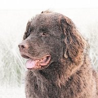
Here is the macro in action. The original image is top left; the parameters dialog is shown in its default state, and then changed during the course of the macro; the final effect is shown top right
As always, I am one person with one computer and have not tested this in every possible scenario. Try it and, if you like it, keep it and enjoy it. This forum has provided me with so many good ideas and answers to questions; this macro is my attempt to “pay it forward.”
[Note: Credit where credit is due. I am indebted to Dave Straker, whose recent YouTube video gave me some excellent ideas for this macro. Dave’s channel is called “InAffinity,” and is a steady source of helpful information. Thanks, Dave!]
Paint by Numbers.afmacros
-
 smadell got a reaction from Cmak in Cartoon effect with AP
If you're not completely satisfied with that effect, you might want to check out a macro I posted a while ago. It's called "Paint by Numbers" and it gives a somewhat different result.
https://forum.affinity.serif.com/index.php?/topic/83173-paint-by-numbers/&tab=comments#comment-438291
-
smadell got a reaction from Cmak in Cartoon effect with AP
Steps...
Here's the macro you wanted. I named it "Dave's Cartoon Effect" in order to give credit to Dave Straker who, after all, came up with the process. The only thing I changed was to set the blend mode of both the inverted outline pixel layer and the live Gaussian Blur layer to Color Burn. I also set the default blur to 0.5 pixels, as this was a bit more to my own liking. As you'll see, though, it is user-customizable. I didn't put in a step to alter the opacity, but clearly you can do that after the fact.
Note that I've made this an importable macros category, and not a single macro. When imported (through the Library) this will become a new category with a single macro in it. This will also let the macro be imported into the iPad version, if you want.
Dave Straker's Cartoon Effect.afmacros.zip
-
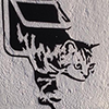
smadell got a reaction from Cmak in Cartoon Effect - a free macro
I haven’t posted any “artistic filter” macros in a while, and I needed to break my dry spell. So, I tackled an effect that, until now, I’ve never accomplished in a way that I considered satisfactory. Today, I’m posting a Cartoon Effect macro that I’m happy with, and that I think will satisfy some users.
The macro is attached as an .afmacros file, which must be imported into the Library panel of Affinity Photo’s desktop version. It can also be imported into the iPad version (although I have not tested it on my iPad as of yet). Once the category resides in your Library, you can move the macro to a different category if you like – click and drag it to the destination you desire.
* * * * * * * * * * * * * * * * * *
When you invoke the macro, it will create a Group named “Cartoon Effect” and all of the edits reside within that group. Because of this, you can turn the group on and off to show and/or hide the effect entirely. If you look at the contents of the group, you’ll find a reasonably complicated multi-level collection of layers. The important ones are labelled, so you can edit the effect after the fact.
When you click on the macro, you will be faced with a dialog box that allows you to make 6 different choices. As you use these sliders, each change will run the macro again in order to invoke your change. The final effect is written to the image only when you click the “Apply” button. The choices you can make during the macro’s run are:
1) How Many Colors?
This is a Posterize adjustment, and the default value is 3. I’ve found this to be the best value for most images, but feel free to experiment.
2) Adjust Amount of Smoothing
This slider simplifies the edges of the colored areas formed by the Posterization. Higher values will simplify (smooth) the edges more. The default value is 4 px, but this can potentially be turned up quite high. At some point, though, increasing the edge smoothing will make the image unrecognizable. Change this slider as needed, but the practical upper limit is far lower than the slider will allow!
3) Outline Width (keep low, increase only as needed):
Outlines are placed at the edges of the posterized colors. They are black, or shades of grey. This slider allows the user to increase the width of the outlines, as needed. In general, keep the values fairly low (the default value is 1 px). Like the smoothing slider above, once you get above a certain value, the results will be atrocious.
4) Outline Darkness (higher = darker)
This slider defaults to 60% and affects the “blackness” of the outlines created. It corresponds to the Black slider in a Levels adjustment. Values over 90% will start to have an adverse effect on the overall colors of the image, and setting the darkness to 100% will turn the entire image black. Values of 90% or lower are generally OK.
5) Adjust Grey Outlines (higher = darker)
This slider defaults to 0.75, and corresponds to the Gamma slider in that same Levels adjustment. The effect of the slider is to make the grey outlines (those that are not entirely black) either more or less prominent.
6) Adjust Outline Opacity
This slider affects the overall opacity of the outlines. The default value is 100%, and setting this slider to 0% will effectively make the outlines disappear. However, once you have made adjustments to the sliders for outline width, darkness, and grey values, this slider can decrease the overall prominence of the outlines.
* * * * * * * * * * * * * * * * * *
I’ve attached two images below, showing the original photo, the Cartoon Effect settings used, and the cartoon result obtained. You should be aware that this macro may not look great on every single photo, mostly based on the overall complexity of the photo and the number of different colors in the original. Also, smaller photos (in my experience, images of less than about 800 x 800 pixels) don’t end up looking great.
As with all the macros I have submitted, please remember that I am one person with one computer, testing on a limited number of images. There is no way to have foreseen all possible scenarios. I believe (but obviously cannot guarantee) that you will be happy with the results.
If you like the macro, please keep it and enjoy it. It is yours to use freely. I have learned a great deal from the users on this forum, and their continuing generosity helps my ongoing efforts at learning. I encourage you to “pay it forward” and contribute to the forum in whatever ways you can.
Be one of the good guys.
Cartoon Effect.afmacros
-
 smadell got a reaction from Robert Gootz in Feature request for Luminal Neo Plugin Support (Photoshop)
From what i can ascertain, Luminar Neo can be called successfully as a plugin from Affinity Photo, but only if you are on a Windows system. I am on the Mac side and have found myself frustrated by AP's inability to load Neo as a plugin.My experience mirrors that of the 2 users above – Neo can be added to the Plugin list, even called from the Filters menu, but it opens a dialog box and freezes the application, requiring a Force Quit and App Restart. I'm not sure if this implicates Skylum, Serif, or perhaps Apple. However, I agree that being able to use Luminar Neo as a plugin for Affinity Photo (within the Mac version) would be really nice!
-
smadell reacted to Bart Hopkins in Cartoon Effect - a free macro
Pretty dope - your generosity is appreciated.
-
smadell got a reaction from PaulEC in Cartoon Effect - a free macro
I haven’t posted any “artistic filter” macros in a while, and I needed to break my dry spell. So, I tackled an effect that, until now, I’ve never accomplished in a way that I considered satisfactory. Today, I’m posting a Cartoon Effect macro that I’m happy with, and that I think will satisfy some users.
The macro is attached as an .afmacros file, which must be imported into the Library panel of Affinity Photo’s desktop version. It can also be imported into the iPad version (although I have not tested it on my iPad as of yet). Once the category resides in your Library, you can move the macro to a different category if you like – click and drag it to the destination you desire.
* * * * * * * * * * * * * * * * * *
When you invoke the macro, it will create a Group named “Cartoon Effect” and all of the edits reside within that group. Because of this, you can turn the group on and off to show and/or hide the effect entirely. If you look at the contents of the group, you’ll find a reasonably complicated multi-level collection of layers. The important ones are labelled, so you can edit the effect after the fact.
When you click on the macro, you will be faced with a dialog box that allows you to make 6 different choices. As you use these sliders, each change will run the macro again in order to invoke your change. The final effect is written to the image only when you click the “Apply” button. The choices you can make during the macro’s run are:
1) How Many Colors?
This is a Posterize adjustment, and the default value is 3. I’ve found this to be the best value for most images, but feel free to experiment.
2) Adjust Amount of Smoothing
This slider simplifies the edges of the colored areas formed by the Posterization. Higher values will simplify (smooth) the edges more. The default value is 4 px, but this can potentially be turned up quite high. At some point, though, increasing the edge smoothing will make the image unrecognizable. Change this slider as needed, but the practical upper limit is far lower than the slider will allow!
3) Outline Width (keep low, increase only as needed):
Outlines are placed at the edges of the posterized colors. They are black, or shades of grey. This slider allows the user to increase the width of the outlines, as needed. In general, keep the values fairly low (the default value is 1 px). Like the smoothing slider above, once you get above a certain value, the results will be atrocious.
4) Outline Darkness (higher = darker)
This slider defaults to 60% and affects the “blackness” of the outlines created. It corresponds to the Black slider in a Levels adjustment. Values over 90% will start to have an adverse effect on the overall colors of the image, and setting the darkness to 100% will turn the entire image black. Values of 90% or lower are generally OK.
5) Adjust Grey Outlines (higher = darker)
This slider defaults to 0.75, and corresponds to the Gamma slider in that same Levels adjustment. The effect of the slider is to make the grey outlines (those that are not entirely black) either more or less prominent.
6) Adjust Outline Opacity
This slider affects the overall opacity of the outlines. The default value is 100%, and setting this slider to 0% will effectively make the outlines disappear. However, once you have made adjustments to the sliders for outline width, darkness, and grey values, this slider can decrease the overall prominence of the outlines.
* * * * * * * * * * * * * * * * * *
I’ve attached two images below, showing the original photo, the Cartoon Effect settings used, and the cartoon result obtained. You should be aware that this macro may not look great on every single photo, mostly based on the overall complexity of the photo and the number of different colors in the original. Also, smaller photos (in my experience, images of less than about 800 x 800 pixels) don’t end up looking great.
As with all the macros I have submitted, please remember that I am one person with one computer, testing on a limited number of images. There is no way to have foreseen all possible scenarios. I believe (but obviously cannot guarantee) that you will be happy with the results.
If you like the macro, please keep it and enjoy it. It is yours to use freely. I have learned a great deal from the users on this forum, and their continuing generosity helps my ongoing efforts at learning. I encourage you to “pay it forward” and contribute to the forum in whatever ways you can.
Be one of the good guys.
Cartoon Effect.afmacros
-
 smadell got a reaction from v_kyr in Cartoon Effect - a free macro
I haven’t posted any “artistic filter” macros in a while, and I needed to break my dry spell. So, I tackled an effect that, until now, I’ve never accomplished in a way that I considered satisfactory. Today, I’m posting a Cartoon Effect macro that I’m happy with, and that I think will satisfy some users.
The macro is attached as an .afmacros file, which must be imported into the Library panel of Affinity Photo’s desktop version. It can also be imported into the iPad version (although I have not tested it on my iPad as of yet). Once the category resides in your Library, you can move the macro to a different category if you like – click and drag it to the destination you desire.
* * * * * * * * * * * * * * * * * *
When you invoke the macro, it will create a Group named “Cartoon Effect” and all of the edits reside within that group. Because of this, you can turn the group on and off to show and/or hide the effect entirely. If you look at the contents of the group, you’ll find a reasonably complicated multi-level collection of layers. The important ones are labelled, so you can edit the effect after the fact.
When you click on the macro, you will be faced with a dialog box that allows you to make 6 different choices. As you use these sliders, each change will run the macro again in order to invoke your change. The final effect is written to the image only when you click the “Apply” button. The choices you can make during the macro’s run are:
1) How Many Colors?
This is a Posterize adjustment, and the default value is 3. I’ve found this to be the best value for most images, but feel free to experiment.
2) Adjust Amount of Smoothing
This slider simplifies the edges of the colored areas formed by the Posterization. Higher values will simplify (smooth) the edges more. The default value is 4 px, but this can potentially be turned up quite high. At some point, though, increasing the edge smoothing will make the image unrecognizable. Change this slider as needed, but the practical upper limit is far lower than the slider will allow!
3) Outline Width (keep low, increase only as needed):
Outlines are placed at the edges of the posterized colors. They are black, or shades of grey. This slider allows the user to increase the width of the outlines, as needed. In general, keep the values fairly low (the default value is 1 px). Like the smoothing slider above, once you get above a certain value, the results will be atrocious.
4) Outline Darkness (higher = darker)
This slider defaults to 60% and affects the “blackness” of the outlines created. It corresponds to the Black slider in a Levels adjustment. Values over 90% will start to have an adverse effect on the overall colors of the image, and setting the darkness to 100% will turn the entire image black. Values of 90% or lower are generally OK.
5) Adjust Grey Outlines (higher = darker)
This slider defaults to 0.75, and corresponds to the Gamma slider in that same Levels adjustment. The effect of the slider is to make the grey outlines (those that are not entirely black) either more or less prominent.
6) Adjust Outline Opacity
This slider affects the overall opacity of the outlines. The default value is 100%, and setting this slider to 0% will effectively make the outlines disappear. However, once you have made adjustments to the sliders for outline width, darkness, and grey values, this slider can decrease the overall prominence of the outlines.
* * * * * * * * * * * * * * * * * *
I’ve attached two images below, showing the original photo, the Cartoon Effect settings used, and the cartoon result obtained. You should be aware that this macro may not look great on every single photo, mostly based on the overall complexity of the photo and the number of different colors in the original. Also, smaller photos (in my experience, images of less than about 800 x 800 pixels) don’t end up looking great.
As with all the macros I have submitted, please remember that I am one person with one computer, testing on a limited number of images. There is no way to have foreseen all possible scenarios. I believe (but obviously cannot guarantee) that you will be happy with the results.
If you like the macro, please keep it and enjoy it. It is yours to use freely. I have learned a great deal from the users on this forum, and their continuing generosity helps my ongoing efforts at learning. I encourage you to “pay it forward” and contribute to the forum in whatever ways you can.
Be one of the good guys.
Cartoon Effect.afmacros
-
 smadell got a reaction from Max P in Cartoon Effect - a free macro
I haven’t posted any “artistic filter” macros in a while, and I needed to break my dry spell. So, I tackled an effect that, until now, I’ve never accomplished in a way that I considered satisfactory. Today, I’m posting a Cartoon Effect macro that I’m happy with, and that I think will satisfy some users.
The macro is attached as an .afmacros file, which must be imported into the Library panel of Affinity Photo’s desktop version. It can also be imported into the iPad version (although I have not tested it on my iPad as of yet). Once the category resides in your Library, you can move the macro to a different category if you like – click and drag it to the destination you desire.
* * * * * * * * * * * * * * * * * *
When you invoke the macro, it will create a Group named “Cartoon Effect” and all of the edits reside within that group. Because of this, you can turn the group on and off to show and/or hide the effect entirely. If you look at the contents of the group, you’ll find a reasonably complicated multi-level collection of layers. The important ones are labelled, so you can edit the effect after the fact.
When you click on the macro, you will be faced with a dialog box that allows you to make 6 different choices. As you use these sliders, each change will run the macro again in order to invoke your change. The final effect is written to the image only when you click the “Apply” button. The choices you can make during the macro’s run are:
1) How Many Colors?
This is a Posterize adjustment, and the default value is 3. I’ve found this to be the best value for most images, but feel free to experiment.
2) Adjust Amount of Smoothing
This slider simplifies the edges of the colored areas formed by the Posterization. Higher values will simplify (smooth) the edges more. The default value is 4 px, but this can potentially be turned up quite high. At some point, though, increasing the edge smoothing will make the image unrecognizable. Change this slider as needed, but the practical upper limit is far lower than the slider will allow!
3) Outline Width (keep low, increase only as needed):
Outlines are placed at the edges of the posterized colors. They are black, or shades of grey. This slider allows the user to increase the width of the outlines, as needed. In general, keep the values fairly low (the default value is 1 px). Like the smoothing slider above, once you get above a certain value, the results will be atrocious.
4) Outline Darkness (higher = darker)
This slider defaults to 60% and affects the “blackness” of the outlines created. It corresponds to the Black slider in a Levels adjustment. Values over 90% will start to have an adverse effect on the overall colors of the image, and setting the darkness to 100% will turn the entire image black. Values of 90% or lower are generally OK.
5) Adjust Grey Outlines (higher = darker)
This slider defaults to 0.75, and corresponds to the Gamma slider in that same Levels adjustment. The effect of the slider is to make the grey outlines (those that are not entirely black) either more or less prominent.
6) Adjust Outline Opacity
This slider affects the overall opacity of the outlines. The default value is 100%, and setting this slider to 0% will effectively make the outlines disappear. However, once you have made adjustments to the sliders for outline width, darkness, and grey values, this slider can decrease the overall prominence of the outlines.
* * * * * * * * * * * * * * * * * *
I’ve attached two images below, showing the original photo, the Cartoon Effect settings used, and the cartoon result obtained. You should be aware that this macro may not look great on every single photo, mostly based on the overall complexity of the photo and the number of different colors in the original. Also, smaller photos (in my experience, images of less than about 800 x 800 pixels) don’t end up looking great.
As with all the macros I have submitted, please remember that I am one person with one computer, testing on a limited number of images. There is no way to have foreseen all possible scenarios. I believe (but obviously cannot guarantee) that you will be happy with the results.
If you like the macro, please keep it and enjoy it. It is yours to use freely. I have learned a great deal from the users on this forum, and their continuing generosity helps my ongoing efforts at learning. I encourage you to “pay it forward” and contribute to the forum in whatever ways you can.
Be one of the good guys.
Cartoon Effect.afmacros
-
 smadell got a reaction from BobMoyer in Cartoon Effect - a free macro
I haven’t posted any “artistic filter” macros in a while, and I needed to break my dry spell. So, I tackled an effect that, until now, I’ve never accomplished in a way that I considered satisfactory. Today, I’m posting a Cartoon Effect macro that I’m happy with, and that I think will satisfy some users.
The macro is attached as an .afmacros file, which must be imported into the Library panel of Affinity Photo’s desktop version. It can also be imported into the iPad version (although I have not tested it on my iPad as of yet). Once the category resides in your Library, you can move the macro to a different category if you like – click and drag it to the destination you desire.
* * * * * * * * * * * * * * * * * *
When you invoke the macro, it will create a Group named “Cartoon Effect” and all of the edits reside within that group. Because of this, you can turn the group on and off to show and/or hide the effect entirely. If you look at the contents of the group, you’ll find a reasonably complicated multi-level collection of layers. The important ones are labelled, so you can edit the effect after the fact.
When you click on the macro, you will be faced with a dialog box that allows you to make 6 different choices. As you use these sliders, each change will run the macro again in order to invoke your change. The final effect is written to the image only when you click the “Apply” button. The choices you can make during the macro’s run are:
1) How Many Colors?
This is a Posterize adjustment, and the default value is 3. I’ve found this to be the best value for most images, but feel free to experiment.
2) Adjust Amount of Smoothing
This slider simplifies the edges of the colored areas formed by the Posterization. Higher values will simplify (smooth) the edges more. The default value is 4 px, but this can potentially be turned up quite high. At some point, though, increasing the edge smoothing will make the image unrecognizable. Change this slider as needed, but the practical upper limit is far lower than the slider will allow!
3) Outline Width (keep low, increase only as needed):
Outlines are placed at the edges of the posterized colors. They are black, or shades of grey. This slider allows the user to increase the width of the outlines, as needed. In general, keep the values fairly low (the default value is 1 px). Like the smoothing slider above, once you get above a certain value, the results will be atrocious.
4) Outline Darkness (higher = darker)
This slider defaults to 60% and affects the “blackness” of the outlines created. It corresponds to the Black slider in a Levels adjustment. Values over 90% will start to have an adverse effect on the overall colors of the image, and setting the darkness to 100% will turn the entire image black. Values of 90% or lower are generally OK.
5) Adjust Grey Outlines (higher = darker)
This slider defaults to 0.75, and corresponds to the Gamma slider in that same Levels adjustment. The effect of the slider is to make the grey outlines (those that are not entirely black) either more or less prominent.
6) Adjust Outline Opacity
This slider affects the overall opacity of the outlines. The default value is 100%, and setting this slider to 0% will effectively make the outlines disappear. However, once you have made adjustments to the sliders for outline width, darkness, and grey values, this slider can decrease the overall prominence of the outlines.
* * * * * * * * * * * * * * * * * *
I’ve attached two images below, showing the original photo, the Cartoon Effect settings used, and the cartoon result obtained. You should be aware that this macro may not look great on every single photo, mostly based on the overall complexity of the photo and the number of different colors in the original. Also, smaller photos (in my experience, images of less than about 800 x 800 pixels) don’t end up looking great.
As with all the macros I have submitted, please remember that I am one person with one computer, testing on a limited number of images. There is no way to have foreseen all possible scenarios. I believe (but obviously cannot guarantee) that you will be happy with the results.
If you like the macro, please keep it and enjoy it. It is yours to use freely. I have learned a great deal from the users on this forum, and their continuing generosity helps my ongoing efforts at learning. I encourage you to “pay it forward” and contribute to the forum in whatever ways you can.
Be one of the good guys.
Cartoon Effect.afmacros
-
 smadell got a reaction from velarde in Cartoon Effect - a free macro
I haven’t posted any “artistic filter” macros in a while, and I needed to break my dry spell. So, I tackled an effect that, until now, I’ve never accomplished in a way that I considered satisfactory. Today, I’m posting a Cartoon Effect macro that I’m happy with, and that I think will satisfy some users.
The macro is attached as an .afmacros file, which must be imported into the Library panel of Affinity Photo’s desktop version. It can also be imported into the iPad version (although I have not tested it on my iPad as of yet). Once the category resides in your Library, you can move the macro to a different category if you like – click and drag it to the destination you desire.
* * * * * * * * * * * * * * * * * *
When you invoke the macro, it will create a Group named “Cartoon Effect” and all of the edits reside within that group. Because of this, you can turn the group on and off to show and/or hide the effect entirely. If you look at the contents of the group, you’ll find a reasonably complicated multi-level collection of layers. The important ones are labelled, so you can edit the effect after the fact.
When you click on the macro, you will be faced with a dialog box that allows you to make 6 different choices. As you use these sliders, each change will run the macro again in order to invoke your change. The final effect is written to the image only when you click the “Apply” button. The choices you can make during the macro’s run are:
1) How Many Colors?
This is a Posterize adjustment, and the default value is 3. I’ve found this to be the best value for most images, but feel free to experiment.
2) Adjust Amount of Smoothing
This slider simplifies the edges of the colored areas formed by the Posterization. Higher values will simplify (smooth) the edges more. The default value is 4 px, but this can potentially be turned up quite high. At some point, though, increasing the edge smoothing will make the image unrecognizable. Change this slider as needed, but the practical upper limit is far lower than the slider will allow!
3) Outline Width (keep low, increase only as needed):
Outlines are placed at the edges of the posterized colors. They are black, or shades of grey. This slider allows the user to increase the width of the outlines, as needed. In general, keep the values fairly low (the default value is 1 px). Like the smoothing slider above, once you get above a certain value, the results will be atrocious.
4) Outline Darkness (higher = darker)
This slider defaults to 60% and affects the “blackness” of the outlines created. It corresponds to the Black slider in a Levels adjustment. Values over 90% will start to have an adverse effect on the overall colors of the image, and setting the darkness to 100% will turn the entire image black. Values of 90% or lower are generally OK.
5) Adjust Grey Outlines (higher = darker)
This slider defaults to 0.75, and corresponds to the Gamma slider in that same Levels adjustment. The effect of the slider is to make the grey outlines (those that are not entirely black) either more or less prominent.
6) Adjust Outline Opacity
This slider affects the overall opacity of the outlines. The default value is 100%, and setting this slider to 0% will effectively make the outlines disappear. However, once you have made adjustments to the sliders for outline width, darkness, and grey values, this slider can decrease the overall prominence of the outlines.
* * * * * * * * * * * * * * * * * *
I’ve attached two images below, showing the original photo, the Cartoon Effect settings used, and the cartoon result obtained. You should be aware that this macro may not look great on every single photo, mostly based on the overall complexity of the photo and the number of different colors in the original. Also, smaller photos (in my experience, images of less than about 800 x 800 pixels) don’t end up looking great.
As with all the macros I have submitted, please remember that I am one person with one computer, testing on a limited number of images. There is no way to have foreseen all possible scenarios. I believe (but obviously cannot guarantee) that you will be happy with the results.
If you like the macro, please keep it and enjoy it. It is yours to use freely. I have learned a great deal from the users on this forum, and their continuing generosity helps my ongoing efforts at learning. I encourage you to “pay it forward” and contribute to the forum in whatever ways you can.
Be one of the good guys.
Cartoon Effect.afmacros