smadell
-
Posts
1,151 -
Joined
-
Last visited
Everything posted by smadell
-

grouping in a macro
smadell replied to maxegb's topic in Affinity on Desktop Questions (macOS and Windows)
It will almost certainly still be a problem for me. Javascript (or, really, any coding language) and I are like oil and water. Any time I tried to script anything more complicated than HyperCard, I ended up throwing my hands up in frustration. Could I do it if I really put my mind to it? I assume so. But I don’t have the time or the determination to go down that road. -
grouping in a macro
smadell replied to maxegb's topic in Affinity on Desktop Questions (macOS and Windows)
Comments by @v_kyr and @R C-R are correct, but the problem remains. If I create a macro solely for my own use, I have control over the naming of any existing layers as well as the layers created by the macro. However, if I create a macro and share it with others (as you know I frequently do) then I have no way to know what layer names might already exist in document(s) created by others. Therefore, any layer my macro creates is given a name that is suitably obscure, and any reference I make to existing layers is usually based on their position in the Layers stack - top, bottom, n layers above or below - and definitely not by its assumed name. Does that guarantee that layer references will always be correct? No, but it’s the best I know how to do. -
grouping in a macro
smadell replied to maxegb's topic in Affinity on Desktop Questions (macOS and Windows)
Definitely not foolproof (and there is no shortage of fools…) For instance, if I have 3 layers named “Background” and I tell a macro to select the layer named “Background” I have no idea which one it will choose. Is it random? Does it search from the bottom up? the top down? The better solution is to use a name which is virtually guaranteed to be unique, even if that means going back to that layer at the end of a macro to rename it to something intelligible. (e.g., create a layer and name it “MyMacroLayer-temp01” which is quite unlikely to be otherwise present. If needed, at the end of macro recording, go back to that layer and rename it something else.) -
grouping in a macro
smadell replied to maxegb's topic in Affinity on Desktop Questions (macOS and Windows)
One more thing… Those first 2 steps are helpful, especially the first “Deselect”. Your entire macro will fail if you have an active selection when you start adding additional layers. But, when programming the macro, the Deselect menu item is greyed out unless you actually have an active selection. Therefore, before starting your macro recording, create a selection (any random selection is fine). Then, click the Record button in the Macro panel and choose “Deselect” as your first step. -
grouping in a macro
smadell replied to maxegb's topic in Affinity on Desktop Questions (macOS and Windows)
Good morning @maxegb. What you are trying to do is very possible. But, as noted, you cannot select multiple layers at once. Instead, substitute these steps at the beginning of your macro. Deselect - make sure there is no active selection Deselect Layers - make sure your new layers are placed at the top of the Layers stack ** these first two steps are optional, but often helpful ** Duplicate the Image - or, perhaps, Merge Visible (which will incorporate all existing layers, adjustments, etc) New Group - from the Layer menu Name the Group - double click on the Group Name and type something Set the blend mode to Screen Move back one - from the Arrange menu Select the duplicated layer - when the dialog box pops up, choose ‘Select layer 1 above current layer” Move inside - now you’re inside the group ** Continue your macro by adding additional stuff ** Select the enclosing Group layer - confirm that you are selecting the ‘parent layer’ in the dialog box This should get you what you want. Believe me, it was a long period of pulling my hair out trying to figure out how to use Groups inside of macros. Once you get it, it’s fairly straightforward. But until you figure out the logic that’s being used, it’s a bit frustrating (to say the least…) -
Here's another option for an edit. This harkens back to the OP's use of Curves instead of Levels. I actually added two separate Curves adjustments – the first one for tonality and the second for contrast. The first adjustment (called "Curves for Tonality" in my screenshot below) brings the black point up from the left, bottom corner to increase the luminance of the darker pixels, while leaving the brighter pixels alone. This gives me more detail in the blacks and shadows, but it vastly diminishes contrast. The second adjustment (called "Curves for Contrast") brings the black point of the image in from the bottom left, which darkens the dark pixels, and it raises the luminance of the midtones, thus creating greater contrast. It still leaves the white point alone. This version of the edit was done without using any masks at all, nor does it invoke the Blend Options curves. (Note: I tried doing this using a single Curves adjustment, like the OP did, but I was not happy with the result. The blacks were too black, and the image suffered by trying to accomplish too much in one adjustment layer.)

-
Hello again, @thomaso. A couple of points to make… 1) A luminosity selection selects the entire layer, but the degree to which pixels are selected is proportionate to their luminosity. Think of this as if every pixel is being described with HSL (instead of RGB) values. The white pixels have a luminance value of 100% and the black pixels have a luminance value of 0%. Middle grey has a luminance value of 50%. When you Cmd-Opt-Click on a layer's thumbnail, the selection strength varies according to the luminance percentages of each pixel. So, in that sense, the light areas are always more strongly selected than the dark areas (their luminance is higher, so they are "more selected.") 2) Like many other apps, marching ants represent the selected pixels, but they only show up for pixels that are 50% selected or more. Therefore, when you Cmd-Opt-Click the OP's photo, you will only see marching ants around the light areas (such as the white jackets, the sky, and so forth). 3) The visibility (or lack of visibility) of the marching ants does not reflect the alpha channel values for those pixels. Presumably, in the original photo all of the pixels have an alpha value of 100% (since they are all completely opaque). Rather, the visibility of the marching ants depends on the strength of the selection and is visible only for those pixels which are 50% or more selected. In a luminosity based selection, the light areas are more strongly selected than the dark areas. (In the abstract, since a pixel selection is an alpha channel, you might get away with saying that the visible marching ants reflect an alpha value of 128 or greater, but it is easier to talk about the strength of selection at this point.) 4) As to the screen rendering of marching ants at the borders, I have seen the situation you describe. I don't know what the explanation is, but have guessed that it is a screen render issue. I don't know if v1 and v2 are different in how they handle this. 5) If I am interpreting your screenshots (at the bottom your last post) correctly, you have created a luminosity selection and applied it to a Levels adjustment. You have then inverted the mask. (In effect, the initial Cmd-Opt-Click selection is a "Lights 1" luminosity selection. The inverted version of this selection, or the mask it creates, is what most would term a "Darks 1" selection/mask.) When you apply this mask to a Levels adjustment, the adjustment preferentially affects the darker areas of the photo, since these are the lighter areas of the mask. This is precisely what the OP did in Photoshop, and represents the method that I suggested to him in my first post. When I used an Exposure adjustment and altered the Blend Range Options for that adjustment, I was using the Blend Options in lieu of a luminosity mask, and I did this because Blend Options allows for more flexibility in deciding where the adjustment is applied or not applied. Please note that if you closely inspect my screenshot of the Exposure adjusted photo, you will see that there is no mask applied to the Exposure adjustment; there is only a Blend Options curve applied.
-
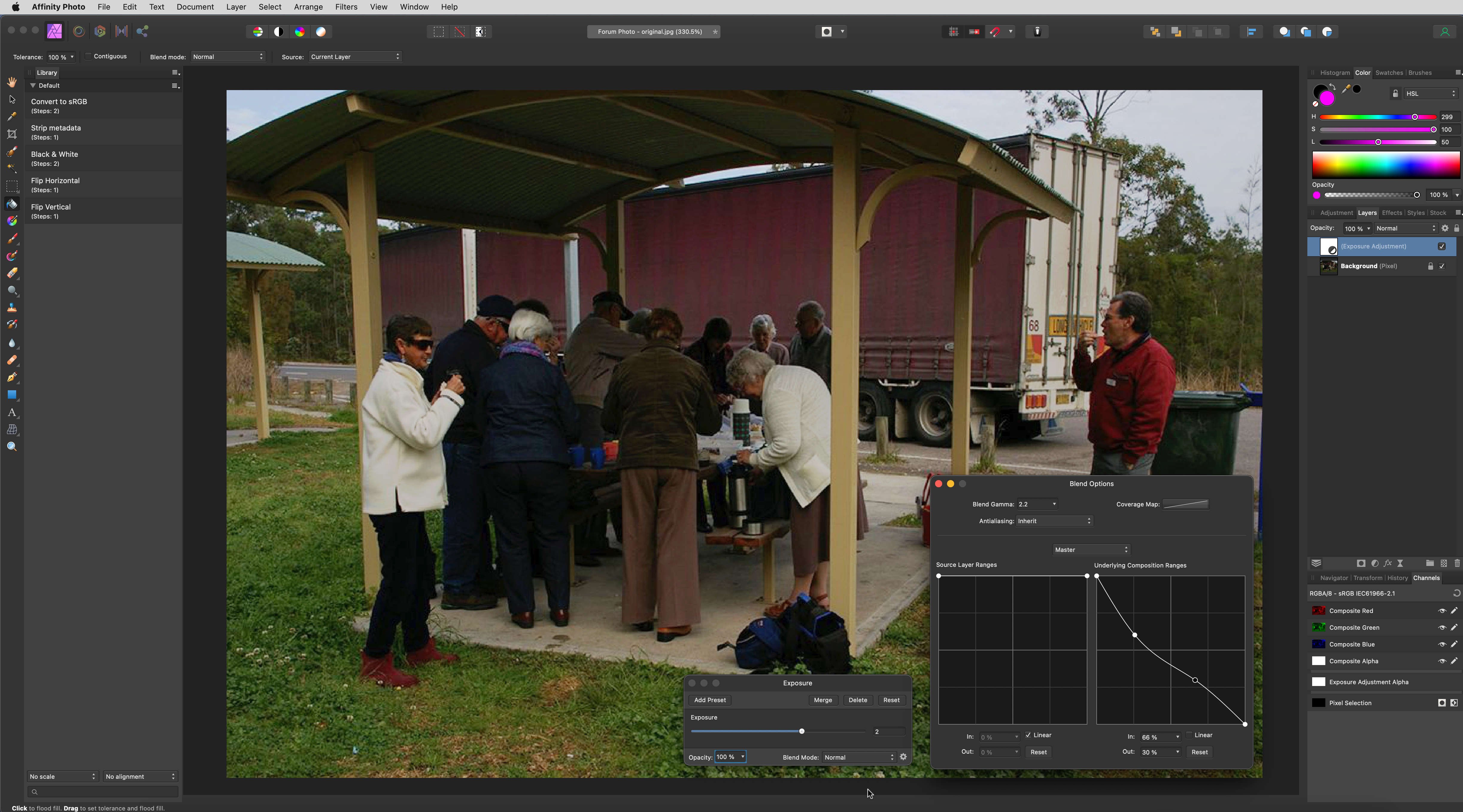
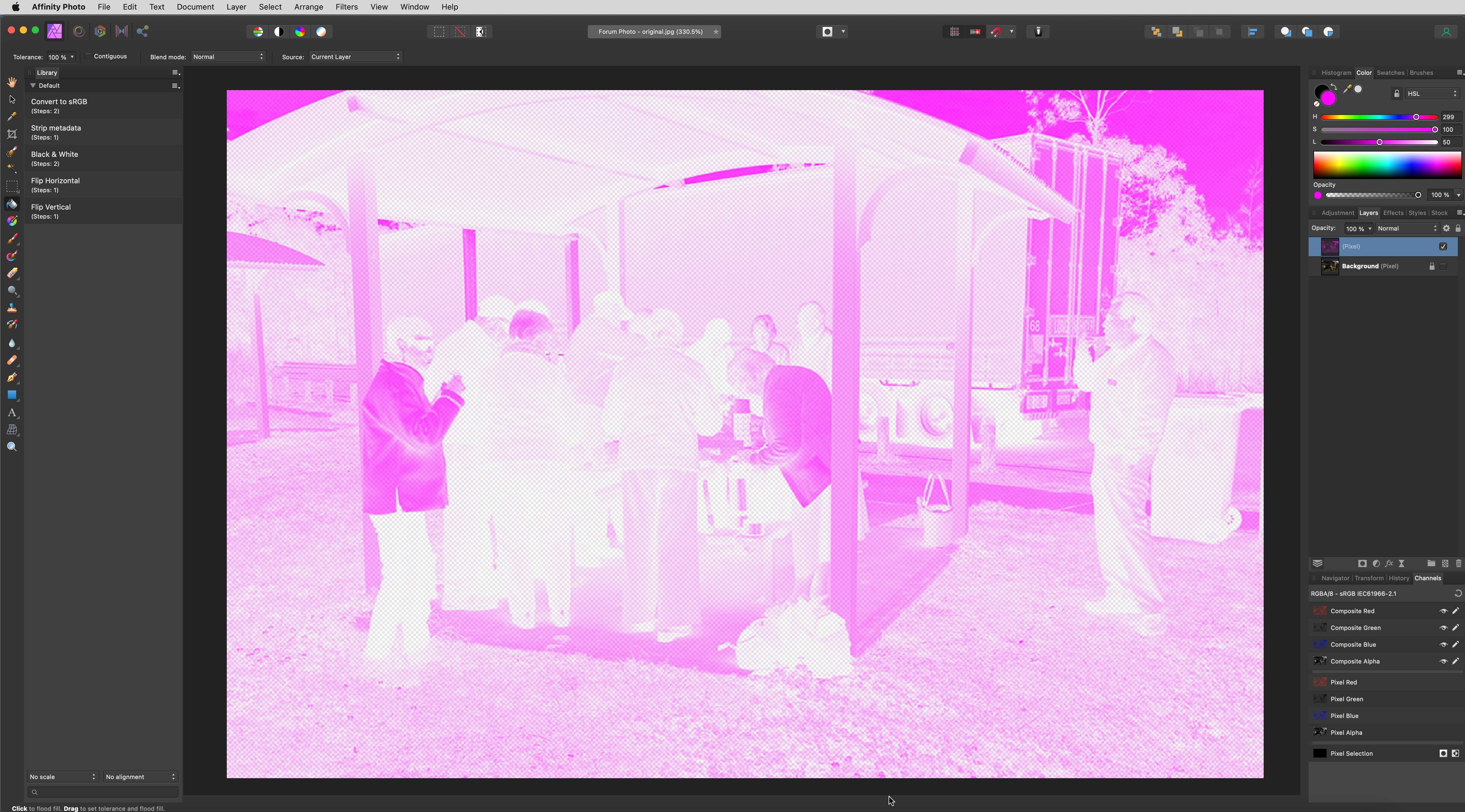
Hi, @Furry and @thomaso. A couple of comments, especially regarding the questions posed by thomaso. First, my suggestion (as posed above) was meant to suggest a way to effectively duplicate the method that Furry was using in Photoshop. In copying the original image into the Levels adjustment, he is effectively masking the adjustment to work more in the highlights and less in the shadows. Inverting that will cause the adjustment to affect the shadows more than the highlights. Because Affinity Photo cannot "paste" into the Levels adjustment directly, I suggested a way to mask the Levels adjustment by first creating a luminosity-based selection of the original image. (As I will note below, I think there are far more elegant ways to do this.) Second, thomaso's question regarding the apparent transparency created with the Cmd-Opt-Click method of selection is best understood as follows. Cmd-Opt-Clicking the thumbnail of the Background layer selects the entire layer, but does so based on the luminosity of each of the layer's pixels. So, a pixel that is 100% luminous - white (255,255,255) will be selected at 100% strength; a pixel that is 0% lumninous - black (0,0,0) will be selected at 0% strength. A pixel that is 50% luminous - middle grey (128,128,128) will be selected at 50% strength. Because the photo provided by the OP is very dark, most of the pixels are selected at very low strength. Because of this, they will appear transparent. Actually, many of them are not completely transparent, but are so nearly transparent that they look that way. When a luminosity-based selection is in place, any operation that takes place next is applied to the selected area at a strength proportionate to the strength of the selection. So, applying a magenta color to pixels that are 100% selected will be applied at 100% strength (or, stated more appropriately, with an alpha level of 255 (100%). Applying a magenta color to pixels that are 0% selected will apply that color with an alpha level of 0, and the color will effectively be invisible. Applying magenta to a pixel that is 50% selected will apply that color with an alpha level of 128, and will appear 50% transparent. In the image below, I have added a blank pixel layer above the Background layer, Cmd-Opt-Clicked on the Background layer, and (with the blank pixel layer active) filled the selection with magenta. (See below for notes on the best method to fill a selection.) Hiding the Background layer reveals the magenta fill, which reflects the luminosity selection – opaque where the Background is white; transparent where the Background is black. Actually the entire pixel layer has RGB values of 300,100,50. But, the alpha channel values are different which causes the higher or lower measures of transparency. Lastly, the method that thomaso has used to fill the luminosity selection with magenta is flawed. Using the Flood Fill tool to fill any pixel layer (with or without an active selection) will always take into account the color directly under the point that is clicked on. Therefore, if I use the flood fill tool and click on the white coat of the woman on the left, only the areas of white are filled. It is only when I bump the tolerance to 100% that AP will allow any color to be affected by the Flood Fill. The better way to do a "fill" with a specific color is to use the Fill… command (in the Edit menu) and specify a "Custom Color". Performing the fill with this command avoids the need to worry about what color you're clicking on. As far as the Select Midtones, Select Shadows, and Select Highlights commands (in the Select menu) are concerned, I have always found them to be lacking in enough specificity for me. And, they tend to create hard-edged selections (or nearly so) that are difficult to control. I played with a couple of methods to accomplish the goal that Furry set out, and I think I got the best solution by increasing the Exposure, applying Blend Options to the adjustment (such that the adjustment is preferentially applied to the blacks and shadows).
-
Hi, @Furry. What you are doing in Photoshop is creating a luminosity mask inside the Levels adjustment. To replicate this in Affinity Photo, first make a luminosity-based selection on the photo layer. Either choose “Selection from Layer Intensity” from the Select menu, or click on the photo layer’s thumbnail (in the Layers panel) while holding the Command and Option keys. With the luminosity selection active, add the Levels adjustment. The luma mask will be incorporated into the adjustment layer. If you need to invert the mask, simply choose “Invert” from the Layer menu or type Command-I with the adjustment layer selected. This should give you the same result that you got in Photoshop. The difference comes down to how Affinity allows for editing Alpha channels. Photoshop allows alpha channels to be edited as if they were monochrome pixels layers; Affinity does not.
-
Hi, @AtomTik. I know you solved your issue in the short term, but it occurred to me there’s another method that might be helpful in a more complicated layer stack. First, create an adjustment layer (like your Brightness & Contrast adjustment) and make it a child of one of the layers you want it to affect. To do this, drag the adjustment layer (in the Layers panel) over the other layer’s thumbnail. Now, choose “Duplicate Linked” and drag that linked adjustment layer to the second layer you want to affect (again making it a child of that layer). Basically, do this for all the layers that should be affected by the adjustment, but do not drag a copy to any layer that should not be affected. Since they are linked layers, setting the sliders in any one of the duplicates will affect all of the linked copies. This might be helpful when re-arranging the order of layers just isn’t feasible.
-
Best DAM I've come across - Photo Supreme. No image editing (and not free), but a whole lot of catalogue power in there. Also, the best implementation of keywords I've ever come across. If Serif creates a good Lightroom replacement, I'd certainly look at it (since it would fit in well with the rest of the suite), but It would have to be really, really compelling. Until then, my nod goes to Photo Supreme. ( https://www.idimager.com/home )
-
I have updated the Currency Effect macro to version 2. This new version adds a live Ripple filter, which will give the engraving lines a bit of wave. This can be turned off (naturally!) but I think the added touch gives the engraving a bit more authenticity. There is also an Instructions macro, which will place on-screen instructions into a new layer. The new version can be downloaded from the first post in this thread. The .afmacros category includes both the original and new versions of the macro, along with the instructions macro. You can safely delete the old version of the Currency Effect, since that original macro is included in the v2 category above.
-
How to copy adjustment mask layers
smadell replied to voitek's topic in Affinity on Desktop Questions (macOS and Windows)
Or, if your target layer is an adjustment layer, live filter layer or Fill layer… 1) Command-Click (or Cntrl-Click on Windows) on the adjustment layer with the mask 2) With the desired target layer selected, invert the selection (Cmd-Shift-I, or "Invert Pixel Selection" from the Select menu). 3) Assuming that your background color is black, choose "Fill with Secondary Color" from the Edit menu. -
I guess I misspoke in this instance. The TIFF and PNG files, having been upscaled from 8 bit files, may not contain more information although they do contain more data. The real reason for my post was to compare the file sizes in JPG at 100% and 98%, since the suggestion had been made to export at 100% JPG quality. The OP was concerned about large file sizes, given his limited storage capability. I suggested a way to attain smaller file size without (much) loss of perceptible quality.
-
Hello again, @stokerg and other Affinity folks. Now running Affinity Photo v2.3.0 (the retail version) and this issue still persists!
-
I just opened a stock landscape photo (using Pexels inside of Affinity Photo) which measured 5,279 x 3,519 pixels. No edits were made at all. I exported the photo to various file formats. TIFF (16 bit) with LZW Compression - 69.6 MB PNG - 41.6 MB JPG (100% Quality) - 21.9 MB JPG (98% Quality) - 14.7 MB The TIFF and PNG images are 16 bit files, and the JPG's are of necessity 8 bit files. Obviously the TIFF and PNG files are substantially larger, but also contain more information. Personally, I use TIFF's only as "interchange" files, such as when using a non-Affinity Raw developer and subsequently doing further editing in Affinity Photo. I use PNG files when I need to maintain transparency. I'll also use larger files (TIFF, PNG, PDF, or native .afphoto) when printing. Otherwise, I rely primarily on JPG's. I've always found it interesting, though, that a huge amount of file size saving can be obtained by exporting JPG at 98% or so, instead of at 100%. The difference in perceptible quality (to me, at least) is nil; the difference in file size is considerable.
-
Non Printing Layers/Objects
smadell replied to DGCON's topic in Affinity on Desktop Questions (macOS and Windows)
This would be a nice feature. But, as it stands now, there is no "info" panel for a layer in which you can designate its printing vs non-printing status. What you can do, however, is to use "Layer States" to set a global on/off switch for layers you want to turn off prior to printing or exporting a PDF, etc. The easiest way to do this is probably to create a "Smart State" using (for instance) a color label. For instance, on a document-wide basis, mark the first non-printing layer as Red. (Right click on the layer, and choose the Red swatch at the bottom of the drop-down menu.) Open the States panel and create a new Smart State. When asked for a name, call the smart state "Turn OFF Red layers" or something similar. In the panel, check the top filter "Layer tag is…" and click in the Red circle. Now, you have a way to designate that layer, and any subsequent layers you create, as non-printing by turning the Layer State to "Hide" or "Show". Before printing or exporting, simply turn the Layer State to "Hide" - turn it back to "Show" when you're done. -
Gamma slider feels inverted
smadell replied to chip2's topic in Feedback for the Affinity V2 Suite of Products
You're not wrong, @chip2. You're just swimming against a rather strong tide. I would dare say that every photo editing software out there that includes a Levels adjustment with a "Gamma" or "Grey Point" slider works in the anti-intuitive manner you're describing. There are literally decades of precedent for a Gamma/Grey Point/Midtones slider that works the way Affinity Photo presents it. Doing it a different way, no matter how intuitive it may feel to "non-technical people," will alienate a large crowd of editors with experience in Affinity Photo and a plethora of other applications. It is said that "haters gotta hate," and switching up the Levels slider(s) would just be another aspect of AP for naysayers to point at and claim that Serif doesn't know what it's doing. Like I said, it's not that you're wrong – it's just that there are some fights that are not worth fighting. -
Gamma slider feels inverted
smadell replied to chip2's topic in Feedback for the Affinity V2 Suite of Products
I think the problem is that we are conflating the "Gamma" slider with a "Brightness" slider, and it really isn't that (although admittedly that's what it "feels like.") Methinks it's just a matter of getting used to what the Gamma slider actually does, and coming to understand it on its own terms. Can you imagine how many posted complaints there would be if the Gamma/InverseGamma/Brightness slider (whatever we would call it – you know, the third slider down) was reversed to work the way the OP describes? I can hear the complaints now - "how can I use this ridiculous program that doesn't work exactly the way Photoshop does?" Also, why not just use the "Brightness and Contrast" adjustment if the Gamma slider in Levels is too much to bear? -
Gamma slider feels inverted
smadell replied to chip2's topic in Feedback for the Affinity V2 Suite of Products
Interesting question, Walt. But the same question could be asked about the Black and White sliders. After all, sliding the Black slider to the right doesn’t make the image whiter - it makes it blacker. And vice versa for the White slider. Obviously the gradients under the sliders correspond to the underlying image, and not the result. And.. at this point, changing it would throw the Affinity world into an absolute frenzy! -
Gamma slider feels inverted
smadell replied to chip2's topic in Feedback for the Affinity V2 Suite of Products
Although I understand the math, my “gut” understanding of the Gamma slider has always been to see it as the “grey point.” I visualize this as if I had created a black to white gradient map with a 50% grey value dead center. If I shift that central point to the right, the underlying image gets darker because more of the midtones are being mapped to darker grey values. Slide the midpoint to the left, and the image gets lighter, because the underlying luminance values in the midtones are being mapped to even lighter values. I don’t know if the Gamma slider is precisely equivalent to a Grey Point slider mathematically. But, conceptually, it has always worked for me as a way to understand what’s going on. -
Hope you enjoy it, @Hilltop.
-
How did I do this?
smadell replied to arquata's topic in Affinity on Desktop Questions (macOS and Windows)
Saving the history is off by default. And, one must presume, your history is not recoverable. If you saved your work as an Affinity Photo file (a file with the extension .afphoto) does that file show any layers in addition to the “Background” layer? That might go a long way toward identifying the steps taken. Short of that, it is possible that one or more of us could suggest possibilities if you posted before and after versions of the photo. Someone might be anle to “reverse engineer” the changes that might have led the before to achieve the after. If you can’t post the photos, that’s understandable. But if that’s the case, you might be out of luck. -
Dull colours Affinity Photo 2
smadell replied to DebSki's topic in Affinity on Desktop Questions (macOS and Windows)
Most folks I've read or heard tend to recommend editing in a wider color space (AdobeRGB or ProPhoto) which supports wider color gamuts, even if the ultimate goal is to export the result in sRGB. I've found this to have modest benefits, at best, but it is considered "best practice." I have set up some presets in the Export dialog for this purpose. Specifically, the preset I use often is set up to Resample - Lanczos 3 (non-separable); Quality - 95%; ICC Profile - sRGB (embedded). This lets me work in a wide color space (I use ProPhoto) and convert on export to sRGB. This has gotten me good results. Would it matter if I did my editing in sRGB start to finish? Probably not too much, but I've heard that it helps when dealing with very bright and very saturated colors, even if they get "dulled down" by the final conversion down to sRGB. By the way, "Show Context Toolbar" is toward the bottom of the View menu. Here's a link to an old (version 1) video that might help a bit: -
Dull colours Affinity Photo 2
smadell replied to DebSki's topic in Affinity on Desktop Questions (macOS and Windows)
Two otherthings, @DebSki. First, if you have a BenQ monitor, why are you limiting your editing to sRGB? Surely, that monitor could handle at least Adobe RGB. You might get better results if you set AP to a working space that was wider )such as Adobe RGB). Second, you can reveal the Context Toolbar with a menu choice (I think it’s in the View or Window menu - not at my desktop right now). You’ll find a menu choice called “Show Context Toolbar” - choose that.