Eagerbob
-
Posts
22 -
Joined
-
Last visited
-
 Vertril reacted to a post in a topic:
Publisher: export PDF with variable font
Vertril reacted to a post in a topic:
Publisher: export PDF with variable font
-
Save for Web?
Eagerbob replied to pbolger's topic in Pre-V2 Archive of Affinity on Desktop Questions (macOS and Windows)
Yes, I know, but the original stays at the same size and there is no way to change that once the export pane is open. Let's just hope that this is indeed the first step and that next version will improve on the UX so that it will delight us with its effectiveness and elegance. For now, I will keep on using Photoshop. -
Save for Web?
Eagerbob replied to pbolger's topic in Pre-V2 Archive of Affinity on Desktop Questions (macOS and Windows)
There is now indeed a "preview" Checkbox in the export pane. Gives you a tiny poststamp preview at 8%. You can enlarge the preview, but the original underneath stays the same size. You cannot change this since the focus is on the export dialog box that is open. The preview window is attached to the export pane in some weird way. You cannot manipulate the preview window so that it sits side by side with the original, change the settings and compare the original with the exported version while you make the changes. All in all a rather clumsy interpretation of the "save for web" functionality that we use and came to love in other apps. Not something that will make you happy if preparing images for online use is part of your workflow. -
Nickolas Simard reacted to a post in a topic:
Save for Web?
-
Chris B reacted to a post in a topic:
Photo assigns wrong profile on macos screenshots
-
Photo assigns wrong profile on macos screenshots
Eagerbob replied to Eagerbob's topic in V1 Bugs found on macOS
Publisher shows the same behavior. Makes sense as it is probably the same colormanagement engine. I am doing webconsultantcy work at the moment where I use a lot of screenhots. So in order to get around the colorshift I opened the screenshots in Photoshop and saved them again as both .jpg and .png with the display profile included. But the images still show oversaturated colors. Only if I convert the screenshots in Photoshop to another profile (sRGB) and save them with the sRGB profile included, Publisher gets it right. Question: do I need to report the bug on the Publisher forum as well? Thanks -
Photo assigns wrong profile on macos screenshots
Eagerbob replied to Eagerbob's topic in V1 Bugs found on macOS
OK, does that mean it is on the list to be fixed? -
Eagerbob reacted to a post in a topic:
Screenshots on Mac have bad colors
-
Eagerbob reacted to a post in a topic:
Screenshots on Mac have bad colors
-
Eagerbob reacted to a post in a topic:
Photo assigns wrong profile on macos screenshots
-
lepr reacted to a post in a topic:
Photo assigns wrong profile on macos screenshots
-
Photo assigns wrong profile on macos screenshots
Eagerbob replied to Eagerbob's topic in V1 Bugs found on macOS
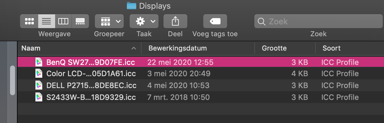
On my mac in library/ColorSync/Profiles/Displays there are currently four display profiles, one "Color LCD" for the built in screen and three profiles for monitors that have been used with my mac: BenQ, DELL and EIZO. Instead of using the profile that is embedded in the file, AP seems to pick a profile from this folder and assign that to the picture, which is clearly wrong.
-
lepr reacted to a post in a topic:
Photo assigns wrong profile on macos screenshots
-
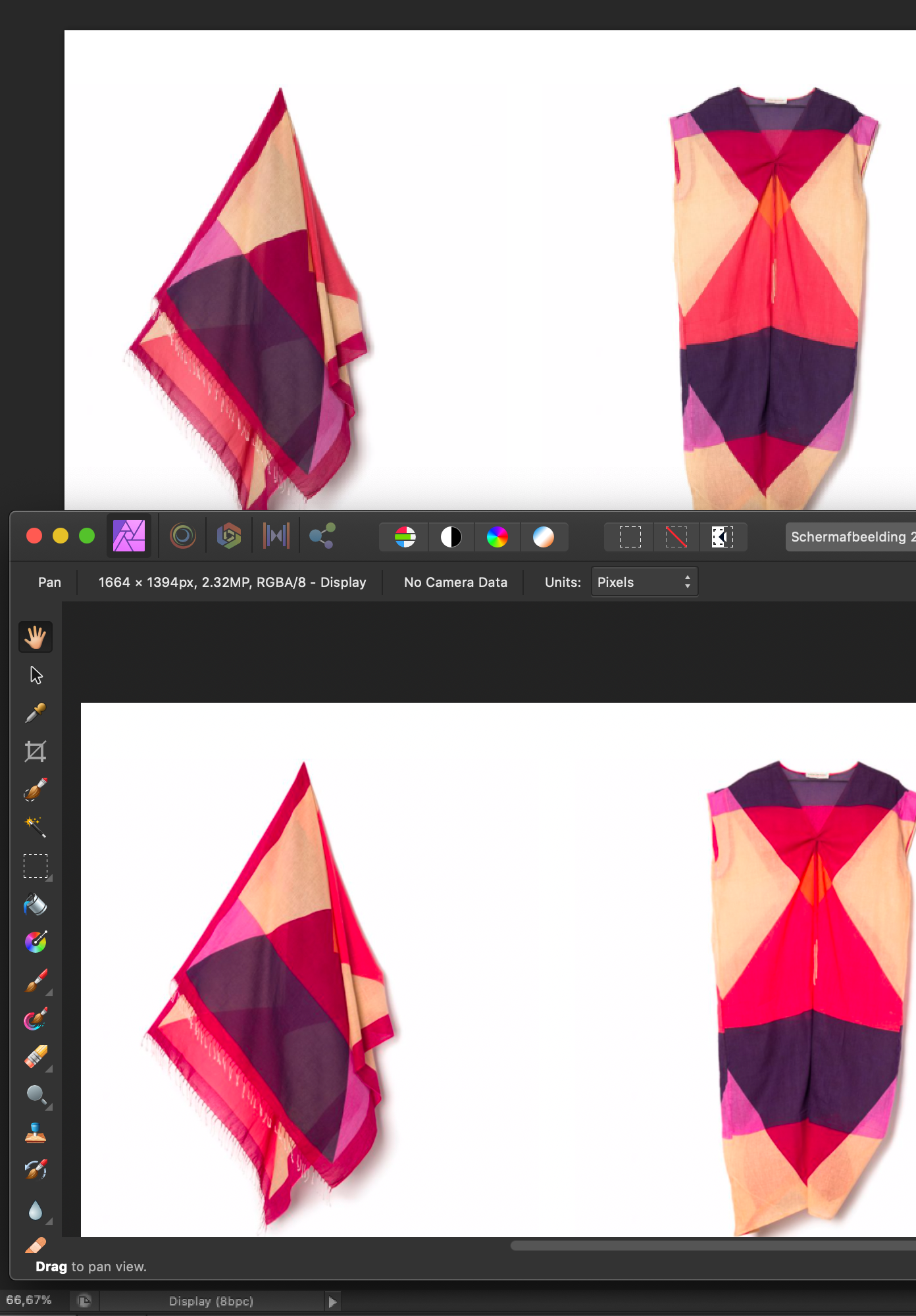
If you make a screenshot wilt the built-in screenshot on macos it embeds the display profile with the screenshot. You can check this with "get info". In this case it uses the profile of my external monitor DELL P2715Q. If you open the file in AP, the colors are off (oversaturated). In Photoshop or Apple's Preview they are correct. See screenshot. If you export the picture from AP, with "embed ICC profile" checked and "document profile" selected, and then check the profile it shows "BenQ SW270C". Which is clearly not correct and explains the oversaturated colors. It seems that AP assumes the screenshot has the BenQ SW270C profile embedded instead of using the embedded profile.
-
no worries!
-
I know. This is the title of a post on this forum, not something that I wrote. Thanks so far.
-
Ah, yes. Under "more" the "embed ICC profile is checked and the "document profiel" is selected.
-
yes, I will do that. Must say that I don't have high hopes that this will be fixed soon, since it was already reported log ago: Wrong color profile conversion whem using masOS screenshot tool.
-
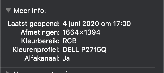
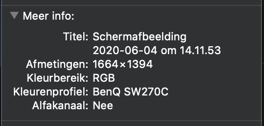
Some things seem really messed up in the color management department. If I check the file with "get info" before opening (and saving) in AP I see that the colorprofile is DELL P2715Q, my external monitor which was connected when I made the screenshot.So that is correct. then, after exporting from AP (I see no option whether or not to embed the document profile) it says , to my surprise, the colorprofile is BenQ SW270. This is my colleagues new monitor, that I tried for a minute on my computer a week ago to see if that worked with my mac, long before this screenshot was made (today).
-
ok, here you go Schermafbeelding 2020-06-04 om 14.11.53.zip
-
If I make a screenshot on my mac it saves the image with the display profile. When I open the image in Photo, colors look wrong (over saturated) Same image in Photoshop looks good. In photoshop I have the color settings so that RGB files keep their embedded profile. Affinity Photo too. See screenshot 1. Screenshot 2: top is Photoshop, bottom is Affinity Photo's. Both show the embedded profile to be RGB/display. Am I doing something wrong or what is going on? I see the problem only with screenshotd, if I open any old .jpg it looks fine. Thanks
-
 Jan Klima reacted to a post in a topic:
Save for Web?
Jan Klima reacted to a post in a topic:
Save for Web?
-
Ok, that explains it well. I do have a 4K monitor connected, but I close the lid of the MBP so that I have just one big screen. I still have to find my way to around the program and arrange it such that I have everything within easy reach.
-
sure, can I post the screen recording here? It is 56MB big. publisher-save-as.mov