Plokhi
-
Posts
18 -
Joined
-
Last visited
Everything posted by Plokhi
-
Thanks i'll give it a go. I'm also on macOS tho, but Monterey 12.3 / M1.
-
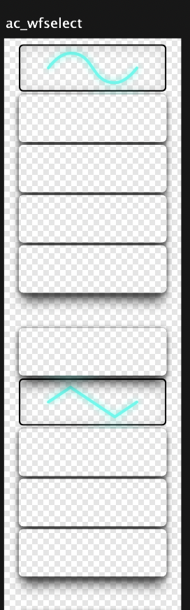
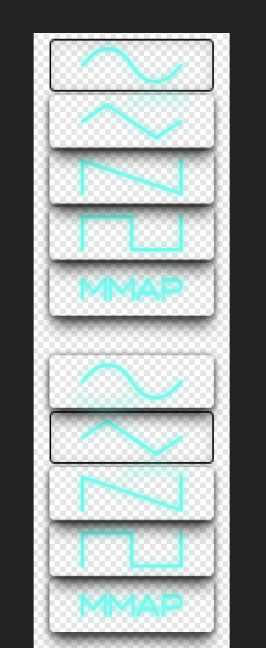
Sure, i've devised a workaround in the meantime. There's two artboards - they look identical inside Affinity Designer. On export however, one ignores erase layer. one has "erase" layer and the other is masked (which is clunkier and harder to edit, but at this point i probably won't move stuff around anymore) Example.afdesign
-
Image1 is how it looks like inside affinity designer, image2 is how it looks exported (16bit PNG with transparency). Shadows, knob markings and some other stuff hidden by erase layer just renders as if the erase layer wasn't there.

-
Transform objects separately "Selection Box" behaviour
Plokhi replied to Plokhi's topic in V1 Bugs found on macOS
anyone? -
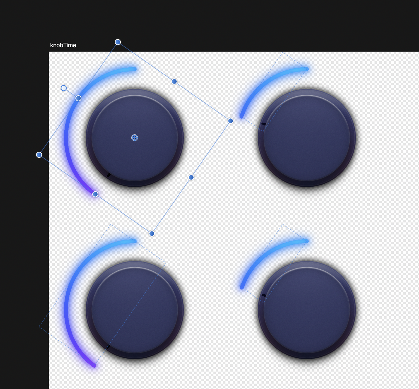
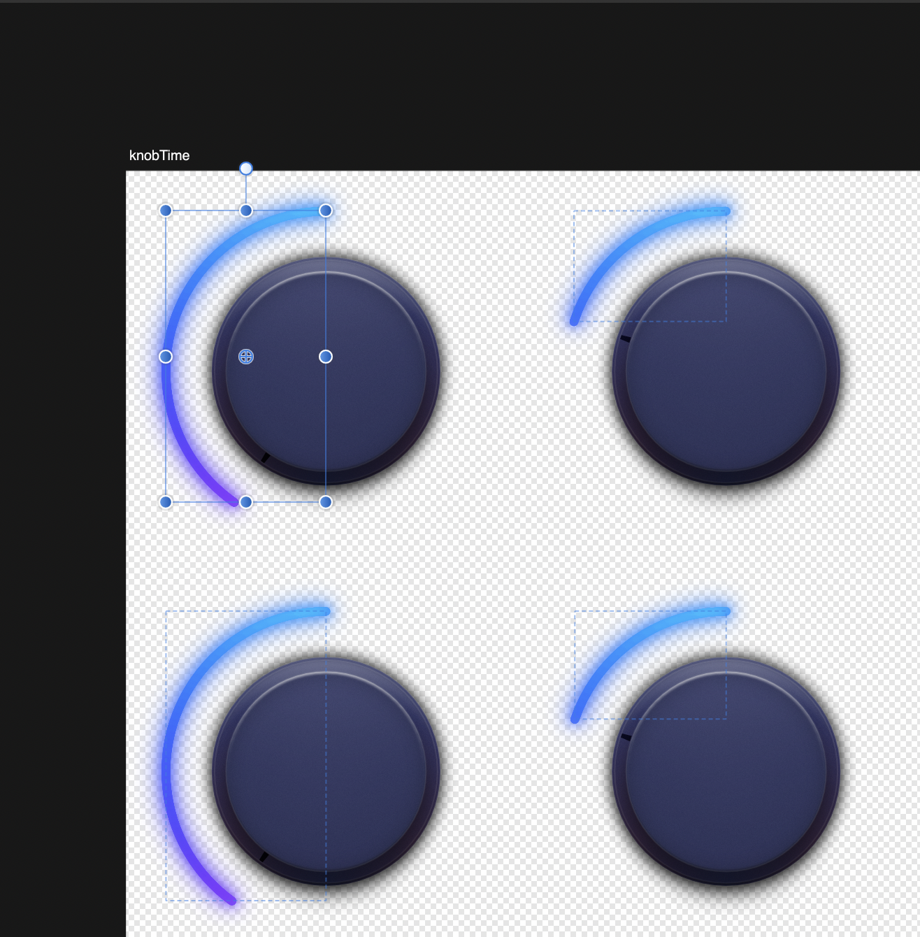
If I use "Transform objects separately", the selection box is correct for the first object, but is wrong for all subsequent objects. I want to resize these and to resize all 290 cells at once, i'd like to use "Transform objects separately", however the selection box is wrong for both settings so they get resized of center. (see screenshots of bound boxes other than first selected) There's no easy way to grid them back then, except manually. If I resize them anyway and try to redistribute them via "alignment" it doesn't distribute correctly either.
-
The AI support isn't really full - affinity designer only opens files that have the "PDF Viewing capability" enabled PDF viewing capability increases .ai size drastically. I don't use that function, and most of my .ai files won't open in AD
-
Yes. +1
-
Akin to illustrator, if you open a single page from a multi-page PDF, you can save it directly back to the multipage PDF. Right now, I need to export it, and go to Preview to replace it.
-
BUG: combine paths - one path gets offset
Plokhi replied to Plokhi's topic in [ARCHIVE] Designer beta on macOS threads
anyone else can confirm this behavior? or is it a problem with my setup -
BUG: combine paths - one path gets offset
Plokhi replied to Plokhi's topic in [ARCHIVE] Designer beta on macOS threads
Nope, still behaves the same. You can't replicate it with the svg i attached? -
its clipboard from affinity designer 1.2.1 opened it in illustrator (via c/p and directly) and it combines shapes perfectly. in affinity designer, it gets shifted slightly. original graphic was done in AD. they're just equal-sided triangles (60 degrees) crossed and combined. nothing spectacular. don't mind stroke size they aren't the same size... just the actual shifting of the path. [edit]: sorry this was posted in the wrong section. My bad. can a mod please move it to bugs? Thank you Clipboard.svg Untitled.mov
-
So, when I add a node, I want it to snap the new node to a guide line. if I hold shift, it only works for 45 degree angles. I have a 60 degree angle, so shift is out of question. is there any way to achieve this?
-
I agree. Final Cut and Logic icons are just silly... I never really liked Logic Pro 7 and then 8 onward logo. (7 was kind of a sampler, and 8 onward is that silly plaque). I think that professional/prosumer oriented software needs a strong brand rather than suggestive icon. Suggestive icon is very useful for people are less computer-literate. But an advanced vector software isn't targeting that demographic. You can't have a clue what a certain plugin does by looking at the icon (battery has a lightning bolt lol), but you instantly know its NI. But the links you posted aren't really NI icons. :) someone designed them to fit logic better, as they're not stock with NI plugins. this is how real battery looks like: They look kinda out of place in Yosemite, to be frank. Sharp thick shadows, very deep perspective, and intense gradients. everything in yosemite is sort of "soft", gradients are hinted not overblown.
-
Hm. Audio guys do it differently then. Cubase Cubase2-300x192.png ProTools: ProTools_Logo.png Nuendo: Nuendo.png reaper: 34655.png Presonus Studio One: 474214058_175.png Sonar: sonar_256x256x32.png iZotopeRX: icon-64.png Cycling 74 Max7: max7_logo.png Not all of the above are good icons though. IMO Cubase, reaper and Max stand out. Also, Evernote for example? I think a strong logo outline can be powerful, more than suggestive icon. Frankly, apple doesn't need strong app logos. They have the apple. None of their apps really need competition - you get them for free with your computer.
-
I think that gradients are "over-designing" the thing. Perhaps you could achieve the emphasis with a subtle transparency instead? and perhaps just a subtle highlight over. edit: the highlight i had in mind: edit2: also, the lighter parts are transparent. You can try it yourself, its a transparent PNG, just copy/paste over something