zypher69
-
Posts
18 -
Joined
-
Last visited
Everything posted by zypher69
-
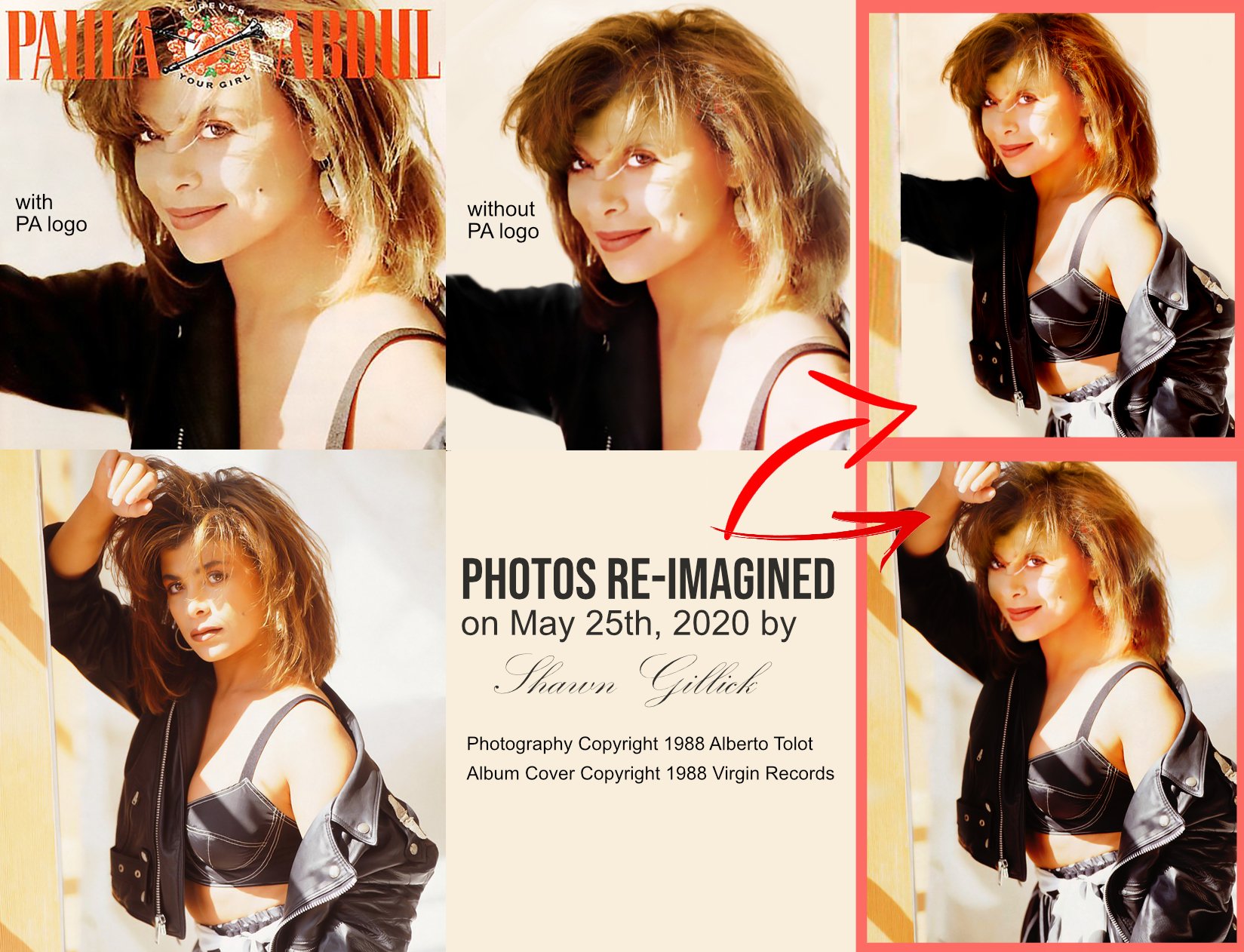
Hello all: I am a 42 year old guy who's been in LOVE with Paula Abdul my entire life (since age 10). I was always obsessed with her "Foever Your Girl" album and album cover photo. Over the years, I always wondered what the rest of her profile looked like during the actual photo shoot. The photo was either cropped or taken from her neck up, which looks good, but I desired to see more. Well, a few photos from that actual photo shoot (1988) were leaked online and I used them to "re-imagine" what she might have looked like when the photo was actually taken. So I used images in Affinity Photo and masked in a profile which I think is a good approximation of what I was always looking for.

-
If you would have carefully read my initial post and read each reply you would have an idea without having each person "demonstrate" visually what the problems are with the gradient tool. Users shouldn't have to do so many workarounds to achieve the results they're looking for. There's no need for clairvoyance or any such nonsense. Again, you were being condescending by even mentioning clairvoyance to begin with. I'm not here to argue though, so I'll digress. I think most readers of this thread will understand what our grievances are.
-
HAAKOO - You can dispense with the condescending remarks. Saying someone "better" provide an example does no one any good. Such verbiage only creates a general feeling of hostility and a toxic environment. I think constructive criticism is more effective than condescension. If you know so much about the gradient tool, then perhaps you can provide us with some examples of best practices and the like. No?
-
affinity photo ADDICTED TO COMPOSITE ART & AFFINITY PHOTO
zypher69 replied to zypher69's topic in Share your work
That's a very interesting way to look at it. Wow. We start as children coloring in coloring books and then graduate to "composite art" as graphic designers during adulthood. Yes, this is true. Everything we've ever been taught comes into play in adulthood. Well, most of it anyway. -
MEDICAL OFFICER BONES: Very well said. That's what I suppose I was trying to say. LOL! You hit the nail on the head with your comment "Affinity Photo is riddled with such small paper cuts throughout its basic tools." That's also precisely my point!
-
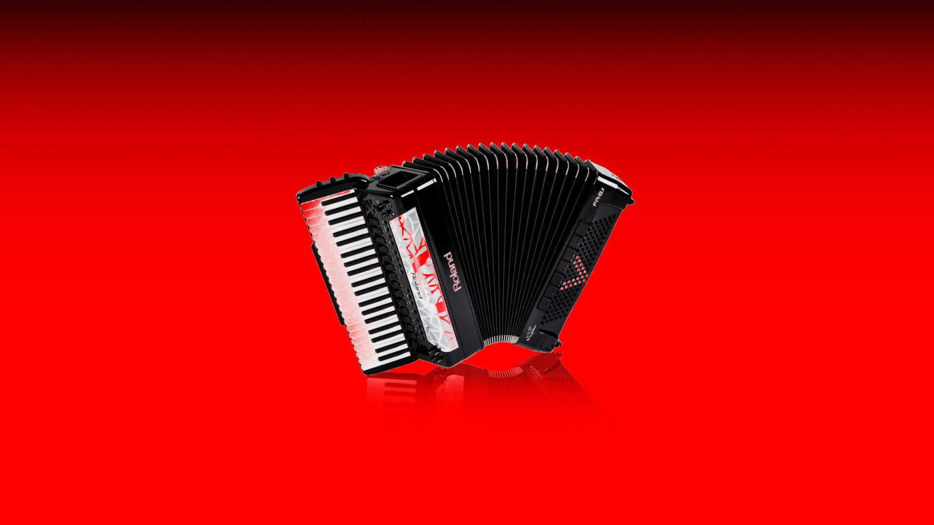
TH3_TWIN, you're having the exact problems I'm having. I just try my best to create the kind of gradient I need in one go so I don't have to start all over again as you mentioned. I also use the rectangle tool (with no fill) to provide a "shell" of sorts for the gradient to exist in. Some tutorials have shown that is how to work with gradients in AP. It's frustrating having to mess around with the rectangle tool in addition to a lousy gradient tool. I even have trouble getting the opacity right and I'm lucky if I get the results I'm looking for in a given project. Sometimes it works fine, other times it's a hassle. When I blend images, I use the simple paint brush tool with a soft round basic brush to perform almost all of blending using masks. I sometimes use the gradient tool, but as you know, AP overwrites previous gradients, so it's best to "try" to do what you need to do in one go unless you want to start over again and again. It's frustrating too, because I used to LOVE using the gradient tool in Photoshop. For all that I love about Affinity Photo, I do miss some things about Photoshop that seemed to just work. I can only digress though. Hopefully the attached image of the accordion is an example of when I actually did get results I was looking for. I'll have to create an example image of when I'm having trouble and post it soon so people will know more about what our problems have been. I post the accordion image just to say that the tool does work, it just needs to be refined to work better. Thanks for your comments and questions.
-
affinity photo ADDICTED TO COMPOSITE ART & AFFINITY PHOTO
zypher69 replied to zypher69's topic in Share your work
Thank you very much. I really appreciate your comments. I put a lot of hard work into each and every one of them. If you have any questions, just ask. -
affinity designer Deck of playing cards I've been working on
zypher69 replied to jimmyplaysdrums's topic in Share your work
Very creative. I know I couldn't do anything like that. Great idea.- 48 replies
-
- 1
-

-
- vector
- playing cards
- (and 1 more)
-
affinity photo ADDICTED TO COMPOSITE ART & AFFINITY PHOTO
zypher69 posted a topic in Share your work
Affinity Photo is a joy to use and allows me to create composite art that helps me stay sane during these uncertain times.
-
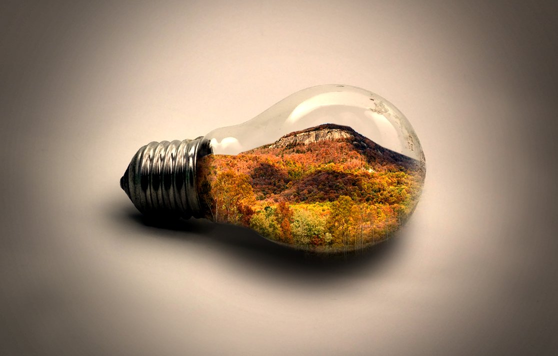
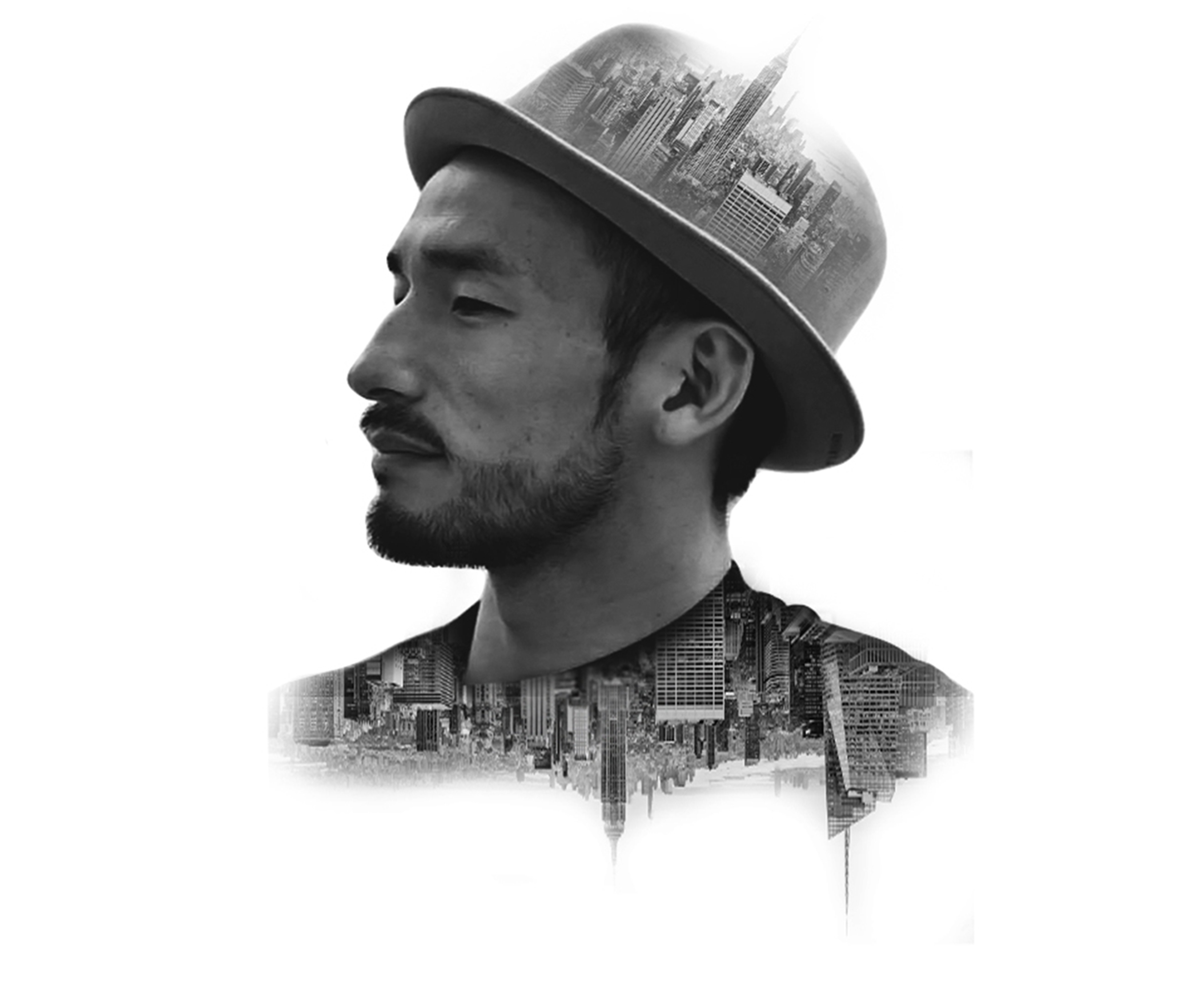
I really enjoy creating double exposure images. Affinity Photo is such a joy to use and does the job exceptionally well. These images are so simple yet so "effective" and fascinating to me. I think the simplicity and minimalist approach is what makes creating them so fun. I can't get enough.
-
AP Selection Tool Issues & Requests
zypher69 replied to zypher69's topic in Feedback for Affinity Photo V1 on Desktop
It's good to know I'm not alone in experiencing this problem. Improvements are definitely needed. -
AP Selection Tool Issues & Requests
zypher69 replied to zypher69's topic in Feedback for Affinity Photo V1 on Desktop
Thanks once again for your reply. I will simply have to experiment around with / use the software even more than I do. I will implement your tips into my work flow to see if better results can be achieved. I will post results accordingly. AT LEAST we're discussing something that I think is an essential issue in Affinity Photo and I hope this dialogue will be seen and considered by Serif developers when working on future updates for the software. I'm sure many of us want to see AP dethrone PS. -
AP Selection Tool Issues & Requests
zypher69 replied to zypher69's topic in Feedback for Affinity Photo V1 on Desktop
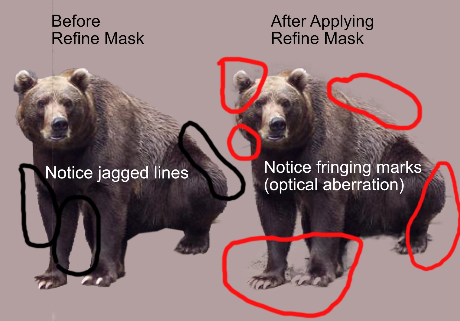
Thank you Murfee for your response. I apologize for using such a low resolution image in my example. I'm sure a higher resolution photo would have been more appropriate. I also apologize for hastily using the pen tool to extract the bear. Aside from those mistakes, I still think my example demonstrates the finer point(s) I was trying to make regarding optical aberrations and bleeding. I understand that making near perfect selections takes time, some amount of precision and patience. Additionally, I am also aware of various tips and tricks one can use to enhance selection edges and results. My issues have simply been that the Affinity Photo refinement dialogue box is a bit confusing and often produces substandard results. Shouldn't the refinement process eliminate the need to spend fifteen minutes of your time making more precise extractions? Adobe Photoshop seems to understand this. I get that Photoshop is more expensive and "should" therefore yield excellent results, but so too, should Affinity Photo. AP is being regarded as the Photoshop alternative and truly IS an excellent software application. Regardless of price, I think Affinity Photo would be better if it produced better refinement results. I simply find it odd that the software all too often forces users to spend inordinate amounts of time refining selections. At any rate, I do thank you for providing me and others with the reminder that levels and curve adjustments can be used with blur filters and other tools to make more precise selections and extractions. I didn't mean to offend anyone or insult anyone. -
AP Selection Tool Issues & Requests
zypher69 replied to zypher69's topic in Feedback for Affinity Photo V1 on Desktop
Robrr - thanks for your response. I think I saw the same Affinity Revolution video you mentioned. I agree with you that the issue must surely be dealt with and I'm surprised more people haven't noticed it. Many people may not have enough graphic design experience to know what's acceptable and what's not. Not everyone has attention to detail awareness. I just hope the issues with the refinement process get resolved soon in future versions. -
AP Selection Tool Issues & Requests
zypher69 replied to zypher69's topic in Feedback for Affinity Photo V1 on Desktop
Pardon any perceived misunderstanding here, but I've experienced fringe (optical aberrations) COUNTLESS times when doing my best to extract subjects and objects from their respective backgrounds regardless of colors. It just happens that the example I used might not have been the "best" image to use. My attempt was to simply demonstrate the fringing and jagged edges without giving much thought to colors, etc. If I had only experienced fringing and aberrations on rare occasions I wouldn't have brought the issue up in this forum. The fact that my experience has been quite dismal compelled me to assume that I wasn't the only individual experiencing this problem. I'm no Adobe apologist, but how does one explain the fact that Photoshop's selection refinement process is far superior to Affinity Photo's current refinement process? As I said, I've been a graphic designer for many years and I have come to just expect software to work, without much hassle. I understand nothing is perfect, but why is the issue so bad that it was one of the first things I noticed when I began using AP nine months ago? I've had to resort to using PNG files created by other graphic designers from stock photo websites for my own artwork. No one should feel like that's a better option than using the tools within their own software. Other people may NOT have had this problem, but I feel quite certain that it's been an issue for other users. The current refine mask / refine dialogue - the whole process is simply substandard. My ultimate point here is NOT to trash AP. I love using Affinity Photo for my work. I just think Serif can do a better job in some areas. Settling for second best is not an option (for me). I look forward to new and improved updates of AP in the future. Requesting that a tool be made better and more accurate is NOT a crime. The issues and problems with the tool are about more than just choosing the right colors and images. Serif can do better - and "must" do better if PS is to become second best. I believe that could well happen in due time. We have to remember it took Adobe many years to become King of the software world. If Serif works hard enough, it can only get better and better. I happily await such a time. After all, how will Serif know to correct such issues if no one mentions them? -
AP Selection Tool Issues & Requests
zypher69 replied to zypher69's topic in Feedback for Affinity Photo V1 on Desktop
Thanks for your reply. Notice the first image is an average-looking photo that anyone could use as a stock image for their work. The second image is my attempt to demonstrate what happens when I try to apply refine mask after making a selection. In this particular image, I used the SELECTION BRUSH TOOL & THE FREEHAND SELECTION TOOLS to make a selection around the bear (subject). I then created a mask and clipped it to the layer containing the bear. I created a grey background and then duplicated the selection I made for the purpose of applying refine mask to it. Upon doing so, I noticed the fringing and overall optical aberrations that typically occur when using Affinity Photo. Such fringing DID NOT occur (for me) in Photoshop (which I no longer use). I also noticed the fringing on the initial selection (THE BEFORE IMAGE). Even when I apply great care and patience when making selections, I STILL get similar results when I apply the refine mask option(s). AT LEAST the edges were much smoother as a result of having selected "SOFT EDGES" in the selection brush tool. Before Serif (AP) offered "soft edges" as an option, selections were much more "jagged" and rough. My point is that Serif seems to be aware of such problems and has taken some action to make the selection process more user-friendly. I simply request that the refine mask process be more accurate and robust in future versions without producing optical aberrations such as fringing or jagged edges. As I noted in my previous post, I have had to resort to actually downloading PNG images created by other graphic designers (from stock image websites). I have refused to select or extract subjects / objects from images directly in Affinity Photo because it's been such a problem. I've found that inserting "ready-made" PNG images is easier. I do a lot of composite artwork. I don't feel like I should have to do that, but I refuse to insert sloppy work into my composite pieces. It's either that or go back to using Photoshop, which I don't wish to do. Thus, if / when Serif (AP) correct these problems, I'll be able to create artwork that is far more "original" than resorting to the use of already cut out PNG images. I am eagerly waiting for a drastically refined selection / refinement process in AP. Thanks again for reading.
-
I'm a seasoned graphic designer with over twenty years of experience. I ABSOLUTELY LOVE and adore AP, but I do think the selection tools need a little refinement. My complaints have less to do with the actual selection tools available per se. Rather, my complaints have more to do with the refine mask aspect of the tools. I don't think one should have to go through the task of selecting "soft edges" when making a selection. Doesn't everyone automatically wish for their selections to have soft edges and NOT be jagged? The refine mask dialogue box is confusing and doesn't seen to work. I know how to use it, it's just that I'm rarely (if ever) satisfied with the results I get when using it. I know PS like the back of my hand and I used to always be able to create near-perfect selections with it. I was almost mortified when I first began using AP to create selections. It's so bad that I have resorted to DOWNLOADING PNG files and smart objects for use in my composite art (for instance). I seldom extract subject / objects from actual photos now UNLESS I absolutely "have" to. I'd much prefer downloading a PNG file where someone else has done the selection and extraction task (most likely using Photoshop) than to struggle with using AP's current selection tools. I hate to even mention this, but how else will AP developers / influencers know what kinds of changes users are requesting? I'm only being honest here. I've been working this way for a few months now. I shouldn't have to do this. If AP's selection tools were more robust and if the refine mask algorithms yielded better results, I would then be able to select / extract subjects and objects from any photo I chose with very few problems or issues. Aside from this huge issue, (and my issues with the gradient tool) Affinity Photo is a stellar image editing program. I will continue to use it, despite current issues. I love supporting Serif and I LOVE that there's finally competition for Adobe. We just have to make sure that all tools work properly and how they were intended to function.
-
I LOVE Affinity Photo. I love it so much that I switched from Photoshop last year. There were SO many things wrong with PS and so many great things about AP that switching was not difficult. However, as I've been using AP over the last six months, I have come to realize that THE GRADIENT TOOL needs A LOT of improvement. There are other issues / tools that could also use some improvement, but the gradient tool stands out the most for me. Whenever I use it, I am confused about how to use it. I've viewed forums, online tutorials and YouTube videos that do instruct users on how to use it properly, but I "forget" how to use it almost every time. I'm a seasoned graphic designer too. I was a PS user for over twenty years. Using such a tool shouldn't be so hard and bothersome. I always end up having to re-create gradients and I have problems when trying to create "transparent" gradients. It seems creating a simple transparent single color gradient (overlay) should not be so difficult. Also, I'd rather NOT have to constantly change the default gradient colors to black and white EVERY time I use it. Why is grey the default color setting for the gradient tool? My complaints aren't so much about default colors as it is general performance. I understand how gradients work. I dare say that Photoshop's gradient tool works like a breeze. It works perfectly. Why must AP's approach to gradients be so difficult? Another frustrating part of using gradients in AP is how hard it is to use the tool to blend two images together. I find it odd that one has to use a "mask" to get two images to blend into each other via a gradient. To put it simply, the gradient tool should be more robust and EASY to work with. I use lots of gradients when I do composite art (such as when blending a grassy field into a separate sky background). I do feel confident that Serif (Affinity Photo developers) will implement some or all of the changes I've requested at some point in the future. I know I'm not the only user who's had problems with the gradient tool. After all, we do not want Photoshop to remain the supreme digital photo editor much longer now do we? True competition requires making things BETTER than others. "Good" just doesn't cut it with me. I prefer getting as close to perfection as humanly possible. I know AP can do this!