

MarcT
-
Posts
19 -
Joined
-
Last visited
Posts posted by MarcT
-
-
51 minutes ago, Pšenda said:
Toolbar should allow quick access to frequently used functions and options.
I agree with you... and certain important tools cannot be displayed on small screens at the moment. I think that it's a big problem.
51 minutes ago, Pšenda said:Each user should set it according to their needs, habits, or the size of their display.
In the customization window of the toolbar, why not offer an option like "Minimize the space taken up by tools".
- If this option is checked : The tools would be displayed on a single icon and a submenu would be proposed to display the other associated tools (as in the simulation above, last image).
- If this option is unchecked (in the case where the user would have a large screen) : The tools would be displayed as they are currently displayed.
51 minutes ago, Pšenda said:But why not - this is already used in Alignment.
Your remark is correct !
-
29 minutes ago, garrettm30 said:
Concerning the third option, I am a little unclear on a good way Publisher could be informed which separate frame to use on a page-by-page basis. Any ideas?
It should be done as for linked text frames. By having a visual difference (ex: using dotted lines instead of a solid line, as is currently the case for linked text frames) ?
-
4 minutes ago, Pšenda said:
View>Customise Toolbar?
Yes, I know it's possible to customize the toolbar.
But the tools take up too much space in width. The idea would be to reduce the width of the tools to a single icon, in order to put as many tools as possible. The sub-tools would be accessible via a sub-menu as is already the case with the rectangle tool, the ellipse tool, ... (left bar).
Do you understand the problem?
-
I'm using Affinity Publisher on a 13'3 inch Apple MacBook AIR.
Unfortunately, the number of icons I can display on my application is limited.
So, I can't display tools like "Distribute", "Geometry", etc.
Why not reduce these options to a single icon - and display a submenu - to free up more space.
For example, like this:

Changer by :
- with closed submenu:
- with opened submenu :
What do you think?
Goodbye.
-
14 minutes ago, Gabe said:
Hi both,
As @garrettm30 pointed out, we are aware of this issue.
Great !
-
Two small details:
- I just tested under Affinity Publisher 1.8.3.627 (beta version) - mac OS 10.15.4. The problem is still there.
- Note that when I'm in full screen (under Affinity Publisher 1.8.2 or Affinity Publisher 1.8.3.627), it's also impossible to move the New document window to Affinity Publisher. The app never appears in the background when I'm sure it's supposed to be on the workspace in question.
The solution proposed by @Old Bruce is interesting and is undoubtedly a good alternative (because in this case, it's possible to move the New document window to the Affinity Publisher application, in order to have it in the background)... even if the result is not quite the same.
-
19 hours ago, Old Bruce said:
Wow, this makes me wonder if it is a problem with the OS. I am running 10.12.6 and 10.14.6 Were you running 10.15.xx when you first started using Publisher?
My Mac is new and I have always run mac OS Catalina. So yes, I've always had this problem since I started using Affinity Publisher, because I've always been on macOS 10.15.X.
-
20 hours ago, thomaso said:
Again, also your appreciated workflow of 4 steps is done manually – wheras a shorter workflow is not influencing its efficiency even if you do it 150 times. But then I personally would prefer even more a way with less mouse clicks.
In this kind of professional application, there are always several ways to do a single action. If I follow your logic, the option of alignment on the page / board should not exist ... after all we could align the objects between them and move them manually on the page / board ... because according to you that is faster. In my workflow "Align to bleeds" option would help me a lot.
20 hours ago, thomaso said:Maybe you mentally (and therefore manually) just still stick in a workflow you are used from InDesign, regardless of this way's efficiency.
Adobe Indesign doesn't offer the "Align to bleeds" option. On the other hand, in Adobe Indesign it's possible to detach the "Align" panel. I think this is a good idea. It's not about copying Adobe Indesign 100%, but only adapting good ideas.
20 hours ago, thomaso said:Converning object moves without dragging but numerically in the Transform Panel: If you set the zero position of your document ruler at the bleed than clicking on X and typing 0 (not "– 5") will move the objects to the bleed.
I know this possibility. But for personal reasons, I prefer to have negative information.
By leaving the rule in its default position, I'm sure that the elements in negative position (X : -5mm / Y : -5mm) are in the requested position. If I put the point 0 in the wrong place (for lack of attention, for example), the positioning of my elements may be distorted ... because it's impossible to put the point 0 precisely : it's not possible to put the point 0 according to precise coordinates according to its previous position ... which would be useful. The only solution would be by using magnetism on landmarks / objects positioned before modifying point 0. Even if in my case there would still be a magnetism because I move the point only to the edge of the document. My explanation is rather valid if we wanted to put the point 0 in a more precise place where there would be - by default - no landmark / object to help positioning.
Finally, last very important point: moving point 0 in a model (master page) will not be repeated on the pages that apply this model ! Which makes moving almost useless.
20 hours ago, haakoo said:Set the shape object(colored block) on a masterpage and adjust it to fill/touch the bleed area
Apply to all pages without overwriting the other masterpages.
This way it always touches the bleed on every page.
Edit linked to have it adjust color or whatever on all pages
Edit detached to have a single page editI know all of these possibilities. It works very well in a rigid page structure, where all the pages look the same. There it's necessary to modify that a few details to arrive at an interesting result. It's not my case. Almost no page is alike. In my case, I make a product catalog of more than 150 pages where no image has the same size / positioning from one page to another. Even if there is a certain structure (grid, baseline, paragraph / character styles, ...) to unify the entire catalog.
20 hours ago, GRAFKOM said:Why argue?
It's enough for Serif to put the option Align to Bleed, and everyone who wants to use it - will benefit.
Others may never need it.
I personally in my company creating business card designs, leaflets etc. for the printing house, I would gladly use this option.
And I'm still struggling to make the alignment panel also a dock window.Like what I'm not the only one ! 😉
18 hours ago, Patrick Connor said:I will bring this sensible suggestion to the attention of the developers, thank you @MarcT
Great, good news! Thank you ! @Patrick Connor
-
Hi,
If I have the Affinity Publisher application in full screen and I do File > New, the New document window appears on another desktop of mac OS. If I validate the parameters of the new document, I'm not redirected to the Affinity Publisher application... so I remain on a blank desktop.
Mac OS : 10.15.4
Affinity Publisher : 1.8.2
Bye.
-
-
15 hours ago, Pšenda said:
This is what I do not understand, why something should touch "exactly" bleeding 🙂
I always stuck the elements on the bleeds to avoid unpleasant surprises. Bad idea ? You will probably say that I'm a little maniac ! 🤣
12 hours ago, thomaso said:Instead of 1.) opening the dialog window + 2.) choosing an align direction + 3.) opening the pull-down menu + 4.) selecting an option (page, bleed etc.) ...
... you alternatively can shorter just 1.) align the objects with a single click on the wanted toolbar icon and 2.) move them manually with the snapping option activated.
It's indeed an alternative solution that I use. But I often find errors in alignment on the bleeds since the positioning is done by hand (even with the magnetism activated). For me, having an option "Align on bleeds" in Align panel would be the best solution. That would be a kind of guarantee that everything is OK ... everything is perfectly positioned.
Note that the Align panel should also be a floating panel (I didn't find this panel in View > Studio) and that the type of alignment (on the page, on the board, on the margin page, ...) be kept in memory to save even more time (what Adobe Indesign offers).
12 hours ago, thomaso said:I can't imagine a waste of time in a workflow with less mouse clicks.
Managing everything manually is a waste of time when there are a lot of elements to position on more 150 pages. Even if I try to optimize everything by using the models as much as possible.
The last option I use is to modify X and Y coordinates positioning (and the transformation origin) of the elements to be sure that they are correctly positioned. I thus have negative values (X: -5mm / Y: - 5mm). But here too it takes a long time to check these parameters.
12 hours ago, MEB said:Or enable the Show Alignment Handles in the context toolbar (Move Tool selected) and use them to align all objects to the Bleed.
Thank you for this option which I didn't know. But the concern is more or less the same as with magnetism (solution proposed by @thomaso). Even if it's a really interesting option.
-
12 hours ago, Old Bruce said:
That is weird. My experience is that a lot of 'bugs' in the panels like this one can be fixed by using View > Studio > Reset Studio.
Since I started using Affinity publisher, both in Beta version and in final version (1.7.x or 1.8.x), I never have a submenu icon. Resetting the Studio or app preferences doesn't change anything.
-
13 hours ago, Old Bruce said:
Hopefully if we get the ability to add Notes we can set up rules regarding the location, Footnotes at the bottom of the page and Endnotes at the end of the Chapter, Section or book. The distinction between Footnotes and Endnotes is very important.
Yes, indeed we have to be able to differentiate between Footnotes and Endnotes. It's so important. But it's also necessary that these notes can be positioned anywhere in the document to give freedom to the graphic designer. I think this is the best option.
-
I understand what you mean.
Why I think this option is a good idea ?
If I have a colored block which must touch the bleeds, I'm currently obliged to align the block on the page or on the board, to then resize or move the block manually. It's a waste of time.
You know what I mean ?
-
+1 ! Good idea.
-
Very good idea.
Please don't link the footnotes to a specific block of text as in Adobe Indesign.
Footnotes should be free. We must be able to position them anywhere in the document. See @julienkinkin.
Bye.
- Markio and julienkinkin
-
 2
2
-
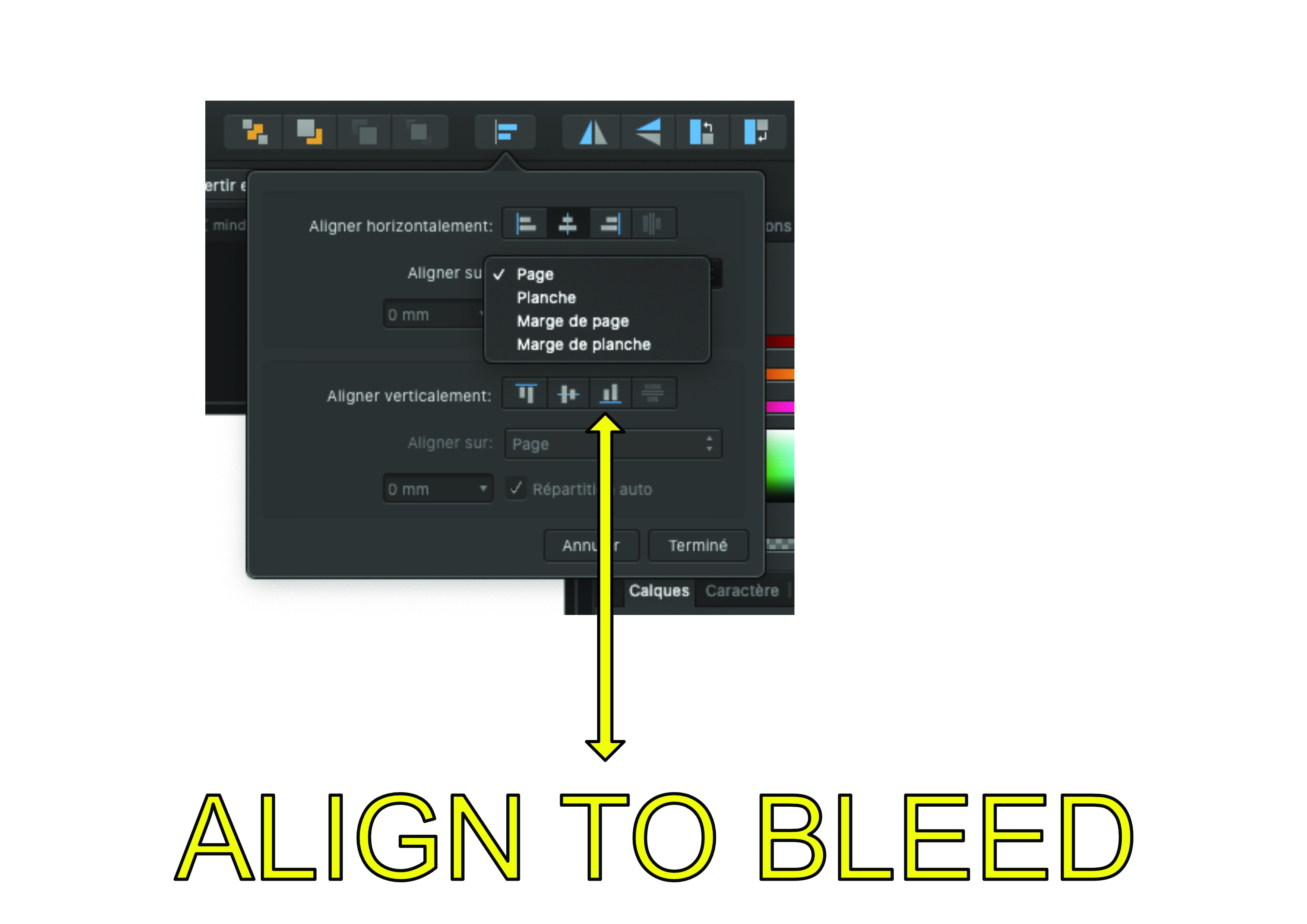
Hi everybody !
In Align panel... why not also offer "Align to bleed" ?
It would be very helpful.
No ? Thanks.
Mac OS : 10.15.4
Affinity Publisher : 1.8.2 (french version)
Bye.
-
Hello,
I don't know why, but I don't have a submenu icon... but the submenu still appears if I click in the area where the icon is supposed to be present.
Example with the "Text style" panel (the problem is present for all panels).
Mac OS : 10.15.4
Affinity Publisher : 1.8.2 (french version)
Bye.
Footnotes/Endnotes
in Feedback for Affinity Publisher V1 on Desktop
Posted
The ideas from @ABC are interesting. But if you need margin notes and footnotes on the same page, how would it work ?
I'm a bit skeptical about this need to impose a style of notes from the start.
In any case, I think it should have a panel listing all of the notes in the document ... much like the Index panel. This would provide an overview of all the notes. For example :
Page 12 :
Page 15 :
Page 23 :
By clicking on the page number or on a particular note, the user would be redirected to the page / note in question.