Shompinice
-
Posts
20 -
Joined
-
Last visited
-
 imagodespira reacted to a post in a topic:
In Windows Version, the Apps Dont Have Right Stroke and Shadows
imagodespira reacted to a post in a topic:
In Windows Version, the Apps Dont Have Right Stroke and Shadows
-
it shouldn't be here at all, because the decision was wrong from the start, and the developers are always crazy about redrawing Windows Forms and turning it into a piece of shit, rather than Reluctance to use native Windows controls, even if it's cheaper, cleaner, and less work
-
Sounds like Rhino Rhino regard all command as both a "menu item" and a "icon in tile", you can choose how they display and combine
-
I love this!
-
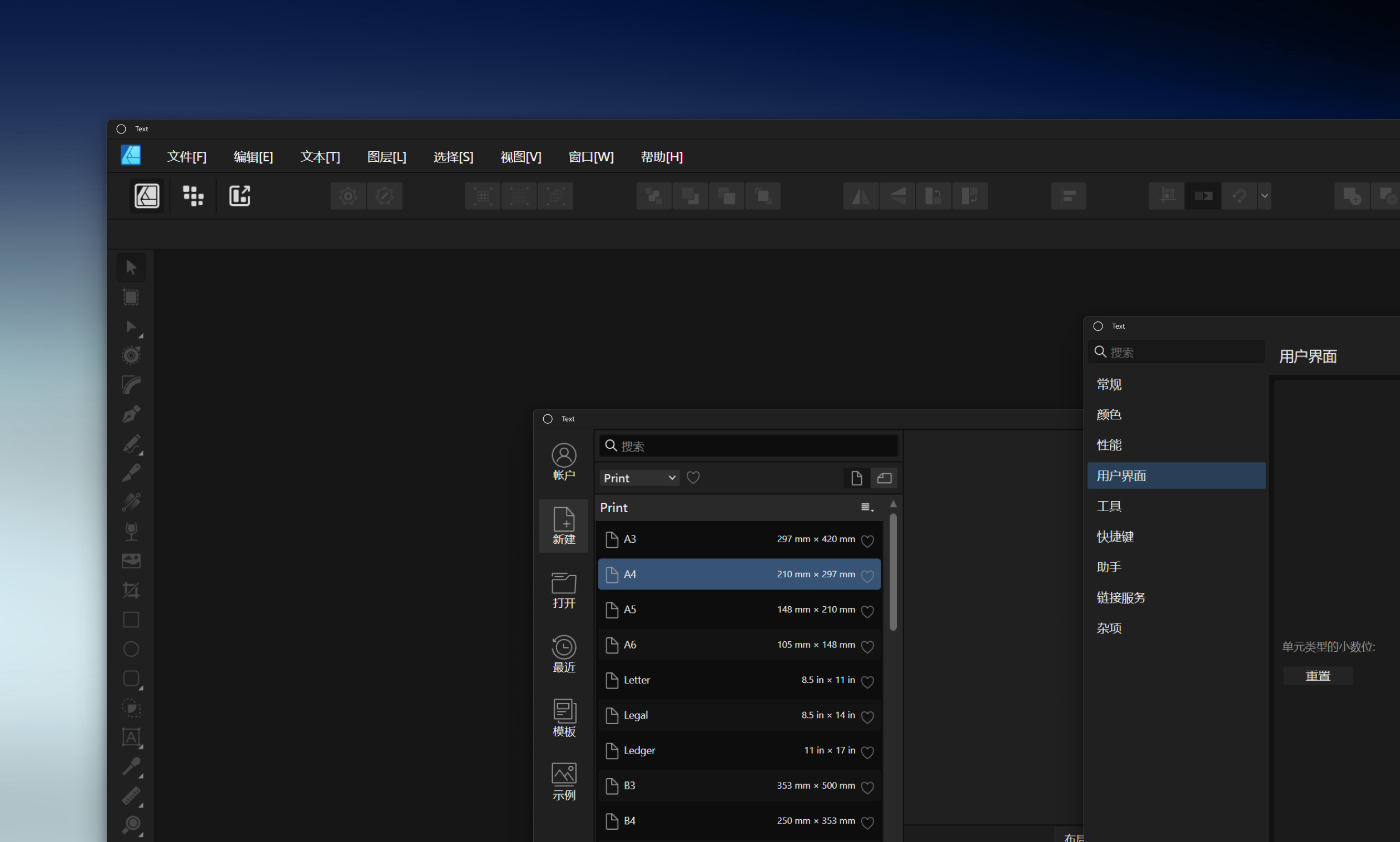
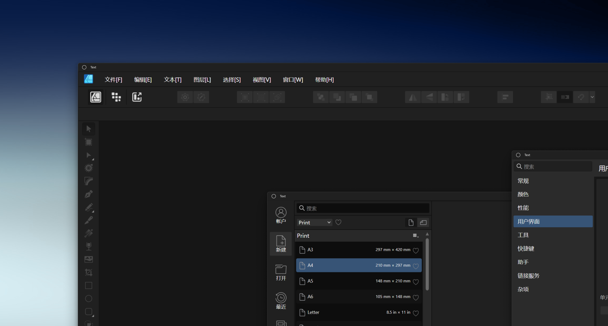
UI - some buttons too small
Shompinice replied to 000's topic in Feedback for the Affinity V2 Suite of Products
I agree, Windows Version has this problem too -
Tab preview is standard in all browsers, and I'm inclined to think that it can be considered in all image processing software - but it must be turned off, and many users will find it intrusive. so concept By clicking the button in the upper right corner of Safari, you can view all the currently open tabs not complelte demo

-
I don't know why Windows applications are always keen to use fully customized Windows Forms. I somewhat think that this is time-consuming and labor-intensive and further leads to a sense of separation from the system. I have this idea, try to use WPF native forms if you can (I'm not sure what UI framework you guys use), if you use WPF, this is a way to keep Windows Forms suitable for dark mode: the color of title bar will follow the system settings It is a cheap ,quick and beautiful and UX/UX friendly way in both design and development
-
I mean, if the engineer tells the designer that we have to choose between two options due to cost and time constraints One is an independent title bar and menu bar, but it has a window edge system consistent with Windows-it has the same appearance and projection as the system window. The second is to merge the menu bar into the title bar, but you will sacrifice the appearance of the window edges (if you treat the 2px stroke as visual) and drop shadow, it will have nothing to do with the appearance of windows and lack hierarchy I think normal designers would choose the first option.
-
imagodespira reacted to a post in a topic:
In Windows Version, the Apps Dont Have Right Stroke and Shadows
-
I am absolutely in favor of this. I mean, if the engineer tells the designer that we have to choose between two options due to cost and time constraints One is an independent title bar and menu bar, but it has a window edge system consistent with Windows-it has the same appearance and projection as the system window. The second is to merge the menu bar into the title bar, but you will sacrifice the appearance of the window edges (if you treat the 2px stroke as visual) and drop shadow, it will have nothing to do with the appearance of windows and lack hierarchy I think normal designers would choose the first option. @ Mark Ingram
-
Shompinice reacted to a post in a topic:
In Windows Version, the Apps Dont Have Right Stroke and Shadows
-
imagodespira reacted to a post in a topic:
In Windows Version, the Apps Dont Have Right Stroke and Shadows
-
As far as I know, it is very cumbersome to simulate the visual and behavior of Windows native form edges in custom windows. Affinity probably doesn't have enough energy to do this yet, so http://stackoverflow.com/questions/39261826/change-the-color-of-the-title-bar-caption-of-a-win32-application This method is more suitable. The only downside is that we'll have a separate menu bar, but I think I'd rather sacrifice the height of the drawing area than the margins that don't align with the system
-
 Pšenda reacted to a post in a topic:
In Windows Version, the Apps Dont Have Right Stroke and Shadows
Pšenda reacted to a post in a topic:
In Windows Version, the Apps Dont Have Right Stroke and Shadows
-
Yes, this does sacrifice one menu bar height, but trust me, it will be a no-brainer! This gives Affinity the same beautiful form edges on Windows as macOS. This brings Affinity in harmony with Windows' native look and feel. This allows the form to have the correct edge and drop shadow system, distinguishing between the front and rear of the window. This makes Windows users realize that they are not outcasts, but are worthy of the same respect as macOS users - at least when it comes to UI/UX. I think it's worth it.
-
So it's a technical choice not a design choice, it's a technical choice that has nothing to do with UX, visuals, consistency, and aesthetics. I don't know why Windows applications are always keen to use fully customized Windows Forms. I somewhat think that this is time-consuming and labor-intensive and further leads to a sense of separation from the system. I have this idea, try to use WPF native forms if you can (I'm not sure what UI framework you guys use), if you use WPF, this is a way to keep Windows Forms suitable for dark mode: the color of title bar will follow the system settings The method reference is http://stackoverflow.com/questions/39261826/change-the-color-of-the-title-bar-caption-of-a-win32-application #include <dwmapi.h> BOOL USE_DARK_MODE = true; BOOL SET_IMMERSIVE_DARK_MODE_SUCCESS = SUCCEEDED(DwmSetWindowAttribute( WINhWnd, DWMWINDOWATTRIBUTE::DWMWA_USE_IMMERSIVE_DARK_MODE, &USE_DARK_MODE, sizeof(USE_DARK_MODE))); There's doc from Microsoft Support Dark and Light themes in Win32 apps https://learn.microsoft.com/en-us/windows/apps/desktop/modernize/apply-windows-themes At the same time, this API does not affect compatibility with older versions, and on Windows 7 or earlier versions of Windows, the API will not work and will not cause strange errors. https://developer.blender.org/D14847 This way you will be able to keep the current black and white title bar for the Windows version to the greatest extent possible, while at the same time being in harmony with the rest of the form's interior.
-
This is just a beautiful excuse for them to deliberately degrade the UI of the Windows version. Don't forget that the people here are designers and painters, and they are all colleagues. Don't lie!
-
Not relevant, we're talking about window shadows There is no shadows in Affinity Windows
-
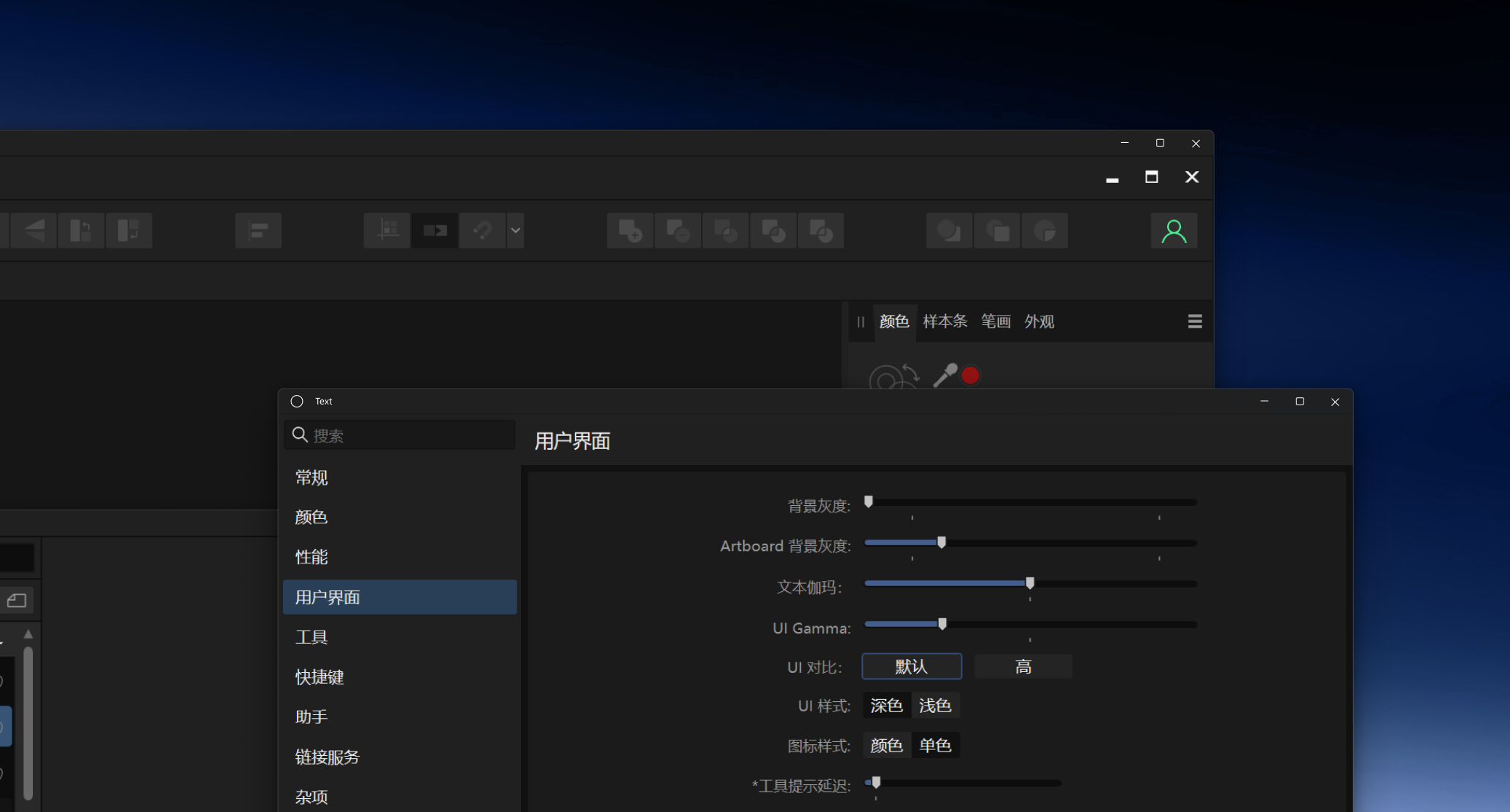
Due to the lack of proper strokes and shadows, under Windows, the edges of the application are not visible against some backgrounds, and the application cannot be clearly distinguished from the background behind it. In contrast, a Windows application's form border is usually (task manager) What it should be
-
https://docs.microsoft.com/en-us/windows/apps/windows-app-sdk/ https://docs.microsoft.com/en-us/windows/apps/winui/ WinUI3 now release. It is time to say goodbye to WPF. For Windows version, we need WinUI3 menu only. Example Notepads(MS Windows), update to WinUI3 As for contrastiong