rumo
-
Posts
49 -
Joined
-
Last visited
Everything posted by rumo
-
Hi guys, since v1.9 it happens now and then that layers/folders are not visible in the layer palette. In detail, there are visible when clicked, but there is zero information shown, like names, the arrow to unfold a folder etc. The only solution by now is to restart Photo. Best, Johannes

-
Hi folks, Photo keeps crashing when I load 16bit Tiff images into the new astro staple function of v1.9 (the app just closes itself). 8bit Tiffs seem to work fine. System is a MPBr 13 2014 running macOS 10.13. Anyone else experiencing this? Best, Johannes
-
Any updates on this topic? Currently searching for an Acrobat Pro replacement for preflight etc. Or am I missing something already baked into Affinity?
-
Hi, I know that this is not something related to support and troubleshooting. But 2020 comes to an end and has been rough for most of us professional designers, photographers, artists…and I just wanted to say thank you to the Affinity staff. When the corona crisis hit us, you gave a generous discount of 50% for the complete Affinity software suite. Even more, you literally gave it away for free for students and to many more due to the three months test period. This is nothing I take for granted and made me finally quit my Adobe CC subscription. It is not only about software, it is the way we treat people, the way we treat each other in this crazy time. Thanks, Johannes
- 1 reply
-
- 7
-

-

-
No need for shouting. I am asking for this as well. It is just way more convenient to have this kind of generators baked into AFpub. Especially since Indesign has it for years, and that’s what Serif competes with.
-
Support for HKS colours
rumo replied to Przemysław's topic in Feedback for the V1 Affinity Suite of Products
I found a missing RGB value for one of the HKS spot colours, so here’s the updated file. HKS-N.afpalette -
Dominic, I apologize. It just struck me that I was too harsh earlier, even before I read your post. You’re completely right to correct me here and I thank you for that. I rewrote my lines above. It is okay to be somewhat emotional here, but it’s of no use when you’re not helpful at the same time.
-
+1 You’re not overwhelmed. I think the swatches panel doesn‘t work properly, or at least it isn’t as well thought-out as the rest of the Suite. So in my professional workflow often it is difficult to use. Don’t get me wrong: There are some really useful features like creating complimentary colours from a single swatch. But overall I consider the swatches panel to be the weakest part of the Affinity Suite.
-
I agree, layers are basically useless in the Publisher. The amount of unnecessary sub-layers that each object creates leads to a complete visual mess. I'm also not sure if a checkbox is the appropriate UI element to toggle visibility, or if this causes further confusion. Indesign uses an eye symbol here, which (for me) is much more self-explanatory. Might be somewhat over-the-top, but UX design is a big part of the workflow. Swatches may work up to a certain point, but not in a professional workflow. I am glad Serif has already acknowledged this because it really bothers me.
-
Text processed as image when effect gradient is applied
rumo replied to rumo's topic in V1 Bugs found on macOS
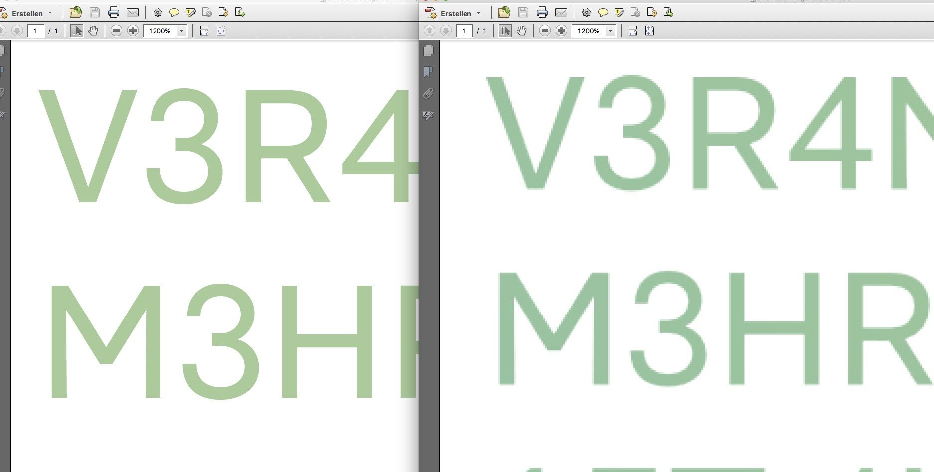
Hello! Okay, now that’s good to know. Thanks for your effort @thomaso. But when layer effects are rasterised by default this export setting is working properly as Indesign does the same here when you deactivate rasterization. -
Text processed as image when effect gradient is applied
rumo replied to rumo's topic in V1 Bugs found on macOS
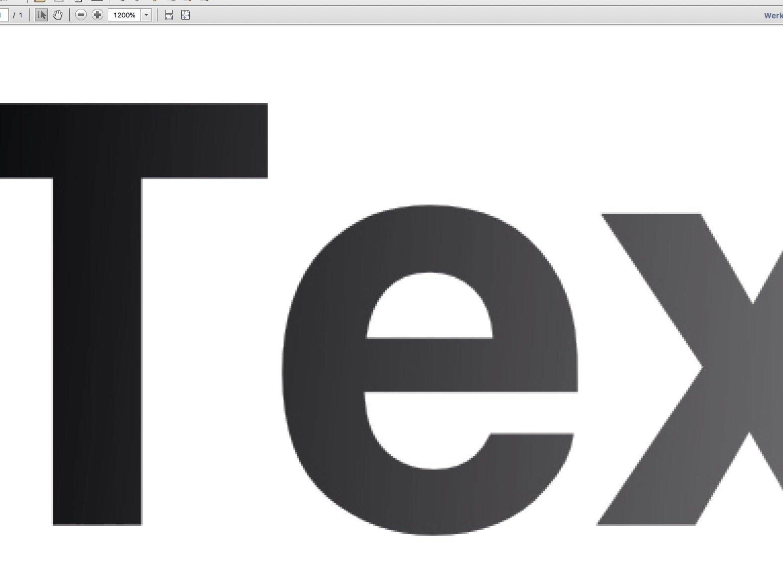
I already thought myself that I made a mistake for sure. Which was the case. I applied the gradient through the effects register not with the gradient tool itself. Thank you for pointing me out, I apologize for that. I tried it and it works like a charm (much better then in InDesign). I changed the initial post respectively. But still, the effects register’s gradient overlay causes the text to be rendered as pixels (see attachment). And I am not sure why this has to be.
-
No problem. Affinity is more than sufficient for here-and-there-tasks. But because it is especially aimed at Indesign users tired of subscription models like me it still needs some polishing. Glad we are already two here! I already spotted that paste style feature, which (for me) is rather useless as it won’t work with long copy of applying styles to single words or paragraphs.
-
Thanks for the replies. As some of them are completely off topic (no offense here) I like to address only those who deal with my initial feedback. Thank you Walt. I moved the bug part to that section. It really is severe because vector text is crucial for print production. My printer would most likely call me nuts if I’d send him prerasterized text of this kind. And he would be right. Indeed I wasn’t asking about zooming features. The hotkeys are too restricted in my opinion, with no reason for that. I’m glad that swatches have already been discussed (didn’t spot it) as it really messes up a professional workflow. Perfect description, thanks. My question is not about copying the style from an object but from text. Like marking the text to be altered and then copy the style from another paragraph or single word just by clicking on it with the pipette tool. This is one of Indesign most basic features. Publisher instead has a dedicated pipette tool and an additional one in the swatches register, so there are basically two tools that just to the same (picking colours) while it could be a much more versatile tool. Again, @Wosven got better words than me. Thanks for the screenshots from Indesign. They tell how powerful this simple tool can be.
-
Dear Affinity staff, maybe its a but, but when I apply a gradient effect overlay to text, the text is then rendered as pixels, not as a vector (like it should be). It is clearly visible in a low-res PDF export and still visible in print-res when zoomed in. See file attached (left: single color, right: gradient). I’m aware that the gradient tool would be the tool to go for in this case—but why is the effect causing the text to be rendered as pixels? Best, Johannes
-
Dear Serif team, after a decade solely with Adobe products, I switched to Publisher a month ago. I already tested the demo when it was first introduced and really wanted to get rid of Adobe for years, but I missed the IDML import feature that came with Publisher’s latest upgrade. I immediately batch converted all of my Indesign files with a script and dropped my CC subscription. With no regrets. I’m a freelance typographer and graphic designer focused on print media and I think Publisher is the better software here. Especially when considering it is not backed by a billion dollar company. Yet there are still some bugs as well as features that I miss in my professional workflow. Here are some of them: I miss integrated access to other spot color libraries such as HKS (not only Pantone) as HKS is a European standard Starting every print document with the cmyk color palette, every web document with the RGB palette etc. And, of course, every saved document with its document color palette. I think the color register is overall missing some logical structure as it is not clear why there are document, system and program palettes. I made my own HKS palette, but only when I import it as a document palette I can use it throughout the software, not only in the current document. That’s confusing. I miss that the pipette can copy styles. I miss the option to rotate the page view of a single page. When I make a layout in portrait mode but have a page that is in landscape mode by design, I really don’t want to turn my head or my display. I miss hotkeys to control how images are display within their containers (min-fit, max-fit etc.). There’s software like Capture One where I can apply a hotkey to literally every function. I am not sure why this shouldn’t be possible in Publisher, too. Keep up the good work. I really appreciate how you treat us folks in this time of crisis. Cheers, Johannes
- 18 replies
-
- 3
-
-
- bug
- feature wish
- (and 1 more)
-
Support for HKS colours
rumo replied to Przemysław's topic in Feedback for the V1 Affinity Suite of Products
My pleasure. Just to quote myself: I just did that, you’ll find the file attached. Please remember to import them as a document palette. HKS-N.afpalette -
Using fonts in Publisher
rumo replied to sammyd's topic in Feedback for Affinity Publisher V1 on Desktop
That is true. It’s just not that convenient that there is no plugin for FEX as far as I know and there other font managers I’ve tested were a bit buggy. Can’t speak for Suitcase though as I never get used to its UI. -
Using fonts in Publisher
rumo replied to sammyd's topic in Feedback for Affinity Publisher V1 on Desktop
Thank you very much for pointing me to this app. I used Fontexplorer for years and it always worked perfectly, though it came at a high price point. So I gave Fontbase and Rightfont a try, both with Indesign and now with Affinity Publisher (no auto-activation with Publisher here). Both came with an interface too simple for my tasks and some flaws like bad font detection with Publisher (so I had them activate manually). Typeface works like a charm. It still lacks my appreciated fontlists checkboxes (helps with activating fonts very quickly) and the given activation button is ridiculously small. But its fast, easy to use and comes at a reasonable price. -
Change guide color?
rumo replied to Luminaire's topic in Pre-V2 Archive of Affinity on Desktop Questions (macOS and Windows)
+1 -
Baseline Grid - First Line Only
rumo replied to benin's topic in Feedback for Affinity Publisher V1 on Desktop
Okay, just a short workaround: It works when you do it the old-style (traditional) way that is, of course, still valid. I don’t know the right term for this in English but typographers that had to deal with different font sizes usually divide the baseline grid into the lowest common denominator (depending on the needed size of the copy text). Let’s say you have a 10/12pt copy, the baseline grid was set to a half/third/quart of the leading, in this case 6/4/3pt. Every other leading must be a multiple of that to not break the baseline grid. So with that 10/12pt copy and a 4pt grid, you could use a 14/16pt intro text and a 26/32pt headline. Indesign’s "first line only" actually just helps to override this.
-
Support for HKS colours
rumo replied to Przemysław's topic in Feedback for the V1 Affinity Suite of Products
Thank you very much, Joachim. Though the other palette worked for me basically (don’t know which one I used, but it came out as a spot colour), your’s appears to be better when I proof my PDF in Acrobat. I’d like to mention that there is a database with metered conversion hues for HKS colours. Tried and tested for years, especially when sending layout PDFs to clients. Maybe I’ll spent an hour of my weekend to integrate them into your HKS-N palette, Joachim, for more accurate colours within the digital working environment. -
Support for HKS colours
rumo replied to Przemysław's topic in Feedback for the V1 Affinity Suite of Products
Thank you very much, this one really helps. Dear Serif team, I really miss HKS palettes too, as they are essential for print production in Europe. -
Baseline Grid - First Line Only
rumo replied to benin's topic in Feedback for Affinity Publisher V1 on Desktop
+1 I finally switched from Indesign CC today after my Publisher’s trial period, and this is something I really missed already on my first job today. It is an essential function for literally everyone working in the field of typography. Hard to believe that it wasn’t considered by now.