chessboard
-
Posts
200 -
Joined
-
Last visited
Everything posted by chessboard
-
 To be fair: If the option "show lines in points" is enabled, you can still enter the value in millimeters in the input field for the line width, if you add the unit "mm" to the numerical value. It's just that you can no longer read the value in millimeters, but only in points. However, it is no problem to set a line to a line width of, for example, 10mm. I just realized that I have never changed the units in the fields to mm in version 1, but have always worked with pt.
 -
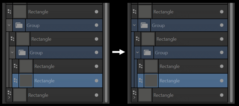
I would like to suggest the following small change to the Layer Palette UI: The hierarchy lines on the left side should not be displayed in gray but in the darker selection color. This would make the layer staggering easier to read and the whole thing more logical.

-
2.0.3 Photo: What's New?
chessboard replied to _Th's topic in Feedback for the Affinity V2 Suite of Products
I think this message is a mistake. According to this list below Version 2.0.3 has not been released yet: -
2.0.3 Photo: What's New?
chessboard replied to _Th's topic in Feedback for the Affinity V2 Suite of Products
2.0.3 is a beta version. You can find the infos about what has changed in the beta section of this forum. For AP for Windows it's here: However, you have to look up each individual beta version of 2.0.3 to see what has changed there. There is usually no list of all changes since 2.0.0, which will only be available when 2.0.3 is released. -
Performance Issues - V.2 - lagging Brush flow/frame rate
chessboard replied to Graphicon's topic in V2 Bugs found on Windows
If you have more than one GPU you could also switch them in the Affinity preference pannels in the "performance tab". Isn't this the same as the setting in the Windows preferences for the apps? I suppose the brush lag must have to do with either AMD CPUs or AMD GPUs. On my old machine I have both (AMD CPU+GPU) and there only turning off OpenGl helps. On my new Machine there is an Intel CPU + nVidia GPU. Here I don't see brush lagging, no matter if OpenGL ist turned on or off. But beyond that, the freeze problem (as seen in the screen capture video on page 1 of this thread still exists. But it is very difficult to narrow down the problem, because there is no pattern when the freezing occurs. For me it doesn't seem to have anything to do with the pure mass of content in a file. Rather using a lot of clipping, layer effects like gaussian blur seems to be of importance. I also see some strange glitches in the rendering when moving objects. The disapear instantly but while dragging the objects there can sometimes some strange pixel forms be seen. Therefore, I suspect that the problems might have something to do with the rendering. Obviously Serif has changed the rendering engine a lot, which in turn could be related to the GPUs. -
Ok, sorry then for the repetition. Was too lazy to search first.
-
Comming from an other discussion I would suggest to implement a separation preview at least in Designer and/or Publisher. With this preview you should be able to check all separation plates, including overprinting and see if there are any spotcolours.
-
Now, this works. But would you say, that it is logical to need two times the same colour (i.e. the same CMYK percentages) to have it one time with overprint and another time not overprinting? Say you want to have magenta to be not overprinting in general, but one shape with the colour magenta should overprint (a yellow shape to get a nice red). Therefore you need to set up a second mangenta colour with overprinting turned on. Mm 🤔, not sure if this is really a logic workflow, because after all it's still the same ink and still ends up on the same color separation. I would say, that overprinting is rather shape based and should be adjusted for shapes, because it determines if a shape is part of a specific separation plate or not. This is something that can be found throughout the Affinity programs - breaking with traditional workflows for... - well, what for? Just to be different?
-
Has V2 fixed Affinity's biggest issues?
chessboard replied to Kal's topic in Feedback for the Affinity V2 Suite of Products
@Tia Lapis Right. TIFF can save lossles or lossy and handle layers (However, I'm not sure if this is part of the official specification of this format, or a propriety feature.) But as mentioned above, lossy is a no-go, because it damages the quality of the image if it is used serveral times in a row. But back to the problem with large files: The filesize on the disk is one side (rather less important today). The question is, can the image software handle this large images when they are opened and edited. This seems to be the problem that @JaGold appearently had to struggle with in AP V2. -
Has V2 fixed Affinity's biggest issues?
chessboard replied to Kal's topic in Feedback for the Affinity V2 Suite of Products
Well, of course 😉. You never want to lose quality, especially in the manufacturing phase. If the client agrees, maybe you can save the final version in a lossy format, but even that publishers don't like to see. Saving in a lossy format, reopening the file, and repeatedly saving in a lossy format means that sooner or later this file will become garbage. BTW, I don't know any lossy file format, that could handle layers. You might want to add that Photoshop is not very good at compressing the file. Other programs can do that better. In Photoshop, for example, it is already decisive whether the bottom layer is a "real" background layer. If it is, this also saves some memory. For whatever reason. -
Has V2 fixed Affinity's biggest issues?
chessboard replied to Kal's topic in Feedback for the Affinity V2 Suite of Products
That's no problem. Apart from photos, which can use a lot of memory (that starts with using 16bit channels), you can do all kind of print documents in an image editing software. I for example do puzzle illustrations in Photoshop. With A3-Size in at least 300dpi, perhaps CMYK-Mode (I use RGB as long as possible), lots and lots of layers the memory requirements can also get very high. Since clients tend to change their minds about some things, it's always good advise to not flatten layers until the work is really done. -
Has V2 fixed Affinity's biggest issues?
chessboard replied to Kal's topic in Feedback for the Affinity V2 Suite of Products
Why not just ignore them who take themselves and their needs too seriously? I don't think Serif values their requirements more highly just because they call themselves professionals. I hardly think Serif actually keeps a list of user requests here from the forum. At least they have ignored most of them in the past years. It is still a big mystery what Serif plans to do with its suite and what suggestions and needs they will take into account. Therefore, it is completely irrelevant whether some users consider their needs to be more important than those of other users. JM2C. -
Has V2 fixed Affinity's biggest issues?
chessboard replied to Kal's topic in Feedback for the Affinity V2 Suite of Products
Well, without doubt there are "professional needs". I understand this to mean, among other things, speed, reliability even on a very large scale, precision, and the ability to streamline and automate workflows. However, the existence of special professional needs does not diminish the needs of users who do not use the software for a living, but may be even the same in some parts. I don't know who said otherwise (I don't read or know each comment in this forum). Professional or not says nothing about the quality of work that is done with the software nor the users themselves. So no need to feel personally attacked when the term "professional" is used. -
Has V2 fixed Affinity's biggest issues?
chessboard replied to Kal's topic in Feedback for the Affinity V2 Suite of Products
I would really appreciate it if we could just discuss the software here and no one had to discuss themselves, feel offended by the wishes of others, or be allergic to the term "professional". This forum is about software and not about the personality of individual users, not about belief and not about the bad guys versus the good guys (may it be users or companies, especially in relation to another software provider that starts with a capital "A"). -
Has V2 fixed Affinity's biggest issues?
chessboard replied to Kal's topic in Feedback for the Affinity V2 Suite of Products
After reading your other post @ProDesigner (about the missing highlighting of the selected recent colour on iPad) I think I now understand, what your criticism is directed to. I must say, I have been a big fan of V2 at first. I like the new features like the shape builder tool, the warp tools, multiple masks in Photo, "hide others", the new export dialogs and some more. But the more I try to work with it, the more I am disillusioned (and therefore disappointed). Still no simplify path tool, for example! What I miss the most of all is stability. I could live with questionable UI/UX design decisions like locked layers that are not locked, preserved transparency not as layer options, but only for painting tools, an almost useless contour tool and so on. But I can't do my daily work with software that starts lagging to or freeze after using it some minutes. I'm glad I don't have to rely on Affintiy Suite and have enough alternatives to get my work done. You will laugh, but for a children's non-fiction book I now used instead of Affintiy Publisher, which started crashing when I was almost ready with the layout, guess what: ... Photoline. This absolutely underrated gem had all the features I needed and used before in Affintiy Publisher: multi pages (of course), virtual duplicates of layers and layergroups (a combintation of linked shapes and symbols in Affinity), vector shapes with multi contours, vector shapes as layer masks, typografic adjustments that filled my needs and so on. And it is stable as a rock! I would really prefer to do my work in the Affintiy suite, because I like the combination of all three apps very much and without doubt, there are some ingenious solutions like clipping by nesting layers, combination of vector and raster, the export persona with slices and so on. But all in all the apps after all these years are still that immature ☹️. So many open ends, that could be connected or just finished. That often stopped half the way. What is a contour tool usefull for, if it can just shift the contour? If I want a contour shifted, I want some original shape that this contour is around. But by using the contour tool I loose the original shape. Thus I have to do the contour with a copy of that shape. But what if I change the original shape? The contour on the copy doesn't follow, because it is a copy and not linked. Of course I could switch to Photo and establish a link between them, get back into designer... forget it! I could do much better with multiple strokes on the original shape. But as said before, I could live with all these shortcommings and with workarounds - if the apps would be rock solid and stable. -
Has V2 fixed Affinity's biggest issues?
chessboard replied to Kal's topic in Feedback for the Affinity V2 Suite of Products
I'm a professional illustrator (professional=this is the job I live from) doing some parts of graphics design as well, for card games, for example (I learned graphic design when there was no "desktop publishing"). Of course I know your scenario. But I still don't see your problem. You switch through different shades of a colour looking for the best fitting. So far, so clear. I do this daily. I really try, but I can't get the problem, that you have with recent colours (except that 10 are too few color patches in my opinion). If I was unsure about colour combinations, I would duplicate the artboard and test another one. Or I would set a color to my liking and save it as swatch to be able to access it again if necessary. In the phase in which I'm not at all sure about the color, I of course also switch very quickly between the colors. But the colors that I then pass over are ultimately also out of the question for the design. And after all, I can get at least the last 10 recent colours. I would never change a colour so lightly that I couldn't tell, if it was this or this one and try to restore it from the recent colours palette. After all, you can change the colour of any vector shape at any time and adjust it to match the overall design. The recent colour list is just a helper to get back the last 10 colours you used. It's a comfort thing, nothing more. May make more sense with painting, than with graphics. Not ment as an insult(!): Just click on the object and you will see which colour it has. Of what interest could it be, which one of the recent colour it was? The actual colour is the colour the object has, isn't it? Perhaps you expect very other things from the recent colour list than I do. -
Has V2 fixed Affinity's biggest issues?
chessboard replied to Kal's topic in Feedback for the Affinity V2 Suite of Products
Sorry, but this sounds a bit ridiculous. Do you really have problems to indentify the most recent colour in a row that grows from left to right? The most recent colour is the most left one, the colour you used before this is the second left one. When there are two rows, the reading is left to right and top to bottom. The most recent is the upper left one. This is no uncommon way of sorting them. For example, Clip Studio Paint sorts them the same way. There is nothing useless with this sorting. If one colour is really so importat for your work, you can save it as swatch in a document palette. Can't imagine, that you really didn't get this. -
Has V2 fixed Affinity's biggest issues?
chessboard replied to Kal's topic in Feedback for the Affinity V2 Suite of Products
The logo you place in the CMYK Publisher document must have CMYK as colour space too. Otherwise it will be rasterized by Publisher. -
Has V2 fixed Affinity's biggest issues?
chessboard replied to Kal's topic in Feedback for the Affinity V2 Suite of Products
I assume that greyscale isn't treated as percentage of the solid printing colour black. That's a missunderstanding of what the greyscale mode is in my eyes. I would suggest to use CMYK mode for print documents and adjust the colour as CMYK (in your case as 100% Black) and use no other colour model if I want to be sure to get the right print colour. All other colour models have to be rasterized for printing. That's in the nature of printing colours. -
Has V2 fixed Affinity's biggest issues?
chessboard replied to Kal's topic in Feedback for the Affinity V2 Suite of Products
Sorry, but could you please explain what grey=0 means? I know only the print colours cyan, magenta, yellow and black. Is grey a spot colour (solid colour)? BTW, why do you export the logo from Designer in PDF or EPS format to place it in Publisher? You can use the native Designer format. -
Has V2 fixed Affinity's biggest issues?
chessboard replied to Kal's topic in Feedback for the Affinity V2 Suite of Products
@tatanka I just tried this in Publisher V2. Admittedly in a very simple way, but it's all about principle. I made a one page document in Publisher with CMYK/8 profile. Drew a shape and set the fill colour to CMYK 0/0/0/100. I then exported this as PDF with "rasterize: nothing", colour space: CMYK and colour profile as in document (ISO coated v2 300% ECI). I than checked the PDF in Adobe Illustrator and Photoshop and there the black shape is still at CMYK 0/0/0/100. The colour separations in Photoshop show colour only for black channel. Perhaps you should check Publisher again. -
Crashing after zooming in and out multiple times
chessboard replied to pxlr's topic in V2 Bugs found on Windows
I now got these crashes even without zooming. I tried to check an other issue and did not zoom at all but drew many shapes. After a while I got the blue circle and afterwards the greyed out window followed by the app disappearing. I assume the crashes might have something to do with the rendering. -
Select > Same > Layer
chessboard replied to Intuos5's topic in Feedback for the Affinity V2 Suite of Products
You could use "Hide others" on the layer you want so select on. You could than do the "select same" (together with "Select hidden objects" turned off) to select just from the visible objects. Sadly this doesn't work. The problem is, that there are two kinds of hidden (invisible) objects: the ones that are hidden by clicking the dot at the right in the layers palette and the ones that are hidden (invisible) by using the command "Hide others". The last only hides the topmost parent in each hierarchy. Their children are invisible but not hidden. 😬 The "select same" commands should treat invisilbe objects as hidden objects and restrict the selection to only the visible ones. -
Performance Issues - V.2 - lagging Brush flow/frame rate
chessboard replied to Graphicon's topic in V2 Bugs found on Windows
I can confirm @affinians description. Almost the same behavior here. I have not tested enough, but it seems to me, that Affinity Photo V2 doesn't have this problem. AP V2 seems to me to be more stable than AD all in all. But this may be related to the different kind of projects I use both for. AD V1 doesn't show this lags either on my system. My system: Windows 11, Intel i7 11370H, 32GB ram, Intel Iris XE Graphics/nvidia RTX 3060 TI Laptop -
Thanks @Pšenda. This helped. Now it works as I am used to. I will mark this question as solved.