Amdival
-
Posts
84 -
Joined
-
Last visited
-
 Gemini80 reacted to a post in a topic:
Preparing Designs for Printing - Vector VS Raster Size/Sharpness Question
Gemini80 reacted to a post in a topic:
Preparing Designs for Printing - Vector VS Raster Size/Sharpness Question
-
Huge spaces between words
Amdival replied to tlhs's topic in Affinity on Desktop Questions (macOS and Windows)
Here are two types of line breaks. A Line Break looks like an arrow (like on an Enter Key), A Paragraph Break looks like a backwards P or a music note
-
Huge spaces between words
Amdival replied to tlhs's topic in Affinity on Desktop Questions (macOS and Windows)
tlhs, the screenshots you uploaded, they are still hard to tell what all is there (you cropped them too close to the edges). Do you see in the screen shots FirstDefence posted that there are paragraph breaks to the right of the paragraph box? They look like mirrored Ps. You might not have added them, but they might still be there. If you are editing a file someone else worked on, they might have added them to force a line break. You need to clear those forced line breaks. -
Huge spaces between words
Amdival replied to tlhs's topic in Affinity on Desktop Questions (macOS and Windows)
Look here
-
Old Bruce reacted to a post in a topic:
Huge spaces between words
-
Huge spaces between words
Amdival replied to tlhs's topic in Affinity on Desktop Questions (macOS and Windows)
It looks like you have a line break after the word "pure". It's hard to tell from the screenshot. -
 tlhs reacted to a post in a topic:
Huge spaces between words
tlhs reacted to a post in a topic:
Huge spaces between words
-
Huge spaces between words
Amdival replied to tlhs's topic in Affinity on Desktop Questions (macOS and Windows)
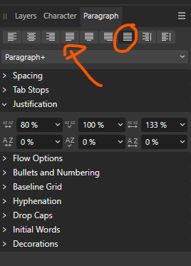
It looks like you have Justify All selected, but I see you have experimented with those things. Toggle Text > Show Special Characters and give us a new screen. I think that'll help troubleshoot it. -
I see no one has responded to this. It's hard to know where to start. What is the print size? You are describing a 13,000x13,000 document. When printing, you also want to know what size the printed product is. That is 13,000x13,000 squares of color. The larger you make the document, the larger those squares are. At 13,000x13,000 You can print a 43" x 43" document and have [roughly] 300x300 squares of color per every inch. You can also print a 86"x86" document and have 150x150 squares if color per every inch. Raster vs Vector Raster and Vector art is fundamentally different. You can scale vector art to any size and never lose sharpness. Raster is is made up of squares. You can also enlarge raster art to as large as you would like, but you are also making those squares larger. Typically for print items that are going to be viewed within arms length, such as things that people hold, aiming for 300dpi is standard. Things that are viewed from further away can get away with a lower dpi. Like I said, it's hard to know where to start, but understanding the fundamental difference between the two different graphics technologies helps a ton.
-
I've used the Wacom Intuos tablets. I dislike the Intuos Pro though, it's too thick and bulky.
-
Amdival reacted to a post in a topic:
Strip blanks when merging in Affinity Publisher
-
3-D Secure Authorization and how to do it?
Amdival replied to VectorCat's topic in Customer Service, Accounts and Purchasing
I'm running into this same issue. Paypal is not an option for me though -
Amdival reacted to a post in a topic:
Free Image resources?
-
Amdival reacted to a post in a topic:
Free Image resources?
-
Free Image resources?
Amdival replied to Row13's topic in Affinity on Desktop Questions (macOS and Windows)
I think what you are doing is fine with no modifications. It seems the intent of the license is to stop people from just downloading the images and redistributing. Physical product sounds like they don't want you to just create a print of the photos that has no other purpose than being an art print. If you are using the images as background images, it seems very well within the intended use of the photos on Unsplash. All of the above is the reason why when the site was Public Domain, it was tremendously better. No sifting through licensing. -
 Amdival reacted to a post in a topic:
How can I stop APhoto v1 "New Version Available" popup?
Amdival reacted to a post in a topic:
How can I stop APhoto v1 "New Version Available" popup?
-
Free Image resources?
Amdival replied to Row13's topic in Affinity on Desktop Questions (macOS and Windows)
I didn't realize Unsplash was no longer a site for Public Domain images. Apparently that change was made years ago and I never knew. Eh, I guess good things cannot last forever. -
Saku reacted to a post in a topic:
Where is Affinity V2 upgrade path?
-
 emmrecs01 reacted to a post in a topic:
Where is Affinity V2 upgrade path?
emmrecs01 reacted to a post in a topic:
Where is Affinity V2 upgrade path?
-
Karl Toon reacted to a post in a topic:
Where is Affinity V2 upgrade path?
-
Use 8-bit
-
It might be helpful to hit the hamburger then Appearance > Show as List
-
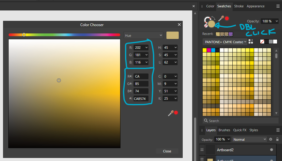
Open the PANTONE + CMYK Coated book. Find your color and select it. The color is now your fill color. Double click the fill color circle. You can see the RGB values. Whoever is choosing brand colors normally would make a decision about what PMS color to use aswell as CMYK and RGB makeups. What I described will give you a quick automated way of finding the RGB values.
-
Amdival reacted to a post in a topic:
Recentering The Canvas - How To
-
These pantone swatch books are available in the Swatches panel. Of course, these colors will be simulated on screen but have the CMYK color mix embedded in them. Are you asking how to do create RGB equivalence for dislays?
-
Dumb question...
Amdival replied to LuvMyDesignTools's topic in Affinity on Desktop Questions (macOS and Windows)
Those are margins. File > Document Setup > Margins