JimGoshorn
-
Posts
247 -
Joined
-
Last visited
Everything posted by JimGoshorn
-
Ability to paint on fill layers
JimGoshorn replied to CPP's topic in Older Feedback & Suggestion Posts
Well I just tried it the manual way. I first created a pixel layer and painted a black rectangle on it. Then I created a layer and using the paint brush I painted it gray and then changed the mode to overlay. The black rectangle showed through the gray layer as expected but gray was displayed around the rectangle as well. I then painted on the gray layer using white and to my surprise it didn't lighten the rectangle in the least just made white appear around the rectangle. Based on this, it would appear that overlay works a bit differently than it does in Photoshop :huh: -
Try it for yourself. When I tried it, I got no alert for a conversion or a mismatch :(
-
Under the Selection menu use Feather
-
Thanks Oval! I was happy that the fields did the math like Illustrator but this offers new possibilities :)
-
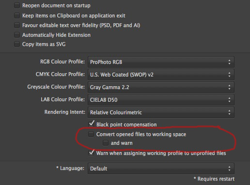
In the preferences you have a checkbox to convert to working space and under that is another checkbox that says And Warn. The convert checkbox seems to be doing what's expected but the And Warn seems to be doing nothing. When AP converts, I didn't get any warning. Also, if the convert checkbox is unchecked and the warn box is, shouldn't the user still be alerted if there is a mismatch?
-
I vote for the Save History checkbox on the save dialog. This way, users will be reminded of the feature before they save the file. Also, if the user saved the file with history previously, the checkbox should remain checked in the save dialog. If the user then wanted to make a copy for a client, a Save As could be done and the checkbox unchecked which would strip off the history data.
-
Blend If
JimGoshorn replied to scottidog1964's topic in Pre-V2 Archive of Affinity on Desktop Questions (macOS and Windows)
Thanks Ben! -
Here is the list on this site: https://forum.affinity.serif.com/index.php?/topic/4630-supported-develop-raw-cameras/
-
The image is recorded in the camera as something resembling a black and white image (think single channel). The demosiacing process converts the image by splitting up the original data into 3 separate color channels (R,G,B) which when combined create the color image. So in basic terms, you multiple the amount of data in the RAW by 3 (it's not exactly 3 but that explains the concept) since it's being split up.
-
Nik Filters
JimGoshorn replied to tony3d's topic in Pre-V2 Archive of Affinity on Desktop Questions (macOS and Windows)
There is a contact us link here: https://support.google.com/nikcollection/?hl=en#topic=3288093 -
.CR2 and .RAF files are RAW files and do not have a color space. The image you process from them is assigned the color space of your choice which in your case is Adobe1998 RGB. In the general preferences tab of the preferences there is a setting near the bottom which will give you an alert if the Warn checkbox is checked. Above that is the option to convert the file's color space to the working color space you have selected in preferences. So if you open a file with no space assigned or a different space assigned and Warn is checked you will get an alert. Test it to be sure but that appears to be the way it works.

-
Is there a list of the variables that you have defined?
-
Would it be useful if we could have something like an eyedropper where we could click in an object and all it's data would be copied (we could specify in the tool's prefs what data to use)? Then we could just double click on the art board where we want another instance to be placed.
-
AD and AP: Right-clicking the titlebar
JimGoshorn replied to digorydoo's topic in Older Feedback & Suggestion Posts
I meant through OSX. Saying a way referred to how or where they display the file path. -
It increases in file size because it goes from basically a black and white image and gets converted through a demosaicing process to a color image with 3 channels.
-
AP: Fuji raf
JimGoshorn replied to photog's topic in Pre-V2 Archive of Affinity on Desktop Questions (macOS and Windows)
It would appear to be an auto tone curve of some sort. If you are not happy with the results, that would be the first thing to disable in the assistant and see if the results improve. One thing I have been wondering about is how dependent is Serif on Apple's RAW system updates? Do those updates affect how they are able to process the RAW files? -
Nik Filters
JimGoshorn replied to tony3d's topic in Pre-V2 Archive of Affinity on Desktop Questions (macOS and Windows)
Contact their support department and request that they add support for Affinity Photo. If they get enough requests they are more likely to do it. -
Blend If
JimGoshorn replied to scottidog1964's topic in Pre-V2 Archive of Affinity on Desktop Questions (macOS and Windows)
I would really appreciate a video for this which would compare doing blend if with Photoshop and doing it with the Affinity apps so we could better understand how to use the feature. After doing it Adobe's way for years, your way can be a bit of a head scratcher :huh: -
If you want to temporarily solve the security issue you can do it from the Security preferences. I had to do this with a Wacom update a couple of versions back.
-
It would be really handy if we could move a path while we are drawing it so we could finely tune it's position.
-
I can pass alone some guidelines: For CMYK which can be used in Photo: White Skin High values magenta and yellow are almost equal with yellow slightly higher and cyan is a third to a quarter of yellow Asian Skin Cyan is a third of magenta and yellow is about a quarter more than magenta Black Skin Magenta and yellow are equal (magenta can be less but skin can look greenish) and cyan is 40% of that There is an entire book on Skin: http://www.amazon.com/Skin-Complete-Digitally-Photographing-Retouching/dp/0470592125/ref=sr_1_1?s=books&ie=UTF8&qid=1437348742&sr=1-1&keywords=lee+varis For Lightroom: Average Skin 79.0% R 69.5% G 62.3% B Medium Skin 81.3% R 70.4% G 60.7% B Dark Skin 70.3% R 61.7% G 55.0% B Using a non-highlight area, Green equals approximately .87-.88 times Red and Blue equals approximately .85-.90 times Green In Photo, you have a white balance in Develop Persona and one in Photo Persona. If you can scan and adjust by eye, then do it that way. Guidelines are not the most accurate and adjusting in CMYK is not for the faint of heart. Dan Margulis wrote a book on Color Correction but Amazon says it is only available used. He has a new book out but it is about correcting in LAB.
-
Newbie Help
JimGoshorn replied to WAYNE76's topic in Pre-V2 Archive of Affinity on Desktop Questions (macOS and Windows)
Hi Allan, When using ProPhoto, it is recommended to use it in 16 bit to avoid possible posterization. 8 bit only gives you 256 shades whereas 16 bit gives you 65536 so it is much more forgiving if you need to make more extensive adjustments. Here's an article in Wikipedia: https://en.wikipedia.org/wiki/ProPhoto_RGB_color_space -
I'm anxious to see what is going to be checked off the roadmap next (not to mention what might be added) :)
-
I was being calm and I was controlling myself. Having been a coder years ago, I stick up for people in the trenches because I know all too well what is involved. You do miss anticipated release dates and try as hard as you can, software frequently has bugs. You can either accept that or you can jump up and down (which won't get the software done any sooner and can create ill will with the developers). I prefer the former and with that, I rest my case.
-
You said in your above posts "Hey, am I the only one who tells the truth?!" and "Well, our question still is when. Perhaps 2015 is hexadecimal?" is rude and sarcastic. I can't believe that you are trying to justify your attitude by saying that you thought you were just formulating the best way to communicate. Ever heard the saying that you can put lipstick on a pig but it's still a pig?? Obviously you never heard that you can catch more flies with honey than with vinegar.