

Designer1
-
Posts
461 -
Joined
-
Last visited
Posts posted by Designer1
-
-
1 hour ago, debraspicher said:
Ok.
On the Affinity website you can see several works, graphics. All these works have been exported in an excellent quality. Try exporting in such great quality.
-
1 hour ago, debraspicher said:
You do realize Affinity is in that graphic, right?...
I don't know how you exported the text. But I need a slightly better export quality for my work/presentations. It needs to be at a very high level.
-
23 hours ago, debraspicher said:
Can you tell which program did which? Feel to rank and critique. I will reveal the programs/settings I used to output these later... Obviously, save & view these outside of your browser... (they are numerically listed, it's just very light in the bottom right under the paragraph)

The text quality is already better here. For the export, I tested Illustrator, Corel Draw and the free Inkscape. All three programmes deliver a much better export quality than Affinity. Affinity can only export text well if it has been rasterized beforehand, preferably at 600 dpi or more. The problem therefore lies in the anti-aliasing of the text.
-
8 hours ago, debraspicher said:
I can't think immediately of any technological reason for this, but it's a surprising result. And can explain why some people have different complaints regarding the appearance(s) of text in their exported documents with re: PNG... particularly if they rely on the matte setting versus adding a plain white background the old school method.
If I have a background with white, make another layer with text and export. The AA gives a light result... it's like it has more feathering...If I decide to use Export Persona and export the layers separately, apply the white matte using a PNG preset, the AA is certainly much heavier. Same with File>Export... with white bg layer turned off.
I was testing samples of Coverage Map and I notice the very heaviest setting was even heavier with the white matte. It looks pixelated.
I thought maybe it was down to the resample method perhaps in the way the white background layer was being applied to the text. But trying all methods, checking preview and floating images over one another and applying "Difference" Layer blend mode in PS, it showed no difference....
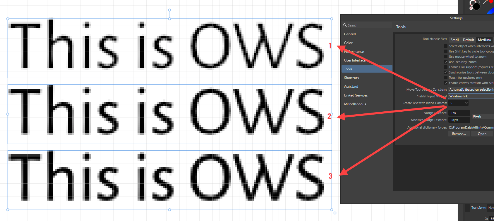
Here is an image I made with the differences in AA through both export methods... to be clear, the top result is "normal" Coverage map (Anti-aliasing curve) and the other two rows below are using a progressively steeper curve to give a more bold result... I show the differences on the right:
Indeed, I turned off Document>"Transparent background" in Photo to remove the checkerboard pattern and could see that the result of the AA in the text indeed does change when I enable/disable the white background in my document.
Edit: Changing Blend Gamma of the text layer to 2.2 resolves the disparity, it seems.In both exported texts, the outlines of the letters in the continuous text are very unclean and pixelated. The result is unsatisfactory. It is reminiscent of inkjet printers with poor print quality. Unfortunately, the gamma setting does not seem to have an improved effect on export quality. This export problem should best be looked at by the Serif staff so that it can hopefully be fixed with an update.
Adobe has various Bicubic export settings that allow for smoother text quality. Unfortunately, Affinity does not have these settings.Bicubic Smoother: Good for enlarging images based on Bicubic interpolation, but designed to produce smoother results.
https://helpx.adobe.com/photoshop/using/export-artboards-layers.html#export-as
-
The export quality in Affinity Designer has not yet been improved. However, the problem of export quality has been known for years. Adobe delivers professional export quality and Affinity unfortunately does not. What use are new functions such as a spiral tool that I hardly ever use if the export quality is simply not right? Serif obviously doesn't realise how important flawless export quality is.
-
2 hours ago, Callum said:
Hi Designer1,
If you use a different profile does your palette show correctly? If not please could you provide a copy of the .afpalette file in question?
Thanks
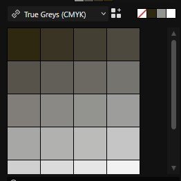
CHi Callum, when using other colour profiles, the CMYK palette looks correct. This pallete was made available here in the forum by Affinity Team a year or more ago. They are real CMYK values. For example black 0 0 0 100.
-
Affinity Designer 2.2.1
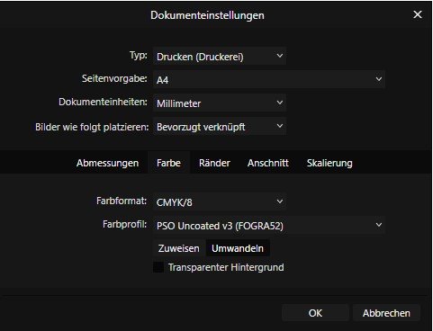
Catastrophically poor colour reproduction of the CMYK colours black and grey. The colours are not displayed as shades of grey, but as unclean shades of brown. You can't work professionally with this! Colour profile used: PSO uncoated v3.
-
42 minutes ago, NathanC said:
Hi @Designer1,
As NotMyFault mentioned could you possibly send us a copy of your affinity document so we can take look? If you could also include a line of text which has not been rasterized for comparison that would be great.
I setup a standard 300DPI A4 document using your font (89pt) and then compared 2.2.0 to 2.2.1 and there were no visible/quality differences when rasterising the text in 2.2.1.
2.2.0:
2.2.1:
Hi @NathanC , the problem is mainly with ISO Coated v2 (ECI). I have changed to PSO Coated v3 and the "Rasterizing" results and exporting as PNG and JPG are fine again.
-
1 hour ago, NotMyFault said:
Any chance?
Affinity Designer 2.2.1 - .afdesign, not the .afphoto file.
-
29 minutes ago, NotMyFault said:
Zooming to 100% would could avoid most of the catastrophe.
Using png format for screenshots would avoid another part resulting from jpeg lossy compression.
please always upload the actual .afphoto documents. In case of non-standard fonts are used, please add an PDF export with fonts embedded.
100% zoom does not change anything! I have also tried rasterising other typographic work in Affinity Designer 2.2.1 - the result is very poor. Even after exporting as PNG and JPG, the quality is miserable.
The problem is mainly with ISO Coated v2 (ECI). I have changed to PSO Coated v3 and the "Rasterizing" results and exporting as PNG and JPG are fine again. -
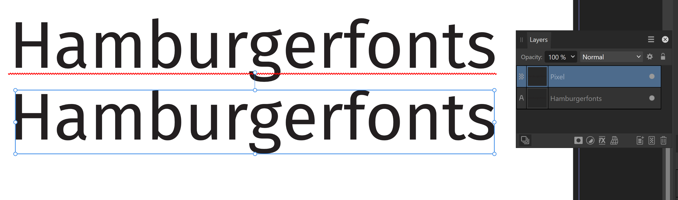
The "Rasterizing" function in Affinity Designer 2.2.1 gives catastrophically bad results. The letters are completely distorted! In Affinity Designer 2.2, the "Rasterizing" function still worked perfectly. This document has 300 dpi, font Fira Sans.
-
7 hours ago, debraspicher said:
Well, this is an unexpected nuisance.
In this file there is a layer for corrections around the mouth (lots of food crumbs). The first image is as it should look, but when using Lanczos Non-Separable in File>Export for Resampling Method and exporting to a smaller size (in this case 33.3%), the lines are visible.As it should appear:
Vs... File>Export[Resize 33.3%] with Lanczos Non-separable as the Resambple option with NO merged layers):
On one hand, this probably means that the individual layers are resampled using the method we chose in the File>Export window? This is good because we need this level of control. The downside?: It creates artifacting that can be seen around the edges of a layer that has transparency (so heal brush work and so on...) when using the sharpest option from what I can tell is Lanc Non-Separable for downsizing...
The "fix" is to use Merge Visible before exporting and that way there's no layers in which to create edges around... a bummer.This problem also exists in Affinity Designer 2.2. Antialising when exporting JPG and PNG is not optimal, especially with typography, round letterforms. This has been reported here in the forum several times. Unfortunately, Serif has not yet done anything to improve this.
-
On 9/14/2023 at 7:19 PM, Patrick Connor said:
We are pleased to announce an update for the Windows release of Affinity Publisher 2, version 2.2.0
This build is available as a (sandboxed) MSIX application installer and as an (unsandboxed) MSI/EXE traditional installer.
Please see this FAQ thread for instructions on how to access the unsandboxed MSI/EXE version.The changes in Affinity Publisher 2 for Windows 2.2.0 (made since the last release Affinity Publisher 2 for Windows 2.1.1) are listed in this FAQ forum post:
To get notified when any new releases are made please follow the latest releases thread by clicking here
UPDATING TO THIS VERSION (free for existing customers)
The software version can be seen on the splash screen and the About dialog (in Help > About Affinity Publisher ).
If you’ve purchased from the Affinity Store — each time you start the Affinity Store software it will check for updates and offer any available update. The Windows builds only automatically checks once per day. In the Help menu there is a manual "Check for Updates". The latest update will install over the top of any earlier version, with no need to uninstall. You can download the latest installer by logging into the affinity store here and find the order in your account and use the "Download" button in there. Alternatively, this new release (and previous versions of Affinity Publisher for Windows) can be downloaded from this link (those installers are NOT for customers who made Microsoft Store purchases).
If you've purchased from the Microsoft Store — Microsoft Store updates are done automatically by the operating system (each time you start the application). If this does not happen for you, open the Windows Store app and click the three dots in the top right corner of the app and then go to Downloads and Updates. Click Get Updates. This should hopefully force the update to show.
These are good functions. However, the export quality of PNG and JPG has still not been improved. A pity.
-
1 hour ago, PaulEC said:
How much simpler can it get? Select the item you want, then hit Return!
How could it work if you just opened a Menu without first selecting the object? And wouldn't opening a Menu be more work than just hitting Return?
"Return" - you have to know that first! Then it's really easy. The menu is much more logical and better, because all the other menus such as transform, etc. are accessible via the menu.
-
2 minutes ago, Ron P. said:
I'm running Designer on Windows, and that online help is for Designer on Windows. Do like the instructions suggest and you will get that menu. I didn't know it existed, until I read the help about it, and tried it.
Now it has worked. However, I find it impractical that you cannot open menus such as the "Transform" menu.
-
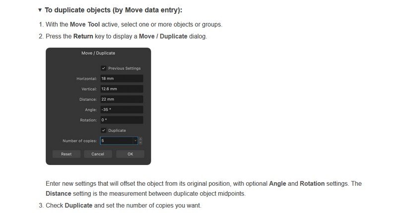
1 hour ago, Ron P. said:
In the Designer 2 online Help, https://affinity.help/designer2/en-US.lproj/pages/ObjectControl/duplicate.html
Not comprehensible. I use Designer on Windows. I don't have this menu! Where can I find this menu?
-
Move / Duplicate
Where in Affinity Designer 2.2 can I find this menu? I have not found one.
This is Affinity Video on Facebook.
-
I tried Inkscape 1.3, the PNG export is excellent. There is a great function in Inkscape when exporting to set the edge smoothing of the contours so that the contours are very smooth. This feature of Inkscape would be very desirable for Affinity 2.2. Inkscape is free and exports PNG and JPG in much better quality than Affinity Designer.
-
5 hours ago, cgidesign said:
Not better or worse but different.
My experience ist, that a higher gamma gives a more crisp antialiasing (which is expected due to the way gamma curves work).
But the effect can be subtle. With thin fonts at tiny sizes it can be obvious but with bigger or thicker fonts less so.
I don't see any improvement in the gamma settings. As I said, the problem is with the anti-allising setting.
-
5 hours ago, cgidesign said:
There is the Text Blend Gamma preference.
It helped me in some cases. Might not be a solution but at least something to try out.
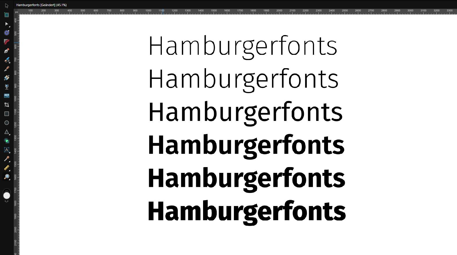
8 point text created with various gamma values (value must be set before creating the text element).
Do you think Gamma 3 ensures better quality when exporting PNG and JPG?
-
Unfortunately, in Affinity 2.1.1 the export quality of PNG and JPG or the antialising has not been improved. It is clear that a professional software should include a high quality export of files. Although many comments have already been written on this topic, Serif ignores this. What a pity!
-
Interestingly, the exported results are better if the design to be exported is rasterised in Affinity Designer before exporting as PNG. This suggests that Affinity's anti-aliasing feature does not work properly for typography and vector graphics.
- Ezbaze and debraspicher
-
 2
2
-
@debraspicher Here I have exported from Illustrator. The contours are smooth. The CMYK - Black 100% is black and not grey as in Affinity Designer 2.1.0.
-
Illustrator has the function how black should be displayed. Unfortunately, Affinity Designer 2.1.0 does not have this function.


PNG text export quality
in Beta Software Program Members Area
Posted
It would be important to improve the export quality of PNG and JPG. Affinity Designer is a great app, the biggest disadvantage is the poorer export quality than Adobe Illustrator.