Aristarxos
-
Posts
27 -
Joined
-
Last visited
Everything posted by Aristarxos
-
I agree with the Kobold and all previous. Stability and reliability are very important. To be honest, even though I own the Designer, I am not thinking of using it, because I know that it has known bugs, that are not addressed. It is a very nice software, but the bugs are not helping at all... Best regards, A
-
Hi Affinity, There is a bug in Affinity Designer, since 1.6 version that still exists in 1.7.3 and has not been fixed. In the attached video, it can be seen that when you add even a single word, in a text phrase that has a specific kerning and tracking (applied text style), the new added word does not keep the same kerning and tracking of the phrase that it is being added. On note the fact that it has been selected the same text style on the word to add. You have to select again the complete text phrase and apply the text style to correct the kerning and tracking. Please fix. A. IMG_2742.MOV
-
I would like to know if they plain to fix this. Did they fix it on Publisher before releasing the software? Guess not.
-
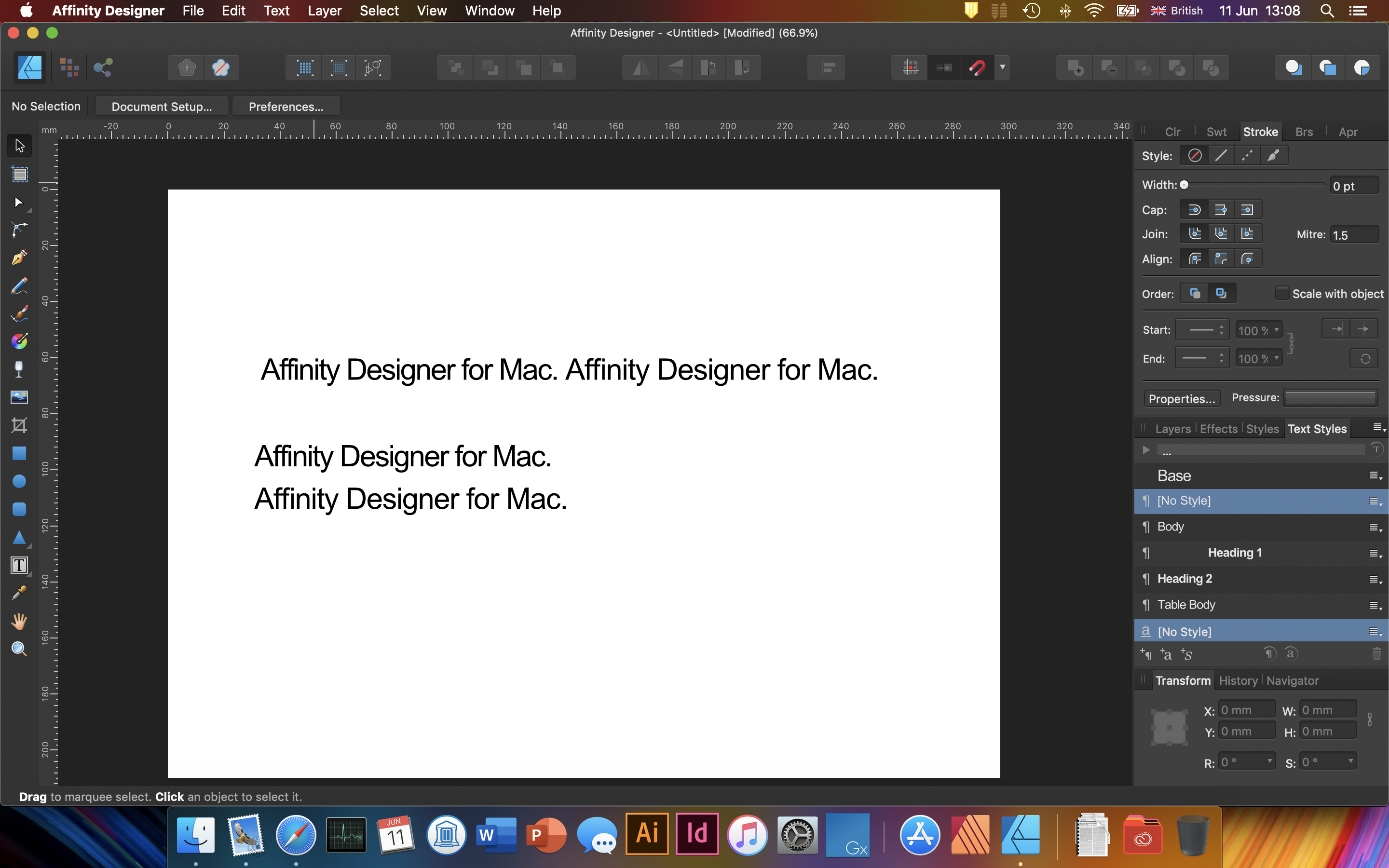
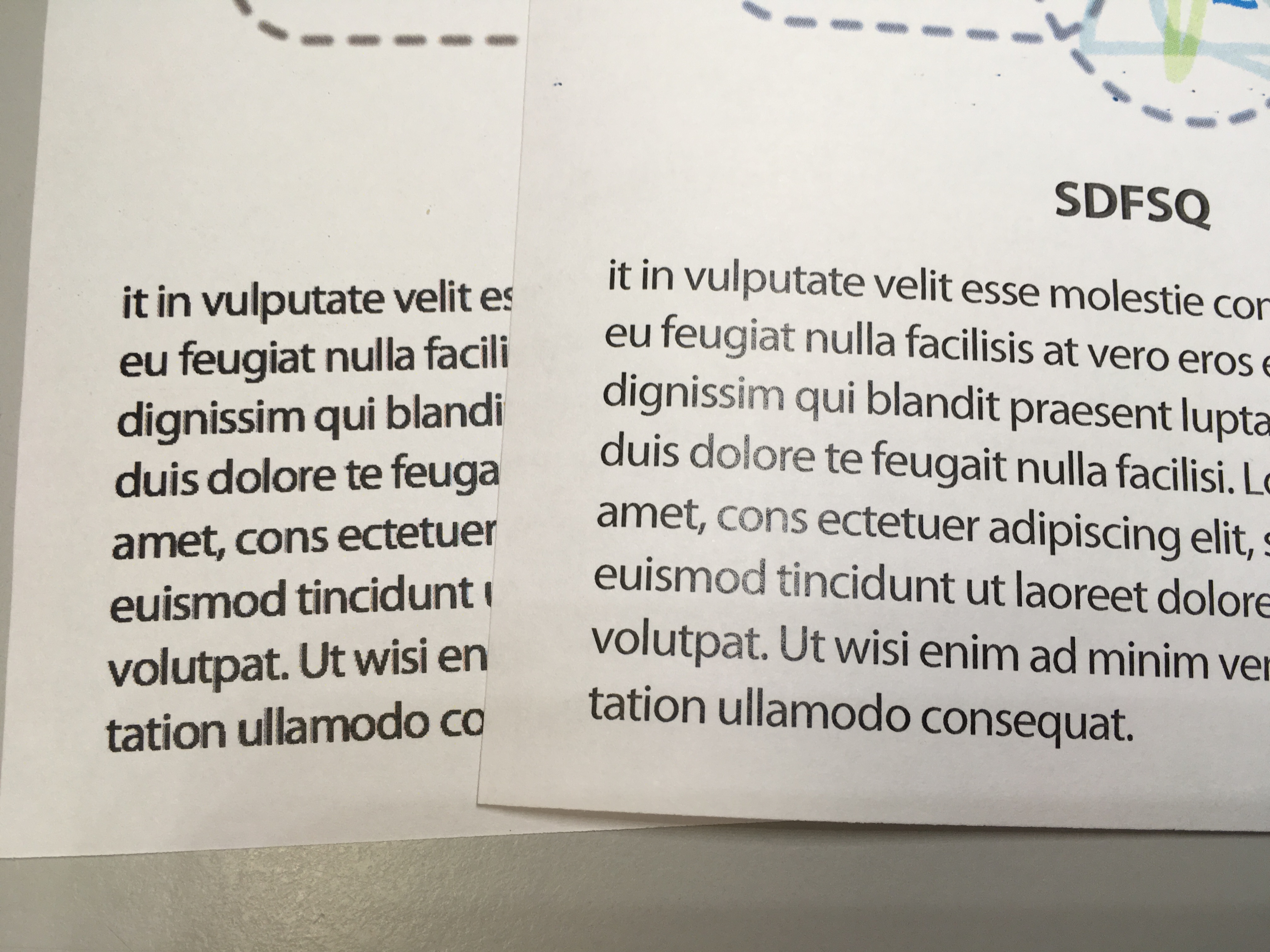
Affinity Forum hi, I would to report a bug for the Affinity Designer 1.7. The kerning and tracking on paragraph styles are problematic (at least for my case). I am modifying the kerning and the tracking on the Base text style (kerning: -20, tracking: -25). Then, I am using the Body text style to write something. It does not work at all. I have to first type the phrase, then select it and then apply the Body paragraph style to have the correct kerning and tracking. Even writing a small text, applying the correct kerning and tracking, and then continuing, hoping that will keep the correct style, it does not work. This problem exists since version 1.6. If this is happening on other users as well, please fix it. It is impossible to switch from other software having these issues. Please check image and attached file. The fist is correct, after selecting the text and applying the style. However the second one has the wrong values. Regards, A. Test.afdesign

-
Print quality issue
Aristarxos replied to Aristarxos's topic in [ARCHIVE] Publisher beta on macOS threads
Hi Chris, Thanks for your answer. Very nice and hard work guys. It is highly appreciated. Concerning the issue, I am printing both the PDF (created PDF from the A.P.) with Preview, and the file directly from the A.P. on a HP M551 colour laser printer. The differences when I am printing are visible, especially on the text of the figure (only). The other main text is normal. This (?) look like the previous one I had reported when printing with the A.D. and the I think a colleague of yours came back saying that the issue derives from the mask (?). Best regards, A. -
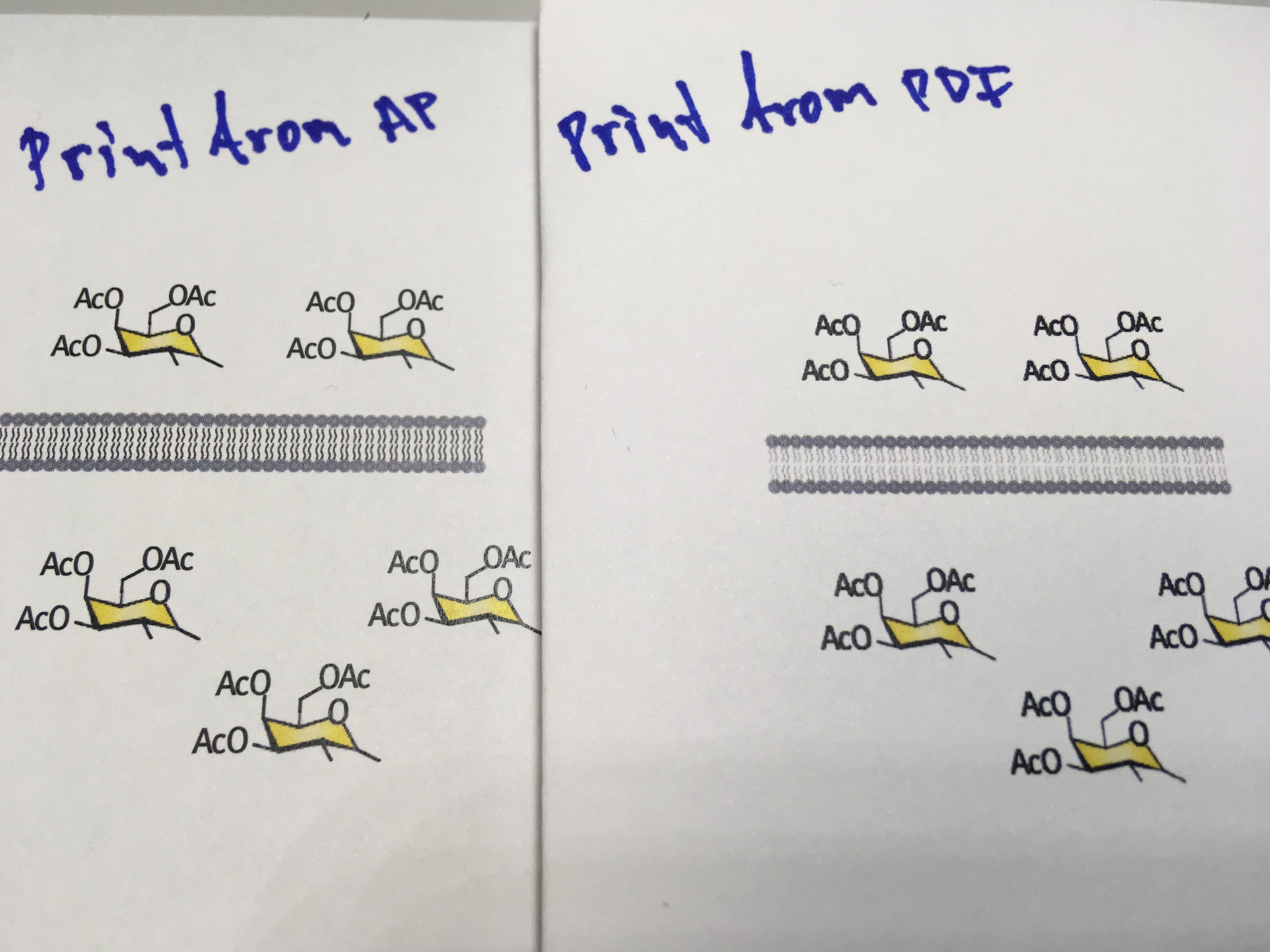
Dear Affinity, I am excited that you are trying to release a DTP software. Very nice try. I have spotted a printing issue with the Affinity Publisher 1.7.0.145 version. I have created a design in Affinity Designer latest version. An AI figure was opened in AD, modified and saved as AD file (file attached). Created an AP document, pasted the text, and placed the figure created from the AD file (file attached). When printing this AP file to a colour laser jet printer, quality is very nice as expected (left part of image attached). However, when exporting the AP document to PDF (file attached) and printing it, then the quality of the PDF looks very bad (right part of image attached). Apologies if already posted. Also please include Greek dictionary, it looks awful like this. Any thanks and keep up the hard work. Best, A AD file.afdesign AP file.afpub PDF file.pdf
-
Hi Callum, Here is the file. It is occurring constantly to everything I do and involves text. Regards, A. Test.afdesign
-
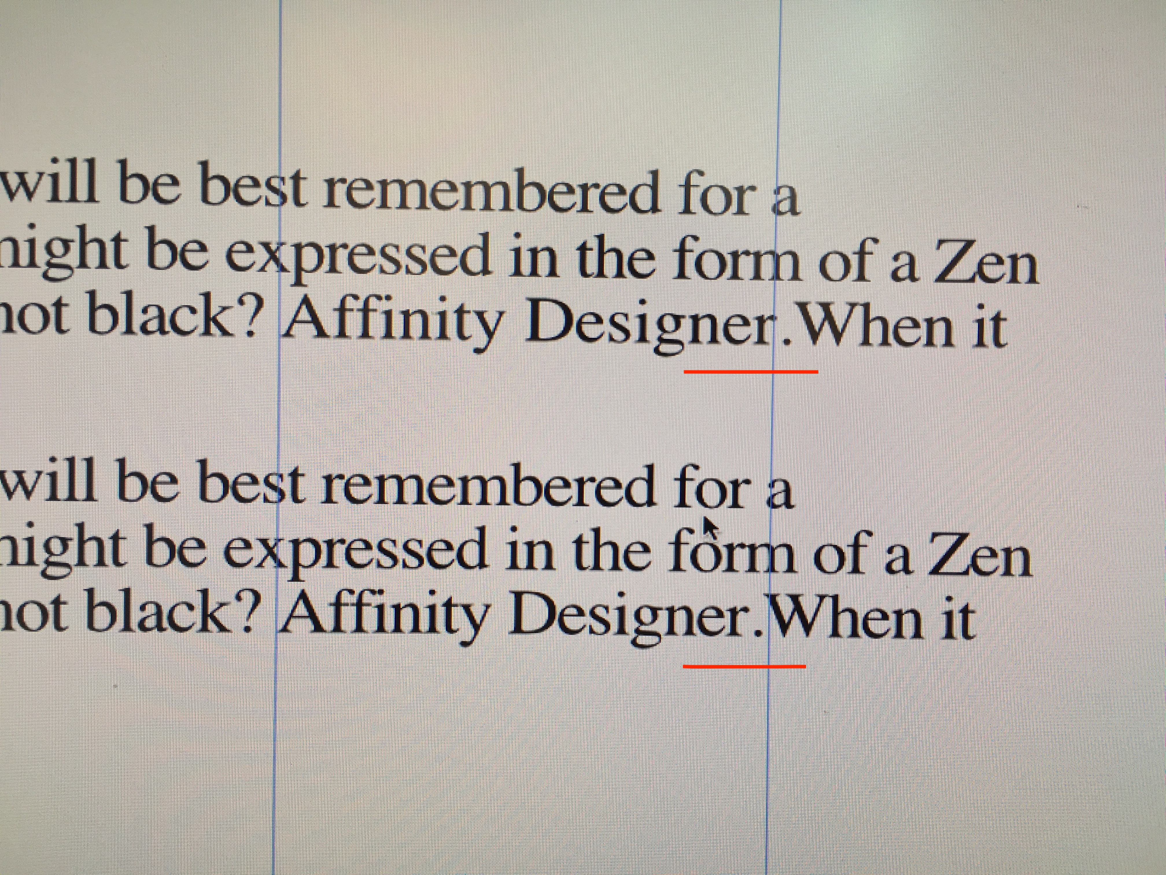
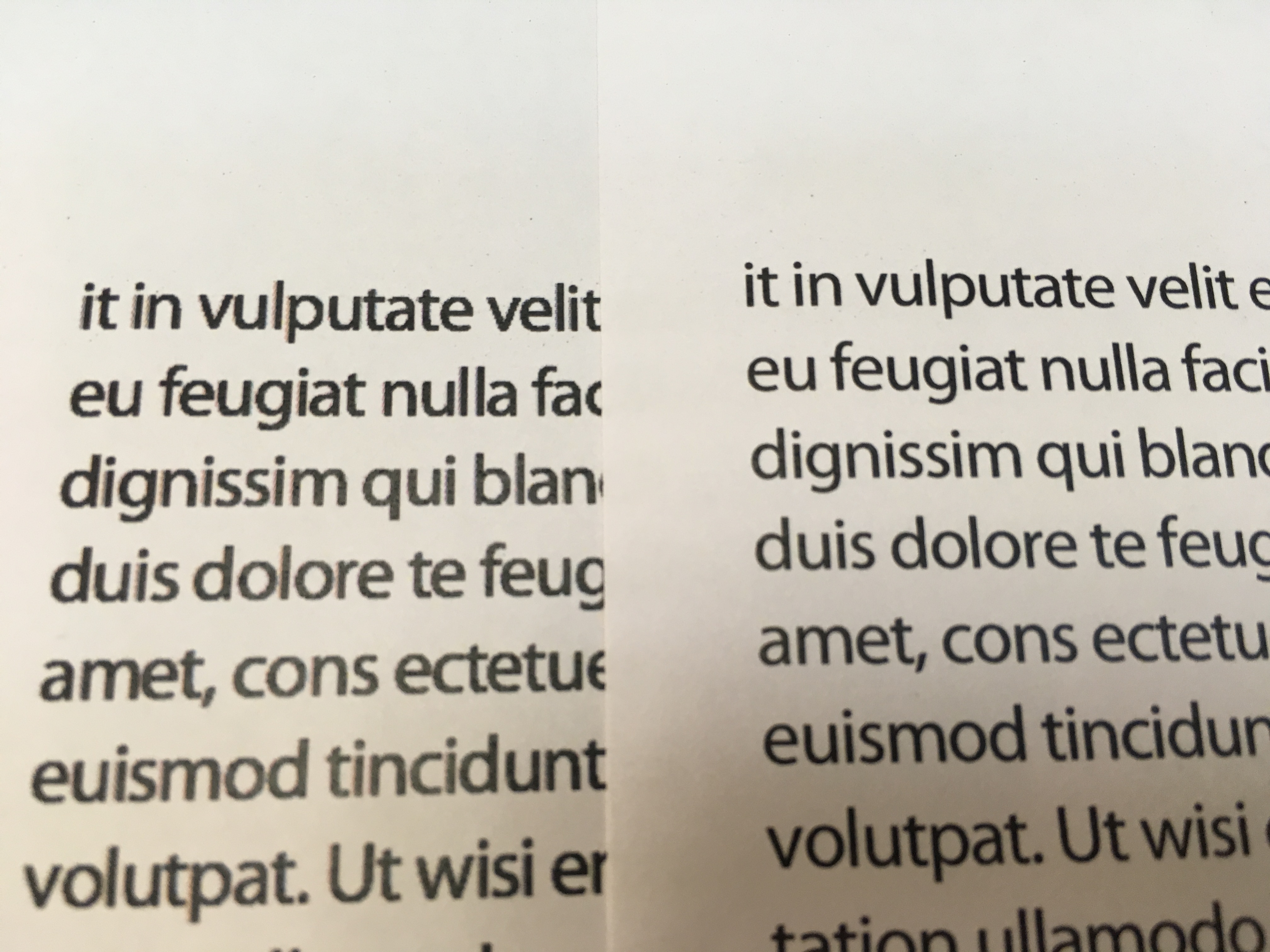
Hi there, I would like to ask if anyone else has the same behaviour as me when typing text in the 1.6.1 of AD. Assume that I create a body text style with a specific kerning and tracking number (negative values). I type the text, all good (upper text paragraph in the image). However, when I revisit the paragraph and add something (Affinity Designer), the kerning and tracking in this latest addition is lost (upper text paragraph in the image). I need to select all the text and select the paragraph style again to correct it (lower text paragraph in the image). You see the problem for the guide lines I have inserted. Best regards, A.
-
Glad to help. A.
-
I got it. I least for my case, it looks like there is bug. I could not understand why with the text it prints fine, but with text+figures the result on the text was blurry. So, I started removing one by one the figures to narrow down the issue. I found out that the problem was an opacity type. All opacities I used were normal and average. Except one, that I had used the DARKEN opacity. When I changed this opacity to normal... voila... All systems go.
-
Yeah, I did the calibration as the document in the link suggests and all the taking out & put the cartridges back in. Calibration was OK. Am I the only with this issue? What troubles me is that the pdf printed from Illustrator was OK. However, I don't know, if exporting as PDF, removes some things that potentially would make Illustrator print go bad. On the other had, never had issues with the latter not matter what I print. Text stays always crisp. I will check for any firmware updates.
-
Hi, I exported a file created from AD as a PDF, opened it in Illustrator and printed on the HP M551. It looks fine. This is the complete file with text and figures, that in similar situations AD print font is not right. Kind regards, A.
-
No worries. I can understand the process. Printed both on the HP M551. Left image exported as PDF and then print. Right image exported as PNG-24 and then print. Have the impression that it looks a bit better on the PNG, but not as expected. A.
-
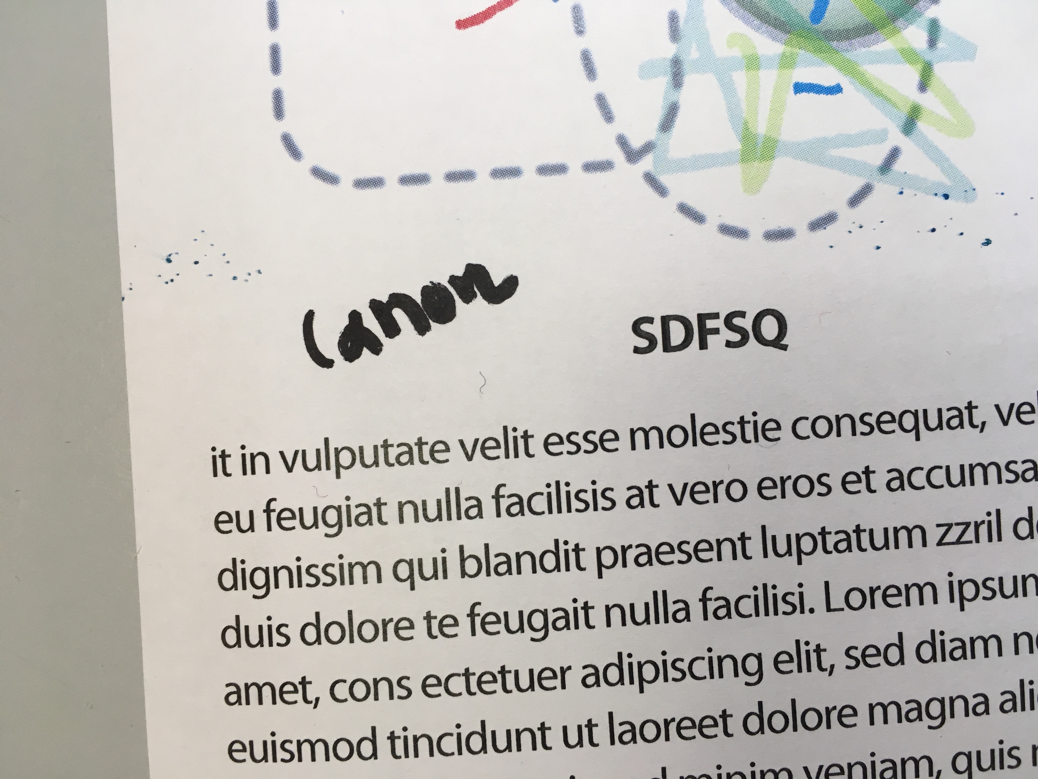
Hi, Sample file is the same as above that contains text and figures. in the first image, both left and right are from the HP M551. The left image is printed from the "open in Preview", while the right one is a normal print from AD. Second image is from the Canon 8500C printed from the "open in Preview" as above. Thanks. A.
-
OK. Image1 is from AD printed on the HP M551. Text is ok, except this minuscule shift of the lower part of font to the left. It can be seen in the large font size of word HELLO. Image 2 is from Word on the same HP M551 printer. A bit out of focus but the text is normal. Interestingly, when I am printing to HP M551 from Illustrator (without changing anything to the printer) the printing quality is as expected (not shown). Image3, left part is from the HP M551, while right part from a Canon 8500C. On the Canon, even with Figures text appears to be normal. Colours on figures are different, but might be a settings issue, I don't know. What parameters do you I should check on the HP M551 printer. Even paper type I choose to print, the result is always the same. I will see if there is anything to update as well. Thanks for your help, A.
-
Hi first defence, Here is an edited AD version of the affected file. Just messed up the figures and changed font. In addition, I added a photo showing that the problem appears on this file too; left with figures, right just the text. Many thanks, A.
-
Dear firstdefence, Thanks for your answer. Document settings are as follows: Page dimension A4; DPI 300 Font size 12 Font type, opentype pro Printer, HP Laserjet 500 color M551 Color format RGB/8 Color profile, sRGB IEC61966-2.1 Out of curiosity, I removed all vectors and printed the same AD file with just the text. The font now prints as expected. All images (the above and the one following) are from the same page that contains both text and vectors (many brushes, color gradients). Am I doing something wrong? Best regards, A
-
Hello, I just tried to print something that I have prepared from the latest version of AD 1.6.1. While on the screen the design looks good, when I am printing it, the quality of the fonts is very poor. They look sort of "pixelised" or out of "focus" if I am allowed to say. When I am using to print from any other application, the quality of the same font, or any other fonts looks as it is expected to be. Definitely, it is not a printer problem. Am I missing something or is it a bug? Best regards, A. Ps. This is an image of the print page.
-
We will be here waiting. Just please get it right.