aaronbieber
-
Posts
8 -
Joined
-
Last visited
-
Thanks for that reply, Gabe! I now understand a lot more about how to think about color profiles and color management thanks to your detailed and practical responses here. Since my images usually end up either on the web or in print, and both of those scenarios are essentially standardized on sRGB, the only "concern" that I have is that manipulating an image with more color data should lead to (at least in my naive understanding) less artifacts, like banding, or similar. For grayscale images it certainly doesn't matter either way. Simply using the grayscale image as a test because the cast is easier to see, exporting with Adobe RGB (1998) seems to completely solve the problem, so I'll be more mindful of which color space I use when I export from Lightroom in the future. Again, thanks so much for your patience and detailed replies here!
-
What concerns me is that Lightroom specifically suggests that 16-bit ProPhoto RGB be used to preserve color details: And Photoshop does a very good job of mapping those non-displayable colors into colors that appear as one would expect (grays look gray, in this case). To map non-displayable colors for a particular monitor space into that space simply so that things look accurate, rather than maintaining those color values for future edits seems like a destructive way to do this, and that worries me if Affinity is going to overtake Photoshop for professional use. On the other hand, failing to map them perceptually leaves people like me wondering how much of what I'm seeing is "true." I completely understand that color science is a deep and challenging field, but I think this is a hurdle that Affinity will have to get over if it is to compete.

-
The document looked the same to me when using the standard sRGB profile in Windows. Can you let me know what the right solution here would be? Based on what Walt said up above, the way to set this up in Affinity may differ from what I am used to, so I'm trying to make sure that I get the most accurate appearance on-screen but also the best possible color depth and accuracy in the file itself. I did one more experiment, which I think is very interesting. I opened the original 16-bit TIFF in Photoshop, which looks perfect. I choose Edit -> Convert to Profile, and I select ProPhoto RGB and "Perceptual" intent. If I check "Preview," the document takes on a very subtle color cast. This is the same effect, although much less obvious than what I see in Affinity. However, when I click "OK," the color cast disappears and it still looks perfect. How should I proceed?
-
Hi, Gabe. I am attaching the full version of the file I am looking at, saved as an .afphoto. However, please note that as I described in my original post, there is no sign of this cyan cast in the file itself. Affinity's own color picker sees the off-color pixels as gray, though they appear to me as bluish or greenish. The above attached screenshot actually captures that precise color, and shows how Photoshop identifies those pixels. I will be happy to provide more system information, etc., if it will help: Windows 10 Pro, version 10.0.18362 Build 18362 nVidia GeForce RTX 2060, running the official nVidia driver version 26.21.14.4187 Output to a LG 4K monitor @ 3840x2160, 32-bit color I am also attaching my custom display profile, which I generated with a Spyder 2 colorimeter. Affinity-sample-photo.afphoto LG 4k.icm
-
I see, that's interesting, thanks for the additional information. I switched my display back to the basic sRGB profile and I can definitely still see a noticeable cyan cast in these areas in Affinity and not in Photoshop. Apart from my strong belief that this is a fairly significant color display bug, I think Serif needs to get their eyes on this because I have followed all of the instructions in the article you linked; I have a custom profile generated by a mainstream colorimeter company and it is applied in Windows at the system and user levels. If anything, the concept that Affinity "manages color differently from most other applications" is the problem: Lightroom and Photoshop do not exhibit this behavior. Photoshop remains, for better or worse, the gold standard for this stuff. I hate to keep comparing to Photoshop, but that's the software I'm trying to replace, and as it stands, I can't do it, I just can't trust what my eyes are seeing in Affinity Photo.
-
Here is a screen capture of Affinity Photo right next to Photoshop viewing the exact same 16-bit TIFF. The color cast should be quite noticeable here (it is to me).
-
Thanks for the reply, Walt. I'm skeptical of your suggested approach because a screenshot should not contain colors managed by the output profile of a monitor; if I take a screenshot with a wildly crazy monitor profile and send it to you, it should not appear wildly crazy on your monitor (although that's an experiment we could carry out). All of that said, I do have a custom color profile applied in Windows, which I generated with my Spyder colorimeter, and which I have used in Lightroom and Photoshop for ages. I'm definitely aware of the ins and outs of color management and have faced no small amount of frustration with how Windows handles it, but my setup is solid and works everywhere else. I think this is a legitimate Affinity Photo bug.
-
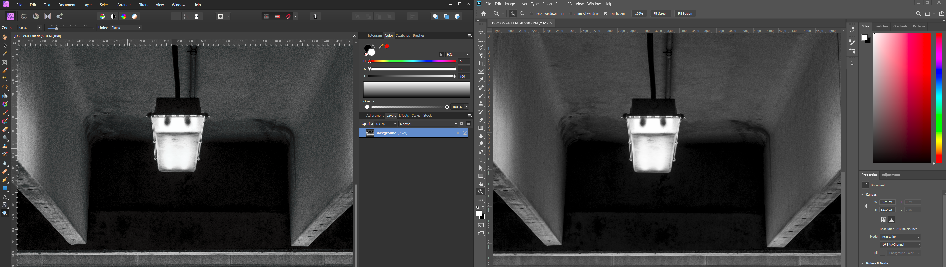
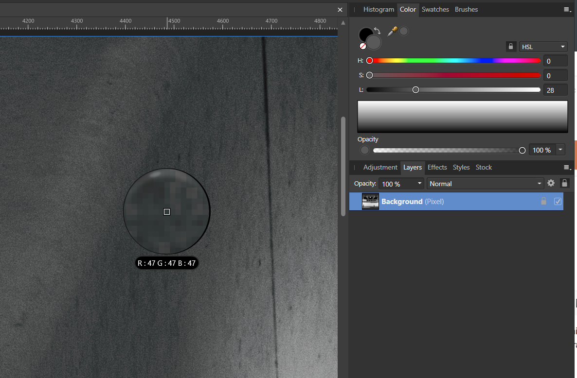
I am trying out Affinity Photo, and a lot of my photographic work is in black and white. Oddly, in Affinity, darker midtone areas have a cyan cast to them on screen. Using the color picker, I can confirm that Affinity believes that the pixels are gray, and when I save the image and open it in another program, the pixels appear gray there. This is frustrating because it makes me not trust the appearance of images in Affinity Photo. To further debug, I zoomed in very close and took a screenshot and opened that screenshot in Photoshop. Photoshop's color picker confirms that the pixels are somewhere in the cyan range, definitely not the gray that they are saved as. Since the underlying image is correct, this is some kind of display bug. I have tried changing the RGB color profile in preferences, but that seems to have no effect at all. I normally use ProPhoto RGB, which is the same profile I use in Lightroom and Photoshop where (obviously) this glitch does not occur. Here is the image zoomed in somewhat in Affiniti, where you can see that the color picker registers a gray tone: And here is a screenshot of a much closer zoom opened in Photoshop demonstrating that there is a cyan cast: If there are some additional debugging steps I can perform, or other information I can gather let me know.