A_B_C
-
Posts
4,409 -
Joined
Everything posted by A_B_C
-
Awesome … great rhythm … :)
-
 Incredible … go for it … :D
 -
A_B_C where can I buy your tutorials? LOL … :D
-
In addition to what MBd said, you could also use a fairly steep Curves Adjustment combined with a Black and White Adjustment on each of the images … :)

-
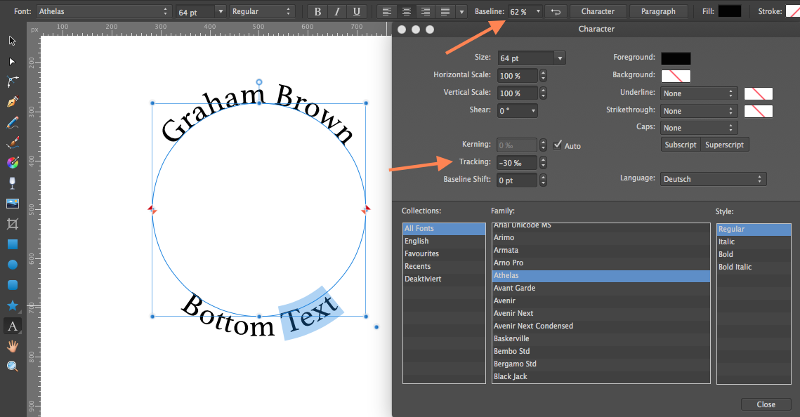
Hi Graham, wow, that turned out pretty good … and it’s easy to get snapping to work. First off, let me link to a very good tutorial video by the Affinity guys that explains the snapping capabilities of Affinity Designer (I can only recommend watching these videos on vimeo … they are very instructive): vimeo.com/macaffinity/ Now, in your case, you would want to go to the Snapping Options on the main toolbar, select Snap to object bounding boxes (these are the blue rectangles around your circles) as well as Include bounding box mit points. In my first video (“Snapping.mov”) you can see, how the midpoint of the green circle is snapped to the midpoint of the orange one. (The red ring is just there to indicate the midpoint of the orange circle.) To make the second circle the same size of the first one, you could either use the Transform Panel and enter the values numerically or do the following, as shown in my second video (“Concentric.mov”): Set the snapping options as above Select the Circle Tool Hover over the midpoint of your text circle (snapping guides appear) Hold down Shift and Command, click and drag from the midpoint of your text circle to the circumference of that circle until your cursor snaps to the bounding box of the text path Either method should work … :) Now, “outline your text before saving”: that means you have to convert your text to curves before saving. To do so, select the circle that contains your text and choose Layer > Convert to curves. Done. But be aware, this action is irreversible. So you might want to either keep two documents for further adjustments or duplicate your text path and hide the duplicate before proceeding. Hope that helps … :) Alex Snapping.mov Concentric.mov
-
You would need to have Affinity Photo to create a perspective effect, since there is no Perspective Tool in Affinity Designer at the moment … if you do have Affinity Photo, you could try the following fairly simple method: Create a new document, either with transparent or white background (depends on the intended use context of your final design) Place your illustration in that document using File > Place … Use the Perspective Tool on the placed file to create the desired perspective effect (do it better than me ;), and please note that the placed file will get rasterised in order to apply the perspective effect) Apply layer effects (drop shadow) by highlighting your layer (placed file) in the Layers List and opening the Layer Effects panel Crop your image to the desired size and export it through File > Export in a web-compatible format (for example PNG) Hope that helps … :) Alex
-
Affinity Designer Customer Beta (1.3.5.4)
A_B_C replied to MattP's topic in [ARCHIVE] Designer beta on macOS threads
Just seen, you’ve added customisable shortcuts for Break Curve and Join Curve … wow … :wub: Would it be complicated to make them work for the Pen Tool as well? That would be very convenient (you know, we can temporally switch to the Node Tool from there, holding the Cmd key) … :) -
Hi Steve, unless I am mistaken, there is still no dedicated option to do this at the moment: https://forum.affinity.serif.com/index.php?/topic/9092-blur-edges/ But you can cheat a little using the following method (and this is essentially the one MEB suggested in the thread above): Create a rectangle, slightly smaller than your photo, apply a Gaussian blur effect Center this rectangle on your photo and apply it as a vector mask to your photo by dragging its icon in the layers list directly onto the icon of your photo By the way, here’s a (very old) video showing how to apply vector masks (in contradistinction to layer clippings): https://forum.affinity.serif.com/index.php?/topic/4069-layer-clipping-vs-layer-masking/?p=16825 Hope that helps a bit … :) Alex
-
Affinity Designer Customer Beta (1.3.5.4)
A_B_C replied to MattP's topic in [ARCHIVE] Designer beta on macOS threads
Wow … apart from Pantone support, this one is highly appreciated … The Move Tool can now be told to move an object, but not children of that object: It’s an option on the context toolbar and will only show up if you have a non-group object selected which has children (a curve which clips a number of other curves, for example). … did I say “appreciated”? No, it’s fantastic … :D So_great.mov -
Watercolor splash
A_B_C replied to crabtrem's topic in Tutorials (Staff and Customer Created Tutorials)
That’s nice, crabtrem … cheers … :) -
Great, Matt … thanks a lot … :)
-
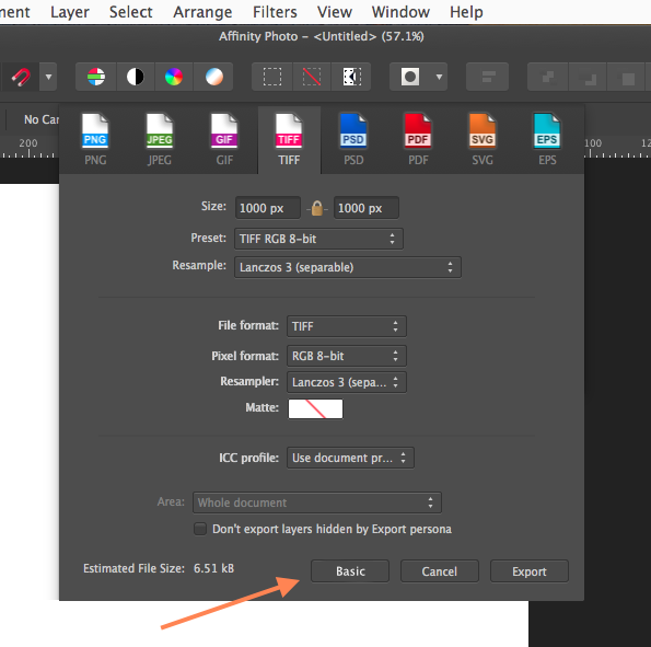
Hey guys, here’s a quick suggestion. I love the way the Grid and Axis Manager is implemented, essentially having a Basic and an Advanced Mode. Now, would it be possible to transfer this idea to the Export Dialogue as well? In my opinion it would create a far better user experience, if we were able to see all of our export settings on a single panel, instead of having to click that More … button, adjust the settings, close the More … dialogue, pick up a phone call, export the document, and see that something has gone terribly wrong, since we forgot to set Matte appropriately … ;) The More … button seems to have the advantage that you can use the same code for the Export Persona and the Export dialogue. But as the export functions are getting more advanced (and thanks for your hard work in this area), I would strongly suggest that you follow the idea of a Basic and an Advanced Mode here as well. I made a super-quick mock-up to show you the beauty of this … ;) Thanks for considering … :) Cheers, Alex
-
Feel free to ask, if there are any problems … :)
-
Hi Graham, here’s a recipe for your text: Create a circle and make sure it is selected Go to Layer > Convert to Text Path. This will convert your circle into a text path, and you will see a blinking cursor on the circumference of the circle. Now type the words that are supposed to be on the top of the circle, choose Center from the context toolbar, highlight your words and adjust font attributes as desired. Set the blinking cursor to the end of your phrase and hit Return Now type the words that are supposed to be on the bottom of the circle. To bring the bottom words out of the circle area, highlight them and adjust the Baseline Shift parameter from the context toolbar. You might also need to adjust tracking and / or kerning for the bottom words or letter pairs respectively. Open the Character Panel and adjust these parameters as desired (first screen shot). I would create another circle for the gradient, just to keep things apart. Here’s the recipe: Create the second, smaller circle. Make sure that snapping is active (Snap to Object Bounding Boxes / Mid Points) and snap the (bounding box) midpoint of the second circle to the midpoint of the first one. Thereby you will make the circles concentric. Select the second circle and use the Fill Tool (Gradient Tool) to draw a straight gradient line from the top to the bottom of it (second screen shot). Now click the little ring (gradient stop) at the top of your gradient line and go to the Colour Panel. Adjust the colour of this gradient stop (third screen shot). Do the same for the little ring at the bottom of your gradient line. Alternatively you can use the gradient flyout panel from the context toolbar of the Fill Tool (fourth screen shot). Hope that helps … cheers, Alex :) P.S. Your attachment is fine … Graham_Brown.afdesign
-
Nice … and great ideas, guys … :)
-
Have you ticked Dither gradients in the preferences? This setting (gradient dithering active) combined with extreme curves adjustment settings might give the noisy result … perhaps … :unsure:
-
Glad we could sort this thing out … :)
-
Gern geschehen. :) Great, that we sorted everything out … and Leigh, perhaps colour profile embedding should indeed be ticked by default … ;)
-
Short answer: yes. Have a look here … :)
-
In der Photo Persona ist das EXIF Panel standardmäßig nicht sichtbar. Aber du findest es unter Ansicht > Studio > EXIF … wenn es das ist, was du suchst … :unsure: Lieber Gruß, Alex :)
-
Hey Jonas14, ich nehme an, du hast das RAW Dokument in Affinity Photo entwickelt, dann als Tiff exportiert, und das Tiff anschließend wieder in Affinity Photo geöffnet. Dann kam die Warnung. Stimmt das? Wenn ja, dann hast du wahrscheinlich vergessen, das gewünschte Farbprofil beim Export in das Tiff einzubetten. Dazu müßtest du im Export-Dialog auf “Mehr” klicken und dann im folgenden Dialog das gewünschte Profil wählen … und nicht vergessen, “ICC-Profil einbetten” anzuklicken … (entschuldige, das hatte ich zuerst vergessen, weil du ja die Beta benutzt) … Nützt das was? :) Alex
-
Affinity Designer Customer Beta (1.3.5.3)
A_B_C replied to MattP's topic in [ARCHIVE] Designer beta on macOS threads
Hors catégorie must feel somewhat like this … ;)
-
Any information, when (or if) extensions for Apple’s Photos will come to Yosemite, Leigh? :unsure:
-
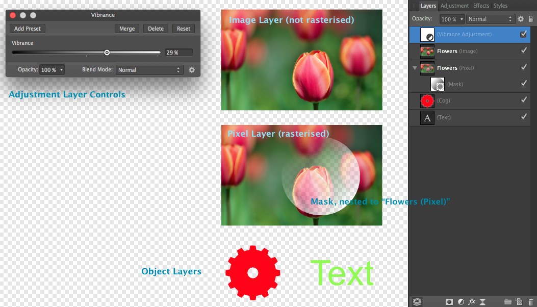
Hey guys, I made a short video, showing you the behavior of adjustment layers in respect to the layer hierarchy. I created a group of two images (Flowers, Wood) to show you the differences. You can create groups by selecting layers and hitting the “folder” button at the bottom of the layers list. 0:00. The Black and White adjustment layer is beneath all other layers. Nothing is affected. 0:02. The adjustment layer is above the Flowers layer and therefore affects just the Flowers layer. 0:05. The adjustment layer is nested to the Wood layer and therefore affects just the Wood layer. 0:10. The adjustment layer is nested to the group, consisting of the Flowers and the Wood layer, and therefore it affects both layers. You would achieve the same effect, (a.) if you made the adjustment layer the first child of the group (by placing it above the Flowers layer and the Wood layer within the group or (b.) if you placed the adjustment layer above the group itself. 0:13. Back to the beginning. Please note the change of the blue highlight bars when dragging the layer. Have fun trying it yourself … :) Cheers, Alex Adjustment_Layer.mov
-
Hi everybody, no offense, but I feel there’s a little confusion about concepts and terminologies here … basically you have to discern between pixel layers, object layers, image layers, adjustment layers, and mask layers. Pixel layers. A pixel layer is basically a container where you can perform pixel based editing tasks like painting, erasing, selecting by a pixel selection marquee, and so on. Object layers. Then there are object layers, falling in different categories: smart shapes (rectangles, cogs, arrows, …), vector paths, text objects. Object layers become pixel layers, when they get rasterised (Layer > Rasterise …). Image layers. Suppose you created an empty document. Now place another file in that document (File > Place …). Then you will see an image (layer) appear in the layers list. An image (layer) is considered an object layer, just like a vector path, a vector shape or a text block. It retains most of its properties until it gets rasterised. I say “most of”, because the colour profile that may be embedded in the placed file gets converted to the colour workspace of the document, for example. Adjustment layers. These layers are used to perform non-destructive adjustment tasks (Brightness and Contrast, Curves, Black and White, …), and the range of their efficiacy depends on their position in the layers hierarchy. Basically, an adjustment layer that is nested to another layer (to a pixel layer, for instance) affects just the layer it is nested to. (The same applies to groups.) Otherwise it affects all layers beneath. Nesting an adjustment layer A to a layer B is performed by dragging A onto B in the layers list. Mask layers. A mask layer that is nested to another layer determines which parts of this other layer will be visible or invisible or semi-opaque. Otherwise it will determine the visibility (opacity) of all layers beneath. Masks are indeed unlike darken or lighten layers (i.e. layers which blend modes are set to “Darken” or “Lighten”). Paint on a layer set to “Darken” with a black brush, and you will usually see a black stroke appear. Paint on a mask with a black brush, and you will hide parts of the layer(s) affected by the mask. Excuse me, if I am not clear enough … I hope that makes sense … and please note, that the in-app help files (Help > Affinity Photo Help) are very valuable, when it comes to getting clear about questions like these. I just can recommend to have a look. Cheers, Alex